Save
There’s an old maxim of user interface design about ensuring that products are useful, usable, and desirable. Does the design solve a problem? Can people make it solve their problems? Do people want it to solve their problems? But even if the answers to these questions are all “yes,” now what? “Usable” and “satisfied” are pretty low bars. It’s like saying your design is “adequate,” “fine,” or “average.” It’s like saying you’re having sustenance for dinner. People want more than that.
There’s an old maxim of user interface design about ensuring that products are useful, usable, and desirable. Does the design solve a problem? Can people make it solve their problems? Do people want it to solve their problems? But even if the answers to these questions are all “yes,” now what? “Usable” and “satisfied” are pretty low bars. It’s like saying your design is “adequate,” “fine,” or “average.” It’s like saying you’re having sustenance for dinner. People want more than that.
Shiny Only Goes So Far
There’s been a lot of talk about designing for delight. Delight is nice, but it’s easy for users to get used to. Habituation becomes a problem. Tasty, shiny, or cute only get you so far. Certainly, there’s a place for, and many advantages to, creating designs that are pleasurable to use. They’re perceived as easier, more trustworthy, and more personal. But sometimes embedding visual treats and trying to be considerate of users aren’t enough to create the engaging, immersive experience of being in flow. Pleasurable interfaces can provide nice surface attributes in the visual design or interesting interactions that are mostly just transient. Your design may need something more—something to keep people interested after the novelty wears off, something to assist productivity. In flow, the experience is rich and deep.
The word “flow” suggests smooth movement in a specific direction. In human cognition, flow comes from focused attention, deep engagement, a feeling of mastering a challenge. The outside world ceases to exist, at least temporarily, and time fades away. There is often heightened awareness and key senses are highly charged. When all of this comes together, people describe the episode as extremely productive and highly creative.
Being in the Zone: Relaxed and Energized
Being in a state of flow is a kind of Zen state that some people describe as “being in the zone.” There can be a meditative quality to flow: deep breathing, concentration, relaxed but structured. Creative people often describe flow-like sensations after an intensive session of making something. People who play sports also say they’re in the zone when they feel fit, practiced, challenged within their abilities, and confident.
Imagine you are in the middle of drafting wireframes or creating a prototype. You have the feeling of doing perhaps some of the best work of your life. You’re productive and it’s going well. Your designs look good. You’re confident that they will test well. You’re capturing everything needed, and you’ve had sparks of insight along the way—not flourishes, but improvements that presented themselves because of some new understanding you intuited after processing hours of observations, practicing, sketching, talking, listening, watching, thinking, and now making. The work seems to be happening effortlessly. You might even be smiling. You’re calm and relaxed, but energized at the same time. What’s happening here? (Your little mirror neurons are firing even now as you read this description, aren’t they? You have had this.) That’s flow.
Mihaly Csikszentmihalyi is the chief scholar of flow. He first witnessed flow when he observed artists working ceaselessly, completely absorbed, forgetting to eat or sleep, forgetting where they were, forgetting themselves as they created. Fascinated, Csikszentmihalyi, decided to study this phenomenon in all kinds of people.
Csikszentmihalyi found that people who experience flow are more open and creative than people who don’t experience flow. During flow, ego slips away as challenges are met and exceeded.
We UXers might look at flow as a state of being in which a human act is mediated by technology such as a tennis racquet, a paintbrush, word processor, or a mobile app—anything where the tool fades away, and the person is one with her creating.
A tennis racquet is an instrument of flow? Certainly. Manufacturers have put a lot of thought and years of research into the design of tennis racquets. Is it strong enough? Is it flexible enough? Does it weigh too much? Too little? Is it weighted in the right places? How does the grip feel? How does the heft feel? How easily does it become an extension of the player’s body?
To take it to UX in the digital space, look at mobile apps. The best mobile apps include only the essential functionality, and yet, users find it easy to integrate the best mobile apps into their lives.
Flow Is an Indicator of Engagement
Most of us don’t design tennis racquets, so it might be difficult to see where we’re designing flow into products and services. More importantly, it can be difficult to determine where the flow should go in a design—in which specific interactions, task flows, visual designs, or in one part of an application or a website versus another. How do you build designs that create flow for the people using the designs? Or, on a more basic level, why would you care about flow for users at all?
In e-commerce, you want flow because that translates to engagement, which turns into revenue. In software, applications, and devices, when a user reaches a flow state, even just momentarily, she’s in love. She’s in control, she’s productive and empowered, she’s motivated and autonomous. The design is fully integrated into that moment of activity, into that experience.
By “flow,” I don’t mean only screen flow that echoes users’ tasks. That type of mechanical design is important as a contributing factor to the overall experience. But the flow I’m talking about goes beyond that. I’m talking about creating an immersive experience for users that makes them productive and relaxed but energized, all at the same time. It’s subtle, it’s elegant, and it’s often invisible to the user because it’s so frictionless.
Don Norman describes designs that promote flow as “behavioral.” This is true usability, as the interface and interaction elements fade from the user’s awareness. To give the user flow is an exercise in subtlety. A design has to string together dozens or hundreds of what Bill Scott calls interesting moments that you don’t really want users to notice. You have to build an unconscious design that is consistently frictionless. You’re not just mechanically getting the user to the next step. You have designed in particular stimuli to elicit specific responses, such as psychological or linguistic cues that make people behave a certain way. When a design does this successfully, even for dull, work-related tasks, a user’s experience may be transformed as she begins to feel appropriate challenge, control, and productivity.
Here are the nuts and bolts of flow, inspired by the writing of Andrew B. King in Speed Up Your Site:
Responsiveness
Users must perceive that the UI is speedy. But bear in mind, if the user can’t do what she wants to do because the design gets in the way somehow, it doesn’t matter how responsive the product is or how fast pages load, hover text appears, or how few steps there are in a process.
Affordances and feedback
Include clear but subtle signals about what’s clickable, what might have discoverable content, and what is navigation. With careful design of hover times, progress bars, “pressable” buttons, and clues to enabling sweeps, taps, and pinches, the product has to help users make quick inferences about how to interact with the design.
Clear information architecture and navigation
Anything you can do to match the design to the user’s mental model is going to assist flow. When the smooth path is interrupted, or something doesn’t seem to fit, users notice and the flow is broken, which means that the experience is also momentarily broken. These small episodes of friction are cumulative. Unfortunately, the breaks in flow weigh more heavily on the experience than the positive, frictionless moments. Experimenting and testing are key to getting it right.
Match challenges to skills
Consider the multiple levels of challenge that the design presents, especially in learnability. What do you want the first 15 minutes to be like? What happens after that? Also consider ongoing use. Users’ goals are different going from starting up to using a design regularly. After your user has grokked the basic concept of the design, what can you build into the design to continuously support users’ changing skills? You can put a user in a flow state when you thoughtfully, subtly integrate progressive disclosure in a design.
Minimize distractions
Clutter, chrome, animation, and surprises may interrupt and be disruptive. Smooth anything that might cause friction. Remove visual and navigational noise that might seem like clutter to users. Designing for mobile apps forces this. Taking the same approach in other designs has some merit for flow.
Context Is Key
Flow isn’t an appropriate goal for every context. Not every design needs to elicit flow, and not every step should necessarily create flow. You don’t want people to be in flow on the home page of a website; you want them to blow through the home page on their way to what they came for.
There are a lot of appropriate places to design flow in. Flow can be short or long. Flow in a weather app might simply mean checking on whether it’s going to rain today, because that fits the flow of the morning as she’s getting ready to leave the house. It’s a quick, automatic gesture-like action the user takes without thinking.
Mastery of Affordances, Subtle Feedback, and Responsiveness: Netflix
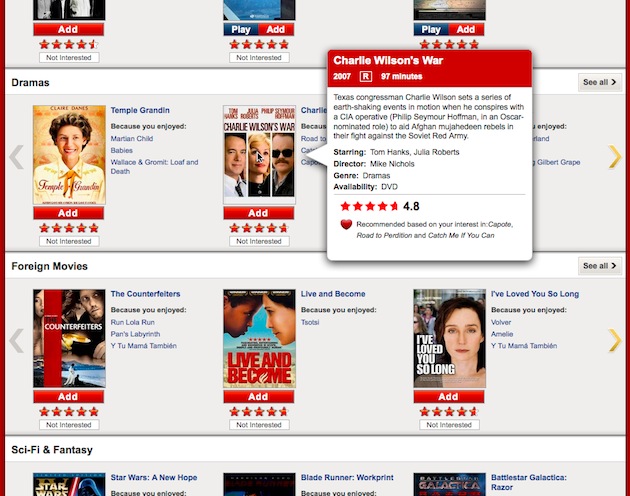
One beautiful example of flow is Netflix’s rating system. At its core, Netflix is a website for renting movies. This seems straightforward enough, but Netflix realized that engagement with their brand was tied to how much time customers spent manipulating their movie queues. So they began experimenting with how to get customers to their queues and realized that there are a couple of sweet spots.
A key path into the site is from emails the customer receives to rate a movie she’s just returned. There’s nothing else in the email, and all she has to do is click a star.
This little action takes her to netflix.com, where she is probably already cookied and so is automatically logged in. There, the site offers more movies similar to the one just rated to rate, review, and add to her queue.
Here’s what is so absorbing: while there are many choices offered at a time, the Netflix team has built in subtle elements to keep the number of choices from being overwhelming, such as just showing a few titles in any category, leaving lots of white space, but still providing options for seeing other titles.
Hover the mouse, and information about the movie comes up. The timing is deliberate, the cinematics are deliberate, the positioning is deliberate, and all are intensely researched. Everything is obviously clickable without screaming about it because there is a distinct hierarchy of interaction. It all helps users know what to do without thinking. All these cues add up to and uninterrupted continuity of interaction, which creates flow. The fact that they’re engaged in a series of tasks that could be endless isn’t frustrating for users; instead, users say they learn about movies they hadn’t heard of before, that it expands their viewing.
Emergent Information Architecture and Navigation: Quora
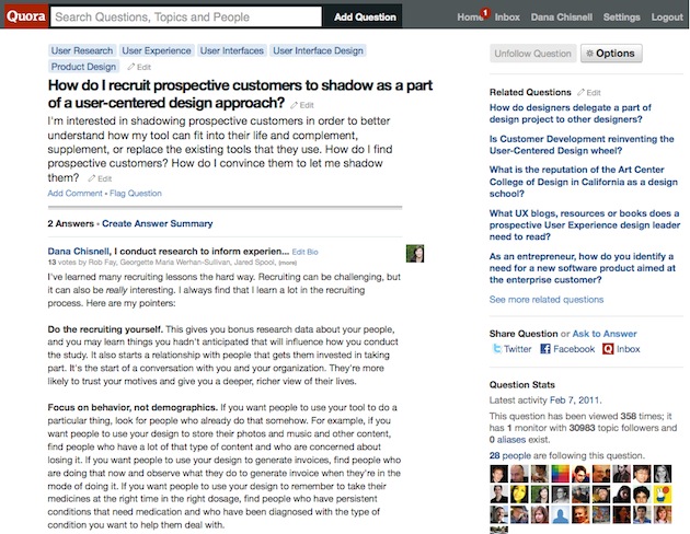
On Quora, you can ask questions of everyone in the network and answer questions from anyone in the network. Flow in Quora, comes from the elegance of the information architecture and navigation. Here, the path is smooth, though there are many possible tangents. It would be wrong to describe Quora’s navigation as efficient. But in this case, that is a good thing; tangents are useful and meaningful, like tributaries on a stream that flow back into the main waterway.
It is easy to lose track of time on Quora because the tangents in the information architecture assist serendipity, if you have any curiosity in you at all. The content is very tightly interlinked, so mastery of the user interface is positively challenging. Yes, some users express frustration, but when the interface is unlocked for them, the reaction is similar to mastering a level in a game.
In the ongoing conversations on Quora, there’s a question for everyone to answer, and answers to nearly every question you could ask. Answering questions is all about demonstrating skill and knowledge, and sharing domain expertise. Asking questions of others who you can learn from and getting answers is very gratifying and mind-expanding. This user interface is trying hard to set up the interesting conversation you have in the hall after the meeting.
The centerpiece of the Quora UI is the question, which may have qualifiers. There are answers, but the answers often lead to tangents as the site offers questions that it thinks are related to this question or topic. And yet, it is easy to avoid getting lost as you move from one conversation to another. Users can feel mastery, feel like an expert, while learning at the same time.
Shutting Out Distractions: Ommwriter
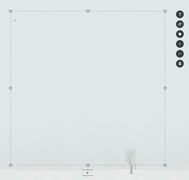
Ommwriter is a beautiful word processor. The visual and audio design are all about putting the user in deep flow. The whole point is to be immersed in a writing environment where distractions are shut out. The features are minimal. You’re probably not going to write reports using Ommwriter, but you could. The formatting features are not there to create a published document. But you could use them that way, too.
The design does everything possible to help the writer be productive. It is beautiful. It is subtle. It disappears into the background as flow takes over. It even has a soundtrack to help the writer feel grounded. This is an appeal to deep skill. As Don Norman suggests, attractive things make people feel good, and when people feel good, they feel more creative and think more creatively. When design reaches for flow, users are also better at finding solutions to problems. Journaling in Ommwriter works better than talk therapy for some people.
The writing interface of Ommwriter is simplicity itself. When the app opens, it shows an outline for the typing space and widgets that open menus on hover. But as soon as the user clicks in the typing space, the menus get out of the way. All that is left is writing. The visual design, navigation, and interaction design make it incredibly easy to infer what to do and when to do it.
Supporting Skills to Meet Daily Challenges: Things
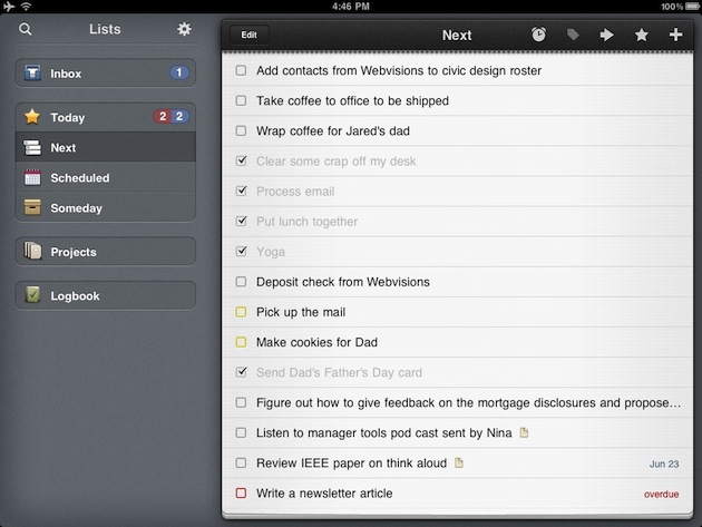
What makes you feel more in flow than getting things done? Things is an app built for just that. It’s a tool for helping people who are trying to attain a state that David Allen, author of Getting Things Done (GTD), calls “mind like water.”
This app is simple. There are not a million features; it’s just a to do list. But everything about it helps users feel in control of their lives. The interface is straightforward but includes useful visual prompts such as the number of items due today. It is also easy to tell what has and has not been done yet. Due items are bright. Today’s competed items fade but stay in the list until they’re logged.
GTD proponents integrate the app easily into their lives. People who have never read Getting Things Done feel organized and in control, learning the principles of GTD through use of the application. And there’s no single way to make it work. This design snaps to different organization schemes, styles of managing projects, and syncs among devices. Things is a tool for flow that needs little or no tool time.
Measuring Flow
Designers who succeed at building flow into designs in the right places stimulate behavior by incorporating psychological cues, language, social cues, and reinforcement. Alone and in combination, these types of cues motivate users to keep working or playing longer than they might without the cues. Designing for flow helps users control the current activity, which results in feelings of mastery, productivity, autonomy, and empowerment. The design closes the gap between the skills and knowledge the user comes to the design with and what she needs to know to use the design.
Physical evidence
How can you tell whether the cues you have built in are working? Teams have been struggling with that question for a while. Analytics probably are not going to tell you a lot about flow and engagement. Surveys may tell you what people want you to know. But qualitative, contextual research where you’re observing behavior as users interact with a design will give you the best picture of whether users are in flow. As you watch, you’ll see that users:
- Stop talking, hum, or make comments about what they’re doing rather than how they’re doing it. They shouldn’t have any questions about how to do what they want to do.
- Are difficult to interrupt, redirect, or get to move on to something else, because they’re deeply focused and concentrating, forgetting you’re there. They are immersed while they master something, feeling challenged but not frustrated.
- Report later that they felt energized, and productive. They might even talk about feeling gratification.
Subjective measures
There are also a couple of subjective measures you might try. An assessment developed by Gallup called CE11 might be a good tool, though Gallup prefers you have them administer it rather than just using it on your own.
Another option is a quiz I reengineered from something called the sustainable-marriage quiz, originally developed by Gary W. Lewandowski Jr., an associate psychology professor at Monmouth University in New Jersey. Here’s my version. Try it with your users. (Of course, you should change the word “website” to whatever your design is):
| Very little … Very much | |
| When you are using the website, do you feel a greater awareness? | 1 2 3 4 5 6 7 |
| How much does this website increase your ability to accomplish new things? | 1 2 3 4 5 6 7 |
| How much does this website expand your own capabilities? | 1 2 3 4 5 6 7 |
| How much do you feel you have a larger perspective on things because of this website? | 1 2 3 4 5 6 7 |
Dana has helped hundreds of people make better design decisions by giving them the skills to gain knowledge about users. She's the co-author, with Jeff Rubin, of Handbook of Usability Testing Second Edition. (Wiley, 2008) Visit Dana's website at usabilityworks.net or follow her on Twitter @danachis.


