Save
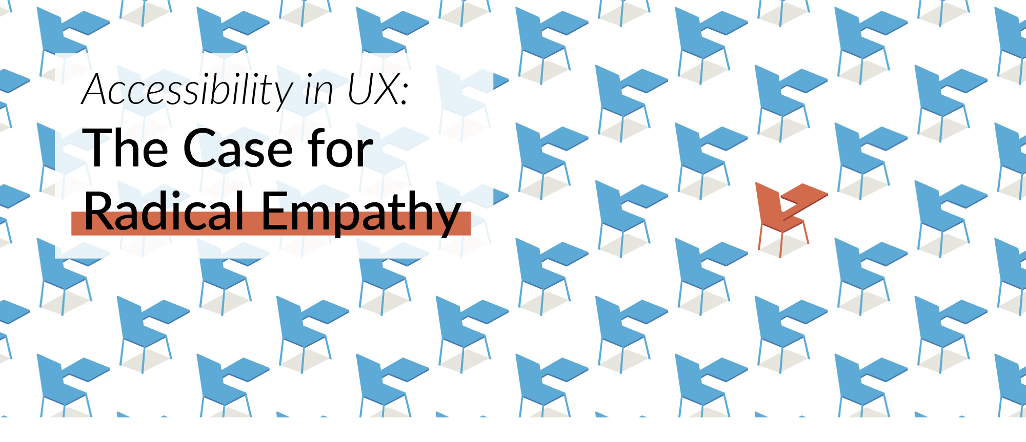
Imagine you were left-handed (and if you are, reflect on your left-handedness). You are part of a 10% minority in the world. Adjusting to certain tasks takes longer — but help in the form of left-handed stationery, sports equipment, etc. is available easily. Now imagine you are colour blind. Or visually impaired. Or clinically anxious. Or prone to seizures. Collectively, you are part of more than 20% of the population, but help is not as easily available, and even less so digitally.
What is accessibility?
Accessibility is a measurement of a user’s ability to use products/services, the extent to and ease with which they can meet their goals. Designing with accessibility in mind enables people with a range of abilities and disabilities to perceive, understand, navigate, interact with, and contribute to the web.
A common misconception is that accessibility requires a focus on users that have some kind of disability — but that isn’t the case. Accessibility design is inclusive of everyone. Maximising ease of use to reach all ability levels leads to products that anyone can use and enjoy, whatever the context. Accessibility design only widens the user pool, and helps all users. The practice of designing to maximise the user pool is known as Universal Design.
Who does this aim to reach out to?
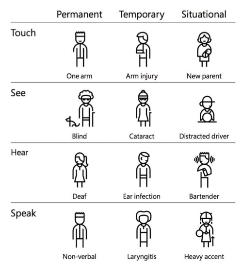
Barriers can be permanent, temporary or situational. They range from people who are completely blind, colour blind to those who have low vision. Of course it does not only involve visual states, but also people who are deaf, people with mobility impairments or cognitive impairments.
Usability and accessibility
Usability and accessibility are not the same thing, but there are definite overlaps between bad UX and inaccessibility. The way to look at this is that a bad experience for the general public is usually much worse for a disabled or impaired individual. Inaccessibility in a product comes between a user and his goal. Inaccessibility can be caused by various reasons –
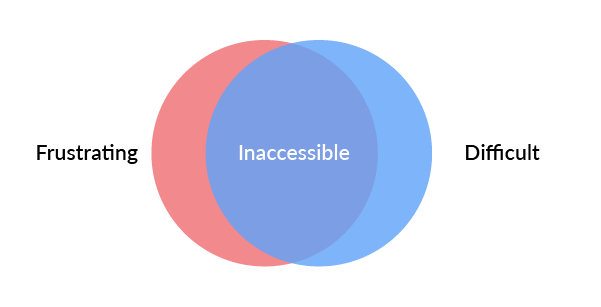
- Physical: It takes too much strength to use
- Conceptual: Instructions and flow are hard to understand
- Economic: It is too expensive
- Cultural: Users can’t understand metaphors relevant to product use
- Social: The social expectations related to use are not intuitive for some social groups
So why should our design be accessible?
Studies show that accessible websites have better search results, they reach a bigger audience, they’re SEO friendly, have faster download times, encourage good coding practices, and always, always have better overall usability.
1. Empathy: Does design exist without it? Should design exist without it?
Empathy is a cornerstone of human-centered design. It is one of the hardest known skills to embody and practice. The way towards empathy is to sit down at the level of the user, and talk with mutual understanding — but given our social fabric, it is likely that we do not have the access to people with disabilities that are directly affected by our designs.
A step in the right direction is this TED talk on design thinking for disability, by a disabled person — https://.ted.com/talks/elise_roy_when_we_design_for_disability_we_all_benefit#t-240823
2. People with disabilities form one of the largest user groups in the world
On an average, elderly people on average spend 6 years of their life being disabled, and the proportion of ageing population is increasing every year. A report published by the United Nations in 2011 estimated there were 1–1.3 billion people with disabilities in the world (as much as the population of China in 2014).
3. The business case for accessible design
Apart from increasing the market reach, accessibility features in products and services often solve unanticipated problems. Accessible design also helps a brand’s positioning as one with thoughtfulness towards everyone.
Along with these fringe benefits, there a well-kept secret among the giants that accessibility actually drives innovation. Google and Apple believe accessibility to be a basic human right — and in that they drive their products to be better, human-er. Microsoft’s Seeing AI innovation is focused on noticing images, and not just seeing them — to better convey to blind people. Similar to that, Google’s Project Tango uses computer vision to help accurately place blind people in a three-dimensional space. Google also has innovations in the area of not just natural language processing, but non-language processing, a way to process sounds and intonnations — a way to benefit the hearing-impaired.
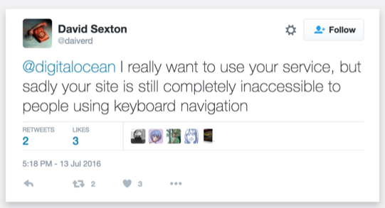
And if you aren’t convinced just yet, in 2006 Target was sued by the National Federation of the Blind for an inaccessible website. They had to pay 6 million dollars in eventual settlement and continue to collaborate for the NFB to ensure accessibility.
How do we make our designs accessible?
1. Ask yourself where you are and where you need to go
First things first, a baseline measure.
Before you start, the accessibility of a current website can be tested using the AXE Chrome Extension. (Available at: https://chrome.google.com/webstore/detail/axe-coconut/iobddmbdndbbbfjopjdgadphaoihpojp?hl=en)
The Web Content Accessibility Guidelines, (WCAG) breaks down accessibility into 4 main principles:
- Perceivable: Can the content be consumed in different ways?
- Operable: Can it function without confusion and without the use of a mouse or complex interactions?
- Understandable: Can a user understand how the user interface of the site functions and the information on the site?
- Robust: Can different assistive devices (screen readers, for example) understand the website?
Based on these categories, one can get ratings of A, AA, and AAA.
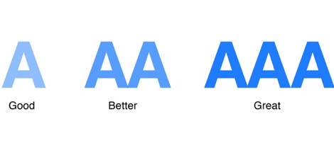
This complete set of guidelines is available here: https://.w3.org/TR/WCAG20/
2. Be good with Colour
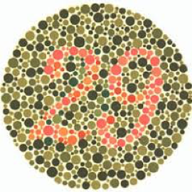
A best practice here is not to use colour as the only visual means of conveying information. One can use tooltips, thick borders, icons, bold text, underlines, italics, etc. in conjunction with colour.
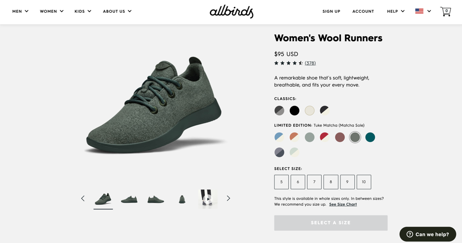
This colour selector cannot be accessed by a person with any range of visual impairments from colour blindness to complete blindness.
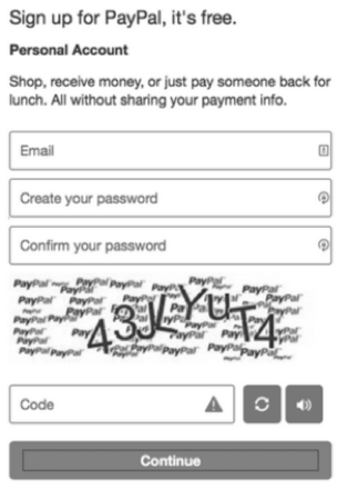
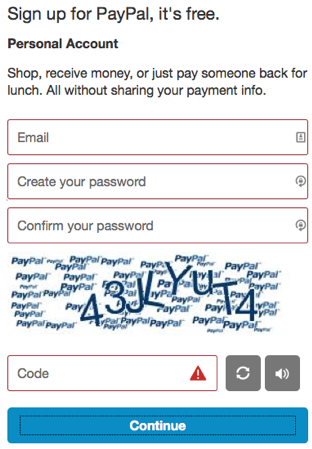
If you look at this screen in black and white, it is impossible to know which fields have an error.
Sufficient contrast between text and backgrounds is a good practice. (A good ratio is 4.5 to 1). Great resources are https://colorsafe.co/ and https://material.io/design/color/text-legibility.html#text-types which help you generate colour palettes for your designs. Another option for Mac users is the Stark plugin for Sketch — that simulates designs in various forms of colour blindness. Another obvious tip is to avoid flashing lights in UI or pop-ups as they can trigger seizures and other light-sensitive responses.
3. Keep it Text-y
People with low vision often make use of screen readers to convert text to speech so that the person can hear the words on a site. A way to allow them to perceive images is using well written and descriptive Alt Text. (Here is a resource for good alt text is practices — https://webaim.org/techniques/alttext/#basics). Another small yet powerful way to assist a screenreader is to add periods in abbreviations (C.I.A. versus CIA). One should offer transcriptions for audio resources, and captions/subtitles for videos.
Text blocks with narrow widths are easier to read for all people, especially those with reading or vision impairments. Because of this, the WCAG recommends keeping a line of text’s character count below 80 characters. Also, avoid using justified text and users should be able to zoom into your site 200% without having to scroll horizontally. In terms of content, the WCAG explicitly states that you should aim to write at a ‘lower secondary education level.’
4. Visual cues
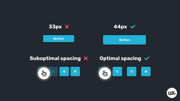
Visual cues are an important aspect of allowing keyboard access. Fonts / buttons should be large enough to click even with an unstable hand. Allowing users to scroll through links using the TAB key with :focus {outline: 0;} enabled in the backend CSS is another valuable integration.
Forms require three specific items that are vital for accessibility: clearly defined boundaries, visible labels and helper text — which recent minimalist designs have started to forego. Clearly defined boundaries for form fields are important for users with mobility impairments and those with cognitive disabilities.
For people with cognitive impairments, keeping a label on a field is important as placeholder text goes away when one types, while labels maintain their usefulness even after.
5. Navigation & flow
Hovering excludes keyboard-only interactions. Very often, UX design uses hover for secondary actions and visibility only for primary actions. People who use speech recognition to navigate require actionable items being visible on the screen. Allow users more time to enter time-related information. Allow users to go back in the flow if they so require, as mistakes can be made by anybody, but more so by people with some inhibitory factors.
6. Test with all users
After all these efforts, is also important to include personas with varying abilities in the testing phase and use accessibility-testing tools (such as WAVE and Color Oracle) to test the design.
And right at the end, one can use this final checklist you can use just to make sure your design is accessible: https://accessibility.voxmedia.com/. We are on the brink of creating a new world.
We reserve the power to aim for one where every disability is treated like left-handedness — with an ubiquitous and seamless solution, free from stigma.
And maybe, just maybe, the physical world will hear us too.
Originally published at https://.zeuxinnovation.com/accessibility-ux.html
References:
- https://.interaction-design.org/literature/topics/accessibility
- https://medium.com/salesforce-ux/7-things-every-designer-needs-to-know-about-accessibility-64f105f0881b
- https://.interaction-design.org/literature/article/understand-the-social-needs-for-accessibility-in-ux-design
- https://uxdesign.cc/designing-for-accessibility-is-not-that-hard-c04cc4779d94
- https://uxdesign.cc/accessibility-guidelines-for-a-ux-designer-c3ba775539be
- https://uxtricks.design/blogs/ux-design/accessibility-standards/
- https://deanbirkett.name/accessibility-for-ux-designers
- https://uxplanet.org/a-primer-to-web-accessibility-for-designers-2c548448c612
- https://.w3.org/WAI/business-case/
- https://.leagle.com/decision/20061398452fsupp2d94611322
- https://.fastcompany.com/3060090/how-designing-for-the-disabled-is-giving-google-an-edge
Kriti is a UX designer from Mumbai. Psychologist by education, reader & writer by passion, she loves to explore ideas within the intersection of design, business and the human experience.


