Save

I stumbled on the topic of accessibility and inclusion while learning user experience (UX) design from MOOCs. At first, I thought it’s a reasonably familiar topic but I couldn’t have been more wrong. After reading through several resources, I now firmly believe, there is no better way to practice user empathy than understanding accessibility and inclusion. This blog post outlines the need for accessibility and inclusion in building products and how it’s a win for everyone involved.
Disability — redefined
When I heard disability, I used to think about people with physical disability such as those those who have lost their limbs, vision, hearing. The World Health Organization (WHO) says over a billion people, 15% of the world population, have some form of disability. They mention disabilities due to ageing, chronic health conditions, mental illness among others. Many people live a normal life without knowing they have a disability like color blindness. WHO argues disability is not just a health problem, it’s a phenomenon reflecting the interaction between features of a person’s body and features of the society in which he or she lives.
According to WHO’s argument, disability happens at the point of interaction between a person and the society. Consider a deaf person walking into a job interview and facing an intercom door.

A deaf person approaching an intercom door

The deaf person trying to use intercom door. Credits : Microsoft
The user faces enormous friction in this situation. It is a loss for both the candidate and the recruiter in the world surrounded by non-inclusive, inaccessible products. The philosophy of inclusive design addresses this problem.
Inclusive design
Inclusive design is about considering the full range of human diversity such as age, class, color, gender, literacy, race and all forms of disability. Any exclusion results in hampering the interaction of the individual with their friends, family, their neighborhood and society. Ramps and access cards in buildings, braille inscriptions in elevators are examples of inclusive approaches to design and offer social participation for everyone.
There is a misconception that inclusive design means designing one thing for everyone. It means creating multiple things where everyone has an option. For example, an inclusively designed train station may offer stairs for youth, escalators for elderly and elevators for those who are wheelchair-bound. The use case of mobility inside a train station is solved via multiple designs with a primary motive-do not exclude anyone.
Challenge of exclusion
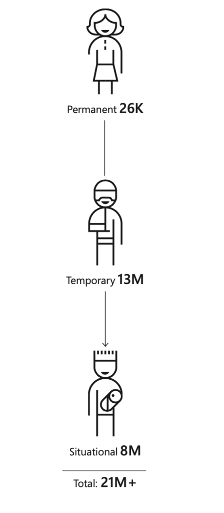
Exclusion is the biggest challenge in entertaining diversity. There are temporary and situational exclusions in everyday life. Few of my MBA batch-mates broke their legs and were wheelchair-bound for months. They faced temporary exclusions from several activities on the campus. Navigating to the check-in counter of a busy airport with luggage creates a situational exclusion. Mobile phones come handy in such circumstances. The touchscreen of a mobile phone that contains every necessary option within a reach of the thumb is designed with inclusive design philosophy.
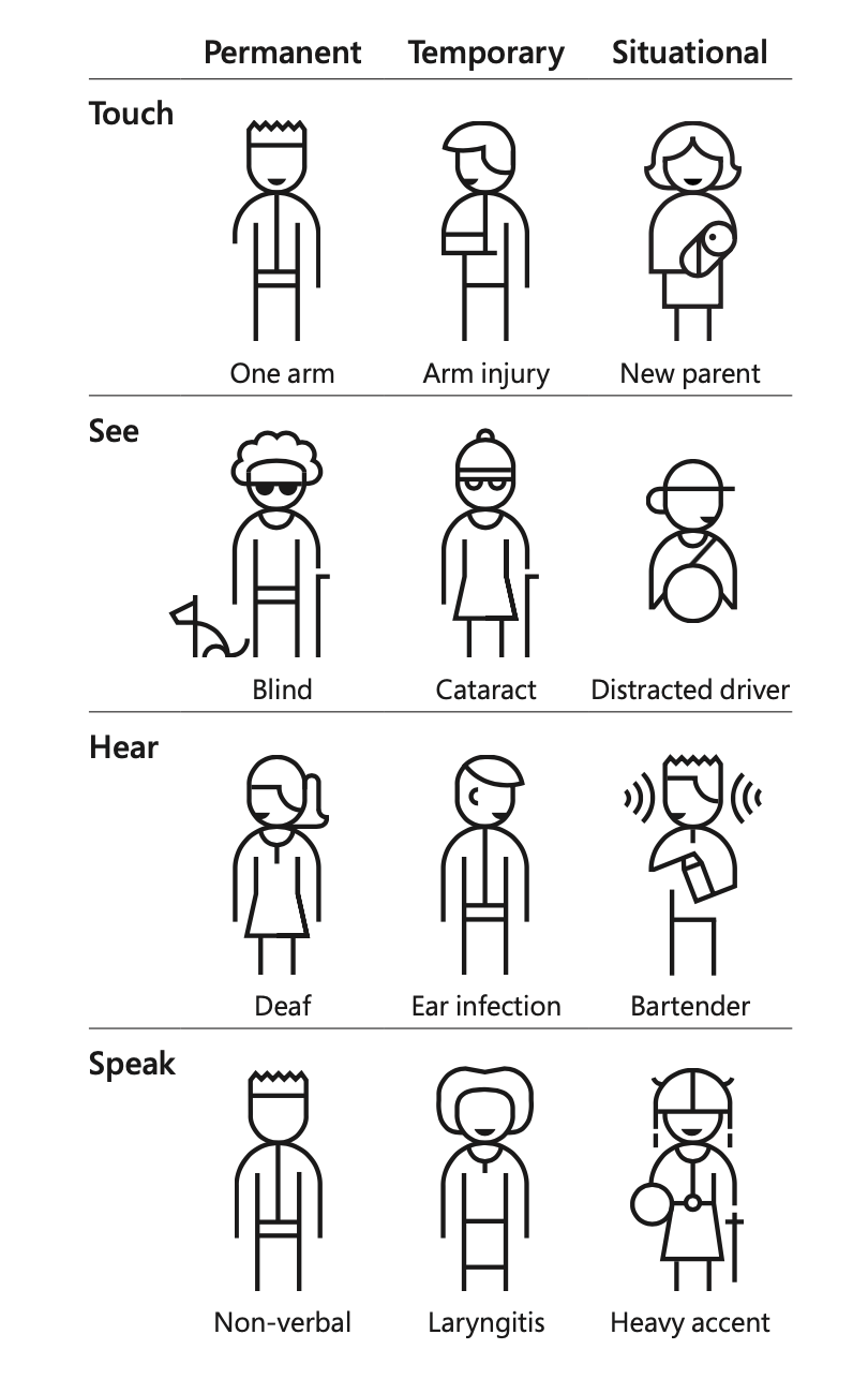
Permanent, Temporary and Situational exclusion. Credits: Microsoft Design
Technology interactions depend on the way we touch, see, hear and speak and remember. I have personally faced difficulties in teaching my father how to use a mobile payment application. He was forced to learn the nuances of One Time Password and Two-Factor Authentication. Many essential modern applications are not friendly to elders. It begs a question whether technology is adapting to us or we should adapt to technology.
Empathy
Empathy is a key ingredient in designing accessible and inclusive applications. Personal biases can influence the way we speak and behave. It can easily influence the products we build unless we choose to empathize with the users.
Product Managers (PM) usually think about user personas when they face a problem statement. Need-driven user personas help PMs practice user empathy while designing products. A noise cancelling headset or a blindfold during prototyping will come a long way in making the product more accessible. Empathizing with users will help us see more barriers than we can imagine.
Solve for one, extend to many
User empathy and inclusive design philosophy will help us design solutions that can work for multiple situations of exclusion. Consider the high contrast screen that was invented for people who had vision impairments. Today it helps people who are using their laptops under sunlight-a situational exclusion gap.
Audible, the popular audio books company is powered by the concept of storytelling that was initially catered to people (primarily children) who cannot read with their eyes. Video captioning that was intended to help people who cannot hear is currently used in busy airports, video call transcription services. When solving a problem for blind or deaf people, we are not only solving for them. We need to start thinking about enabling participation for people with disabilities in everyday life in society. We can extend those products and make it accessible for many more people in the future.
Takeaway
While designing a product, recognize the exclusionary aspects. Empathize and learn from the diversity of users. Solve for one and extend it to many. These are the most important takeaways from my UX lesson yesterday.
Most of the references are taken from Microsoft’s design blog. It has quite a lot of movies, guides on the topic of inclusive design. I highly recommend checking them out.
Article originally published at karthikeyanmalaisamy.com.
Karthikeyan is a Product Manager at Microsoft. He has an MBA and computer science engineering background. He is passionate about building products that makes people lives easier. His musings can be found at karthikeyanmalaisamy.com.


