Save

As digital commerce grows in Pakistan enabled by digital transactions, banks are competing along with Fintech startups to provide better app features and offerings, but no banking app seems to place their focus on the digital experience itself.
I’m an ex-SCB IG Graduate and having worked as a product manager for credit cards in Pakistan, I know what the key focus areas of most banks are — reducing cost. That in itself shows where the priorities lie, this is not to target any bank, but because having the right focus is important and the focus should always have been “Customer Experience” — digital or physical, the human element should never go missing. In this article, we’ll have a look at the app’s UX through the design thinking lens — what works for users and what doesn’t, i.e. is it usable, viable and feasible for the users and the business.
Design thinking defined
Design thinking is a human-centered approach to innovation that draws from the designer’s toolkit to integrate the needs of people, the possibilities of technology, and the requirements for business success.
— TIM BROWN, EXECUTIVE CHAIR OF IDEO
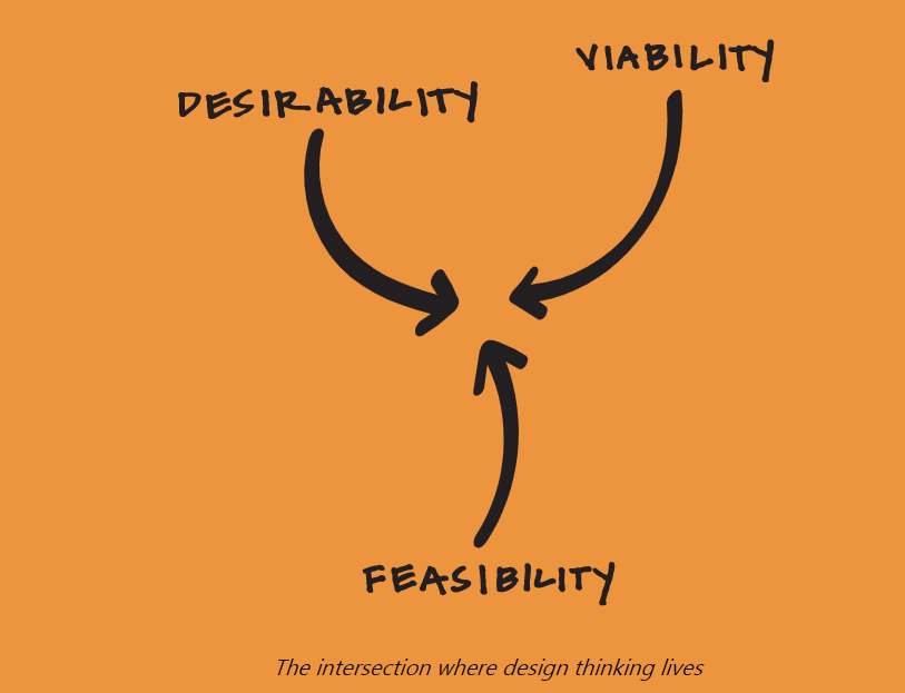
The world today is one with interlocking systems, where many of the problems we face are dynamic, multifaceted, and inherently human. Humans need to navigate through disruption in technology and globalism with the only way to successfully do that being — having the human as the focus of problem-solving. The products in today’s world need to be desirable (do we really want it? do we need it?), feasible (can this be done in an efficient manner?) and viable (is it profitable/sustainable?) for them to be successful and having that very approach is what gets you the larger chunk of the pie- today people not only require a solution to their daily problems but a solution with a satisfying experience.
The UX Audit
Ideally, the UX audit is a process that requires deep-diving into the journey of the app with a focus on business goals, competitive analysis, accessibility concerns, usability reviews/testing, user interviews, persona development, app analytics, responsiveness testing, and performance testing — but we aren’t going to go into each detail here — the purpose here is to give a bird’s eye view on what works and what doesn’t. Therefore for this purpose, we’re going to audit the app using Nielsen Norman- 10 Heuristics Principles of design.
These principles are:
- Visibility of system status
- Match between system and the real world
- User control and freedom
- Consistency and standards
- Error prevention
- Recognition rather than recall
- Flexibility and efficiency of use
- Aesthetic and minimalist design
- Help users recognize, diagnose, and recover from errors
- Help and documentation
Usability
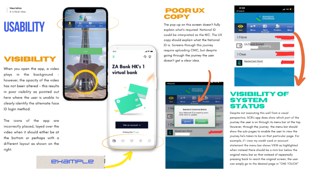
I started off by testing the app for basic usability — how do you log in, what’s the first thing you see, what are the cues, how do interactions work, and more importantly what the journey is.
Key Findings
- Visuals impair usability (for example, when logging in you can’t see the fields clearly and you only catch a glimpse of the face ID login option as the video plays and leaves a darker background).
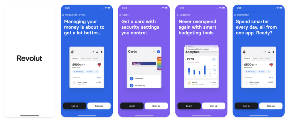
- No focus on the UX copy — the UX copy should be simple, self-explanatory, and yet human. The key to a great experience is having the human touch, Stripe, Acorns, and Revolut bank have done that fantastically well by using copy that sounds like a human conversation as the user moves through the journey.
- As far as the visibility of system status is concerned, SC does a fairly decent job — however, the top menu bar is incorrectly placed and seems to hover in the middle while the more menu results in a cluttered view. Therefore, it is fair to say the focus of SC has been on functionality, not experience — the app fails to take the user on a journey similar to Revolut’s example below, instead, users need to find their path through trial and error.
- The onboarding experience for new customers and repeat customers should be different — instead of the app just opening up the home page on signup, the user should be educated on the usage of the app, its features, and how to use them.
Visuals and Aesthetics
Key Findings
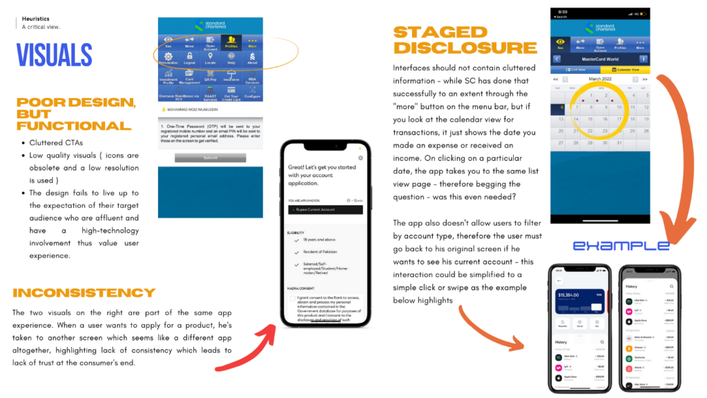
- In complex interfaces every icon, button, and text piece is fighting for attention — therefore it is essential to keep the information that befits the context and is enough for the user to have a clear idea of what purpose it serves — in some areas, the icons, for example, do indicate what they’re for, but from a visual perspective these icons, fonts, and design elements are not relevant to SC’s aspirational target audience.
- The influx of challenger banks requires traditional players to adapt, SC has failed to do that and the app seems more like a traditional ERP system (mobile version) instead of being an app that helps them move finances. The Millennials and Gen-Z who are the current and upcoming target audience of SC respectively will fail to relate to this design given they interact with apps such as Instagram, Facebook, Snapchat, Clubhouse, and Twitter all of which use modern interfaces with a high focus on visuals — the new challenger banks are doing the same.
- The idea should be to create a unified, seamless experience through familiarity, therefore when creating visuals, and choosing icons and fonts it is essential to pick out ones that are similar to the ones that are being used in these very apps. (recognition rather than recall)
- Inconsistency is common throughout the app — if a user wants to apply for a new product, the app renavigates to a web app version that has no similarity with the other screens of the app and there is no option to return to the previous screen. On cancellation, the app renavigates to the login page of the app which means the user has to repeat a journey they’ve already made when it could have been a click instead.
Flexibility and Efficiency of Use
Key Findings
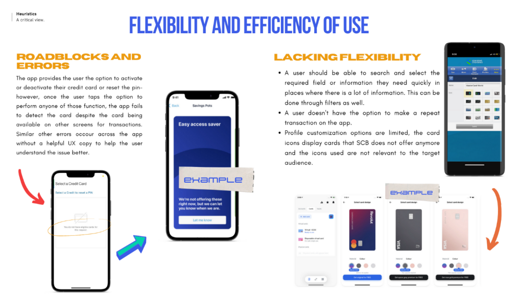
- Multiple roadblocks throughout the journey, for example despite having the option to manage cards through your app — there is no consistency in the UI throughout the journey and the user hits a roadblock when they can’t manage their cards despite the option being available and an active card in usage.
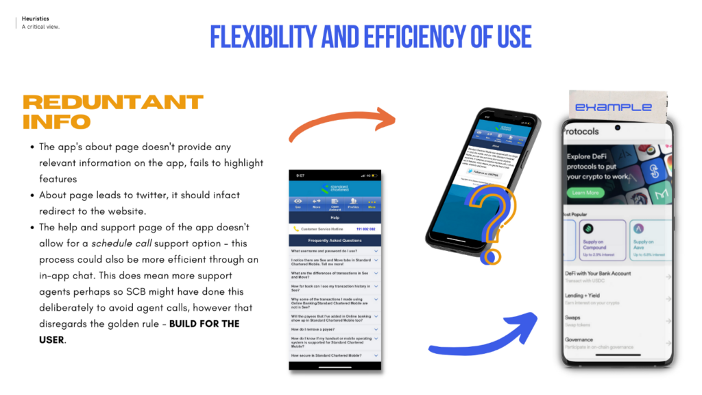
- In terms of flexibility, the app offers limited options to diagnose a problem, not allowing the user to filter problems based on type or search for solutions. The app also doesn’t allow for any repeat transactions but does have the standing order option which allows the user to enable the option of auto-transfer of a particular amount on a particular date- however, it’s not as feasible as allowing for a repeat transaction because if the user wants to change the amount/date they have to cancel that standing order and make the transaction separately. For example, the UI on the screen in the image above allows the user to filter through help options and also provides a bit of context thus making for much easier user interaction.
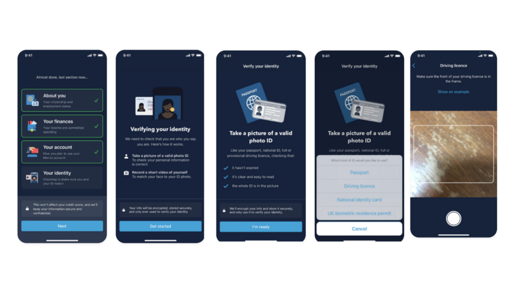
- The app lacks the element of the journey — such that the user isn’t guided each step of the way as they should when creating an account. If we have a look at the example below, the Monzo app is clearly more interactive because it follows the rule of staged disclosure with one key action on every screen. This allows for more information and context to be provided to the user enabling a more informed journey- the app also highlights steps you’ve already completed in the application process thus providing the user visibility on what has been accomplished so far and what is required next.
Key Takeaways and Conclusion
- The app should take the user on a journey, however with SC’s app the user needs to navigate his way through trial and error.
- Non-coherent UI — the app visuals remain inconsistent throughout the app showing that design thinking was never part of the development process.
- Poor UX copywriting makes the digital experience less human.
- Redundant information and restricted customization make for a less desirable experience
- No use of information filters or CTA buttons (call helpline for example)
- No use of a design system
- Error strewn journeys
However, the app does well from a functional perspective with users able to execute the most relevant tasks such as transfer of payment, viewing transaction history, or making QR payments, therefore, making it a feasible solution, but one that might not be desirable.
Moiz Najmuddin
I'm passionate about helping solve the world's biggest problems through technology and a user-centric approach. I bring together experience from helping multiple startups take their first steps and achieve scale and the business judgment and communication skills of a top-tier strategy consultant.
- Humans need to navigate through disruption in technology and globalism with the human as the focus of problem solving.
- The author of this article analyzes the bank app’s UX through the design thinking lens by using Nielsen Norman- 10 Heuristics Principles of design and provides key takeaways:
- Visibility of system status
- Match between system and the real world
- User control and freedom
- Consistency and standards
- Error prevention
- Recognition rather than recall
- Flexibility and efficiency of use
- Aesthetic and minimalist design
- Help users recognize, diagnose, and recover from errors
- Help and documentati


