Save

I mentioned in my post on the psychology of simple design, that design should be instinctive and simple, where it’s seamless to our own unique world. It’s familiar to us. For the first time. And, well, every time.
But simple isn’t easy. Far from it. So let’s look at the top 5 reasons behind the monumental task of designing simple experiences…
REASON #1: SIMPLE IS HARDER THAN COMPLEX
This isn’t just a fancy Steve Jobs quote.
Okay, it is. You got me.
But there’s a vast amount of knowledge, skill, and experience behind Steve’s quote…
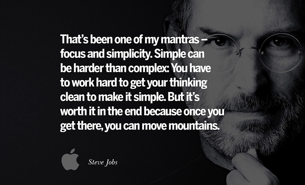
In my humble opinion, what Steve is really saying here is that it takes longer to develop simple solutions due to the extraordinary amount of iteration involved in the development process, and therefore it’s much more expensive due to constant exploration and redesign.
Additionally, simplicity demands myriad teams with incredible talents, and the best thinking from extraordinary thinkers who can think differently.
Not to mention an unrelenting mental focus of these teams on solving specific problems, combined with a duality of convergent and divergent thinking. And it requires the right leaders with the capability to develop the brilliant visions to drive these teams towards the development of a simple solution.
Simple is exponentially harder than complex, namely because there’s a psychological chasm that most teams cannot surpass… or perhaps they have not been setup to succeed with simplicity due to a lack of time, money, and/or skill.
REASON #2: HUMANS LOVE COMPLEXITY
So we discovered that simple is harder than complex, and now it turns out that humans are hardwired to reward complexity.
But wait, I thought you just said we’re hardwired to prefer beauty, order, and simplicity?

Yes, it’s true that humans appreciate those things, but our brains actually reward complexity. This is called complexity bias, and it occurs in the pursuit of new things. Bright shiny objects. New friends, apps, widgets, and on and on. Companies have made trillions of dollars based on this basic concept, aka consumerism.
However, a critical element we should recognize in our pursuit of new things, is that we learn. Because on the flipside of complexity, simplicity has a calming effect on us, but doesn’t reward us… unless of course, we’re learning and achieving.
REASON #3: HUMANS HATE LOSS
Whether it’s the loss of friend or lover, money, or your iPhone that you keep forgetting in the Uber. It’s all the same to us in that we mourn these losses. Our brains view these losses to be deeply negative responses, where our emotional response is twice as strong as the reward from a gain.
For example, your brain will process the loss of your iPhone to be twice the emotional response of when you first purchased it!
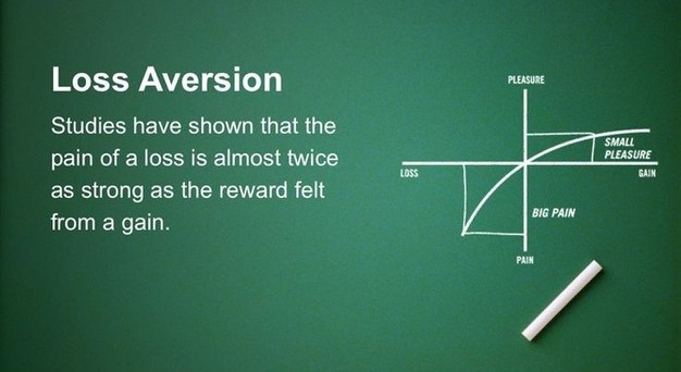
In the digital realm, simplicity often involves taking something – or many things – away, and we don’t like that. Our brain treats this as a loss. How many times have you looked at a new app and said, “this experience is great except it doesn’t have X, Y, and Z!” I myself am still a little perplexed that Facebook took away messaging in the main app, and I refuse to download Facebook Messenger to this day. #whyFBwhy
So we mourn these losses, well, until we forget about it in our pursuit of something new.
Woo-hoo! Instagram app has messaging!
REASON #4: WE DON’T FULLY UNDERSTAND OURSELVES OR OUR ENVIRONMENT
Humans are highly-complex creatures living in a highly-complex world that only seems to get crazier and crazier each year. We have a limited view of ourselves and the world we live in, mainly because both are based on some extraordinary science that most of us don’t know about and/or understand. Except the ~1% of us who are scientists.
And I still haven’t met a designer who moonlights as a scientist.

Because of this, we can’t fully predict the often irrational behavior of humans. I mean, how did MySpace lose 100 million users to an almost identical solution, i.e. Facebook?
We also can’t predict how our Earth will behave when we slowly destroy it with pollution, destruction, and overpopulation. The Earth reacts with global warming, flooding, drought, and now pandemics?
So if we can’t fully understand and/or predict our own behaviors and that of our natural environment, then how do we create beautiful and simple digital experiences that users will love?
REASON #5: SIMPLE REQUIRES TAKING EXTRAORDINARY RISKS

Navigating all of the previous 4 reasons requires an extraordinary amount of risk:
- Risk of misunderstanding users’ wants & needs
- Risk of designing something too complicated
- Risk of building the wrong product
- Risk of wasting time due to failure
- Risk of the loss of money due to failure
Humans have become much more risk adverse now than just 100 years ago, mainly because we have much more to lose in the pursuit of our dreams. Because of that, we tend to gravitate towards things that are familiar to us. Things that are safe. Reliable. Like a steady 9-5 job versus a risky startup.
Tell me this, would you risk it all?
CONCLUSION
Creating something beautiful and simple without losing the essence of your idea is extremely difficult, if not seemingly impossible.
The crux of the problem around creating simple solutions is that designers – in collaboration with product teams – have the difficult task of trying to translate real-world objects, behaviors, and interactions into digital experiences that solve important user problems and are easy to use.
There’s an art to making the overly complex seem simple.
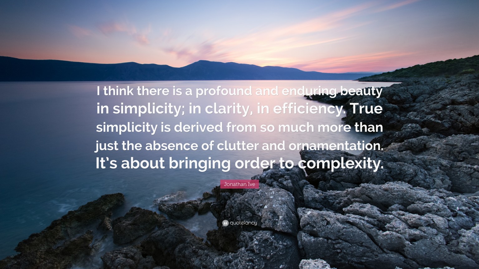
As the brilliant Sir Jonathan Ive once said, “I think there is a profound and enduring beauty in simplicity; in clarity, in efficiency. True simplicity is derived from so much more than just the absence of clutter and ornamentation It’s about bringing order to complexity.”
Clarity of communication. Optimization of processes. Solving complex problems. Finding that perfect analogy that everyone easily recognizes.
These come from practicing great design. Not being satisfied with good, but striving for great and then awesome. It takes experimentation. A willingness to try and fail.
And try again!
Joe Smiley
Joe Smiley is a respected design leader who has developed innovative experiences for over 20 years for many Fortune 500 companies - including Activision Blizzard, E*TRADE, PwC, Marriott, AOL, Disney, FedEx, and others - as well as numerous government agencies and nonprofits. He is currently the Head of Ecommerce design for Blizzard Entertainment, where he leads the development of world class experiences for gamers. Additionally, he is a successful entrepreneur who co-founded and ran multiple tech startups. He is also a speaker and published author, and he recently served as a judge for the MIT $100k challenge. He holds an MBA from the University of Virginia Darden Graduate School of Business, and a B.A. in Design from Virginia Tech. His ideas on utilizing design for disruptive innovation can be followed on DSRUPTR.com.
- Designing simple and seamless experiences is exponentially harder than designing complex solutions
- Simple solutions require an extraordinary amount of time, money, and skill
- Other obstacles to simple design include complexity bias, loss aversion, unpredicted behavior, and fear of risks


