Introduction
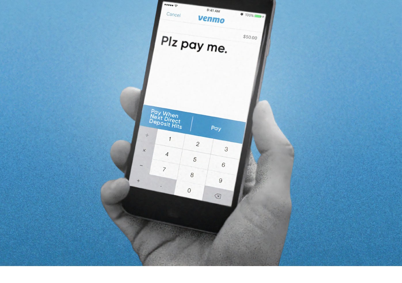
Venmo is a mobile payment service owned by PayPal that allows people to pay and request money from their friends. Venmo provides a social way to pay friends when you owe them money and don’t want to deal with cash. Users can make payments using money they have in their Venmo, or they can link their bank account or debit card quickly.
Framing the Problem
This case study focused on creating a user-centric solution to the question, “How can Venmo streamline group payments?” With over 40 million users, Venmo has mastered being an application that allows people to easily make payments and requests. However, it lacks group functionality. When making group payments or requests, the same amount of money is applied to every person in the group.
User Research
My team (Kanijah Brickhouse and Hana Kovaci) and I conducted interviews to further understand user experiences when completing group payments. Working with real world data from users helped us avoid solutions we believed would be fit for the user. We conducted non-directed user interviews with users between the ages of 19 and 50.
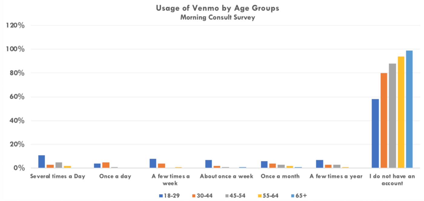
Venmo is popular among millennials, so we decided to interview representative samples of Venmo users. About 80% of our users were between the ages of 19–22 and 20% were between 30–50 years old.
User Research Takeaways
The questions we found most helpful and received the most critical information for are:
- Have you ever split a bill using a peer to peer app? If yes, how did you split the bill?
- What are your experiences like when splitting a bill?
- How beneficial do you think a splitting the bill feature would be?
The main point that we found from our interviews was that 100% of the users utilized their phone calculator to determine how to split the costs when splitting a bill. Some users explained how they had a neutral experience while others expressed how this method can be a bit time consuming when there is a big group of people splitting a cost.
Another point we found popular in our research was that 100% of users suggested that a splitting the bill feature would be beneficial to a certain degree. Users stated that this feature would save them time and would make the payment process easier for them when they are making group payments. Users tend to manually request people one by one when people owe them different amounts of money because Venmo does not have a feature to manually split total costs between users.
Implemented Design
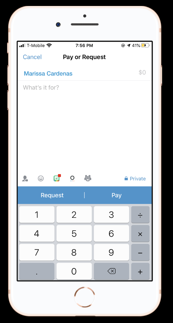
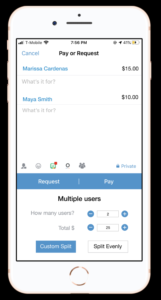
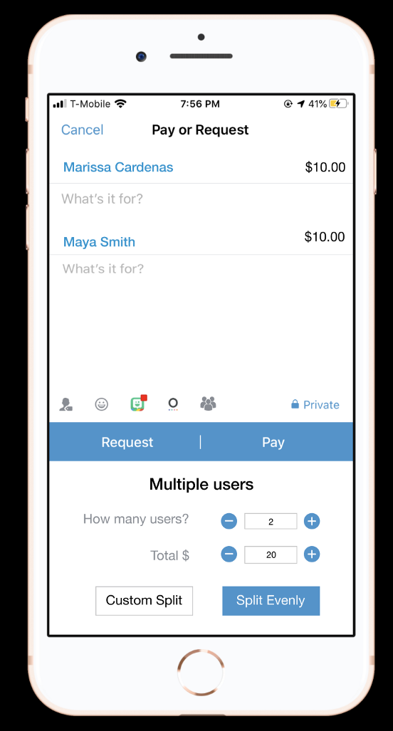
Based on our user interviews, we decided to implement a group icon above the pay and request features in the Pay and Request page. Our reasoning behind this was that we did not want to make a large change to Venmo’s simple layout that users found friendly. The icon is the same color (grey) and the same size as the other icons.
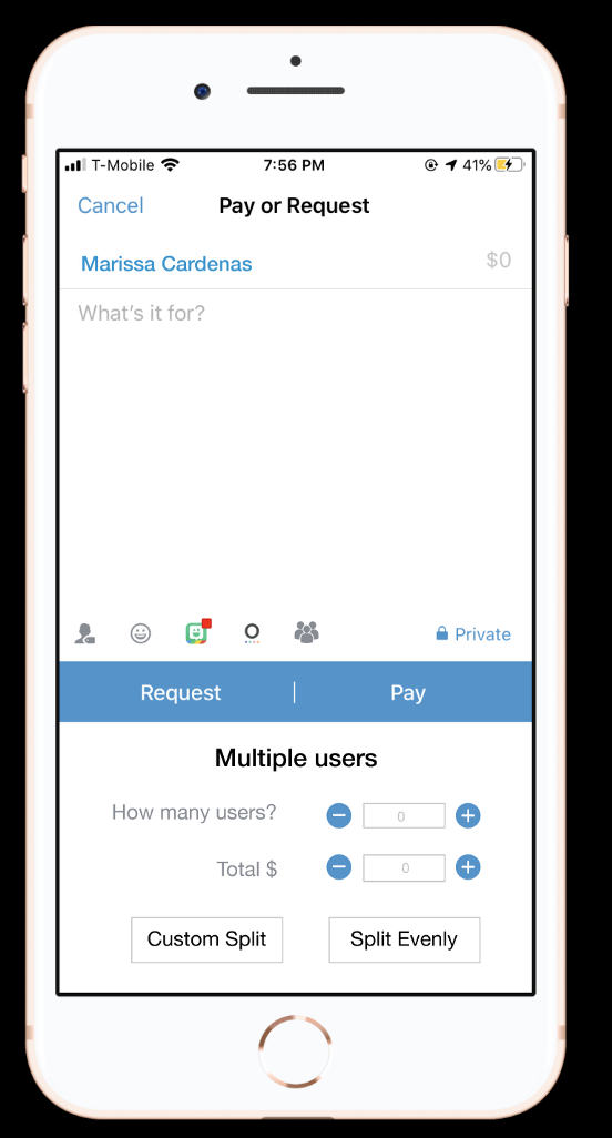
Once the Venmo user clicks on the group icon, a multiple user section will appear under the pay and request features. The goal of this section is to allow users to insert how many users they are requesting or paying as well as being able to insert the total amount of money they will be splitting.
Left Screen
The Venmo user is going to split $25 between two users. The user chooses to Custom Split and is going to either pay or request $15 from one user (Marissa Cardenas) and $10 another user (Maya Smith).
Right Screen
The Venmo user is going to split $20 between two users. The user chooses to Split Evenly and is going to either pay or request $10 from both users (Marissa Cardenas and Maya Smith).
Usability Testing
Upon finishing our mockups, we conducted three usability tests with users between the ages of 21 and 29. All three users liked the idea and the implementation because the design had the same colors and style of the features that are already in the app. There were two suggestions that the users made so that we could further improve the implemented design.
- Make it more clear that the user can manually enter numbers in the “How many users” section as well as in the “Total $” section.
- Implement a group “What’s it for?” feature so that users have the option to decide whether to fill that in with one group or several individual descriptions.
Conclusion
Designing features for a popular app can be challenging because people can be complacent with features the app already has. I learned how important user interviews are and how they allowed my team and I to discover that all people were manually splitting their costs through their iPhone calculator and not in Venmo, the app they are making the payments and requests in. We were able to design a feature that creates a solution to that issue and get feedback that that there could be visual design improvements.
What are the next steps?
- Conduct more usability testing with older age groups
- Conduct deeper research in adding and subtracting buttons and how they play a role when manually entering numbers
Future Features
- Clear information about manual and increase/decrease features for number insertion
- “What’s it for” group feature with one common description for all users in a group


