Visual design is a polarizing piece of the design process. It’s often ignored as a superfluous facet of design, merely there to please stakeholders looking for eye candy. Or – even more commonly for junior designers – visual design is viewed as the end-goal of great design: if it’s gorgeous, it’s good; if it’s ugly, users won’t be happy (and albino seals will suffer).
Visual design, however, is neither insignificant nor the end-all to great design. Visual design is a means of communicating through orienting illustrations and photography, meaningful typography, evocative iconography, persuasive color, comforting spacing and layout execution, and many other “little big details.”
Tl;dr: visual design is about using the visual aspect of a product to improve the user’s experience. Conceptually, it’s pretty darn simple. But why do we bother investing in visual design, and who should be involved? Furthermore, when and how do we get started? Let’s start with Why, and move from there to Who, When, and How.
Why
Visual design is important for many reasons. For one thing, your visual design is the first impression your product will make. Studies have shown that we have 50 milliseconds before users have made their first judgments on our products. Perhaps somewhat surprising, however, is the fact that not only is visual design the first impression consumers will have of your product—it is actually arguably the most important impression it’ll make.
Consumer Reports found that users will decide whether to trust the credibility of a site based more upon its visual cues than its actual content. Additionally, visual design is one of the strongest ties a designer can use for effectual branding. A great information architecture is absolutely paramount, but it won’t convey “Star Wars” or “Huggies” like thoughtful and intelligent visual design will.

Figure 1: Duolingo (a popular language-learning tool) has a visual design purpose built to convey a friendly, upbeat, and down-to-earth (no pun intended) message.
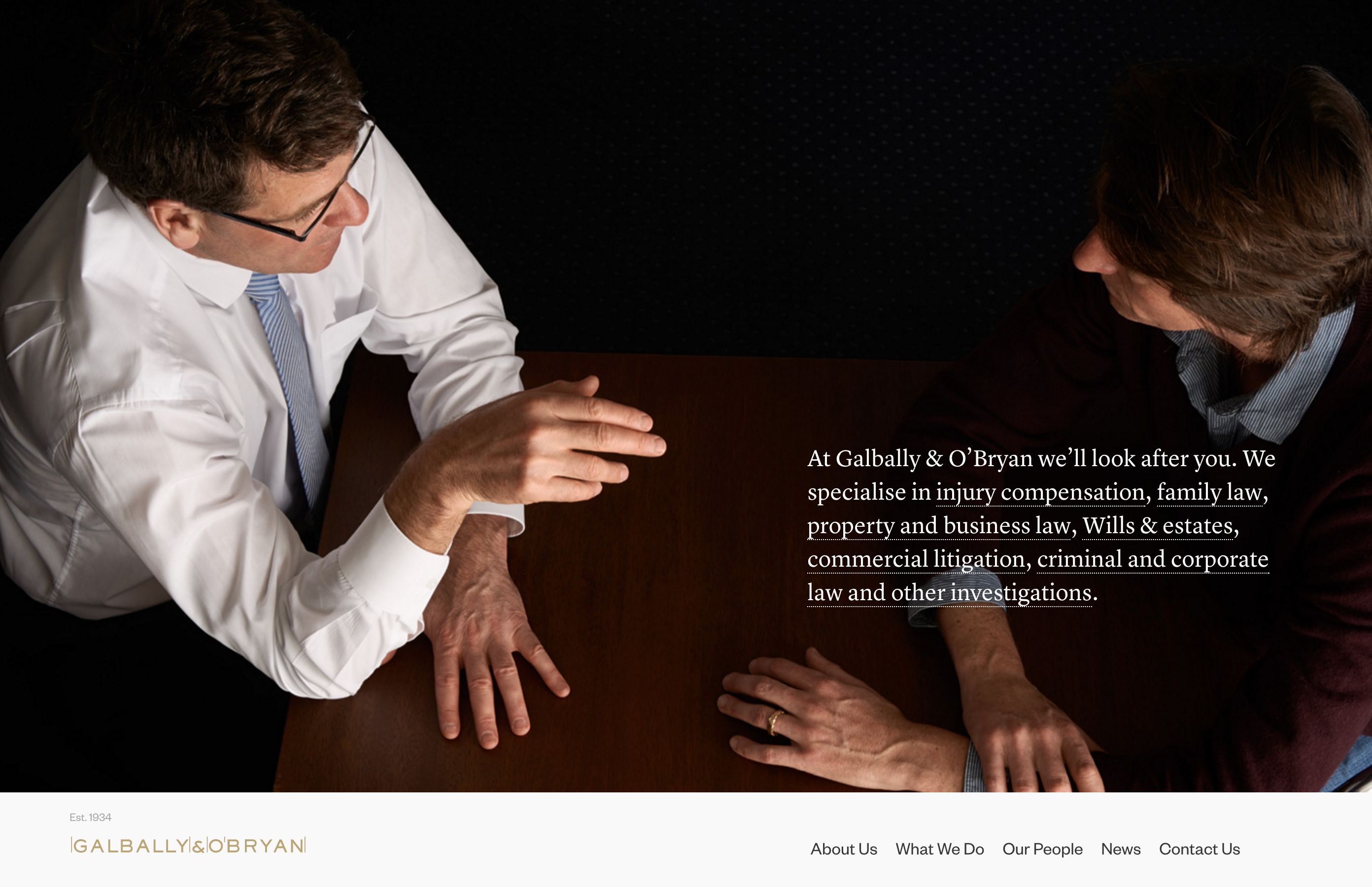
Figure 2: Galbally & O’Bryan’s homepage, on the other hand, has a reputation to uphold as a high-profile legal agency. As such, its visual design is clean cut, elegant, and highly professional. Imagine what it would look like if these two visual design systems were swapped – what would the impact be?
There’s a significant real-world reason we should all be proponents of visual design’s underdog importance. Though failing to produce great visual design is one of the less harmful mistakes a designer could make practically, it’s one of the greater mistakes we can make perceptually. But let’s reverse that for a moment: if a user’s perception of a product is that it’s “sup3r lame,” for all intents and purposes, the product is sup3r lame. If users don’t like it, they’re less likely to buy it. Call me a capitalist pig, but I say that’s a big deal. (Also, I am a capitalist pig).
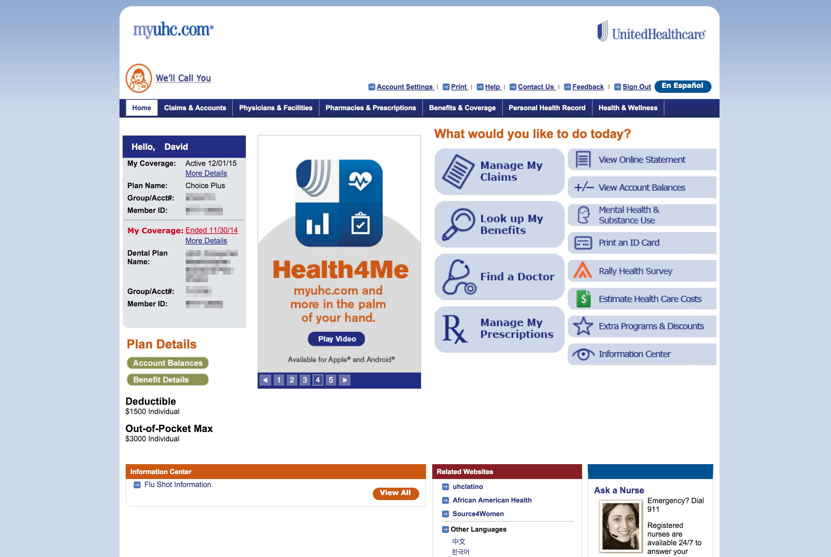
Figure 3: Does the visual design of United Healthcare really encourage you to trust them with your medical and financial information?
Basically, the way your product looks is the first thing users will notice and will likely be one of the most important things they notice. It’s low hanging fruit. Grab it.
Who
We’ve already established that visual design is an important part of design. Furthermore, we all agree (if you don’t, you’re wrong) that design, as a verb, is something that is done, for better or worse, by every team member on a project. Logically then, visual design can be affected by anyone.
However, visual design is a somewhat more specialized element of design than some others in that it requires more technical know-how to execute upon – tools like Photoshop and Sketch are not for the faint of heart. As such, it’s also slightly more important that it be done by a designer-by-trade versus a designer-by-nature (aka human). The tools and tricks used by visual designers aren’t terribly intuitive and are rarely effectively carried out by a non-designer. We may hate (and I mean drinking-mayonnaise-and-grapefruit-juice hate) it when people say designers are just there to make things look pretty, but visual design is one place we’re less-than-usually expendable.
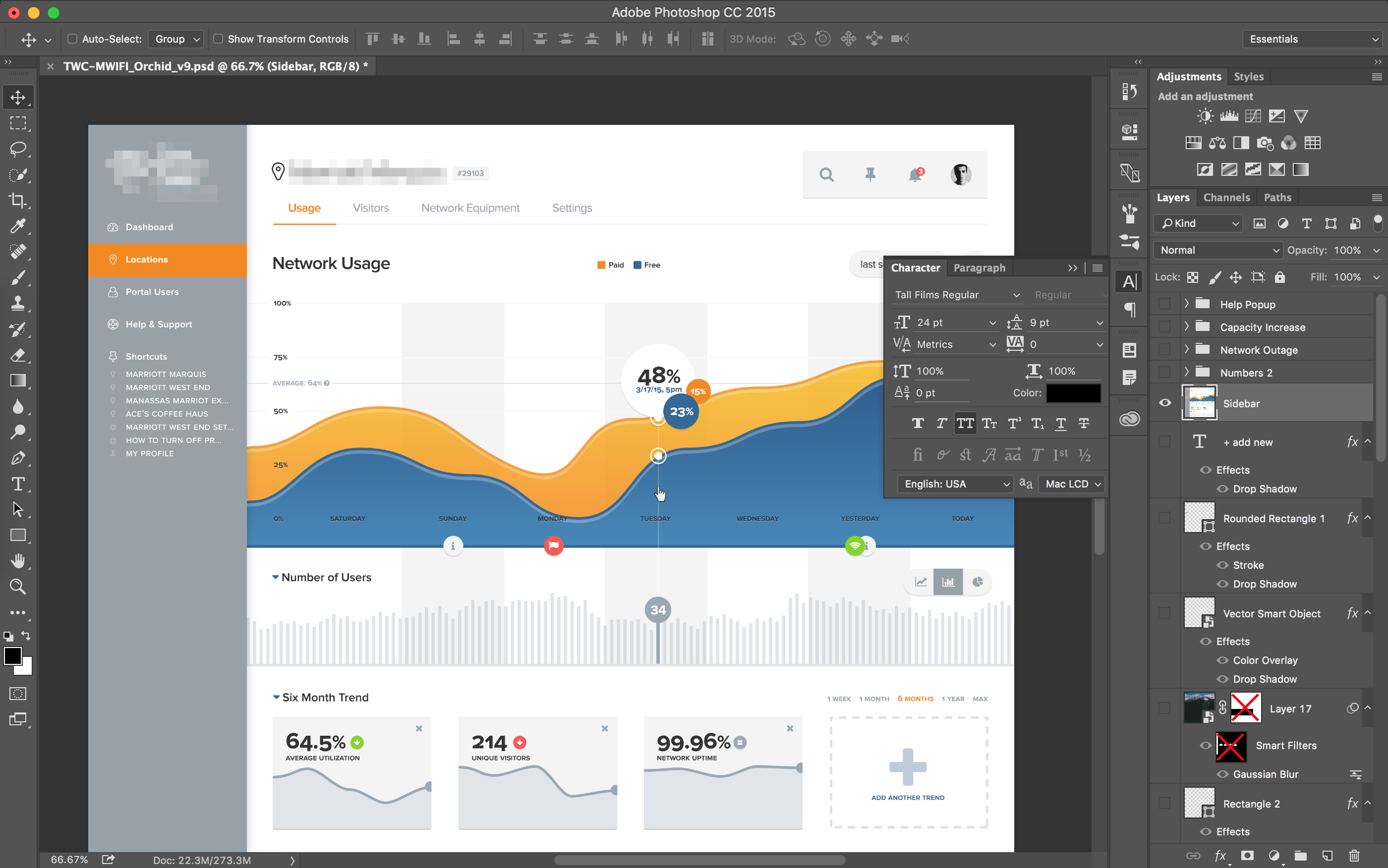
Figure 4: Photoshop is Greek to the humble pleb.
When
When does visual design matter? All the time. We already talked about this. Goodness, pay attention. Design, whether elegant or federal government, is a process that needs to account for the entire lifecycle of every product’s engagement. Visual design is a part of design. Thus, visual design is something that needs to happen from day one to completion.
The personality of a product is going to massively affect its design
That being said, we need to acknowledge that visual design as a focus is something that’s going to come later on in a project. Pragmatically, there are a few reasons this is wise.
First, visual design deliverables take freaking forever. Pixel perfection is extremely time-consuming, and iterations and pivots are not nearly as quick as they are in the wireframing and even prototyping stages.
Second, visual design is a huge portion of what we at 3Pillar call “personality design.” The personality of the product is going to massively affect the visual design of a product, and since pivots on visual design are so laborious, a prudent designer will save the deliverables of visual design ’til after the personality of a product has some structure.
How
This is a process that should be thoughtfully laid out and executed upon. Like all great design, visual design very, very rarely happens by accident. While there’s no way I’m going to cover how to use Photoshop or Sketch and then cover the principles of typographic hierarchy or color theory here, I’ll give you a few process pointers that may direct you towards great visual design:
- Find out what you’re up against. Get the style guides and brand guidelines from the client as soon as you can. Don’t waste time building something (even with low-investment visual design like moodboards) that’s going to have to be undone. Ask for these on day one, even – if they exist, it won’t be any harder to acquire now than it would be a couple months down the road.
- Find out who you’re designing for. I know you’re already doing this because you’re a good designer and good designers never, ever skip the research phase of a product’s design. So understand the stakeholders and the users early on so that you can later please the heck out of their eyeballs.
- Start visual design early on. Collect moodboards, build out the personality of the product, or even just jot down some adjectives that will be the foundation for the product’s visual design. Make sure it follows the research findings you’ve already acquired and that it is in line with your client’s branding (if it exists), and make sure it’s not tacked on at the end.
- Help the client understand what your visual design deliverables are there to do. Visual design deliverables are slow. Don’t waste your time and the client’s money on building more of them than needed. Build a mockup or three, a great design system, and get to code (or the physical product, if that’s your gig) as quickly as possible. Help the client understand that these deliverables are purely for internal use/approval and testing, but that the actual visual design is always going to be executed on the product, not in a bunch of PSDs (ie “Desktop-v13_optionC-final-FORREALTHISTIME_sigh-v2.psd”).
- Have a reason for your visual design direction. Remember when we talked about that research phase? This is where understanding the stakeholders, the users, and the market is going to come in handy. You’re a professional designer – act like one. If you pick chartreuse for that button, chartreuse better be the best gosh-darn color that could possibly be picked for that button. If it’s just your gut and you don’t have a reason, get one. If it’s just your gut and you can’t get a reason, make sure you’re right. If it’s just your gut and you’re sure you’re right but you can’t get a reason, make one up and make it good.
Conclusion
Visual design is not all there is to design, but it’s an important part of a well-thought-out product. It communicates a lot and is something that users generally find very comforting, engaging, and desirable. Make sure it’s purposefully conceived early on, that it’s as lean as it can be without sacrificing quality, and that you can back up the direction you take. Getting this right goes a long way, and this fruit is ripe for the picking, so go pick it.