Save
Redesigning the Bloomberg Terminal would be any interface designer’s dream. There’s obviously much room for improvement since the interface hasn’t changed for a long time, and the personas using it are quite easy to define.
But the complexity and richness of the displayed data, the necessity to fully understand how traders use the tool, and the immediate impact on the work efficiency of more than 156,000 users around the world make it tremendously challenging to make any changes.
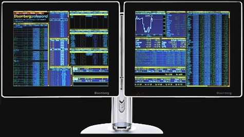
Here is a picture of the Bloomberg Terminal as it stands today (2010). As most users say, “it’s hideous.”
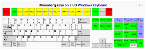
Here is the Bloomberg keyboard:
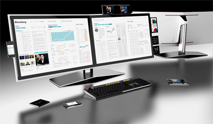
IDEO has submitted a redesign proposal back in 2007 after a 3-week study. Here’s how it looks:
A widget allows you to zoom in on some detailed part of IDEO’s design and have some explanation on the choices they’ve made. You can also read a short description of the project on their website.
But as a PortFolio.com article clearly puts it: “Bloomberg isn’t looking to do a major overhaul of its terminals’ graphic design anytime soon. In fact, company executives see the Bloomberg terminal’s unique presentation as a status symbol and a selling point. ‘We have to be religiously consistent’ to satisfy users who become attached to terminal’s look and feel, says Bloomberg chief executive Lex Fenwick. ‘You can see a Bloomberg from a mile away.'”
The Bloomberg terminal is the perfect example of a lock-in effect reinforced by the powerful conservative tendencies of the financial ecosystem and its permanent need to fake complexity.
Simplifying the interface of the terminal would not be accepted by most users because, as ethnographic studies show, they take pride on manipulating Bloomberg’s current “complex” interface. The pain inflicted by blatant UI flaws such as black background color and yellow and orange text is strangely transformed into the rewarding experience of feeling and looking like a hard-core professional.
The more painful the UI is, the more satisfied these users are.
The Bloomberg Terminal interface looks terrible, but it allows traders and other users to pretend you need to be experienced and knowledgeable to use it. Having been a user of the Bloomberg Terminal for five months, it took me a week and a few painful hours to handle it, and I am no genius. The only real impediments were the unbearable UI, remembering which key to push to make the “magic” work, and having to go through the 86-page manual.
Bloomberg’s terminal interface will not evolve any time soon both because of the leadership Bloomberg has on the market and because users will not be satisfied with something simpler and more efficient.
Bloomberg is an extreme case of a common UI phenomenon where users take pride and find highly rewarding to handle a painful interface. Obtuse UIs are generally only accepted by early adopters of brand new or highly innovative services. Most of the time, the success of the service and the growth of its user base makes it both necessary and natural to redesign the UI. But despite the fact that Bloomberg is a market leader and has a large user base, this pattern of UI evolution hasn’t come to pass.
The only valid reason explaining why the Bloomberg design will not change is the behavior of its users. Users who favor complexity and clutter over efficiency and clarity to sustain a fictive status symbol.
Dominique Leca
Dominique Leca is a 25-year old entrepreneur based in Paris, France. He co-founded a company specialized in iPhone application development in early 2008. As Publishing Manager there, he designed: allRadio 2, Geomaster, EarthSecrets and Fracture. He collaborated on many iPhone application projects for major French companies and brand
Dominique graduated from the HEC Business School in 2008, and had prior experiences in finance and advertisement. He blogs at dominiqueleca.com and can always be reached via Twitter @domleca.


