Save
A flood of 5-star ratings in the app store is what every developer hopes to see when they check in on their apps every morning. Positive word of mouth is the primary way great apps climb and sustain themselves at the top of the charts. Of course, feature placement from Apple (if you’re lucky) doesn’t hurt either.
As it turns out, you only have to do one thing well to get those 5-star ratings: delight your users. And how do you do that? You have to work harder than your competitors and stay singularly focused on that mission to delight. This is, of course, not so easy to pull off. You have to dig pretty deep in your smartphone’s app store to find any 5-star apps. When you stumble across one, you’ll notice that the app has very few downloads and reviews. Chances are it wouldn’t be a 5-star app if more people were using it. Most apps at the top are 4 and 4½ stars. The vast majority, however, fall at the 3-star level or below.
For users to rate an app, they must submit their ratings with at least one star. So if you have an app in the store, congratulations, it’s at least a 1-star app. The other four stars are up for grabs. Two of those stars can be picked up for simply meeting expectations; the other two come when an app exceeds the expectations of its users.
It’s actually pretty easy to get three stars. All you have to do is ensure that your app does what it’s advertised to do. Be honest in the store description, show your best screenshots, and deliver on your promise. That’s what makes a 3-star app.
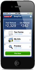
SnapTax has maintained a 4½ star rating since we launched it in January with 80% of our reviewers having rated it as 5-stars. Following on that experience, I will share my advice in this article for how to delight mobile users.
Solve Problems in New Ways
Give your users a solution they didn’t think was even possible. In other words, do something that has never been done before. 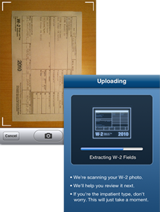
For SnapTax, most users would have never thought it possible to file their taxes on a smartphone. The concept alone of start-to-finish taxes on their smartphone already exceeded their expectations. Add to that a feature that had never been done before—optical character recognition of a complex document (a W-2) to transfer data to a form (a tax return)—and we were primed to wow our customers. Snapping a photo of your W-2 and seeing up to twenty fields filled automatically into your tax return really does feel like magic.
Stress Over Every Detail
Focus on the basics and do them amazingly well. Mobile devices force us to simplify based on screen size, interaction models, and the short attention span of our users. It’s not enough to get a few things right, every bit of the experience counts. Stress over every detail. Focus on simplicity. Iterate and refine constantly. Give your customers more than they expect even in the smallest of things.
Build For the Platform
To approach a 5-star rating in a specific app store, you need to get the app right for that store’s specific platform. Study the guidelines. Match native interaction and design patterns. Borrow from industry giants that have the biggest customer base. Steal from those apps that make it to 4½ stars. Don’t be vanilla and create something generally appealing; make it an amazing experience for the device and use all the special features unique to that device. Cross-platform web UIs, while right for some, will shave development costs but cannot take advantage of the available emerging technology.
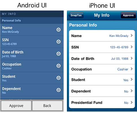
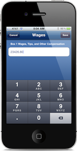
With SnapTax, we created a customized Android experience. The Android platform’s interaction models are quite different from those of the iPhone. We paid careful attention to create a user interface that matched the expectations of the Android user while retaining all of the features available for the iPhone. The result? SnapTax holds a 4½ star rating in the Android Market as well as in the iPhone App Store. The SnapTax UX design for iPhone vs. Android is unique, but its overwhelmingly positive customer reviews are virtually identical.
Prototype, Build, Repeat
The benefit of prototyping is, of course, to test concepts before coding them. Prototyping also helps you move fast. You can stagger development as you learn what works and what doesn’t work with users. As soon as you feel confident in a particular screen or flow, code it. Continue to prototype and iterate. Get user feedback as often as you can.
For SnapTax, we were able to iterate on, refine, test, and scrutinize every aspect of the experience by building a fully tap-able prototype of the entire workflow of the app. We didn’t just prototype a few screens or a few things we wanted to experiment with, we prototyped all of the screens. We didn’t just prototype sections and flows, we prototyped the end-to-end experience, which is over 200 screens. And that doesn’t include the countless variations that were either tested with users or experimented with internally.
With working parts of the app implemented, we were able to get even richer feedback. We continued to iterate with both working code and the prototype, using two phones with customers; one had the working app on it and the other had the prototype. In doing so, we were careful to retain as much continuity as possible between the two.
We iterated as often as weekly and were able to get two or three times as much feedback from customers this way. By the time we released the app, we were very confident that we had eliminated problems and had found many ways to delight our customers.
Star Power
The secret to 5-star success is simple: delight your customers by finding a way to do more than even you thought was possible. In his book Outliers: The Story of Success, Malcom Gladwell makes a clear argument for why opportunity followed by dedicated hard work allowed outliers like Bill Gates and The Beatles to achieve more than nearly anyone else in their field. The mobile revolution is here. We all have the opportunity to create a 5-star app for our customers. To do so we will have to work extremely hard to delight them.
To learn more about SnapTax, visit https://snaptax.com
Alan Tifford
Alan Tifford is a mobile experience design leader with 15 years experience. He's designed 5-star productivity apps for iOS and Android for Intuit, which have been profiled in numerous reviews, books, and magazines. He is the lead designer for TurboTax SnapTax, the mobile industry’s first ever start-to-finish tax preparation application for the iPhone and Android, reinventing the way people do their taxes. He focuses his energy on driving innovation and design thinking for complex projects from ideation to implementation. He's known as a problem solver and inventor with 9 patents and 20 pending in the areas of financial management and tax preparation.


