At this point in time, wireframing has established itself as a critical component in every designer or developer’s process. Hopefully that’s the case, anyway. Whether you’re part of a global agency superpower or operating as a solo code-slinger, the concept of visually outlining the information and interaction of your site before you start designing or coding has probably found its way into your workflow in some form. Maybe it’s simple sketches in a notebook or a complex set of clickable HTML wireframes that describe your site in every detail—the point is, you’re doing it. And with such widespread adoption of wireframes, a myriad of products have appeared with claims of making the task of wireframing faster, easier, and more useful.
Which One to Choose?
So which wireframing product has the features that actually make your job easier? Features that let you to quickly put together layouts are, of course, important, but so too are others that allow you to duplicate, export, and share your wireframes. For the purposes of this review, these features can be grouped into the following categories:
- Speed & Accessibility: What devices and platforms are supported and how is the overall speed?
- Shapes, Components, & Attributes: What tools and options do you have when constructing layouts?
- Templates & Workflow: What features save you from having to duplicate work?
- Interactions: How can you manipulate wireframes to simulate responses?
- Reviewing & Sharing: How can you collaborate and share with teammates and clients?
The Contenders
To further narrow the scope of this review, the contenders were limited to web-apps, which offer the most accessibility by being, you know … on the web. Thus, MockFlow, ProtoShare, and HotGloo were chosen as the challengers. They’re all in the same weight-class in terms of features and are, more or less, all centered around creating interactive website wireframes. So, now that we have our picks, let’s get into the ring.
In the Blue Trunks: Protoshare
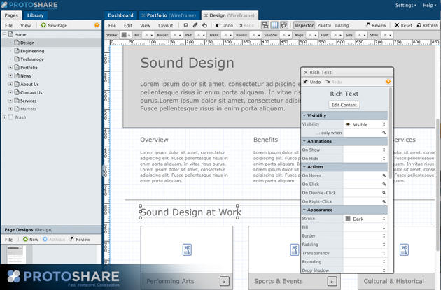
Protoshare is a wireframing product built on an impressive Javascript/jQuery engine and is accessed exclusively through a browser. Being only HTML, it is technically mobile and tablet-friendly by default. The UI is very compact, yet verbose, and with tabbed pages within a single browser window it offers a lot of potential.
Stand-Out Strengths
One of Protoshare’s strengths lies in its ability to comprehensively design a website at a high level. You’ll notice the sitemap panel on the left side of the UI and features that enable the manipulation of hierarchy, including easy drag-and-drop pages, quick duplication, and info panels—all the tools that make this phase of wireframing easier with Protoshare.
Along with the sitemap creation features, Protoshare has templating tools that allow page elements to be duplicated across the site, but also independently and on the fly. Contextual sub-menus, for instance, can be easily created by dragging and dropping the desired pages from the sitemap panel. This makes creating menus easy without all the typical accordion fly-out nonsense.
Protoshare also offers tools for increased wireframe fidelity for the more technically capable, such as adding classes and custom CSS to elements and even inserting your own drop-in components such as date-pickers and other widgets, all thanks to its simple HTML/Javascript platform.
Notable Weaknesses
Protoshare’s most notable weakness stems from one of its inherent benefits: Javascript. Protoshare simply runs slower than its competition. When you resize your browser, you can almost hear the javascript chugging as it recalculates positions. Even on fast Internet connections you still feel the slight delay in every click and movement. It seems like a minor irk, but when you’re spending eight hours a day wireframing, those seconds add up. This is compounded by the WYSIWYG editor, which slows down working with content even more.
Another weakness is Protoshare’s export and sharing functionality, which is critical when dealing with clients—especially non-technical ones. Protoshare unfortunately has no PDF export option, and requires reviewers to log in before reviewing wireframes (no public URL to share).
Scores
Speed & Accessibility (2/5)
Although accessible from any browser or tablet, the Javascript engine hinders performance and can be frustrating at times.
Shapes, Components, & Attributes (3/5)
The ability to customize elements with CSS allows for a lot of flexibility, but some basic components such as icon placeholders are missing.
Templates & Workflow (5/5)
A versatile template system makes it easy to duplicate elements with the addition of “smart” variable elements like contextual navigations, labels that automatically display a page’s name, and functional breadcrumbs.
Interactions (4/5)
Good set of interactions for show/hide and the ability to insert custom Javascript option allows for additional functionality.
Reviewing & Sharing (3/5)
Clickable review mode is good and features push-pin notes and threaded conversations, but no PDF or additional output option, nor a quick and easy public review link.
In the Yellow Trunks: MockFlow
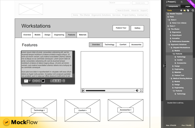
MockFlow takes a less-is-more approach to wireframing with its minimal Flash-based UI. The wireframe canvas itself takes precedence in the UI and workflow centers primarily around making per-page wireframes extremely quickly, with less emphasis put on the site as a whole.
Stand-Out Strengths
Speed is definitely MockFlow’s strongest feature. The snappy web-based interface is complemented with an Adobe Air desktop app that is even faster—syncing changes to your online account. Overall the point-and-click UI is very responsive with little delay and the combination of other functions, such as a quick search for components and a simple, fast WYSIWYG editor, lets you build pages as fast as you can physically work with no barriers in the way.
A large set of components also saves designers from having to create increasingly common page elements from scratch. Components such as tabbed-containers, alert boxes, maps, charts, and date-pickers are all available by default. More user-generated components can also be imported into your UI from the MockFlow Store, including complete kits for Facebook or Android apps.
Other features that illustrate MockFlow’s emphasis on the visuals are the review and export functions. Public links are available for clients to see, and the entire wireframe can zoom and scale within a window—an especially helpful feature when presenting over a web meeting. Per-page exporting is also available and supports formats including PDF, HTML5, PowerPoint, and Excel, as well as exportable sitemaps in traditional tree-style format.
Notable Weaknesses
The biggest feature set missing from MockFlow is interactive components. Despite the wide range of elements available, there are no options to simulate interactivity beyond simply hyperlinking pages together. This is where MockFlow’s dedication to the visual presentation of a wireframe works against it and forces a designer to create static variation pages that are hidden in the navigation in order to show how an element may change.
Another weakness of MockFlow is from a user management and organizational standpoint. Users (both internal and clients) are all piled in the same global list and must be added manually to each project. Roles and permissions are also applied per project, rather than per-user, which can become exponentially cumbersome as the number of clients, collaborators, and projects increases.
Scores
Speed & Accessibility (5/5)
The combination of a fast Flash-based web app, a companion desktop app, and an HTML5 mobile version make editing and viewing speedy on any platform.
Shapes, Components, & Attributes (4/5)
A wide selection of components with basic options (color, size, etc.) can get you most of the way there quickly, although fine-tuning options are limited.
Templates & Workflow (2/5)
Templates are limited to one master template per-page, requiring cutting-and-pasting between pages for additional elements that are shared (but not universal).
Interactions (1/5)
No interactivity for elements that incorporate changing states or visibility; pages are rendered relatively flat.
Reviewing & Sharing (4/5)
Multiple formats as well as different types of output (project-wide, per-page, sitemap tree, page comparison) as well as public review links; though non-threaded commenting can make complex discussions confusing.
In the Pink Trunks: HotGloo
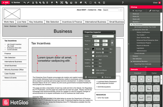
HotGloo is another Flash-based product that seems to straddle the line between complex, technical wireframes and purely visual layouts with additional emphasis on responsive interactivity that adapts to different users.
Stand-Out Strengths
HotGloo’s most notable features revolve around elements that respond to user interactions. Sets of components can be grouped together and each group’s visibility can be triggered by the type of user viewing the page, clicks, hovers, or other variables. Entire sets of variations can be reflected across multiple elements on a single page (logged in versus not logged in, for instance) for wireframes that more accurately represent real functionality.
HotGloo also offers a very lightweight yet powerful template system that allows you to build full-page layouts to be used across a site or small, singluar elements (like an ad, for instance) that can be placed on various pages in different locations, but edited from one central spot. These template components can also be double-clicked and edited on the canvas (similar to symbols in Flash or clipped elements in Illustrator) keeping you in-context.
Contextual palette menus in HotGloo also allow for an excellent amount of control over an element’s appearance without the need to resort to writing CSS. Common attributes include CSS3-supported effects such as rounded corners and strokes as well as gradients.
Notable Weaknesses
The biggest drawback to HotGloo its use of Flash, making reviewing wireframes through a browser on an iOS device impossible (for most clients, anyway). Although PDF exporting is still an option, you lose all the interactive components that make HotGloo great, especially when designing for the iPad or iPhone.
Another complaint about HotGloo is that annotations are never consolidated in a comprehensive, easy-to-review format in-context with the wireframe. Notation pins, similar to Protoshare, capture per-feature comments but are only found in an overall chronological list of activity, or on the wireframe itself. This forces you to either read notes in reverse order from the activity feed (while not looking at the wireframe), or to find and click every note icon throughout the site, which can result in a very frustrated developer.
Score
Speed & Accessibility (3/5)
Overall performance is fast through a browser thanks to the Flash platform, but lacks support for iOS devices.
Shapes, Components, & Attributes (4/5)
Although not as comprehensive as other products, the available components are quickly and easily customizable with CSS3-supported attributes.
Templates & Workflow (4/5)
A simple template system (similar to Flash symbols) allows the flexibility to create pages that combine various types of templates together with edit-in-place functionality.
Interactions (5/5)
Powerful action/reaction controls allow you to trigger events such as an element’s visibility via click events or by a reviewer’s user role.
Reviewing & Sharing (3/5)
Reviewing interactions are excellent for simulating functionality for user testing, but again, lacks iOS support and comprehensive documentation tools
The Winner, By Unanimous Decision (Well, Sort Of)
After a brutal 15 rounds, this judge’s scores have HotGloo coming out ahead with 19 out 25, Protoshare in second with 17 closely followed by MockFlow with 16 points. But there’s a rather large caveat that goes along with these rankings: mainly that it’s obvious that each of these products caters to a certain way of creating interactive wireframes and thus prioritizes different aspects of this process. None of them are perfect by any means, but there may be one product that works better for you.
Protoshare, for instance, seems more developer-centric. Accessibility, site-architecture and technically-oriented features allow for a lot of control, if you know how to use them. Mockflow, on the other hand, appears to be designed for one person or a small team to quickly churn out simple, visual-focused wireframes for a non-technical audience. HotGloo, however, represents a best of both worlds. With strong layout and component features, good template functionality, and the added benefit of easy-to-use interactions, HotGloo is this reviewer’s wireframing tool-of-choice and is considered, at least at the moment, the heavyweight champion of the wireframing world. But if Mr.T in Rocky III taught us anything, it’s that a new challenger is always waiting in the wings.
Kickboxing photo courtesy of Shutterstock


