Last year, I gave a presentation at MeshU that took a behind the scenes look at how we arrive at design decisions. I’ve since taken clients through variations of this presentation, which is always evolving because it corresponds to such a perennial and fundamental question in our field.
I’ve always appreciated it when fellow UXD practitioners talk candidly about what works and doesn’t work for them. Insights and methods pioneered by others have helped us improve our process here at Teehan+Lax a lot. Maybe our spin on things will be helpful to you and your team.
Here’s the presentation
During a recent pitch, one of our clients asked us to come back and explain how we “bridge art and science” when making design decisions. I think this is an intriguing way to pose the question (and it speaks to how clients are becoming more engaged and sophisticated in what they’re looking for from a design shop).
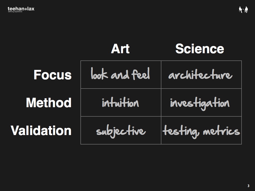
Let’s start by defining our terms (Slides 1 through 20). There are a few conventional ways to differentiate between art and science when it comes to user experience design (please note that I’m speaking in stereotypical terms here). In terms of focus, an artistic process is concerned with issues of look-and-feel, whereas a scientific approach focuses on deeper, more systematic issues like underlying architecture. In terms of methodology, art relies on intuition and experience, whereas science depends on rigorous investigation and analysis. In terms of validation, an art-led process often rests on subjective or personal evaluation, whereas a process that’s grounded in science relies on rigorous testing using quantitative metrics.
Although perhaps a helpful starting point, this model doesn’t tell the whole story. In fact, we can flip things around (Slide 8) and take a look at the other side of the coin. Over the last six years, some of the most influential academic research in HCI has demonstrated the importance of emotional, relational, and aesthetic affordances in design. When you factor in experience, intuition is often an important check on incomplete or distorted data that might otherwise mislead, and there is certainly an “art” to testing in appropriate and productive ways.
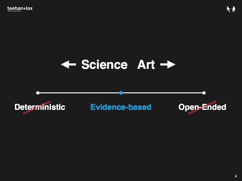
In other words, rather than this binary opposition of art vs. science, a better model is perhaps something more like a continuum. There are two extremes we want to avoid. At one end, we have deterministic design—the idea that we can be entirely predictive, almost in a Newtonian physics kind of sense, mapping out causality for everything, no matter how complex or layered. At the other end we have open-ended design, where decisions are more or less arbitrary. The first alternative has turned out to be pretty unrealistic; the second is just a cop-out. We’ve tried to strike a balance between these two extremes and have gravitated towards evidence-based design as our happy medium.
Evidence-based design (EBD) is a term that comes from the medical world. Evidence-based medicine is the “conscientious, explicit and judicious use of current best evidence in making decisions about the care of individual patients.” Transposed into our context, we like the idea of EBD because it acknowledges the fundamental reality that design is about making choices, and that the goal is to do this on an informed basis. We don’t have to maintain the pretense of a magical process that guarantees optimal results, but neither are we given free license to design whatever we want. Our decisions become accountable to the best available evidence whenever possible.
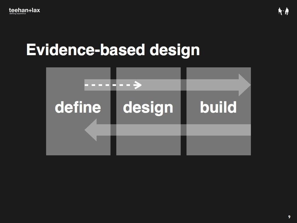
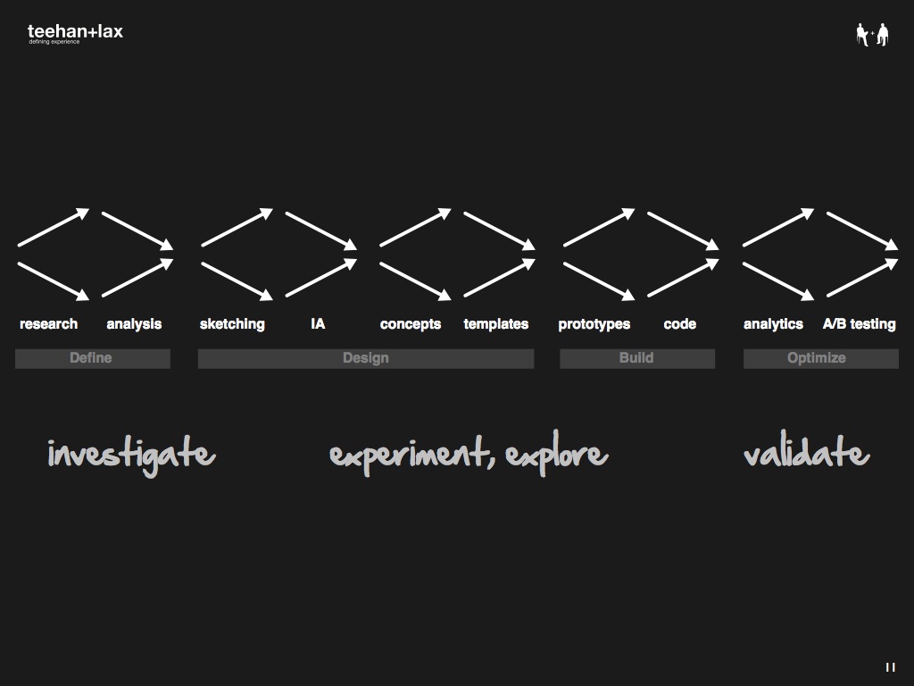
EBD is not just about gathering up data at the beginning of a project, it’s about infusing design decisions with data-driven insights throughout the entire process. Slides 16-20 visualize this goal in terms of a typical agency process (actually, our process). In practice, there’s typically a gap between the define (or research or discovery or whatever you want to call it) and design stages. This is a fundamental challenge; you can have the best researchers on the planet, but if their observations and insights don’t carry over to impact and influence design decisions, they’ll do you little good.
So how do we bridge the gap? For us, the secret has been to build our process around a rhythm of open exploration and refinement. Slides 22-28 visualize this approach (thanks to Brendan Schauer et al. from Adaptive Path for the inspiration). We oscillate between a ‘go wide’ mode where we investigate, explore and experiment, and a ‘refine down’ mode where we focus and prioritize. When this happens over and over again, we get these critical points of inflection that keep us grounded (evidence-based) and moving forward (design).
Let’s take a look at a real life example. Slides 29-48 provide a glimpse behind the scenes of our work on thestar.com redesign. We start by going wide and essentially scavenge for as many design inputs as possible. These vary project by project, but at a minimum we’ll need to get a handle on demographics, psychographics, behavioral profiles for target users; a concrete understanding of what is and isn’t working on the current site; business goals, needs and requirements; and a comprehensive competitive analysis.
All we have at this point is raw data; we need to turn this stuff into evidence and insights we can actually use. Borrowing from Subject to Change, we believe that inputs become evidence when they are durable (you can kick them around and mash them up), actionable (there are clear implications for design), and impactful (they actually start to change the way designers think about the problem itself). So how do you get there? This is where the art part comes in.
In the beginning, we aggregate stuff in one place, organize it loosely, and share it among the team. Tools like wikis are good for this exercise. Next we start to look for patterns and find corroborating data—multiple pieces that tell a coherent story. We then construct and test narratives for things we heard from stakeholders. These narratives help us get at the context behind the requirements. We then create focusers—models (visual, conceptual, personal, etc.) that help us focus and filter.
Two focusers that we often use are personas (archetypal users) and design principles (mini mission statements). Focusers are important because they allow us to find the signal in the noise, develop a common language and conceptual framework, and make our assumptions explicit. Because they’re so elemental, they can inform design decisions on a case-by-case basis throughout the entire process.
Sketching has always been central to our process, but we’re starting to formalize this step and make it more collaborative and inclusive. In the case of The Star, we generated about 150 initial sketches (going wide) for 10 key templates (which we refined down in detailed IA). Prototyping is another technique that allows us to explore and test ideas and assumptions. Critical and complex elements in the UI make great candidates here.
Finally, we need to develop a plan of attack for knowledge gaps or areas of uncertainty. For example, with The Star we noticed some anomalies in the analytics data. When we took a look at the competitive set (with a little help from Image Spark), we didn’t see very much alignment in how other media outlets were using certain areas on the page. As a result, we developed a fairly wide-range of alternative modules for split/multivariate testing.
So there you have it: a relatively geeky look at the case for, and our approach to, evidence-based design. I hope that some of these ideas and examples ring true with you. What do you think? I’d love to hear what others are doing in their design practices and processes.