The $64,000 question in software industry today is:
How do you transform a software design process into its ideal form—an objective, deliberate activity that furthers the cause of commerce—from its typically subjective, clumsy one, which always seems at odds with the bottom line?
Its deceivingly simple answer requires that we overcome some elegant human imperfections. Ironically, the answer came to me from a subculture that has its roots deeply planted in the exploration of the human condition: rap.
Design’s Got a Bad Rap

The early courtship process in a relationship is usually characterized by a healthy curiosity for each other’s tastes: favorite restaurant, type of food, fit of jeans, color, movie, book, music, and so on. Music is always high on the list. If your experiences have been anything like mine, a conversation about musical preferences can get as contentious as a political or religious debate.
I was a bit of a music snob when my wife and I met. “After all,” I would think to myself, “I’ve been playing the guitar for the better part of the last two decades; I must be a better judge of music than the everyday listener.”
So, imagine my plight when my wife (girlfriend at the time) disclosed to me, very proudly and excitedly, that she was into hip-hop and pop, and looooooved Jay-Z, Beyonce, and Usher. My heart sank, but I was determined to “cure” her. No love of mine could enjoy to such heathen music.
“It’s not real music,” I explained. “It’s exactly what’s destroying this generation. I can’t believe you would support such crap.”
In her unwitting wisdom, she responded, “That’s just one way to look at it. I just like the beats and melodies. It makes me want to dance. It’s fun.” Blasphemy. The woman I was intending to marry was trying to compromise my values for some… fun?!
The crux of her argument (which took me a good couple of years to accept after umpteen discussions) was that people listen to and select music in different ways. There is no right way to select music. In fact, you could argue that at a cognitive level, music selects us for varying reasons: we relate to the artist, the beat inspires us to dance, a particular melody reignites a fond memory, the song was recommended by someone we trust, and so on.
Subjectivity in musical taste tracks closely to our orientation toward design. And I mean “design” in the broad sense—inclusive of user experience, visual design, information architecture, and so on—even though it’s going to peeve some of my peer “designers” in the software culture.
Is the Lemon Really Yellow?
 Sensory experiences—in this context, experiences stimulated by objects or actions that have an inherent aesthetic quality such as music, art, or visual design—are truly subjective. What you sense when you see a color, for instance, can only be accurately described through your sensation of it. Every other account is an approximation at best. It’s no wonder there is a massive body of literature on the topic of color, which has intrigued everyone from Aristotle to Faust‘s author, Johann Wolfgang von Goethe.
Goethe was an influential, mid-18th century polymath: a person whose expertise spanned a variety of subjects such as poetry, drama, literature, science, and so on. Among other works, he produced an extensive study titled Zur Farbenlehre (Theory of Colours), in which he questioned Newton‘s application of the scientific method to color theory (pg xxxviii).
Physics alone, Goethe argued, couldn’t sufficiently explain color. To truly understand color, one must look to its softer, cognitive, and often contradictory attributes. Unfortunately, these are not easily quantifiable; as a result, color remains an intriguing topic for exploration even today.
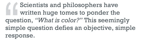
Betty Edwards‘ book Color: A Course in Mastering the Art of Mixing Colors presents a fitting and eloquent observation that affirms Goethe’s hypothesis even today:
Fortunately, a scientific understanding of color theory is not a prerequisite for appreciating or applying color evocatively. One need look no further than the Kuler gallery to see evidence of this.
This is not to say that everyday color enthusiasts are experts at “painting pretty pixels.” But it does suggest two things about the aesthetics of experience design: picking harmonious colors isn’t a scientific exercise and, more importantly, certain individuals are more proficient at it than others.
It’s Not Personal
Edwards also writes about how our sensations are influenced by cognitive bias. Various brain processes affect our ability to see what is actually there—that is, the true data reflected back to the retina—rather than what our preconceptions tell us we are seeing.
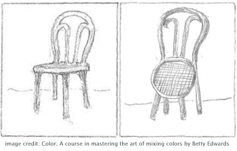
Take the phenomenon of size constancy, a neural process that jumbles perception by actually overriding the direct data hitting our retina, causing us to “see” images that fit our preexisting notions of the situation. This is the reason some of us “can’t draw.” Even though the retinal image of the chair is exactly as shown in the image on the left, our brains convince us to draw the right image because we know the relative dimensions of the chair.
Our personal conflicts with creative representations—whether music or the visual design of a Web page—are just that: personal. And, as size constancy illustrates, these conflicts are deceiving enough to pass undetected, despite their irrational origins. Of course, problems arise when we pretend that our personal and subjective sensations are objective.
The tendency to assume that our views correspond to reality has its benefits. Evolutionarily, it has helped us quickly interpret the world. We know, for example, that a silhouette of an elephant on the distant horizon is an elephant. But paradoxically, we find this very quality at the root of our disagreements about music and design.
 Ultimately, it’s this same predisposition that leads us to question our creative counterparts’ aesthetic talents and irrationally promote our own views as fact.
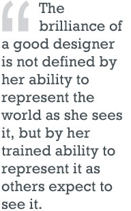
In a sense, you could say that the brilliance of a good designer is not defined by her ability to represent the world as she sees it, but by her trained ability to represent it as others expect to see it.
Again, certain individuals are more proficient at it than others.
Is Design Subjective?
We’ve all heard that design is subjective and that “beauty lies in the eye of the beholder.” Unfortunately, we often misinterpret these aphorisms and use them to rationalize why we don’t like certain designs. When someone argues that our reasoning is faulty, it ruffles our feathers.
Another (redundant) way of putting the point is to say that design is subjective from the perspective of the subject (the beholder). From the perspective of the designer, however, design is as objective as anything else. A designer feels that his product is deterministic—no different from a line of code.
Good designers have an acute, trained, and almost instinctual ability to communicate with an audience through their products. Great designers are so objective that what they produce may not even remotely resemble their personal tastes and intuitions.
It’s Time to Grow up

For a design process to produce an extraordinary product, two conditions must be met: stakeholders and participants must unequivocally accept that they aren’t designers, and trust the real designers’ abilities. This of course requires that the real designers are good at what they do. Bill Buxton provides a great template for identifying good designers.
Simple as this recipe seems, few get it right. Elaine Wherry of Meebo recently wrote a piece on why UX professionals are some of the most professionally unhappy folks she’s encountered. Doug Bowman’s legendary goodbye letter to Google tragically confirms some of her observations. Clearly, our industry is not there yet. But we must persevere, for the rewards are rich.
A good understanding of a designer’s process naturally encourages other behaviors integral to designing good products. It allows clients to let designers do their work without telling them how to do it. It makes it easier for designers to measure their work objectively, not relative to their clients’ personal (and often limited) understanding of the context. It improves how designers and other participants collaborate. It streamlines the design process with an undying focus on the customer experience. It frees up team members to focus on their core areas.
Ultimately, it is this simple recipe of acceptance that transforms a design process into its ideal form—an objective, deliberate activity that furthers the cause of commerce—from its typically subjective, clumsy one, which always seems at odds with the bottom line.
The Punch line
In the time it took me to write this piece, my iTunes cycled through a diverse collection of hip-hop and rap tunes. Next to me is a dusty stack of assorted classic rock, blues and jazz CDs, waiting to be ripped.
The irony of this picture is only underscored by a Jay-Z lyric that is unexplainably and almost mockingly real: “He who does not feel me is not real to me, therefore he does not exist. So, poof… vamoose, son of a b@#ch.”