The browser is an excellent tool. It’s ubiquitous, simple to operate, and extremely powerful. What’s more, it is almost entirely composed of useful surfaces. The window design (like an actual window) is focused on the content, with minimal but functional tools for navigating that content—and increasingly, even those tools are being hidden or marginalized.
There is one part of the browser, however, that has not changed since the earliest days of pre-graphical clients: the URL bar. It is the one piece of the browser UI that has remained opaque to end users. Even the status bar and advanced preference panes are framed in plain English: “Loading images…”, “Disallow script?”, “Could not connect to server”. These are all things that bring obscure information to the top layer of user experience in plain, direct English. Even if the user can’t react to the information or even comprehend it, they appreciate being addressed in their own language. Why is the URL bar the sole survivor of command line language being presented to the user?
I propose that the URL bar be modified to fulfill a significant purpose for the user other than just displaying long strings of characters mostly irrelevant to, and mostly ignored by, the user. A user should be aware of his location on the Internet at all times, and of any relevant information that he has requested or transmitted in getting there. The way the URL bar presents that information is completely inadequate.
Before I go on, it’s worth mentioning that many websites are already moving towards practically URL-free navigation in the form of Java- and Flash-based input and navigation. Web apps like Grooveshark and Picnik, for example, forgo traditional navigation by using scripts to hide or replace information usually found in the URL. These sites already recognize the uselessness of the URL bar and have abandoned it, but if it were to suddenly become useful again, they might take it back.
The task is to lay another layer between the URL and the user—one that makes the URL intelligible to him. So how do we make such techno-gibberish readable? A procedural abstraction layer on top of a URL string wouldn’t go very far, because of the many variations in directory order, script formatting, and so on. An automatic URL wrapper could make sense of the domain and a few odds and ends that show up on every website (image locations, standard search functions, that sort of thing) but on websites with more unorthodox organization, it would break.
What needs to happen is the establishment of a standard set of URL meta tags. I’m going to make up a standard for the purposes of this article: a meta tag called <nav>, with a few standard parameters. These would go in the HTML document header along with other browser-level stuff like page title and favicon.
Let’s take as an example a typical browsing session on Amazon. The user is looking for an item, and may have clicked on a few things, logged in, and so on. He’s poking around in the kitchen area and decides to check out a new stovetop espresso maker. Here’s what the URL bar holds, at least for me:
Good god! First of all, it’s just incredibly long—and they get much longer. There is hardly any information even recognizable to the user in the first place, and what he does recognize he likely won’t understand. What’s critical? What’s secret? Will this link work for a friend? And what part shows where the user currently is, where he came from, and where he can go?
Another caveat worth mentioning is that most websites get around this problem by simply having the page itself display where the user is (the “breadcrumb”). This is good, but completely unstandardized. And this is just my opinion, but shouldn’t location information be located in standard place? What if every website moved your file menu to whatever position it thought handy, or moved the back button or reordered your tabs? No—this is information that should be available, at least partially, in a standardized and reliable format. The user puts things into this bar to go places; the user should look to this bar to see where he is.
Let’s put my idea into practice by applying a set of my <nav> tags to the first URL.
As you can see, there are a few attributes added in: ordering for the navs, names to display, and a few extra things to make things easier on designers.
Different browsers could render the navs differently, but here’s a quick mockup of what that snippet above might look like:
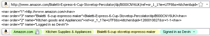
The graphic component would be skinnable client-side like any other browser UI element, but always separated into these visually distinct “navs.”
The first nav (Amazon) would have to be determined in a secure way, of course; we couldn’t have Site X claiming to be Amazon just by typing it in. The last nav (order=”0″) would be a little more freeform, since it doesn’t refer to any part of the URL.
These navs must be interactive, of course; each navigational unit should be clickable and have predictable results. Clicking on Kitchen would bring you to the kitchen section of Amazon; clicking on Amazon would bring you to the home page; clicking on Logged in would bring you to your account. These are buttons and shortcuts already available on the page, but like I said, why can’t such rudimentary navigation be included in the address bar, where supposedly it is collected and presented to the user?
It would be interesting to be able to pass certain values through a nav, too, that would in turn affect the relevant portion of the actual URL. For instance, when on a page that lists items sorted by date, there could be nav elements in the URL bar that give the user control over sort order and method. It would act like any on-page pull-down menu, and the values could be set by the website’s designer. I change things like that all the time by messing with bits of the URL, but shouldn’t my mom be able have that option, too?
The behavior of the navs could be as simple or as deep as any other browser UI element. The back button doesn’t simply go up one directory, even though that’s what it used to mean when navigating the Web was more like navigating a file tree. Now the button can resend information, re-query databases, cause user events like dialogs, and have context-sensitive actions like displaying a short browsing history on right click. Navs could be just like that. And sometimes back does mean going up a directory, so sometimes clicking or deleting a nav would simply be like deleting that portion of the URL. The entire nav display, it goes without saying, could be turned on or off with a click.
It’s not a foolproof system, of course. I’m not a web designer or security expert, and there are doubtlessly some complications I haven’t thought of. But the potential here really is huge and the costs in terms of extra design work, while not trivial, are justifiable. We could have a rich, powerful, and informative set of standard items where now we see a long, largely meaningless string overflowing with characters of little or no value to the average user. The browser is the tool of choice for the consumption of unprecedented amounts of information, and it deserves all the streamlining we can give it.