Lately, I have found myself questioning the effectiveness of the traditional sitemap as a stakeholder-facing deliverable. The main goal of a site map is to provide a holistic look at a site’s (or application’s) structure—that is, to answer the big question of “What goes where?” These days, however, site structures are not as simple as they were in the early days of the Web, and the “positions” of pages, functions, etc., are not so cut and dry. As the Web has evolved to include larger, more complex sites, it has become increasingly difficult to create sitemaps that stakeholders and clients can interpret with speed and ease.
The Sitemap: A Quick Primer
A sitemap is the first tangible step towards the creation of a site. In conceptualizing a sitemap, one is visualizing a site as a whole. The process requires—and, in many instances, helps improve—knowledge and an understanding of what this site will be, what content it will contain, and what its scale will be. Sitemaps identify site structure and—to an extent—content types, and also help define the building blocks of the user experience. Sitemaps show us what goes where and—again, to an extent—how pages are connected, thus showing what paths users will take to get to their desired destinations.
Building a website of any scale without having any of this documentation is a bad idea. It lets things slip through the cracks that have to be shoe-horned into the site late in the process, making things messy. In addition to all of this, stakeholders rely on sitemaps as a status-checking tool to ensure that their sites will accommodate the content they require, and that the navigation matches their needs.
Using a fictional portfolio site as an example, the traditional sitemap generally looks like this:
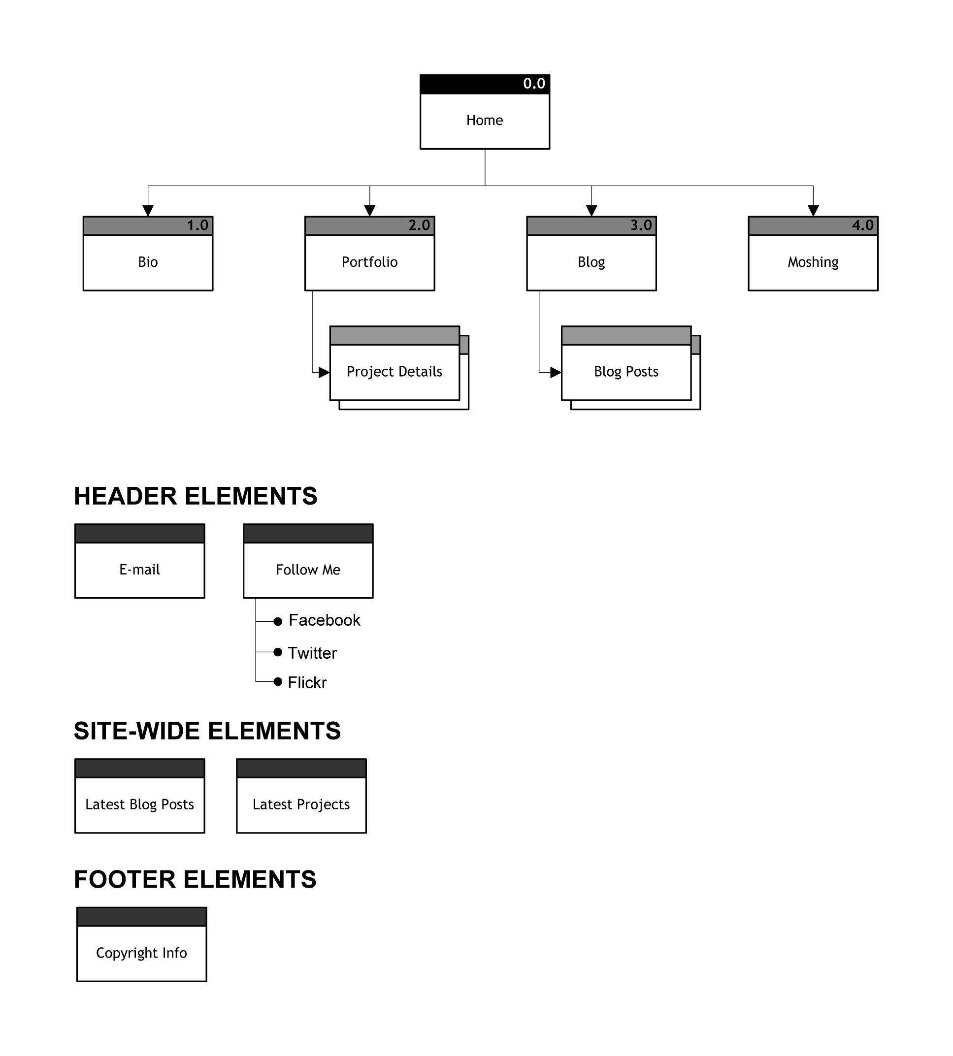
At the very top is the homepage, followed by the main navigation. Beneath each of those items are the pages that fall into those sections. Below that, there are the “floating” footer, header, and modular site-wide elements. It’s easy to get a sense of the site at a glance, with all the pages and elements it contains. It’s also easy to notice any glaring omissions or snafus. If I took a look at my sitemap and decided to shuffle things around and add some additional items, it would only take a few minutes to make the changes.
So, What’s the Problem?
That kind of basic diagram works well for small and simple sites, but things get tricky for larger, more complex sites and applications. Take Facebook, for example. There isn’t a standard primary navigation like there is in my portfolio site example, or in a site like nytimes.com. In complex contexts, the traditional sitemap has a few failings.
Firstly, many sites are too large to be represented in a single diagram. The Web is now the primary destination for written content. Content-heavy sites such as Yahoo! and CNN have seemingly limitless numbers of sections and pages; their homepages act more like portals to several sites that all fall under one umbrella. Representing such enormity in a static sitemap is almost impossible. One trick that works fairly well in this situation is to create a high-level sitemap only showing two levels of depth, followed by more detailed, section-specific sitemaps. This is a simple solution to represent large brochureware (corporate or editorial websites such as ge.com or soccernet.com, for example) while sticking with a familiar model.
But what about sites that aren’t quite so simple? These days, dynamic content is king. Real-time updates from various sources populate webpages that are refreshed automatically. Sometimes these sources are pulled from different areas of the same site, sometimes they’re drawn from external resources, and sometimes they are a mix of both (e.g., Digg). Illustrating the relationships between a site’s various sections and external resources is challenging, to say the least.
My general principle for information architecture and interaction design is to take the complex and make it simple—whether working on data display, interactions, or stakeholder-facing documents. While there’s technically nothing wrong with presenting complex deliverables, it does increase the risk of confusion, and confusion does not usually lead to confidence. Presenting stakeholders with complex deliverables grates against my goal of taking the complex and making it simple, but the ongoing trend of dynamism and interconnectedness of websites is forcing greater complexity in our structural diagrams. But if we are able to take complex user paths and interactions and make them simple and easy for users, surely we should find a way to do the same for our stakeholders and the documents we create.
It’s also a challenge to illustrate a holistic view of a site that has a nontraditional navigational structure. Social websites in particular aren’t organized in ways that conform to ordinary modes of hierarchy and structure. Taking Facebook as an example again, it’s very difficult to determine at what level an “Event” or “Place” resides in relation to a person’s profile or an application.
A Possible Alternative
For these complex cases, diagrams based on the concept map model can be useful. A typical concept map consists of a collection of nodes that represent individual concepts, linked to each other by arrows that represent their relationships. These arrows are typically labeled with relationally relevant phrases like “includes,” “is necessary for,” etc. The concept map is a far more flexible diagram than the typical sitemap, so it can be used as an alternative presentation of structure and interrelationships. Different shapes can be used to differentiate external content sources from internal site pages, functions and elements from actual pages, etc. And, because concept maps don’t follow a tree structure, they can display more fluid structures fairly well.
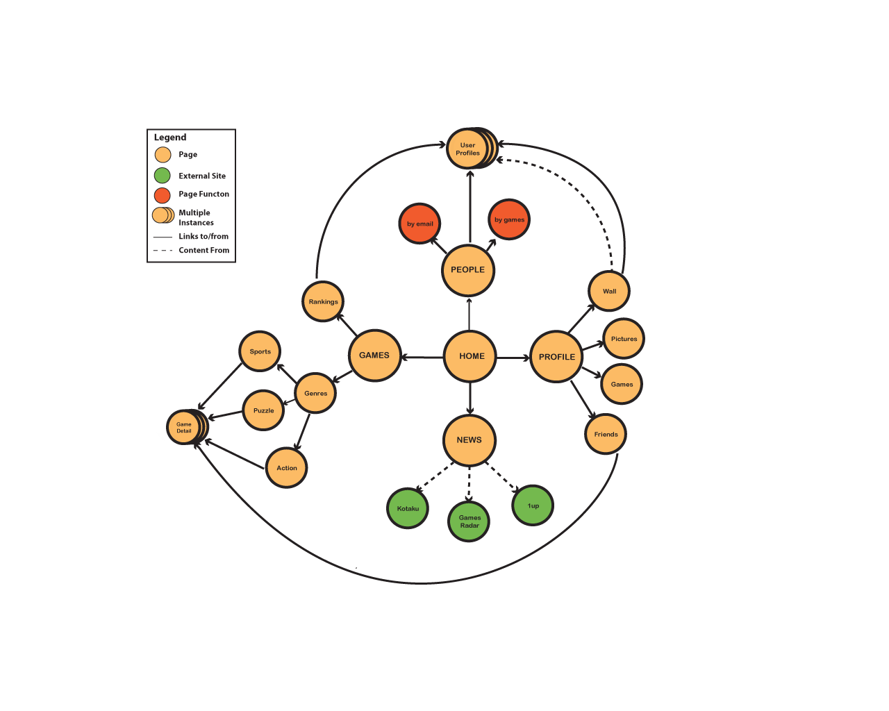
The example concept map above is a high-level representation of a simple game-based social network. The legend indicates that the dotted lines link pages and their content sources—some of them external, some of them internal. Structure isn’t shown as standard parent–child relationships, but rather as a more circular structure. This allows for the easier display of relationships between pages on the same level, and is a more accurate depiction of how the user might experience the site if the traditional concept of the “main navigation” does not apply.
Sadly, like all solutions, concept mapping is not perfect. Displaying all of this information can lead to a diagram that is overwhelming, messy, and difficult to interpret for people who are unfamiliar with concept maps. This particular drawback is actually more significant than one might realize. Information architects (IAs) are hired to not only organize content, but to also develop experiences and interfaces that are satisfying and usable. Providing stakeholders with documents that are difficult to comprehend could easily make them question the IA’s ability to deliver user experiences that are usable and comprehensible.
The risk of overwhelming stakeholders with information is a problem that connects directly to my aforementioned general principle of information design: less is more, so hide (or remove) what people don’t need. While this is simple enough to do when working in an interactive medium, static documents are another story.
Looking Forward
This brings me to my ideal solution: an interactive hybrid site diagram—one that integrates wireframes and site/concept maps into an easy-to-use mini-application.
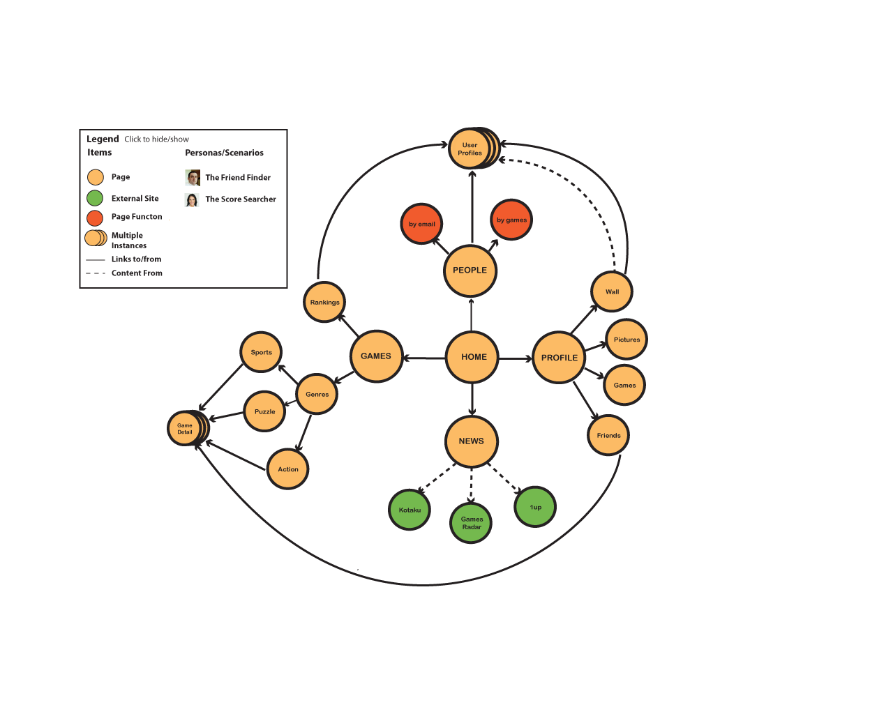
Above is a low-fi mockup of how this could work. On the surface, it appears to be very similar to the regular concept map. The main difference is that users of the hybrid site diagram can filter out the information they do not want to see. They can also view the map from the perspectives of different personas and scenarios. By clicking on one of the personas, a description of the user and his task-flow is shown while the map adapts to show that user’s path. Clicking on any of the page nodes will display the wireframe of that page. The wireframes, too, could then be interactive (to a point, of course), allowing the stakeholder to get a feel of how the site experience would be for users.
However useful this sort of map would be, though, introducing it as a deliverable in the middle of a project-cycle would likely require more time and resources to create than are typically available. However, if one were to devote time and resources to develop this deliverable as a side project, outside of client-billed hours, it would be a fantastic resource to the project team.
Even more useful would be the development of a framework that is flexible enough for a variety of projects and users. If a small team were to develop an application that allows for the easy creation of interactive maps, it would be a real boon to the information professional. Ideally, this application would be adaptable enough that its users would simply need to input some data (persona info, site content, relationships, and so on) and, presto: an instantly generated interactive concept/site-map hybrid.
For Now, Though, Pick What’s Best for You
Sadly, most of us aren’t able to create such an application. So in the meantime, while we wait for someone to create and license it we should remember this: before deciding on which deliverable or set of deliverables to provide to stakeholders, it is important to think about the context in which they are being delivered. That is, the type of site/application we are creating, the familiarity of the stakeholder with IA diagrams, the stakeholder’s personality, and the stakeholder’s patience level and attention span (the latter two are too often disregarded, I find).
The right deliverable is based on the above factors, and the solutions I have proposed do not comprise an exhaustive list. There are a lot of other potential solutions to this problem, including:
- Scenario-based sitemaps
- A series of concept maps, each showing greater levels of detail (first pages, then content sources, and so on)
- Userflow/sitemap hybrids
- Highly annotated navigation studies
The sitemap will certainly evolve. I can imagine a future in which all visual deliverables are presented in a single, cohesive interactive digital package that is readily accessible online and can be downloaded and used locally. It will be some time coming, though, so until then the sitemap will endure. It may, however, find itself moving towards an “internal document” status like the many complex UML diagrams created by developers for developers. Or perhaps it will be relegated to “optional” status—always created, but only provided upon request. Whatever the case, just remember to be as flexible as possible and let your context and stakeholder guide decision-making.