Another of Adobe’s annual MAX events has come and gone, and I took quite a bit away from my time in Los Angeles. The clear message from Adobe CTO Kevin Lynch during the first day’s keynote was that the company’s immediate focus is on enabling solutions for “multiscreen” applications, citing dozens of new form factors, abundant broadband availability, and more Internet-connected devices in the home than ever before.
The literal connotation of ”multiscreen” would be ”many screens.” Sure it’s catchy, and sounds great on marketing materials, but it’s far from accurate. Though the idea of “write once, deploy everywhere” is enticing to developers and project managers alike, should that be the goal? Granted, productivity is paramount and time is money, but simply resizing the same application to fit on multiple devices doesn’t necessarily ensure the best experience for users.
Another interesting concept from the conference came from Adobe Evangelist Ryan Stewart: “Contextual Applications.” This expresses an idea that has great promise, although it has yet to be realized. In Adobe’s own words from a little over a year ago:
These solutions are broader in scope than a device, a campaign, or a single service; rather, they encapsulate the various contexts in which the end user exists, interacts, thinks, consumes, and purchases.
– Design contextual solutions and applications, Adobe [pdf]
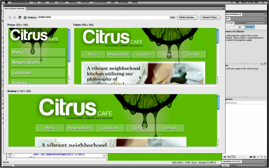
Adobe’s demo of Dreamweaver CS5 was intended to showcase the re-flow and automatic layout abilities of HTML pages that take advantage of CSS3 media queries. This makes it possible for each page in a website to adapt to the browser it’s being viewed in, and each page that Adobe demoed did so marvelously.
I applaud the efforts to make content more customized to the device it’s being displayed on, but there are two rather clear indicators that context is not at the forefront of this workflow.
1. The layout change is superficial
Context is not only about differing screen sizes. In fact, screen size is only a small part of the equation.
To be more specific, content-creators must leverage the advantages each context affords. For example, in the mobile scenario, many other factors should be considered. The user’s location, network connectivity, time-relative information, hardware and software performance limitations, light sources, viewing angles, contrast, sound, user presence, and privacy are each equal parts of the whole experience of a mobile device. When an application or site is used on a phone, it should take advantage of the things a phone can do, not simply readjust the display to be readable on a smaller screen.
Your content is of little value to its users if it ignores the context in which it was viewed, manipulated and processed.
– Cameron Moll
2. The path to the content is made longer
Also in the demo (at time marker 3:25), the homepage of the example site is previewed across a 3-up view: one for a desktop browser, one for a tablet, and one for a smartphone browser. The phone’s content becomes buried beneath the main navigation, adding an extra interaction to get to the information in the site that the user wanted. On a device that can afford the least amount of extraneous actions, these extra steps mean extra time spent waiting, extra data transferred, and extra battery use. It may seem minuscule, but over time, data usage, battery level, network activity, and even data costs can add up. These types of decisions made during an application’s planning can make or break the experience.
Admittedly, it was just a demo, and before I seem too focused on only the less-positive aspects of the keynote, l’m happy to report that as far as Adobe’s message regarding UX message is concerned, it gets better. Adobe seems to be shifting of the way it thinks about and approaches multiscreen application development.
Kevin Lynch made the statement, “We really need to shift now to building mobile first,” a concept that Luke Wroblewski is credited with championing, and that many in the experience design field are shifting to. In the words of mobile-first convert, RJ Owen, the idea that designing and planning for the mobile “version” of your application first makes the most sense because:
- Mobile is more important than desktop these days.
- Mobile forces you to focus on what’s really important.
- Mobile extends your application’s capabilities (GPS, touch-screens, etc.).
You can view the clip from Kevin Lynch’s keynote where he talks about mobile-first on Luke’s blog. So, there is a silver lining, and I’m glad to see Adobe making strides towards providing better experiences across application end-points.
Martha Stewart joined Kevin Lynch to unveil her Martha Stewart Living magazine iPad app, proving once again that interactive experiences are breathing new life into the struggling print industry. The app itself is simple and beautiful, refreshing and stunningly original, and showcases just how expressive, sensory, and immersive a magazine experience can be. From using multitouch and gesturing to break apart delicate Phyllo dough in a recipe, to displaying a time-lapse montage of a flower blooming, presenting a “living cover” to the user, this iPad app represents the rebirth, and redefinition of the magazine. During Martha’s time on stage, she made some statements that showed just how much she gets it:
We want to tell a story, but we also want to also show a story.
This allows you to go as deep as you want to go, or as shallowly as you want to go.
Indeed, Martha understands just how much of an impact that maximizing context and staying current through technology can have on a brand’s identity and presence.
Continuing with the multiscreen theme, another sizable push by Adobe has been aimed at developing content for the “digital living room,” specifically the television. Adobe announced AIR on TV, a new version of their powerful Flash-based runtime that will allow developers to create applications for products such as Google TV.
Developing interactive content for televisions isn’t new, the technology and consumer-readiness are finally in sync. With more and more bandwidth and Internet-ready televisions being announced regularly heading into the holidays, folks want to start getting their web content on televisions. From a development perspective, it’s not as simple as throwing content onto a web server, plugging a USB drive into the TV, or submitting work to a centralized marketplace. There is a bit of a learning curve when it comes to providing a quality experience on televisions.
Companies like litl, where I work, are helping to educate developers wanting to create applications for the TV, by providing information about television-specific display issues such as overscan. This is a new frontier for many people, so it’s important to understand the ins, outs, and gotchas” in order to keep applications optimized and performing well.
The applications we develop are on more devices and operating systems than ever. Planning for multiscreen (or contextual) applications needs to begin with mobile-first and cover far more than varying screen sizes. Instead of the idea of “write once, deploy everywhere,” we should embrace something along the lines of, “write for mobile, provide the best possible contextual experience on each additional device.” That should be our goal.