Throughout my career, I’ve generally understood the value of doing (or having) a content audit as an input into a website redesign. A content audit is an assessment of a website’s content from both a quantitative perspective (i.e., “How much content is there?”) and a qualitative one (i.e., “Is the content any good?”). But what’s not often discussed or understood about content audits are the significant benefits they yield beyond the basic assessment of content quantity and quality.
On a recent project I worked on, the content audit was crucial to facilitating strategic conversations about design direction. These conversations would have been much more difficult without having completed the content audit. We used the audit in several ways, each instrumental in guiding the effort:
- Reveal the true scale of the website’s content (there was less than we thought).
- Clarify and refine the project scope (it took on a different focus than we had expected).
- Facilitate strategic discussions about design objectives and direction (which were different from what our stakeholders had imagined).
- Establish a common language for the team to use throughout the project (which was more complicated than we had anticipated).
I’ll use this project as a framework to highlight how to effectively approach and use content audits in the context of a website redesign project.
The Project
The task was daunting: to reinvigorate and make newly relevant a dusty old employee intranet that had been an unregulated content dumping ground for almost ten years. Ongoing neglect had wreaked havoc, and the website’s users had simply stopped using it.
The problems were clear:
- Employees couldn’t find the information they needed.
- The information they did find was out of date or irrelevant.
- Content was categorized, structured, and displayed inconsistently.
- Employees went elsewhere to get what they needed.
The Process
A content audit typically starts with a page-by-page cataloging (or “inventory”) of a website’s content. This can be a painstaking and time-consuming process depending upon how much content is on the website. Many designers I’ve worked with grudgingly admit the value of this activity, but it’s deprioritized because it’s perceived as requiring a large time investment relative to its value. And in many ways this perception is right. An inventory of a website’s content on a spreadsheet is just raw data. It doesn’t tell you much about the content other than what’s there. The hard work and, ultimately, the payoff rest firmly on finding the nuggets of wisdom embedded in the raw data.
We can do that by using the content audit as a platform for facilitating often-difficult conversations with stakeholders about the purpose of the site, the priorities of users, and the operational constraints and opportunities.
There are many ways to break down and analyze a website’s content to facilitate these discussions and inform design decisions. What follows are the areas that I’ve found to be most effective in the context of a website redesign:
Identify and document content volume and types
At the start of any redesign, there are often wild exaggerations of how much content has to be dealt with. These opinions tend to feed anxieties and overwhelm, and are often why the prospect of completing content audits are too quickly dismissed. Having data on how much content is actually there gives everyone on the team a real number to objectively consider and plan around.
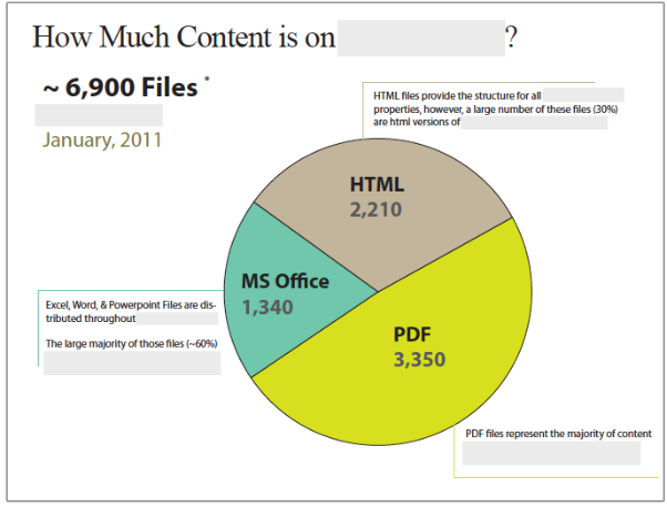
On the intranet project, we realized immediately that the numbers were grossly overestimated. The site was big, but not as big as everyone thought it was. Over 60% of the “pages” were, in fact, PDF or Microsoft Office files, many of which were duplicative of existing HTML pages. This revelation helped clarify the scope of what we were dealing with.
Once we’d sorted and tallied the content of the website, the next step was to use it to facilitate discussions about the future plans for content:
- Is all of this content still relevant? What business, customer, or employee need does it support?
- What new content must be created in the coming months? What’s driving those needs?
- What drove decisions about file types and/or variations in format that exist? Do these decisions still hold?
Identify and document the current content structure
There’s always some sort of structure, even on poorly designed websites. Creating visual illustrations of these structures and their organizing principles often reveals problems or oddities that can help inform the direction of the design solution.
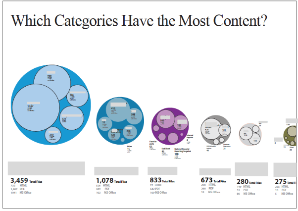
On the intranet project, we discovered that the organization of content was ill-conceived and not accommodating of operational realities. For example, there were nine content areas, however, over 50% of the content was in just one of those areas. This lopsided distribution created too many layers of navigation and contributed to poor content discovery and recall.
Once you have a visual depiction of how the current content is structured and organized, you can use this to facilitate the following discussions:
- Why was content organized in this fashion? What drove some of these early decisions?
- What information has been difficult to classify and organize within this framework?
- What are the most important content types relative to business objectives?
- What have people told you about how the content is currently organized?
Assess whether the content is being used
Having a content inventory (including production URLs) gives you a map and reference point for site analytics. While these reports can sometimes be misinterpreted, they do give high-level insight into how the current site is or isn’t being used, and what content is sought most often.
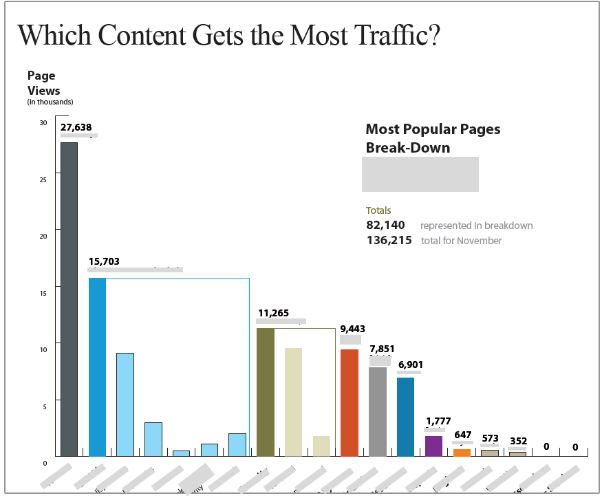
On the intranet project, we used these reports to enhance findings from user interviews. For example, users did not express a desire to understand organizational hierarchy or reporting structures, yet views and downloads of organizational charts were high. These are important realizations for design.
This data can be used to have frank discussions about what is and isn’t needed on the site.
- What content is rarely used? Is there something definitive that can be deduced from this?
- What does the popularity of certain content say about how people are using this site? Can that content be extended and improved upon to give them even more?
- How can the design be structured to facilitate access to known important information?
- Are there ways of revealing the relevance of content that’s not currently being used?
Document inconsistent content presentation
A common problem with neglected or poorly managed sites is the level of inconsistency in content design and presentation. Taking screenshots of a wide-range of pages and presentation types during your audit is a great way to capture inconsistencies and identify opportunities for consolidation.
On the intranet project, we showed a large array screenshots and then illustrated how the content structure could be normalized at the presentation level, eliminating inconsistencies and unnecessary variations. We did this by identifying common content attributes even though the content displays were wildly different.
Spending the time to capture and annotate screenshots early on is essential for productive discussions about operational realities and future design direction. Use these artifacts to answer:
- Is there a reason similar content is presented differently? Sometimes this is for legitimate business reasons, such as aligning with offline collateral.
- Where have efforts to consolidate gone awry? What’s driving these inconsistencies beyond just lack of awareness?
The Results
In the intranet project, this process uncovered many insights that led directly to design decisions, most notably:
An acute awareness of priorities
Knowing what content is on the site and why, and what is actually being used, is essential to understanding priorities. The audit facilitated conversations and shaped questions about content usefulness and utility that otherwise would not have been as fruitful or revealing.
Business and operational constraints
Business and operational constraints are often revealed through the auditing process. In this project, there were clearly operational constraints that would limit what we could propose with any design solution. For example, while the stakeholders liked the concept of a fresh, news-oriented homepage, they simply didn’t have the bandwidth to support regular updates. Assessments and follow-up discussions revealed these constraints more clearly than would have been the case had we not undertaken the audit. And these discussions shaped how we approached the design, ensuring that whatever we recommended didn’t conflict with operational realities.
A common language
Audits can reveal organization-specific language and terminology that is unfamiliar to those outside of the organization. In this project, the content was cryptic in many ways, so the audit helped us decode the content and establish a shared understanding of concepts. As a result, design reviews were less abstract, and aligned more closely with how the internal teams thought and talked about content. Additionally, we were able to reuse existing content in our prototypes to reveal structural decisions and, where necessary, write representative copy to serve as a guidepost for future content development efforts.
A true sense of scale
The site was definitely big, but not in the way everyone or we thought it was. We gained a more nuanced view of the content, coming to understand that we weren’t talking about a 10,000-page site. This substantially changed how we thought about the design and the number of page and content-type design variations we actually needed to accommodate. This realization also brought a healthy level of objectivity to the conversations and removed a lot of anxieties driven (mostly) by uncertainties.
If approached correctly, content audits are an exceptionally powerful tool. Beyond the basic assessment of a website’s content quantity and quality, they help designers understand an information space, facilitate strategic conversations, and uncover substantive insights that directly influence design direction and strategy. In short, we increase our likelihood of redesign success by approaching audits with these broader goals in mind.