A prospective customer is perusing your website, comparing the products and services you offer. You designed the site to make it easy for him to buy. But did you design the site to make it easy for him to choose?
UX designers have become highly proficient at designing for user action. They design with the assumption that users will take action. But it’s important to understand that every action is preceded by a decision. Every action to buy is preceded by a decision about what to choose.
Research shows that decision-making is a highly malleable process, and that people’s preferences are not nearly as firm as we might believe. Decision outcomes are actually largely contingent on the environment or context in which those decisions are made.
From a website design perspective, this is huge. It means that the design of the website has a critical impact not only on usability (which is what designers typically pay attention to), but also on how people decide. Decisions lead to actions, and user actions drive the bottom line.
The Goal of Decision-Making
So how do we design for effective decision-making? The first step is to understand the goal of decision-making. In a nutshell, the goal is to get the best decision outcome with the least amount of effort. Notice that there’s an inherent conflict or tradeoff baked right into the goal itself. Typically, better decision outcomes result from greater effort.
It’s important to be aware of this goal and its built-in conflict because the design ultimately either exacerbates the conflict, or it eases it. That is, the design plays a critical role in either helping or hindering people in making a decision. When people can’t decide, they don’t decide. And this often has serious implications for achieving website objectives.
Designing for Decision-Making
Many aspects of the design affect decision-making, including the visual layout, the number of options available, the type of information provided and how it’s worded, and many others. The effect of the design on decision-making is often subtle, yet powerful because it is so subtle.
One of the most effective ways to design for decision-making is to find ways to leverage people’s natural behavior and existing decision-making strategies.
Assessing value through comparison
A key question to consider when designing for decision-making is: how do people determine or assess value? How do people figure out the worth of things?
Since people do not have an innate ability to objectively determine the absolute value of things, they instead use a process of comparison. People are constantly comparing things: products, services, places, ideas, other people, etc. This process of comparison is an integral aspect of people’s natural behavior, and so it’s something that designers should leverage when designing for decision-making.
To demonstrate the power of comparison in people’s decision-making behavior, let’s turn to a study where researchers split people into two different groups, and then asked everyone to individually determine how much they would be willing to pay for a dictionary.
Individuals from one group were shown a dictionary with 20,000 entries that had a torn cover. Individuals from the other group were shown a dictionary with 10,000 entries, in perfect condition. The results showed that on average, people shown the dictionary with more entries but having a torn cover were willing to pay $20, while the group shown the dictionary with less entries but in perfect condition were willing to pay $24.
Researchers then asked a third group of individuals to compare the two dictionaries side-by-side and indicate how much they would be willing to pay for each one. The results showed that when people were able to compare the dictionaries, they were willing to pay more for the one with more entries, regardless of the torn cover. On average, they were willing to pay $27 for the dictionary with more entries and a torn cover, and $19 for the dictionary with fewer entries that was in perfect condition. This was a direct preference reversal from when people were evaluating each dictionary by itself.
This may seem like a rather simple study, but there are a couple of important takeaways that are especially pertinent for UX and web design. First, people’s assessment of the value of each dictionary was directly impacted by whether they were evaluating the dictionary in isolation or by comparing one against the other. As I said earlier, people do not have an innate ability to determine absolute value. Value is determined through a process of comparing and contrasting.
In order to assess the value of each dictionary, people needed a standard against which to compare. How many entries does a good dictionary have? Most people don’t know. So, when evaluating the dictionary with no defects, they had to come up with their own standard. Those who evaluated the dictionary with a torn cover didn’t know the answer to that question either. But, they knew that the torn cover was clearly suboptimal, an attribute they could readily evaluate as “bad.”
When people had a chance to compare the dictionaries directly, they were able to judge them on the characteristic that really mattered: the number of entries. The cosmetic defect paled within the context of what’s most important in a dictionary. When people can’t evaluate the most important aspect of something in a meaningful way, that aspect gets discounted for another aspect that’s easier to evaluate. This is how the decision-making environment can sway decision outcomes.
The comparison process itself, then, and the way in which it is designed, can help or hinder people’s ability to focus on the right attributes and to assign value effectively. In the dictionary example, people’s assessments were swayed by whether they were asked to evaluate each dictionary separately or by comparing them side-by-side. They were also swayed by the type of information made available or not made available. Consider, for example, how people’s assessment may have differed if just one piece of data had been provided: the average number of entries found in a typical dictionary.
Consider also the impact of people’s goal in decision-making, to get the best possible result with the least amount of effort. In the dictionary example, some people’s assessment was swayed by the attribute that was easiest to evaluate: the torn cover.
These are the kinds of things that deserve consideration when architecting the environment in which people make decisions.
Designing the comparison space
Since the process of comparison is the means by which people assign value to something, it’s important to design or architect the environment (or webpage) to accommodate this innate behavior. An effective design enables people to easily focus on the right things and make meaningful evaluations. Probably the best way to learn about designing for comparison is to look at both good and bad examples, and examine what makes them that way.
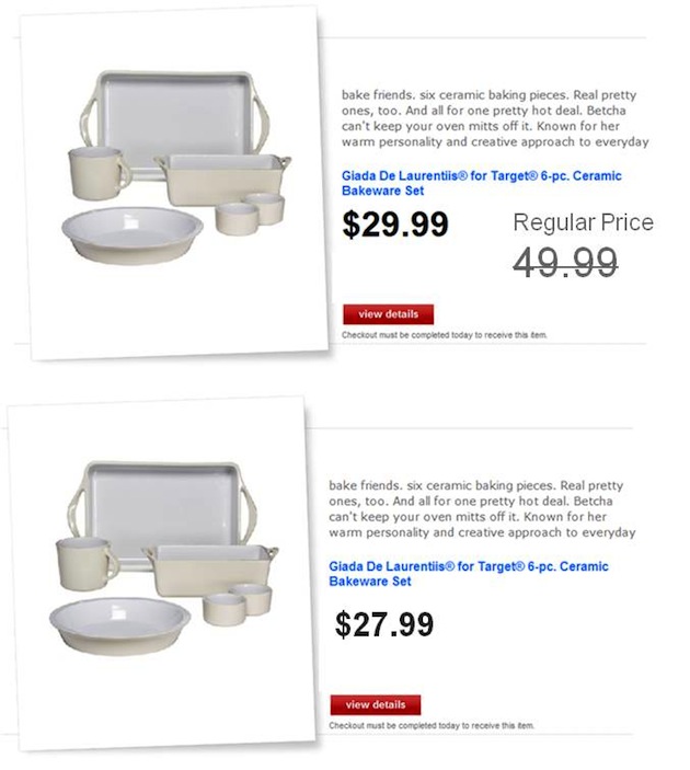
Example 1: Setting context
Which of the two examples below is most effective? Note how the reference point (the regular price) in the first version sets the context, thereby enabling people to more effectively evaluate whether the price is “good” or not. Even though the price is lower in the second version, the first version appears more compelling because of the comparison against the regular price.
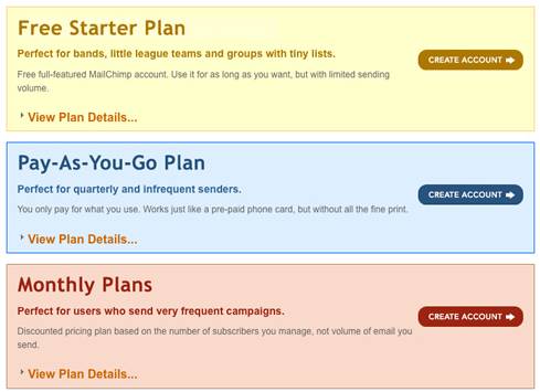
Example 2: Facilitating easy comparison
The example below is designed as if no comparison across plans is required. The design assumes that users will be able to make a decision simply by viewing the individual plan details. It is likely, however, that the first thing users will want to do is compare plans so they can understand the differences between them. This UI does not make it easy to do that.
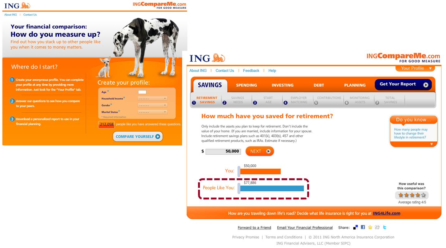
Example 3: Providing points of reference
The example below respects people’s natural need to compare. Many people wonder whether they’re saving enough. To display a single number is not enough, as people cannot glean meaning from a single number (is $50,000 of retirement savings good or bad?). The designer of the site understands that people need a reference point against which to compare. Here, the reference point is “people like you,” but it could be any number of different values—a recommended amount or industry standard, the amount of your savings at this time a year ago, etc.
Example 4: Showing contrasting values
The example below does an excellent job of leveraging the power of comparison and contrast. Note the extreme contrast between the five-star rating and all lesser ratings. The data tells a compelling story.

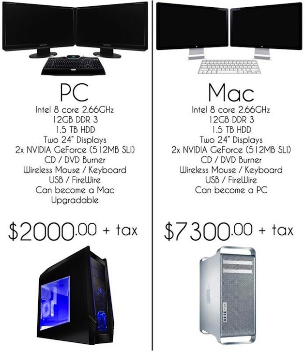
Example 5: Enabling easy visual scannability
This page also has a convincing story to tell: that the PC and Mac are essentially the same, yet very different in price! This story would be conveyed more effectively if the user wasn’t forced to read the jagged (center justified) text in each column in order to get the message. The design would support the story in a more compelling way if the page were easier to scan and the size of the images, which currently dominate the design, was reduced.
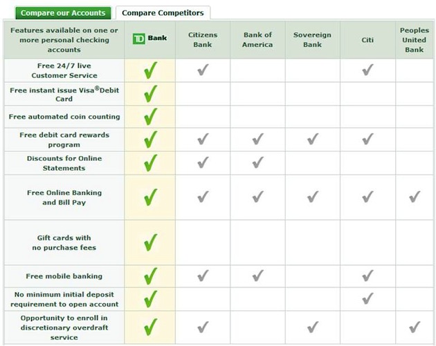
Example 6: Designing for salience
The design below is effective because the table layout makes visual scanning easy. It takes only a second (or less, pre-attentively) to see that TD Bank beats its competitors—at least on the criteria it has chosen. Note how the visual design supports the overall message of the page. TD appears in the first column (the only bank listed with its logo), which is the column we encounter first as we read left to right. Unlike the other columns, that column also contains a subtle background color, and displays big green checkmarks straight down the line. Its competitors take a back seat visually, almost appearing grayed out compared to TD.
In Summary
One of the most effective ways to design for decision-making is to leverage people’s natural behaviors and decision-making strategies. With this, there are two fundamental things to keep in mind:
- the goal of decision making (with its inherent built-in conflict).
- that people assess value through a process of comparing and contrasting, something they are constantly doing.
A key aspect of designing for decision-making, then, is to design an environment in which comparisons can easily be made. This involves easing the inherent conflict within the goal of decision-making by:
- Providing a reference point so people can assess value and glean meaning
- Helping people determine the right things to focus on by making those salient
- Leveraging the visual design and page layout to eliminate clutter and enable easy scanning
- Providing the right information at the right time, while eliminating all unnecessary information
Decision Architecture
Historically, the UX design toolbox has not included a focus on the science of decision-making. This needs to change. We need to recognize the important role that user decision-making plays in the achievement of website objectives. Just because designers may not design for decision-making doesn’t mean that the design isn’t having an effect.
There is no such thing as a neutral design. Every design has an effect on user decision-making, whether designers proactively design for effective decision-making or not. It’s no different from designing for usability. Every design is more or less usable, regardless of whether the designer designed for good usability or not.
Architecting for decision-making results in a win/win/win outcome for designers, for business partners, and for users. This is why decision architecture deserves a prominent place in the UX toolkit.