Save
The mist, the spotlights, and the two hosts make the Apple Design Award (ADA) ceremony seem almost like the Oscars for geeks. In place of that coveted golden statuette, the geeks drool over the chance of winning a mythical glowing cube and some crazy Apple swag awarded to the developers of Apple’s favorite new apps.
I had the tremendous and slightly embarrassing honor of being the first to receive said cube this year at Apple’s World Wide Developer’s Conference (embarrassing because, being the first, I inadvertently stepped up the wrong side of the stage). Let me tell you, it’s a pretty neat feeling—not the stepping on the wrong side of the stage part, but the glowing cube part. It gives me goose bumps just thinking back on watching John Geleynse demonstrate my app, Grades 2, in front of thousands of app developers and press who are much more intelligent than myself.
But enough reminiscing. I’ve been thinking a lot about how we can use Apple’s ADA judging criteria to help us build incredible mobile apps. Exploring these criteria might just give us a better chance at the glowing cube and will most certainly help us build experiences users will download and enjoy.
1. Delightful
One of Apple’s key insights is that technology cannot simply be functional. Even usable isn’t enough. Technology needs to be enjoyable. It needs to be emotional. It’s got to have personality.
Delight is in the details. Subtle hints, humor, metaphor, animation, and beautiful visuals are some of the tools we use give our app character.
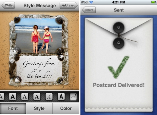
Postage, which won an ADA in 2009, goes to great lengths to produce the illusion of creating and sending a real, physical postcard, all the way up to delivery. They could have easily displayed a default pop-up box saying the post card was delivered, but they took the time to craft a custom animated envelope. That’s delightful!
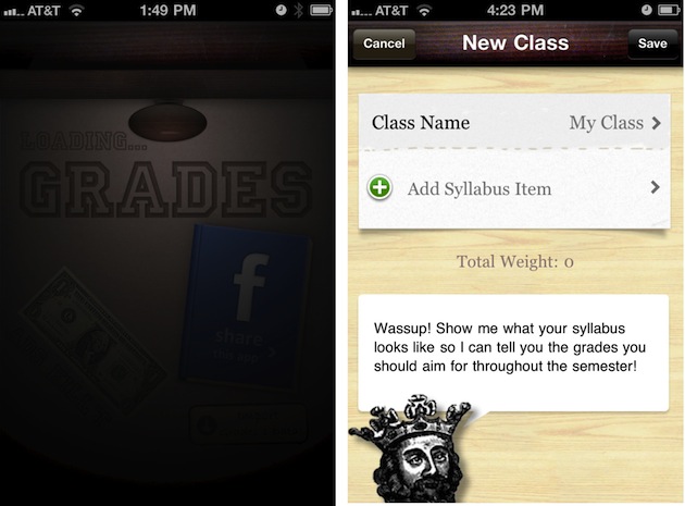
Grades 2 is a grade and GPA calculator—not exactly a breathtakingly engaging concept. But we tried to make it fun by using a drawer metaphor and filling it with thoughtful, humorous, and often cheesy details and characters that give the app a distinct personality. Users like it when you make banal tasks fun.
2. Intuitive
An intuitive app just works. The interface itself explains how to use the app, implicitly. On one level, matching user’s real-world mental models and making sure things look tap-able can help. But in my experience the axe is one of the best tools for making an app intuitive. Making an app “dead simple” requires the axing nearly all of the cool features it’s creators envisioned, leaving just the essence. This applies to everything from the elements on a screen to the entire concept of an app. Kill every feature, button, and option that isn’t absolutely essential. The painful process is well worth it. You might think your users will want more choices but remember that every new feature, button, or option adds complexity to the app. Just think, if you could get your interface down to just one button, everybody would know how to use it. Of course that is impossible but still, less is definitely more.
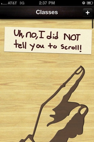
When users open Grades 2 for the first time, they know what to do because there is only one button. The only other thing to do is to scroll…
3. Elegant
An elegant app solves problems in an ingenious and tasteful way. It works to make less work for the user. Text input is an example of something that requires a huge amount of work from the user. Even worse, users often use their device with one hand, which makes text input all the more cumbersome. Reduce the need for text input by removing fields, offering suggestions, and setting automatic defaults. Even better, find smart ways to eliminate text input altogether, like automatically finding the user’s current location rather than forcing the user to type it out in a form.
When I asked one of the lead designers at Apple why he liked the UI of my app, I was surprised to hear he liked that it automatically switches the type of keyboard based on the type of input required when switching fields in a form. I thought it was common sense, but he said you would be surprised how many apps don’t do this. These are small details that often get lost in translation from design to code, an important reason why designers should stay involved even after coding is in full swing.
4. Engaging
An engaging interface grabs a user’s attention and keeps it. It makes everything else going on in the world seem somehow unimportant.
Engagement generally starts with amazing visuals based on a compelling concept. Before users even use an app, they need to take the leap of downloading it from the App Store. While the description and reviews play some role in their purchase decision, the majority of users go straight to the screenshots. With that in mind, be sure you interface clearly demonstrates the concept of the app in a stunning way.
Great visuals can draw a user in but looks can’t sustain a long-term relationship. Too many apps look great but fall short in the overall experience, whether it’s a confusing flow, an inconsistent interface, or choppy animation. An engaging interface places the user in a magical, fluid, and almost tangible experience and anything that reminds them they are still using a computer (a glitch, a choppy animation, or any unresponsiveness) kills that.
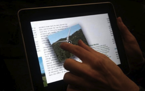
With Our Choice, Push Pop Press set out to “change the way we read books” by making the book come to life. They achieve a very tactile effect by making all the objects on the screen, from the page itself to the interactive illustrations and videos, not only touchable but draggable and swipe-able, giving the user an immense sense of physicality and control. The app also makes great use of audio and stunning visuals to draw users into the experience.
5. Exciting
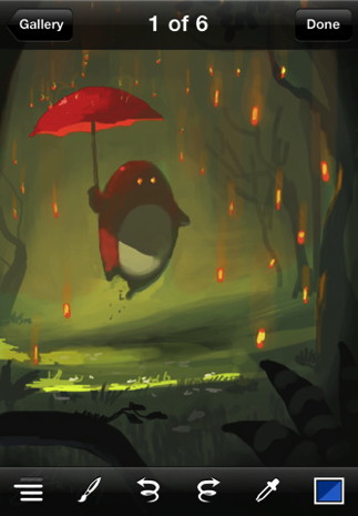 Excitement isn’t so much about the app itself as it is about the exciting things you can do with it. Brushes turns your mobile device into an art studio capable of producing art worthy of being a magazine cover. To artists, the possibility of working on their masterpiece whenever and wherever is extremely exciting.
6. Compelling
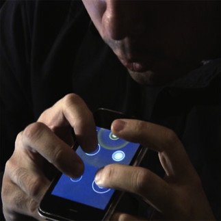
Remember the first app you showed your friends after you got your shiny new device? The one where your friends were like, “Wow, what is that?” It’s probably because the app allowed you to do something you never expected to be able to do on your mobile phone. Compelling apps often think outside the box with the technology that is built into the device to build experiences that weren’t possible before.
Golfscape uses a combination of the phone’s camera, GPS, compass, and a golf course database to show golfers critical distances through an augmented reality viewfinder.
Using the iPad’s gyroscopic sensors, Starwalk allows users to put their iPad up against the horizon and see all the celestial bodies and satellites that are in that part of the sky.
7. Reliable
A reliable app does its thing and does it every time, without fail. It’s dependable, it’s robust, and it doesn’t crash. Information in your app is up to date, accurate, comprehensive, and preferably accessible even without an Internet connection. A beautiful app is useless if it crashes all the time or gives bad information.
Conclusion
The App Store is a vast ocean of apps. To stand out from the crowd and to get Apple’s attention, obsessing over the design is absolutely essential. Incredible design isn’t cheap; it requires time, money, and very good taste, and also a deep passion for the product you are building. The only way a designer will go to the lengths it takes to make an award-winning app is if he is passionate about it. The builders of such apps consider themselves craftsmen, painstakingly carving delight into every layout, button, and alert message. Passion shows. Get inspired, don’t compromise, and build something amazing!
Be sure to check out Apple’s Ingredients of Great iPhone Apps video to learn more about what it takes to build great apps.
Jeremy Olson
Jeremy has always been right at the intersection of design and software. As a homeschooled kid, he always loved art and was delighted to discover software development as an outlet for his creativity.
After ten years of building software, Jeremy landed his first big success at the age of 19 as a Sophomore at UNC Charlotte when he built an iPhone app called Grades. Apple not only featured Grades on the App Store homepage, but awarded the second version the coveted Apple Design Award in 2011 and Grades has since become one of the most popular Education apps on the App Store, being featured in national press such as Fox News and the Huffington Post.
Now a senior, Jeremy has transformed his company Tapity into a full time business and his team works with startups and big brands alike to craft delightful apps for iOS.


