Flag

We stand with Ukraine and our team members from Ukraine. Here are ways you can help

Home ›› Data visualization ›› Page 8

Data visualization

Read these first

A conversation between Jesse James Garrett and Ken Jennings about the overlap between mapheads and designers serves as a preview for UX Week 2014.

Article by Adaptive Path
Share:Jesse James Garrett and Ken Jennings Talk Maps and Design
8 min read
jjg-kj-uxweek-small

Taking data with the richness of what Minority Report showed us and giving it the kind of approachable interface seen in Her.

Article by Tutti Taygerly
Share:Designing Big Data for Humans (with a Little Help from Hollywood)
4 min read
designing-for-humans-small

Following cues from cognitive science can help you create information dashboards that users can process reliably and quickly.

Article by Shilpi Choudhury
Share:Four Cognitive Design Guidelines for Effective Information Dashboards
4 min read
cognitive-guidelines-information-dashboards-small

An excerpt from the new book Interface Design for Learning offers strategies for supporting community-building, collaborative learning, and successful social interaction.

Article by Dorian Peters
Share:Learning from Each Other
8 min read
learning-from-each-other-small

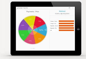
A closer look at the results in the Bringing Order to Big Data category of the international Design for Experience awards, featuring the winner: Roambi.

Article by UX Magazine Staff
Share:Making Mountains of Data Rewarding to Roam
7 min read
dfe-roambi-small

The official website for the international Design for Experience awards is up and running!

Article by UX Magazine Staff
Share:The Design for Experience Awards Site is Live
1 min read
dfe-site-launch-small

Did you know UX Magazine hosts the most popular podcast about conversational AI?

Listen to Invisible Machines

This website uses cookies to ensure you get the best experience on our website. Check our privacy policy and