Flag

We stand with Ukraine and our team members from Ukraine. Here are ways you can help

Get exclusive access to thought-provoking articles, bonus podcast content, and cutting-edge whitepapers. Become a member of the UX Magazine community today!

Home ›› Design ›› New Google Analytics: First Impressions

New Google Analytics: First Impressions

by Alex Schleifer
2 min read
Share this post on
Tweet
Share
Post
Share
Email
Print

Save

Google’s free metrics service gets an upgrade.

Google’s limited beta release of the next iteration of their analytics tool has landed and we were lucky enough to experience it first hand. While there was never any questioning of the tool’s value many had complained about the complex and uneven interface. Indeed, after the acquisition of web-analytics developer Urchin, Google was very quick to release a free, re-branded yet unfortunately still rather clunky version of the popular commercial statistics application. In our opinion, Google Analytics’ interface had always let it down and while its detailed reporting undoubtedly filled many a stat-junkie with glee its best features were frustrating to find within the disjointed UI. Until now, that is.

With its wealth of features, depth and stats-heavy content redesigning Analytics was never going to be a simple task but thankfully it was handled admirably. The new interface is proof of the talent that exists within Google’s UI team. It’s a gem: clean, clear, and designed with purpose. Don’t expect major new base features like real-time stats (reports are still delayed by hours and hours) bar some neat e-mailing tools, this is very much an interface upgrade and in many ways an entirely new experience. Here are some notable improvements:

  • Better structure: Tools are logically organized (Visitors, Sources, Content & Goals).
  • Flexible dashboard: You can intuitively add most reports to the dashboard.
  • Clearer charts: The new dynamic charts use up all available screen real-estate to great effect.
  • More intuitive: Most items are hyperlinks. Clicking on a pie chart slice will drill down to that section allowing you to access details nearly instantly.
  • Prettier: Everything from the charts to the typography have been overhauled. Makes the entire experience far more enjoyable.
  • More approachable: Neatly organized, friendly in its design, Analytics says “hello, try me!” — contextual help is the icing on the cake.

Within the next few weeks the upgrade will be rolled out globally. Google has cleverly provided a tool that helps users find their way around the new interface by matching the destinations to the old one. Be sure to check out the guided tour to see what you can expect.

post authorAlex Schleifer

Alex Schleifer
Alex is CEO of Sideshow , an award winning creative agency. You can read his blog here.

Tweet
Share
Post
Share
Email
Print

Related Articles

AI that always agrees? Over-alignment might be the hidden danger, reinforcing your misconceptions and draining your mind. Learn why this subtle failure mode is more harmful than you think — and how we can fix it.

Article by Bernard Fitzgerald
Introducing Over-Alignment
  • The article explores over-alignment — a failure mode where AI overly validates users’ assumptions, reinforcing false beliefs.
  • It shows how this feedback loop can cause cognitive fatigue, emotional strain, and professional harm.
  • The piece calls for AI systems to balance empathy with critical feedback to prevent these risks.
Share:Introducing Over-Alignment
4 min read

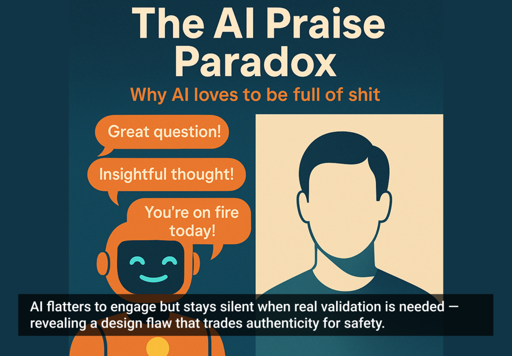
Why does AI call you brilliant — then refuse to tell you why? This article unpacks the paradox of empty praise and the silence that follows when validation really matters.

Article by Bernard Fitzgerald
The AI Praise Paradox
  • The article explores how AI often gives empty compliments instead of real support, and how design choices like that can make people trust it less.
  • It looks at the strange way AI praises fancy-sounding language but ignores real logic, which can be harmful, especially in sensitive areas like mental health.
  • The piece argues that AI needs to be more genuinely helpful and aligned with users to truly empower them.
Share:The AI Praise Paradox
4 min read

Mashed potatoes as a lifestyle brand? When AI starts generating user personas for absurd products — and we start taking them seriously — it’s time to ask if we’ve all lost the plot. This sharp, irreverent critique exposes the real risks of using LLMs as synthetic users in UX research.

Article by Saul Wyner
Have SpudGun, Will Travel: How AI’s Agreeableness Risks Undermining UX Thinking
  • The article explores the growing use of AI-generated personas in UX research and why it’s often a shortcut with serious flaws.
  • It introduces critiques that LLMs are trained to mimic structure, not judgment. When researchers use AI as a stand-in for real users, they risk mistaking coherence for credibility and fantasy for data.
  • The piece argues that AI tools in UX should be assistants, not oracles. Trusting “synthetic users” or AI-conjured feedback risks replacing real insights with confident nonsense.
Share:Have SpudGun, Will Travel: How AI’s Agreeableness Risks Undermining UX Thinking
22 min read

Join the UX Magazine community!

Stay informed with exclusive content on the intersection of UX, AI agents, and agentic automation—essential reading for future-focused professionals.

Hello!

You're officially a member of the UX Magazine Community.
We're excited to have you with us!

Thank you!

To begin viewing member content, please verify your email.

Tell us about you. Enroll in the course.

    This website uses cookies to ensure you get the best experience on our website. Check our privacy policy and