Let’s face it: We‘re all going to die. And hopefully, if you played your cards right, you‘ll likely leave behind a few bummed-out people in the wake of your passing. What I aim to solve with this project, is to design a platform that educates and supports the wishes of those passing, as well as those who are left to mourn. I will discuss the research methods I followed to better empathize with peoples’ needs during such sensitive times, and how I created an inclusive and accessible Deathcare platform for all while giving grieving individuals the ability to connect to others.
The Challenge
I set out to understand the sensitive process of EOL (End of Life) Care and what individuals, both the dying and surviving, needed at that time.
My aim was to find common pain points along with recording any relief or stressors they experienced throughout the process.
While technology is no substitute for the human heart and what it can provide, I do believe that it can be a tool to help people connect. The following research was done to see if there were a place for such an application.
The Problem Statement
We live in a society unable to cope with death. This leaves few known options for the dying and little to no support for those left behind. If not properly cared for some of these friends and family members may suffer:
- Isolation & depression,
- Difficulty relating to others,
- Confusion about what to do next,
- PTSD,
- Left tying up loose ends and other tedious affairs,
- Vulnerability to those who prey on the mourning (its a sad fact)
The Proposed Solution
My idea was to create an app that would:
- Perform daily check-ins to track the wellness of the individual using the app;
- Provide resources to assist individuals through logistics and paperwork;
- Provide tips and articles about the grieving process along with material related to their individual circumstance;
- Connect people to moderated forums and grieving groups in their area.
The Users and Audience
You Got This is an app designed for those who are experiencing a great loss. While this app could offer support for any type of grieving (the loss of a relationship, job, etc), this particular user flow is geared towards those who are grieving the loss of a loved one.
In addition, it is my view that this app could be used, even prescribed by, grief counselors for setting goals with their patients and monitoring their progress over time.
Roles and Responsibilities
UX and UI designer. Researcher. UX Writer.
What I Did and How I Got There
My approach to this challenge was based on the DESIGN THINKING PROCESS model, which is an approach based on empathizing, observing, testing (and failing ASAP), iterating as many times deemed necessary and then implementing the design.
Research
I knew that my attempts to create a wellness app about Death and Dying would be an interesting one, as it is rare to imagine the two concepts being anything other than opposed. I also understand that Death and grieving is as personal as it is universal, so I needed to paint my questions with a broad brush and with the utmost care — to empathize and observe and see where peoples’ answers led me.
Qualitative Analysis
The act of collecting and analyzing non-numerical data.
Competitive Analysis & Industry standards
The first step in my research process was to find four businesses within the Death and EOL apps currently in the market. I evaluated their aesthetic, tone, offerings and accessibility to identify the strengths and weakness of each platform along with discovering any opportunities that I could find to incorporate into a new one.
I chose to study three: The Order of Good Death, Empathy and Lantern.
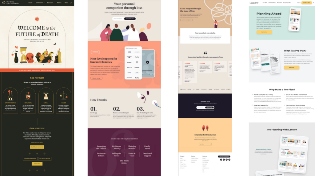
All three used large, broad sections for easy readability. The images were light and digestible and the tone was straight forward and calm. It was clear to me that while each of these fulfilled a very important purpose, there was no app or website actively addressing the lack of connection users have when grieving. These websites weren’t connecting people to other people.
User Interviews
Next, I conducted a series of interviews with individuals ranging in age, gender, background, religion, and ethnicity, curious about their experiences with and around death. I guided them through questions as each one shared intimate stories about the final time spent with their loved ones; what they went through during the transition, how they coped after their passing, and what they felt worked or could have further assisted in their process.
What moved me so much, was people’s desire to tell their stories.
Here are but a few of the many quotes I found helpful:
“I wrote and wish I had done more- I cherish those notes and letters. It puts me back into the intimacy of that time and place. It allows me to remember the small details- the sadness and the beauty of the moment.”
“I felt completely alone for the first year. I think people were nervous to be around me because they couldn’t handle the situation.”
“I wish I had recorded her more. We would have her read children’s books so that when her grandkids could grow up, they would be able to listen to her dictate their favorite stories.”
“There is a certain calmness that comes with letting go. But it also comes with guilt. We feel like we are abandoning our sadness — our person — when we feel like we’re starting to feel better. I needed support though that, definitely.”
“I found some groups, but they were all led by Christians. No offense, but I’m an Athiest Jew. I couldn’t connect to someone else’s god.”
Summary
To summarize my Qualitative results, it seemed that there was a niche within the industry and that people were looking to connect with others during these times.
Quantitate Analysis
The act of collecting and analyzing numerical data.
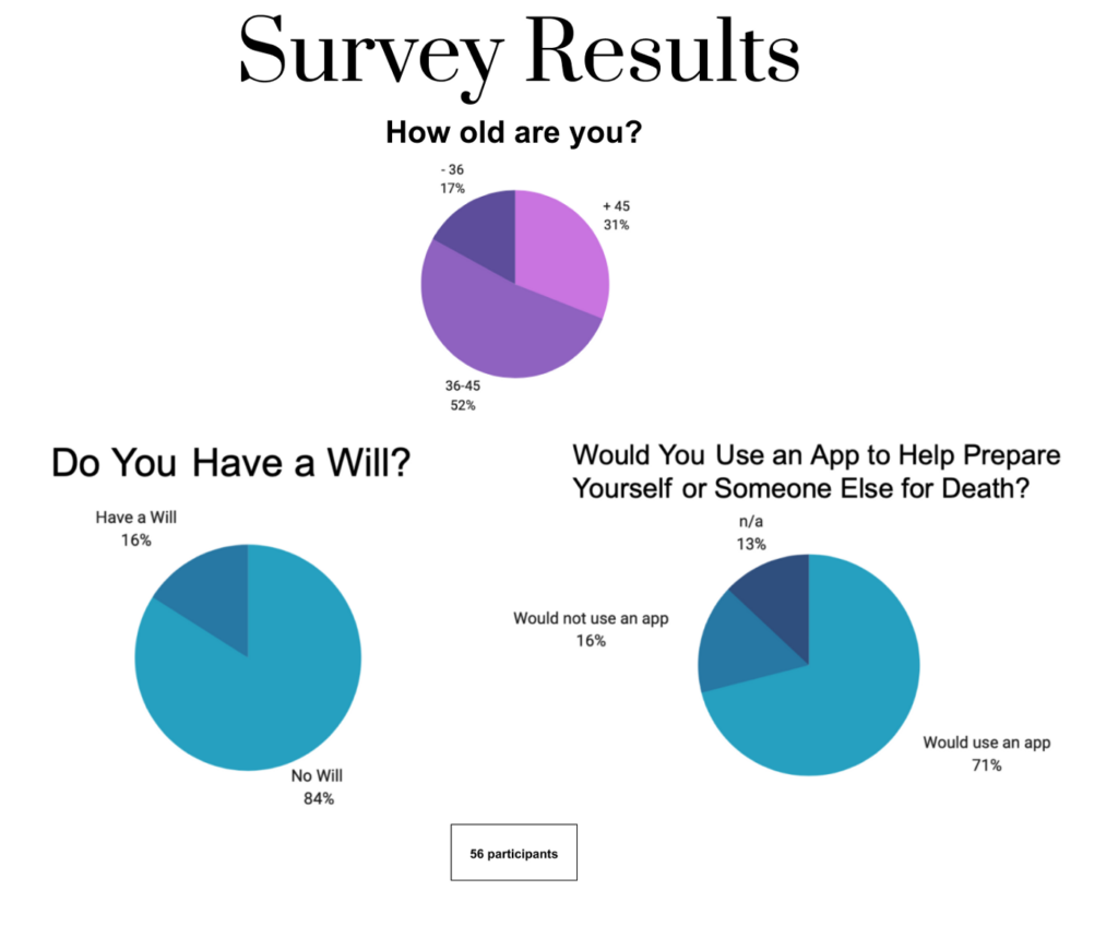
Death Survey
Next, I created a survey about Death and posted it to several platforms: Slack, Reddit, and Facebook Grief Groups. My goal was to get a general sense of people’s relationship with death and to observe patterns in their answers that either shed light on common pain points or uncovered helpful insights.
Again, since the experiences surrounding death are so subjective, I wanted to cast a wide net that would lead me in a direction as to where a wellness app could serve people best.
Observations
After reviewing the survey, I stumbled upon a few realizations.
The first, was a huge, “FUTURE paint point.” As you can see from the graphs, most people are not well prepared for death. Out of the 56 respondents, 83% (who were 36+) did not have their affairs in order, and a total of 31% were over the age of 45. This means that if something were to happen to a loved one, the bereaved would be left figuring out what to do next.
I also posed some very direct questions, asking for people’s views on a “Death App.” A vast majority, while not completely convinced, were open to the concept and offered the following insights:
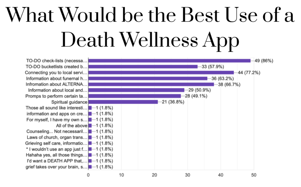
Top three:
- To-do checklists (for pre and post mortem affairs);
- Connecting to local services;
- Information about alternative Death Care;
- Grief counseling and support were common write-ins.
Finally, I posed a question about Wellness Apps overall, and to my surprise, 26 (nearly half of the respondents) reported using wellness apps for not only physical health but for mental health as well.
One quote that really stood out:
“I need an app that isn’t so generic. I need it to argue with me. I need it to reach out and touch ME.”
Summary
To summarize my Quantative results, it was safe to say that people were interested and that there was a “market” for a Death Care App.
Fist Ideation
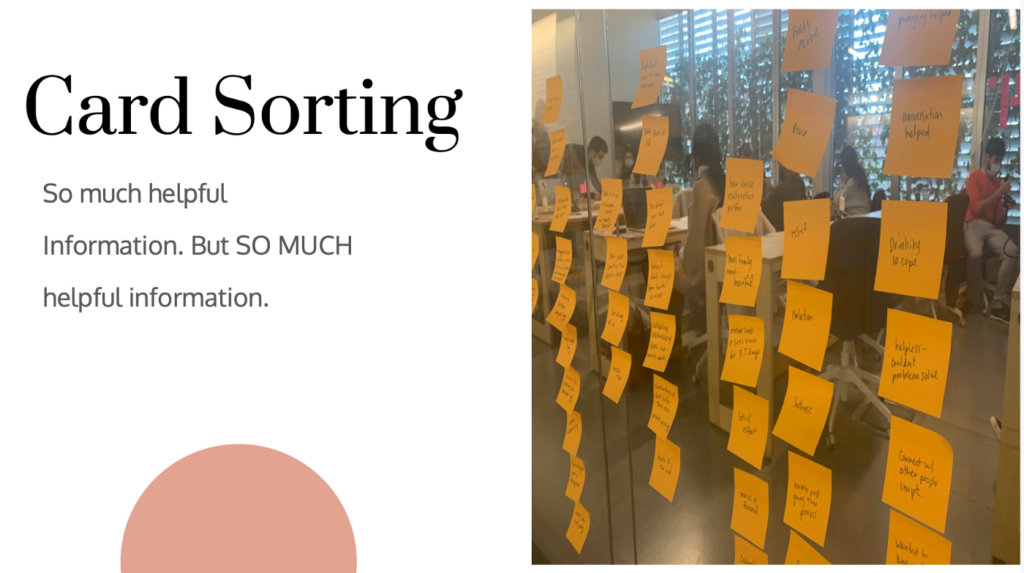
After gathering all of this information, I started on my first round of ideation, using Information Architecture to help organize the information I received. I grouped together key concepts and phrases ranging anywhere from alternative burial options to details about personal coping mechanisms. In total, I had over 60 Post-Its which I then arranged into 10 different sections. This would allow me better organize and empathize with people’s needs.
Site Map
From there, I developed the bones of the app, listing the headings and where they would be arranged on the platform. There was a lot of work and user-feedback during this process.
User Flow
To get a better sense of how a user would navigate the site, I created a user flow, navigating the person from entering the app all the way through to the task of signing up for a Grief Group.
Branding
I wanted the color palate of You Got This to be grounded, yet cheerful, conveying a muted elegance that the client could trust.
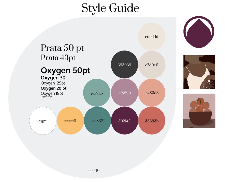
Color
Soft but grounded. Easy on the eyes.
Voice and Tone
Tender and understanding. Helpful and encouraging.
Font
Prata and Oxygen felt formal but accessible.
Images
I chose illustrations, as many of the grief websites did.
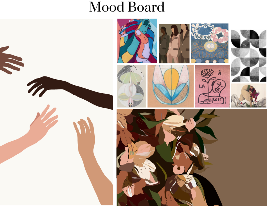
This moodboard was inspired by my favorite artist, Hilma af Klint, who was inspired by all things spiritual and mystic. I used earth tones and contrast, understanding that whatever palate I chose needed to be easy for the mind and for the eyes.
First Round of Prototyping
Wire Framing
With my Site Maps and User flow in hand, I now had enough information to start drawing the first iteration of the onboarding and development of the application. I kept these designs simple, knowing that adjustments and omissions would be made.
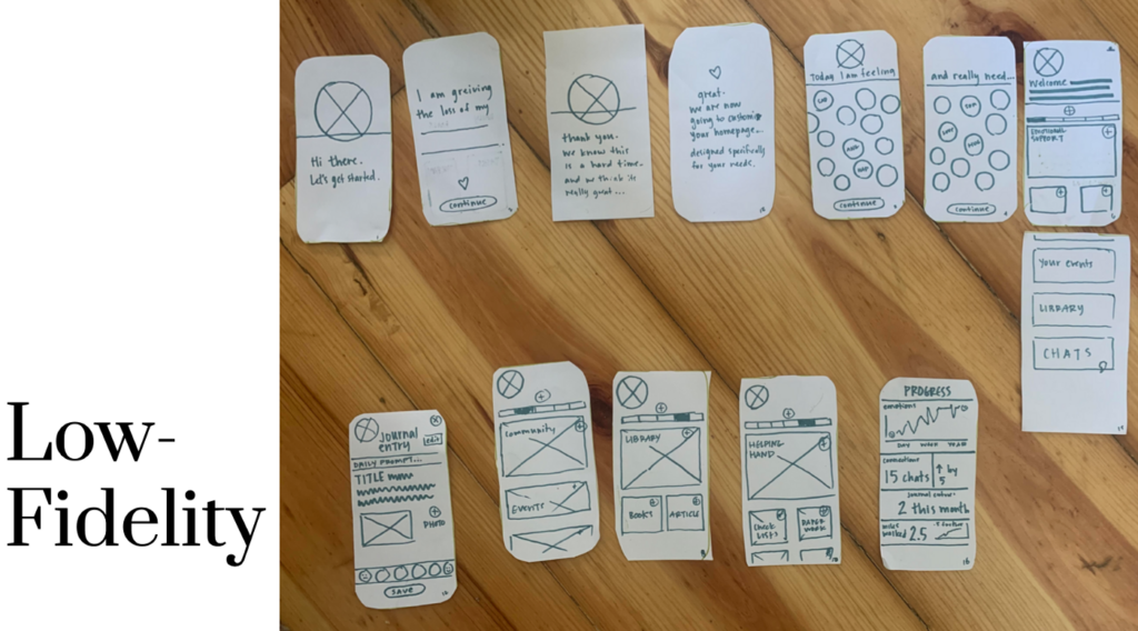
Testing The Wireframe
I tested 6 people to navigate my Wire Frame and to give me feedback on its functions and usability.
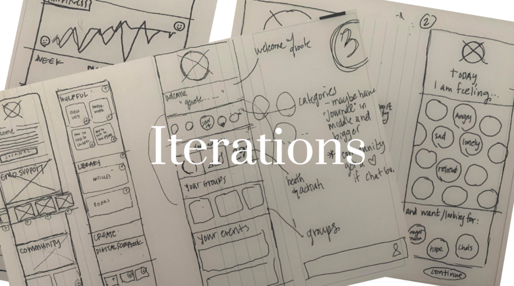
Second Ideation
For the second ideation, I gathered all user feedback from the first and edited the prototype accordingly:
- I changed the language, making the app’s tone softer;
- I remove a calendar allowing folks to schedule visits, as it seemed unnecessary;
- Decluttered the homepage, which was a bit overwhelming upon first iteration.
After these changes were made, I felt confident to start my Mid-Fidelity.
Mid Fidelity
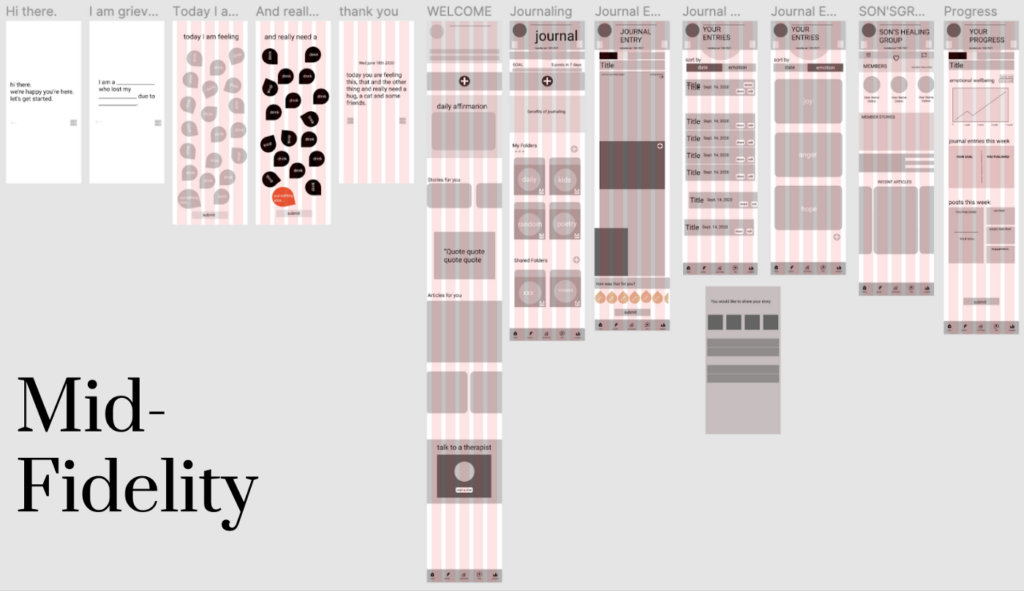
Third Ideation
For the third ideation, I gathered all user feedback from the second and edited the prototype accordingly:
- Created a more thorough onboarding process;
- A way to better record the user’s progress throughout the healing process.
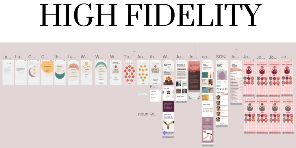
Fourth, But Not Least Ideation
Based on a bit more feedback after presenting my first High Fidelity, I ended up doing the following:
- Instead of “Radio Buttons” I added an actual button during the onboarding process. This made it easier for people with larger hands and more sensitive eyes.
- Since connecting with people was the most important niche to fill, users’ “GROUPS” should be at the top of the homepage.
- There should be a larger and more straightforward way for people to access their “To-Do” List, so I added those to the Homepage as well.
Here are the final prototypes of YOU GOT THIS. Enjoy!
Lessons and Learnings
- I learned that MVP is key to staying focused and to not create too many unnecessary pages.
- Keep iterating! Keep asking questions. The more you do, the better your end result will be.
Next Steps
I loved this project and certainly want to develop ways in which I can continue to help people during this process. I’d love to find a way to incorporate actual grief groups into this application and to see if YOU GOT THIS would be helpful for grief therapists to track their clients during thier grieving journeys.