Save
Good design in any discipline usually carries a structure of order and harmony. Since the Renaissance, artists and architects have used a strong understanding of proportions to create aesthetically pleasing architecture. Many of these classical design principles have followed us into modern times and can be found today in effective web design.
Take an A4 piece of paper for example. If you take it and halve it, the resulting size is A5 with the same exact proportions. No other proportion has the same properties. 16th century architect, Andrea Palladio knew this well. It is believed that because, fundamentally, most architects—like Palladio—use a similar system of proportions to plan and design spaces, buildings can look very different while remaining similar at their cores.
Structure and Beauty
It’s in human nature to seek an understanding of the nature of the things we see. Beauty is defined as a combination of qualities that pleases the mind and senses, and is often associated with properties such as harmony of form and proportion.
Vitruvius, the first known Roman Architect, offered three criterias for something being beautiful.
- It is pleasing to the eye.
- It is in good taste.
- It is well-proportioned.
Although many argue that the application of the golden ratio in Renaissance architecture, in particular the Parthenon, seems to be without foundation. It seems at the same time undeniable that even if the golden ratio was not used intentionally for the construction of this perfect Doric temple, the proportion of this structure was still influenced by proportions derived from nature and influenced by the human body.
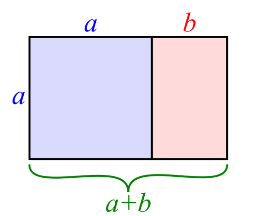
Also known as the Divine Proportion, the golden ratio is a mathematical concept that appears in some patterns in nature. Many architects and artists have employed the use of the golden ratio in their works, especially in the form of the golden rectangle, with the belief that it is what humans subconsciously find to be aesthetically pleasing.
Vitruvius believed in using proportions found in nature as well. The architect is famous for his theory of the Vitruvian man, which culminates understanding in the proportions of the human body. He believed that architecture is an imitation of nature. He used the human body as a standard of perfect measurement. Both ideas stem from the belief that there is a definite proportion that is pleasing because it appears in nature and we are programmed to be used to them.
Grid System in Architectural Planning
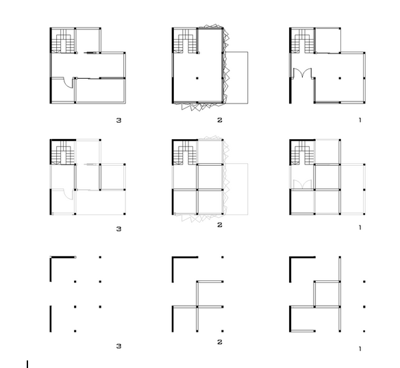
Often in their first year of architecture school, students are presented with the typical nine-square grid exercise. Not surprisingly, the nine-square grid was derived from Palladio’s geometry—all his villas were variations of three bay by three bay organizations in a nine-square grid. Students are encouraged to be creative with adding and arranging architectural elements albeit within a predetermined nine-square grid system. It was argued by Timothy Love that this grid format is the ideal geometric system for understanding the correlation between building components and their spatial qualities.
Plans for a house based on a nine-square grid
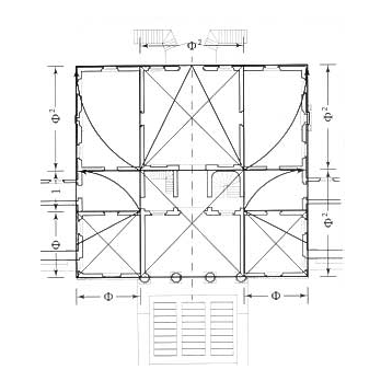
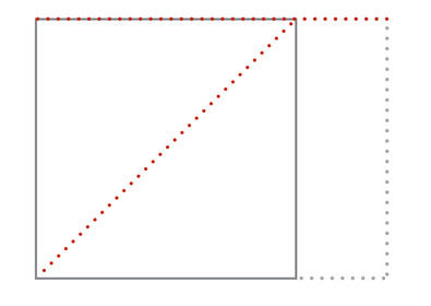
Most buildings follow a modular grid system to allow for structural efficiency and effective space planning. This grid system is not arbitrary. In Villa Emo by Andrea Palladio, one can clearly see that. To start building a room, the architect starts with a perfect square. He then draws a line from one corner of the room to its diagonal corner. Turn this line horizontal to make one side of the room, forming a longer wall and making the room a rectangle. This is a perfect demonstration of an application of the golden rectangle in architecture.
Think about it this way: the grid is much like syntax in language. It is a rigid established framework in which semantics can happen. Using a grid system like that is not only good for harmonious purposes but is also a useful tool for expressing design rules within a layout. On a smaller scale, using a grid allows for internal transformation. For example, a balcony established in the right grid can become a room. On a larger scale, using a grid allows for sensible and logical extension of the architecture. On an even larger scale, using a grid sets the rule for possible connections between buildings. All these happen on two folds: structural planning and spatial planning. Employing a simple grid following the rules of the golden rectangle allows for the above to happen. That is not to say that it is the absolute in architectural design. The tartan grid developed by John Habraken allows for a profound level of flexibility that bridges the limit of space utilization and physical limitation.
Taking These Proportions into Web Design
Some web designers obey the rules of the golden rectangle as well. Although not necessarily always mathematically accurate, visual principles are intuitively presented in a similar fashion on well designed web pages. So how does a designer apply these principles to a standard web page?
Consider the above diagram, using Palladio’s method of having the proportions of a room being 1 to the square root of 2. In a web page design, this could be divided as the main block for content and the smaller block for the sidebar. Interface objects could also be arranged and designed based on this diagram. Objects could be laid over the grid and scaled accordingly to achieve the same kind of harmony one could see in the Palladian villas.
It’s in human nature to seek an understanding of the nature of the things we see
The nine-square grid translates to the rule of third when it comes to digital design. This is said to be a simplified version of the golden ratio. Divide any image horizontally and vertically into thirds and one would get 9 grids. According to this rule, the vertices of the grid lines are points of interests. The human eye naturally notices visual elements placed near or on these points; it is also believed to be more comfortable to view. To arrange and organize smaller elements, it is possible to further divide the thirds into smaller thirds and so on.
Following the theory of rule of thirds can help designers direct their users’ attention with intention. The rule can help determine the placement of key elements on your website—be it banners, advertisements, key content, or social media icons. Applying this structure also results in a sense of harmony and order.
Moving Forward
Just like in architecture, the usage of the golden rectangle, golden ratio, or the rule of thirds is not necessary. This concept is suggested as a means to create sense of natural balance in design work. However, developing a grid system appropriate for your product’s web pages will not only help you create a consistent and logical visual structure, it’s also sustainable for further changes. You will thank yourself for employing grids when you have to plug in new design elements in the future.
Image of Parthenon courtesy Shutterstock.
Ling Lim
Ling Lim was an architectural designer in Singapore before she decided to pack her bags to explore her possibilities halfway across the world. She is now Head of Design & User Experience at a growing startup, myWebRoom, based in San Francisco. When she is not solving problems, she enjoys powerlifting and traveling.


