Save
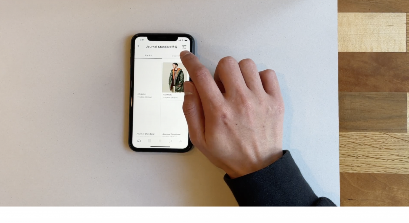
Of course, it would be ideal if we can prototype and test but if we are to make the deadline we need to start development now. Maybe next time.
I’ve heard this many times. Confession, I have even been in the position of saying it. But lately, I have been feeling that we don’t have time not to do usability testing.
In this post, I hope to show how it can save more time than it takes. That even 30 minutes can be enough to get started.
Usability or user testing may sound complicated. Like something reserved for big companies like Facebook or Google. I promise you though, usability testing can be done easily and by anyone.
If you already know what usability testing is, skip the next part and jump straight to the practical bit at the bottom. If not, let us start from the beginning.
What is usability testing?
According to Hotjar (a popular tracking product):
Usability testing is a method of testing the functionality of a website, app, or other digital product by observing real users as they attempt to complete tasks on it. The users are usually observed by researchers working for a business.
Usability testing can help prove if what you are building will work or not. It can even help show if it’s worth building in the first place.
Ideally, we start testing before we build and then test at various steps in the design and development process. We can test everything from conceptual flows to different UX writing (labels of buttons and so). Depending on the stage of design we may use different tools as Cassandra Naji has a good article about.
So when do we take the time for testing?
There is no time to not do usability tests
It can be very hard to get buy-in from managers to do testing. Usually, it comes at the end of the process when there is no time left.
But the same way bugs get more expensive the later they are found, issues with requirements or design are no different.
Finding a usability issue before building the functionality saves you both development, bug-finding and fixing time. So with that math, the sooner you can verify the usability the better. The more costly or important a feature is the more critical the need for testing.
I don’t remember where I saw, heard or read this the first time, but there is a saying going something like this:
If you can’t afford to do it right the first time, can you afford to it twice?
This is of course simplified but the point is, if we do something without thinking it through, chances are we need to redo it. This will cost us more time in the end.
With testing, it can feel like we’re building something twice. Once a prototype and once the real deal. The prototype, however, should be seen just as the first iteration. Built to learn and avoid big mistakes early on.
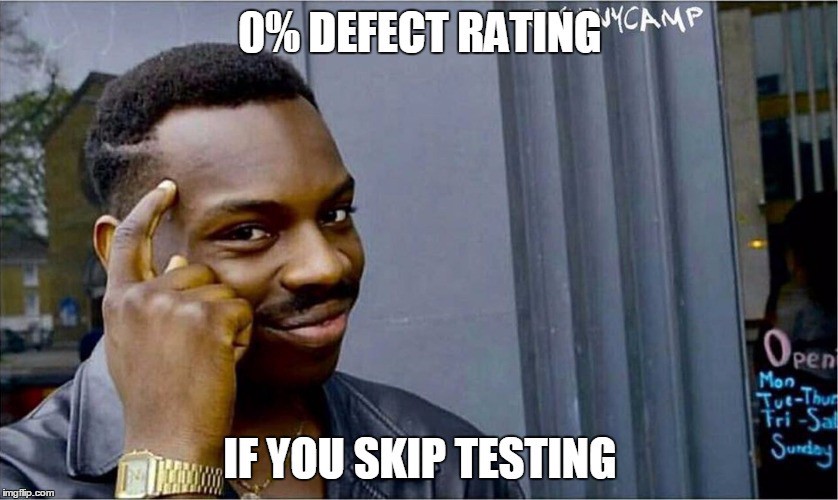
It doesn’t need to take long
You can for sure, spend lots of time on testing. The more you test the more confidence you will gain. But even running just a few 30 minutes tests you will learn a lot.
Having a real user interact with even the simplest paper prototype can save you weeks of development time. Sometimes you can find how what you thought was a critical feature can easily be solved some other way.
We can calculate that in Excel. What we really struggle with is…
Begin testing with 3 to 5 users (or around there). To get non-biased feedback you need to check overlap between different users but at some point, the overlap will begin repeating itself. After five users or so, you will gain more evidence for the same things rather than new insights.
As an example of how quickly, even with the test session, you can gain vital insights, I wrote an article a while back. This show how quickly your “brilliant” idea can get invalidated when coming in contact with users for the first time.
How to run a simple test
We have been running a few different types of tests in my current team. The actual thing we test with differs from time to time, but there is a general pattern:
- Define what we are testing and what we hope to see
- Prepare a prototype or the actual feature
- Explain to the user what we want them to do, often using a made-up user story
- Observe the user, asking them to explain and clarify as they use the product
Let’s dig into each step.
Defining the test goal
Begin by deciding what to test for. This has multiple benefits:
- It helps to focus flow and to get the feedback you are looking for as opposed to things you may already know about or not care about at this time.
- Setting the goal will also help you to see the process and what you are expecting.
I still do the mistake of jumping head first without thinking about the goal. This usually leads to mixed feedback which is harder to prioritize and sift through.
Preparing the prototype
When testing you don’t need to have a functional product. You can test with many levels of varying fidelity:
- Pen & paper roleplaying. Talking yourself or your team through a user story
- An interactive prototype (for example Figma)
- A minimal, sometimes mocked out, version of the feature in the actual app
- The completed feature in the actual app
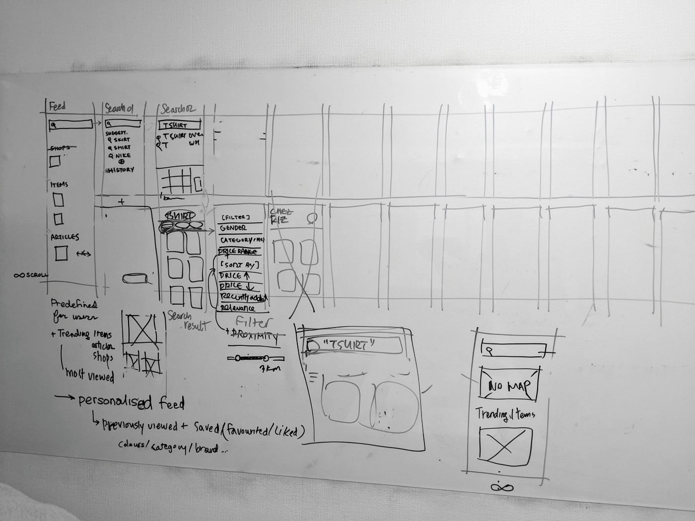
What approach you want to use depends on which stage we are in. It can also depend on how much time you have for testing and how critical the feature is.
Any new big feature could go through testing of all the four types above.
But it is really case-by-case. Sometimes it can be easier just to build the feature in the app and try it, other times you want to try it in Figma first.
We wanted to improve our zoom function for images. This is hard to do in a prototype as coding it in there is pretty much the same as doing it in the app. So we did! A few hours of development time and we could try it on real data. And in the end? We chose to keep it as is, the new change really didn’t improve it much.
We also use Firebase distro and Appsflight to distribute test versions of our app to people in the company. That way they can try it on production data, getting a real feel for how it works on their own device.
Explain to the user what we are testing for
The best kind of user is a user who has never seen your feature before. That way you can get completely unbiased and truthful feedback.
If you test with someone who has been involved in developing the feature the risk is that they are primed. This means that they will, even with the best intentions, shortcut issues that non-involved users might hit. This can be good sometimes but it also won’t give you a true picture of how an un-initiated user would use your feature.
That being said, you will want to guide the user. They will likely wonder if they are “doing it right” as they go through the test.
It’s important to reassure them that there is no way for them to make anything wrong. If something is hard to understand or they get stuck they should be encouraged to ask or explain their thoughts. This is exactly what you are looking for. If the feature is perfect they’ll accomplish the goal without any question, this seldom happens (in the first iteration at least).
Give the tester a goal to accomplish and any background info they might need to help narrow the test. Example:
Today we will be testing a change to our checkout flow. Imagine you are buying a new t-shirt. You can use this credit card and this address as your own. You don’t have to worry about which t-shirt you are picking as we will be focusing on the checkout today. Please think aloud as you tap through the screens.
Monitor
Finally, the actual test. Let the user walk through your use case and ask them to explain their thinking and their thoughts. Usually, the user quickly forgets about this or moves too fast. Sometimes this is ok, but ask them to slow down and explain what they are thinking. This is usually needed if they look lost and begin tap around aimlessly.
You will likely notice that they don’t tap where you thought they would and that they skip over instructional texts. These kind of things are exactly what you’re looking for.
At this stage, write up all observations. Don’t discuss them or analyse them there and then. Just take notes.
Ideally, you have a partner running the tests. Two pair of eyes will catch twice as much and sometimes different things. Another really good thing is to have one person take the notes and the other person leads the user.
Once all observations are in and you have run a few tests, you will see recurring themes.
Note that some users will struggle at some points and this does not mean that every single thing needs to be fixed. Also, if a user manages to find a functionality after tapping into the wrong area once, this doesn’t mean it’s horrible, after all, any new app is a learning experience and they will get it next time.
What we’ve learned in our tests
Let me share a few things that we have learned in our tests. Some things have saved potentially hours and hours of reworking user interfaces. Some were vital but quick wins:
- When testing our search functionality, we found new filters we had to add because users expected them to be there
- When testing how filtering items worked, we found that without guidance users couldn’t even find the button to filter
- When running a pen&paper roleplaying session on a collect-in-store feature, we found huge risks in the fundamental idea that we had to mitigate
Practical tips
To wrap up the above, here are a bunch of tips that have helped me make the general experience smoother:
- Pick your goal, what to test and what you hope to get out of it
- Pick your testers, try to test with new people every time but also check if your changes between iterations work with the same people as well
- Write up a flow of how you expect the user to go through the app, this helps set your expectation and also guide the user back if getting off track
- Make sure the prototype works before going to your test user, run through it yourself first (several times I’ve found lasts minute bugs or misses)
- Bring a backup device, too often the user’s own phone or PC won’t work
- If testing outside your office, make sure to have a backup internet device with wifi-hotspot
- Assure the user they cannot do anything wrong, it’s a test of the product or features not of them
- Document your tests, write up all tiny observations, if you don’t they will be forgotten soon after you leave the room
- Test with at least three users
- Take feedback and observations as what they are, observations. A single user not finding a button doesn’t mean the entire UX is broken
- Sit down afterwards and debrief with the others you tested together with, going through the observations and draw conclusions or new hypothesised
- Start simple, recording tests can be great for learning but it’s a plus, not a must
- Bundle up test, running 2–3 tests at a time. It gets the flow in and saves time in preparation
- Be really, really thankful to your user. They are making you a huge favour by giving you their time to figure out how best to serve them and all other customers
I can also recommend reading Designing for the Digital Age. It’s pretty heavy and slow but a great base reference for getting started on UX design.
Finally, to be even more practical, let me share an example test protocol document of a test round we did. It’s nothing fancy: Example of test protocol
Conclusion
I hope that reading all of the above helped inspire you to try this out rather than the opposite.
Even if you don’t follow all of the steps above, you can use it as a guide and give it a quick go. I promise that the first time you allow someone else to take the reigns of your app and you just watch, you will learn something.
Always improve the process and preparation every time you run a new test. That’s how I came to the above process.
The first time I ran it, I literally just sat down and asked “please try to do X”.
I hope this helps and if not please let me know in the comments, maybe I missed something or I can help out some way. Or maybe you have other tips you can share that worked for you, I’m all ears.
Thank you for reading!
David Dikman
Active reader, developer, manager, entrepreneur & sporadic writer here and at Greycastle. Currently working at Styler
- Taking the time to conduct usability testing allows to discover bugs at earlier stages and earn time to redesign some features.
- Usability testing doesn’t have to be long. Even 30 minutes might be enough to identify the most critical issues and save costs and development time.
- There are four main stages to follow to run a test: defining what should be tested, preparing a prototype, explaining to users what we want them to do, observing them.


