Save
More than a year ago I very proudly announced that Boxee, the much-loved social media center software company, had hired me as the user experience designer for their beta. In the five months that I worked with them, I conducted user interviews and usability testing to identify people’s needs, behaviors and frustrations, and redesigned the app’s navigation and key screens.
Earlier this month the Boxee beta was released, and the consensus so far is that the overall experience is a huge improvement over the alpha. While I have not been formally engaged with Boxee since May (such is the life of an independent consultant), I am incredibly pleased to see that many of my ideas were implemented and made all the better by Boxee’s small but outstanding team of visual designers and developers.
The Process
I conducted interviews with six prospective users (people who at the time had never used Boxee) and five existing users. I also performed usability testing with five existing users (three on their laptop and two on their home TV).
For the user research, I asked a boatload of questions about people’s media consumption habits and attitudes. Of the 11 people I interviewed, two people subscribed to basic cable without DVR, five people subscribed to digital cable with DVR, and four people did not subscribe to cable at all.
Everyone I interviewed watches TV and movies using their computers, at least in part; approximately half had substantial personally-stored media collections and almost all used streaming media online. All interviewees also consumed digital music and photographs to some degree.
These individuals all considered themselves tech savvy, but represented both ends of the spectrum: from tinkerers to zealots. While some were programmers, others worked in technology only tangentially as business analysts, writers, designers, and sales representatives. They also had varying use of social networking websites, Web applications, blogs, and other websites.
The questions I asked during my interviews are below.
User Interview Questions
- Tell me a bit about yourself. Where do you live? Where are you from? What do you do?
- What kind of computer do you have?
- What kind of TV do you have? What stuff do you have hooked up to your TV?
- Tell me about your TV watching habits. Cable? Satellite? How often? Where?
- Who do you usually watch TV with? How do you decide what to watch?
- What kinds of shows do you watch? Are there shows that you watch regularly? How do you remember to watch them?
- What are your movie watching habits?
- Do you watch movies on your computer? How? Where? When?
- Do you watch videos, movies or TV shows online? How? How often? Where?
- Do you subscribe to Netflix or similar? How do you use it?
- Do you use Hulu, YouTube or other online video sites?
- What is your personal movie collection like?
- Are you using any media centers now? Which ones? Experience with them?
- What is your personal music collection like?
- What are your music listening habits? How and where do you listen?
- Where do you find music?
- Do you listen to music on the Internet? Where?
- Have you ever played music at a party you were hosting? How? Where?
- Have you ever played music through your TV? What do you use? How do you navigate? Keyboard/remote
- What is your personal photo collection like?
- Where are your photos stored?
- What photo applications do you use?
- What photo sites do you use?
- Have you ever displayed your photos on your TV? How? What do you use? How do you navigate? Keyboard/remote
- What websites or blogs do you frequent?
- Do you comment on blogs? Review sites?
- Do you use Facebook? How?
- Other social networking sites? Twitter?
- Other Web apps?
Usability Testing
Not only did we want to get to know prospective target users of the Boxee application, but it was also important that we receive input on how existing users are currently using the system. To measure the ease of use of several areas of the Boxee experience, I conducted usability tests with five existing users: three of whom most regularly use Boxee on their TVs, and two who primarily use Boxee on their laptops.
The usability tests started with each user simply walking me through their typical usage scenarios, from launching Boxee, to finding a movie or TV show to watch, to scanning through their music. Then after approximately 30 minutes of this natural navigation and discussion, I asked each participant to perform a series of tasks. This helped to identify breakdowns in user flow, usability flaws and bugs, or generally any problematic areas in the experience.
The tasks were as follows:
- Start watching one of your favorite TV shows.
- You just realized that you’ve already seen this episode. Switch to the next episode.
- You’re done watching this show for now. Switch to another favorite TV show.
- Our friend is in an episode of Army Wives. Find it.
- Now you’re in the mood for some music. Play one of your favorite songs.
- Check out the latest episode of This American Life on NPR.
These usability tests resulted in a wide array of findings, and several themes emerged across participants. I have collected the most pervasive and significant areas of difficulty and have provided my recommendations on how to resolve the problem. The issues are organized by content area.
Personas and Scenarios
To aid in the design and development of the beta, I developed three personas derived from insights I learned in my research to depict Boxee’s target users; I called them a Practical Dad, a Techie Bachelor, and a Principled Fan. The personas do not reflect a single person, but rather are an amalgamation of various interviews. There is a lot of intellectual property captured in the personas so I will refrain from sharing them here.
I also developed a set of high-level scenarios to describe how each of the personas would interact with an ideal Boxee application. The scenarios helped us envision the right workflow, step-by-step, and allowed us to identify the key features necessary to meet users’ needs. A selection of the scenarios we aimed to support are:
- I want to see if a movie is available online
- I want to subscribe to a current season of a TV show
- I want to pick up where I left off in a movie or TV show
Features
From the scenarios I was able to draw out an extensive list of features across multiple areas of the app that would need to be implemented in order to meet our target users’ needs. Overall, we wanted to provide users with greater ability to discover content across sources, easier ways to sort and filter lists, and quick access to their favorite programming.
It was a long, long list, and not everything that ideally belongs in the app was realistic for our release schedule so we were forced to triage. We started first by prioritizing scenarios, and then marked each feature as Must Have, Should Have, Nice to Have, and Won’t Have. This helped focus the team on what we needed to tackle immediately.
Flows and Wireframes
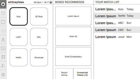
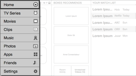
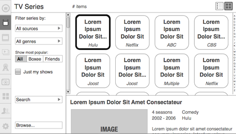
Now with the full set of features we were intending to implement, I set out to weave them together in an easy to use way that would make for a pleasurable experience. I drew flow diagrams to indicate how a user would navigate from screen to screen, and then created a series of wireframes of the key screens to recommend layout, prominence of features and content, necessary functionality and data display.
The Outcome
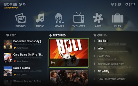
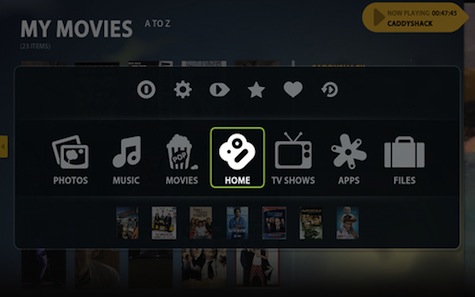
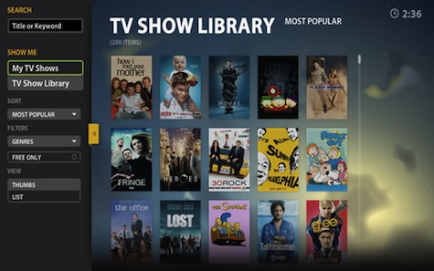
Take a look at some of the key screens of the app below, and see how my wireframes laid the groundwork for the beta’s redesign.
Home Screen
Navigation
TV Shows
In the Press
Ars Technica
1/13/2010
“The program’s user interface has undergone a significant transformation that simplifies navigation and makes Internet content easier to access.”
TechCrunch
1/07/2010
“The new version is really a complete overhaul of the app — it’s received a new, sexier UI that makes it easier to browse through the service’s content (and anything you might have saved locally too).”
Mashable
1/07/2010
“The UI overhaul is significantly better…”
Wired
12/31/2009
“Yes, there are many methods for putting web video on your TV, but Boxee is the most elegant solution I’ve seen. For the beta release, the whole user experience has undergone a slick redesign.”
CNET News
12/09/2009
“…new beta has a completely redone interface that is far superior to the alpha’s.”
Lifehacker
12/07/2009
“From the outset, it looks a whole lot more pretty and user friendly.”
Gizmodo
12/07/2009
“What looked impressive during the demo was how cleanly it aggregated both local and online sources of video content.”
Engadget
12/07/2009
“We’re particularly fond of the new global menu for quick shuffling through the menu and to shortcuts.”
What Do You Think?
If you’re a Boxee user, I would love to hear your thoughts on the beta. Praise, criticisms, and questions are all welcome.
Whitney Hess
Whitney Hess is a user experience design consultant based in New York City. She helps make stuff easy and pleasurable to use. Prior to going independent, Whitney was on the design team at Liquidnet, an international financial software company that runs the leading electronic marketplace for wholesale stock-trading. Previously, she was an interaction designer at two marketing agencies, Digitas, and Tribal DDB, where her clients included American Express, The New York Times, Allstate, Claritin, Tropicana, and EarthLink. Most notably, she helped to conceive, design, and test an innovative card search tool for American Express, and is named as a co-inventor on its U.S. patent.
Whitney is a strategic partner with Happy Cog and user experience consultant for Boxee, among other startups and major corporations. She received a Bachelor of Arts in Professional Writing and a Master’s degree in Human-Computer Interaction from Carnegie Mellon University. She writes about improving the human experience on her blog, Pleasure and Pain and can be reached via Twitter @whitneyhess.


