Save
When the iPad first came out, many industry pundits were quick to make comparisons: It’s a giant iPhone! It’s twice as heavy as the Kindle! It’s an inferior laptop! The first crop of iPad applications didn’t fare much better. Design gurus slammed them for not taking full advantage of the new medium. Usability experts slammed them for taking designs too far from established usability conventions. What did they expect? These early app designers had a handful of Apple-designed apps to draw inspiration from and a rough set of design guidelines. Moreover, they had only a few weeks to go from ideation to production.
If you believed all the negative analyses in the early days, you would have thought the iPad would’ve been a complete failure. But that hasn’t been the case at all. In Apple’s last earnings call, Steve Jobs revealed that the company sold 4.19 million iPads in the 2010 fourth quarter alone! And following today’s announcement of the iPad 2, Apple must be doing something right.
Sure, things could be better, but many apps actually improve upon the status quo. In particular, there have been some innovative approaches to discoverability—the ability for users to locate something they need to complete a certain task. While discoverability can still be improved in many applications, the strategies in this article may be a helpful starting point for iPad and other tablet designers.
Leverage Mental Models
Designers who successfully leverage mental models—an individual’s understanding of how something works—make it easier for their users to discover app features and functionality. For example, most iPad eReader apps use the mental model of the physical book. There are no navigation buttons, but the book’s graduated edge suggests that page turning is possible. This is more intuitive than the explicit “Next” and “Previous” links found on most web pages, and the target sizes are far more forgiving, which is critical in touchscreen design.
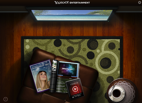
But don’t forget that mental models can be taken too literally. Remember the Yahoo! Entertainment app?
Exploit Physical Characteristics
Certain types of content may have physical characteristics that can aid in discoverability. These characteristics may be grounded in real world physics (e.g., we expect a sphere to spin) or abstractions conceived by the designer. To illustrate, the Pennant app uses a variation of Apple’s cover flow design pattern to browse baseball teams, which are represented as cards. Instead of showing “more” buttons or arrows, the names on the far right and left are truncated to indicate that additional content is available.
Spring Into Action
One surefire way to make a feature discoverable is to bring it to life via animation. Before I go any further, there’s one caveat: if animation is overdone it can confuse users and make it unclear exactly where to focus. But when subtle animations are strategically introduced, they can help reveal features and teach users how to interact with them.
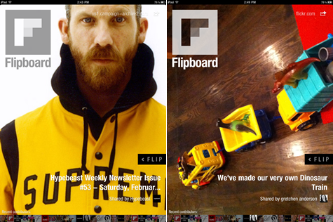
Consider the Flipboard iPad app. When you open the app, there’s an inviting slideshow with captions in the lower right. Just above the caption is a little black bar with animating “< FLIP” text. This modest animation introduces the app’s primary interaction in an elegant, unobtrusive way.
Provide Sneak Peeks
Even the most basic iPad apps have both primary and secondary tasks, e.g., the primary task on an eReader is to read the text and secondary tasks may include adjusting brightness, type size, and so on. Instead of making primary and secondary functionality equally discoverable at all times, an effective strategy is to provide sneak peeks into the secondary functionality. Not only does this allow the user to focus on the primary task, but it may make it easier for designers to make optimal use of the limited screen real estate. For example, the SketchBook Pro app displays the sketching tool bar when users first open the app, but hides it once they’ve made a selection. Tapping at the top of the screen brings the tools back into view.
Just-in-Time Features
Making features discoverable doesn’t mean they have to be visible at all times. Another option is to anticipate when users will need a particular feature and display it at that time. To illustrate, take a look at the Pulse application. When the user reaches the end of an article, the navigation bar is maximized, providing access to other articles in that section. If Pulse were to show the navigation bar at all times it would clutter the interface, but more important, the user probably doesn’t need to see all the other articles while they are reading. It’s worth noting that Pulse doesn’t prevent users from accessing the navigation bar while reading; they can always reveal the navigation by tapping on the small black tabs.
Spell It Out
Making all features reasonably discoverable can be challenging if the app scope is broad or if the app introduces new interaction approaches. For example, the Keynote iPad app created a multi-hand gesture for moving a group of slides within a presentation. Given that multi-hand gestures are still relatively new, it’s worthwhile to highlight this feature in the Getting Started and Help docs. These tips don’t have to be limited to static images and text. Some of the more successful iPad help tools include video, overlays, and interactive content.
Summary
Improving discoverability within applications has been a challenge ever since the early GUI days. Back then, designers agonized over whether to redo the layout, make the buttons bigger, or bold the text. These design problems haven’t gone away, but devices like the iPad give designers a whole new set of tools to tackle discoverability challenges. This doesn’t mean designs have to be overcomplicated. In fact, the technology can help create designs that are more simple, elegant, and usable.
References
- The Myth of Discoverability, Scott Berkun
- Designing for iPad: Reality Check, Oliver Reichenstein
- Usability of iPad Apps and Websites, Raluca Budiu and Jakob Nielsen
Suzanne Ginsburg is a user experience consultant based in San Francisco, California, and the author of Designing the iPhone User Experience. She works with many different kinds of organizations, from established technology companies to small iPhone start-ups. Suzanne also maintains a UX blog, Touchy Talk, where she provides advice on touchscreen app design. If you’d like to stay in touch with Suzanne, follow her on Twitter @suzanneginsburg.


