
A television commercial recently caught my attention. It wasn’t anything extravagant, just a simple promotion for a protein shake. However, as I watched, I couldn’t help but notice a few graphical inconsistencies from my perspective.
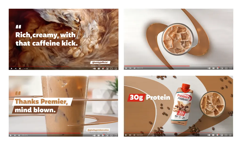
One scene showcased authentic peanut butter and chocolate swirls, followed by beveled and embossed three-dimensional graphics, finishing with similar but flat two-dimensional elements. Upon further investigation, I believe the three-dimensional graphics were intended to depict their logo. Nonetheless, the animation as a whole felt somewhat haphazard.
I couldn’t hunt down the specific commercial in question, but I did find a YouTube video for their Cafe Latte flavored shake utilizing similar graphical elements:
In truth, the commercial’s design was okay — it simply got me thinking. Regardless of my or others’ opinions on the graphics, the encounter made me contemplate how designers can often be our worst critics. Our externalized judgment, viewed through our individual lenses, sometimes exposes our arrogance and self-importance.
We sometimes overlook that we’re not designing for other designers. Our responsibilities begin and end with the needs of our clients and the audiences who engage with our designs.
Make It Pop!
Often, designers obsess over perfection in all the wrong places. We become preoccupied with superficial elements such as graphical treatments, typefaces, and trendy styles, losing sight of what truly matters about design: communication.
Perhaps the protein shake commercial had inconsistent graphics in my opinion. However, the critical factor is the communication of content and how it resonates with the target audience. If some semblance of brand continuity exists and the customers and clients are happy with the result, why does it matter what we designers think?
In fact, my experience has taught me that non-designers typically enjoy graphics we designers loathe, such as bevel and embossing and crude three-dimensional animations. And I’ve worked with enough client-made PowerPoint documents, Photoshop files, and web templates to support this theory.
In the case of the protein shake company, I would wager that some internal stakeholders may have suggested adding something to “make it pop”. Cue the cringe.
Clients and similar individuals often have a preference for eye-catching and elaborate graphics. Interestingly, when they request something simple and clean, they often desire a replication of another company’s branding. On multiple occasions, I have encountered the question, “Can you design it to look like Apple’s website?” As if Apple’s design has nothing to do with the entire company persona.
The stark contrast in perception between designers and the general population brings to mind Arby’s logo debacle, which serves as a prime example of this disparity.
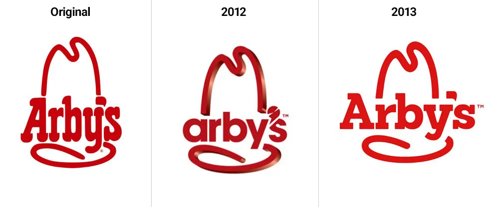
In 2012, Arby’s unveiled a new logo featuring a glossy three-dimensional hat, flat-designed lowercase text, and a peculiar comma shape. Not surprisingly, the new logo received negative reactions, prompting an update only a year later. The newly updated logo embraced a flat design with bold red lettering reminiscent of the chain’s original design.
However, I would venture to say that most of the critiques of Arby’s logo likely originated from designers, people who think they’re
designers, and individuals with too much free time on their hands.
Additionally, I would argue that the company executives likely influenced the 2012 logo update.
I may regret expressing this statement, but if the logo had been as dreadful as suggested (putting aside its production and scalability issues), it would not have seen the light of day.
Arby’ is a sizeable corporate food chain, so imagine how many executives, marketers, and internal stakeholders signed off on that 2012 logo update. And you can bet many of those folks thought it was excellent — although they may not admit it now.
So maybe the logo wasn’t as bad as we made it out to be? I can’t believe I would think that, let alone write it. But the truth is designers’ tastes differ from those of the general population. Yet the irony is we typically design for the general public, not designers.
Nobody Important Cares
The purpose of sharing a mundane protein shake commercial and horrid fast food logo is not to criticize them but to highlight that nobody, at least those who matter, gives a shit about the perfection of our designs to the degree we care.
In my experience, the general public, especially clients, typically cannot discern between mediocre and exceptional designs. Hence why they hire us to begin with.
Don’t get me wrong, some clients and stakeholders eagerly point out every mistake we make, acting as pixel-perfect police. However, for the most part, clients, stakeholders, and even customers have little understanding of what constitutes exceptional design.
I’m not suggesting we should be aiming for mediocre. But we should spend more time focusing on the purpose and essence of our designs rather than obsessing over subjective aesthetics, self-appointed standards, and concerning ourselves with what other designers think.
Ultimately, you will get burnt spending energy crafting designs that solve a problem that the target audience cares nothing about.
In the UX industry, we have learned that usability is valued more than just superficial aesthetics. So, instead of obsessing over minor details such as the depth of a shadow or the use of a gradient, we should prioritize design factors such as readability or hierarchy. By doing so, we can create designs that truly enhance the user experience.
Suffering Losses
You may ask yourself, what’s the harm of wanting flawless and exceptional designs? And that’s a valid question. After all, excellent design is the benchmark of superior skills and establishes community bragging rights.
The problem is most designers do not work in a vacuum. We interact with clients, customers, and designers every day. These connections are vital if we want to succeed at our job. I would even argue our ability to manage good relationships is more important than our design skills.
Many years ago, as a young Art Director, I was obsessed with design perfection. I would badmouth clients’ and stakeholders who disagreed with my designs and ignored external suggestions from fellow designers. I was a cocky designer, driven by ego and overconfidence.
The most regretful aspect of that period in my career was how I interacted with the designers I was mentoring. I became excessively involved, constantly scrutinizing their work and insisting on design modifications. It reached a point where I would even take over and redesign things because I didn’t think they were “correct.”
During that period, I was especially harsh towards a particular designer. She was someone I was mentoring and happened to be one of the initial employees under my management. She possessed exceptional design skills, but my relentless pursuit of perfection and insistence on things being done a certain way ultimately led to her resignation.
I felt responsible for her departure. Reflecting back on my behavior, I feel ashamed. I learned a lot from that experience. I should have been more encouraging and communicated better. But more importantly, I should not have placed design perfection above a human relationship.
Becoming a Mature Designer
Mature designers can detach themselves from personal preferences and judge design on fundamental merits such as design principles, usability, and overall objectives. They also understand the importance of collaboration and open-mindedness. And possess the humility to accept when a design doesn’t work based on grounded reason instead of clinging to personal biases or preferences.
Furthermore, designers with maturity are skilled in handling criticism turning it into constructive feedback for improvement. They also value the power of diversity in design, understanding that a broader perspective leads to richer, more innovative designs.
Most importantly, they prioritize empathy for those they work with and the users who interact with their designs.
Conclusion
As designers, we must strike a balance between perfection and purpose. While we shouldn’t settle for mediocrity, we should prioritize the essence and purpose of our designs over our personal standards. Our energy is better spent crafting designs that effectively solve problems and resonate with the audience.
Moreover, as mature designers, we must value collaboration, diversity of perspectives, and empathy for others. When we put designs before people, we lose sight of what’s truly important in life.
This article was originally published on Medium.