Save
I’ve often wondered why some of the most innovative companies in the product design world are afraid of deviating from standard conventions when it comes to web design. The conclusion I’ve come to, after interviewing several clients, is that they don’t understand what makes a convention standard in the first place. In fact, many don’t seem to understand what a “convention” is.
I’ve been asked questions like “Is it a standard convention to include share buttons on blog posts?” to which I answer, “Why do you want people to share your blog posts? Do you measure success based on shares or views?” The reason I am often answering a question with a question is because the client’s question isn’t about conventions at all; it’s about strategy and looks to a larger customer journey. What the client is really asking is: Are we publishing content that we want users to share? If so, are we making it easy for users to share?
There are a few leading conventions regarding placement and the types of sharing buttons that are used. But the hypothetical client actually hits on an important differentiation between a convention and an experience: conventions are established to help users through an experience, and an experience is designed to achieve goals.
The reason I like to separate convention selection from experience design (or journey planning) is that clients are sometimes timid in straying from standard conventions, but still want forward thinking, insights, and innovation to be applied to experience design. Pushing the boundaries in experience design often requires the use of standard conventions to ensure the experience is usable, familiar, and understandable.
What is a Convention?
A convention is a way of approaching something. In UX circles, conventions are established over time by monitoring usage and mapping usage data back to goal completion. The more people who are able to successfully complete goals using the established conventions, the more likely those conventions will be used in the future.
The Value of Standardized Conventions
Conventions that get utilized frequently and become familiar to users are known as standard conventions. Some people think standard conventions have to look the same, but I think they just have to utilize the same mental model. This is where a lot of UX professionals, and their clients, get tripped-up.
UX professionals tend to rely on established conventions in order to help users through an experience. Users that are dumped into a website will be looking for familiar elements to interact with. If users get confused during an experience, they will look for standard conventions for guidance. Users often have to understand many different elements and how they work together quickly. If a user isn’t able to understand the conventions used within a couple seconds, statistics show they’re likely to leave.
I think there are three categories of UX conventions every designer should be familiar with:
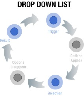
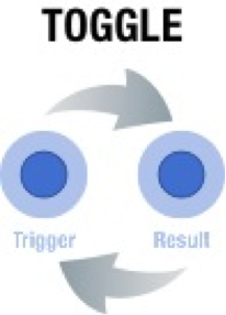
- Interaction Design Conventions: These are models that govern interactions. Interactions tend to align with the mental models users go through when engaging with certain interactive elements, like toggle and drop down lists.
- Information Architecture Conventions: These are models that govern layout, categorization, and flow. Many visual designers like to innovate around IA conventions—things like a big floating shopping cart menu that hugs the bottom of the browser, or a single page checkout. Although I don’t necessarily think it’s a bad idea to come up with innovative alternatives to established IA conventions, they should support an innovative experience and not just be used to win design awards or look pretty in a portfolio.
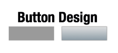
- Visual Design Conventions: These are models that govern the look and feel. These aren’t visual design choices that an art director would make; they’re things that have shown to improve usability. For example, buttons should have a slight gradient, shadow, or hover state to ensure users know they’re clickable. Same thing with links, the blue text color with an underline is the standard visual cue for a link. Obviously, this can be stylized, but the more stylized it is, the less apparent the link will be to the user.


It’s important to familiarize yourself with standard conventions. If you deviate from a standard, make it a conscious choice and ensure that you have a reason and rationale. I firmly believe that finding innovative ways of using standard conventions is essential for creating the best experiences. Conventions are sort of like micro-experiences in their own right; but what I’m suggesting is using standard conventions to anchor an innovative experience. Focus on innovating the elements that make up the experience (flow, navigation design, content, etc.) but use standard conventions to ensure the experience is understandable and usable.
Innovate Experiences
So, if I’m suggesting that you utilize standard conventions when possible, does that mean I’m not innovative? Not at all, I’m a big advocate for innovation— my risk threshold for innovation is higher than many of my colleagues. That said, I think innovation should be applied to an entire experience in order to better achieve goals. This method of innovation is completely measurable against established KPIs.
There are two parts to creating an innovative experience.
- Developing a deep understanding of your target market: In order to achieve successful innovation, it’s necessary to develop a deep understanding of what your target market is used to interacting with, what they like, and why they like what they like. This background research will help inform your short-list of potential models that could be used to achieve strategic goals.
- Selecting the optimal model to achieve strategic goals: Once you have narrowed down the potential models you can utilize contextually, you can select which model will achieve the best possible results. Here’s a great article that outlines the difference between innovation and optimization. Optimization is about making the current model work better; innovation is about selecting the right model. Innovation, like UX in general, can deal with granular elements or larger cross-channel experiences. Innovations can be small, like turning a button into a slider, or big, like integrating social media with an e-com experience.
Convincing Clients Innovation is Right
If you approach a project by focusing on where existing models break down, many clients will understand that a certain level of innovation is required to improve performance of KPI’s. The challenge will be to figure out where that client’s threshold for change is. The most effective method I’ve used to find this threshold has been to provide a few options with pros and cons.
I’ve participated in dozens of pitches in my career, and the most successful ones that result in long-term revenue and happiness all approach the pitch with A) user insights, B) possible models, and C) a visual design illustrating a possibility. It’s key to present insights and models up front to ensure that creative doesn’t become the only thing that’s being evaluated post-pitch. Keep in mind, many pitches don’t allow for stakeholder interviews prior to the pitch. This means that there’s a often a lot of guess-work involved with many pitches. I’ve found it to be more effective to focus on possible flows and extensions using experience mapping than to try to sell polished creative
The easiest approach to selling innovation is to:
- Start with an innovative strategy. If this can be sold through user research, existing data, and other hard evidence, the project will be off to a good start.
- Break down the business requirements into a series of user stories or user flows. These should align with the overarching strategy, and should include innovative options with rationale.
- Prioritize user flows (or stories) and map them back to a thoughtful content strategy.
- Create a set of wireframes or a prototype that only innovates to help achieve business goals more effectively.
- Highlight standard conventions throughout the experience. This tends to put clients at ease when trying to wrap their minds around a particularly innovative experience.
Note: This is still a proven method for achieving optimal results when working on briefed projects too. Some of the biggest digital agencies in the world utilize the process of showing selected models as options. The most effective time to collaborate on model options is during the planning phase of the project. They can usually be presented as sketches, flows, or wires at this stage; rather than full creative.
Conclusion
It can be challenging to innovate online. Not only is user research, testing, and critical thinking required for successful innovation, having the sales skills to convince a client innovation is the best course of action is key to turning simple creativity into innovation. The easiest way to evangelize innovation is to rely on standard conventions for familiarity, and innovate the experience around those conventions.
Lightbulb image courtesy Shutterstock
Jordan Julien
Jordan Julien is an independent consultant working in the Toronto area, specializing in experience strategy. He's worked with brands like Coke, Nike, BMW, Dove, Canadian Tire, Kraft, Telus, P&G, and Diageo. He's worked with agencies like Critical Mass, Razorfish, W+K, TAXI, Trapeze, Ogilvy One, and Capital C. You can follow Jordan on Twitter, or though his blog.


