Pinterest has skyrocketed to the number three position among all social networks in terms of traffic, and although the site is being compared to Facebook and Twitter, its user experience design is actually far superior to those larger networks in terms of its potential to drive social commerce.
The Advent of Social Commerce
When Facebook hit half a billion registered users in July, 2010, industry observers—including myself—were proclaiming the advent of social commerce. I blogged about the first Facebook stores, and the impending rise of the digital community mall. However, as I interviewed customers about social commerce on behalf of my retail clients, they were surprisingly reluctant to “Like” individual products on Facebook and share them with their friends—even the plugged-in Millennials. Their reasoning: “I don’t want to annoy my friends by sending product placements, and I find it annoying when I receive them.”
Despite its massiveness, and despite all the energy and resources poured into social commerce, Facebook has not delivered the goods. Not yet, anyway. Nobody wants to be the guy showing up in the midst of a group of socially connected friends to shout, “Hey, anybody want 10% off on teeth whitening? How about a sweet timeshare in South Beach?”
It doesn’t work. The wires are there, but the context is wrong.
Then along came Pinterest, bursting onto the scene with exponential growth and a new approach to sharing online content. According to Experian Hitwise, Pinterest had 21.5 million visits during the week ending January 28, 2012, about 30 times more than it had received just six months prior. As I already mentioned, it’s now the number three social network, behind Twitter and Facebook. However, Pinterest isn’t just one of the fastest-growing social networks, it also does something crucial that other sites haven’t been able to do: It drives social traffic to online retailers. A recent Shareaholic study showed that Pinterest accounted for 3.6% of referral traffic in January, outpacing Google Plus, YouTube, and LinkedIn combined.
Pinterest Takeover
According to a study by BlogHer that polled over 2,000 women, Pinterest has overtaken Twitter in some key social commerce indices: finding product information ( Pinterest’s 26% vs. Twitter’s 18%), finding out about new products (39% Pinterest, 39%; Twitter, 24%) and seeking advice and recommendations (30% vs. 29% respectively). Plus, Pinterest is a much younger social network, so the gap could widen substantially this year.
But the numbers are only part of the story, and in my mind, not the most important part. Pinterest’s user experience has captured my attention. The communication experience that Pinterest supports sets it apart dramatically from its competitors.
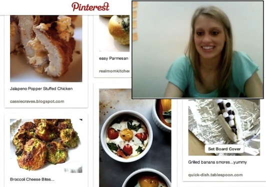
Being a middle-aged male, I’m hardly representative of Pinterest’s core user base. To help me get a better understanding of what makes the Pinterest user experience so engaging, I recruited Courtney—an account coordinator for Retail UX, and a Millennial female—to give me a tour of Pinterest from her perspective as an avid user.
To say that Courtney was enthusiastic about the task is an understatement; she was beaming. This confirmed my sense that the Pinterest user experience has managed to strike a chord deep within the psyche of its users. What’s so magical about it? After Courtney’s extensive Pinterest tour, I came up with seven reasons why the Pinterest user experience will outperform its social commerce competitors:
- It’s About Stuff
- It’s Simple
- It’s Social
- It’s Personal
- It’s Beautiful
- It’s Functional
- It’s Mobile
Let’s explore these traits.
It’s About Stuff
Facebook is about relationships. The implication of being friends on Facebook (or connections on Linked In for that matter) is that there is a relationship already in place, or that a relationship could be desirable in the future. Pinterest, on the other hand, unabashedly serves up a seemingly endless stream of desirable objects. Sure, there are some puppies and celebrities, but there are many, many images of products that you can buy or dream about buying.
While Pinterest does a superb job of highlighting desirable objects, it somehow avoids the stigma of being crass or commercial. The comments in Pinterest state, in thousands of different ways, something similar to: “This makes me happy, and I want to share it with you.” The association of products with intense positive emotions has been the dream of marketers since the golden days of the 1950s. And now, in a time of rapid decline of traditional marketing approaches and venues, consumers are themselves making those associations, using the Pinterest user experience as their preferred channel of expression. When Pinterest users share their favorite products, it seems natural … expected. By contrast, attempts by Facebook to introduce commerce have seemed suspect, out of place, or even invasive.
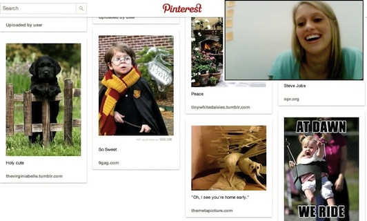
The design of Pinterest pages makes it easy to scan hundreds of Pins in a matter of seconds. During lunch today, I was about to do a Google search on ceviche recipes, but instead went to Pinterest and typed ceviche into the search field. I scanned about a hundred images of ceviche recipes in under a minute to find the one that looked the most appealing . The ability to scan a content index visually, and then click to the original content, makes Pinterest an invaluable search tool. Still, a ceviche photo in Pinterest has been pinned because it leads to a good recipe. The site is not as valuable for items that can’t be easily evaluated by their visual attributes, like digital cameras.
It’s Simple
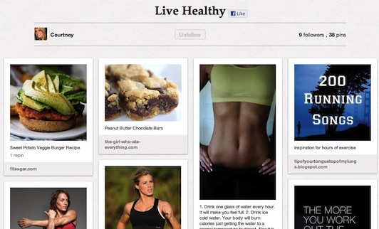
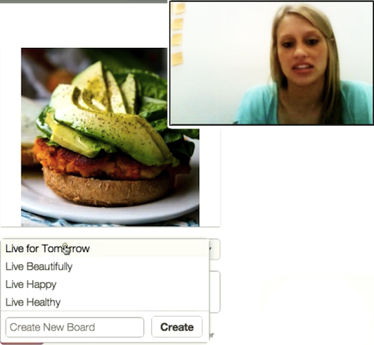
The structure of Pinterest couldn’t be much simpler. The hierarchy from top to bottom is: User, Pin Board, Pin. Every user, or Pinner, creates one or more Pin Boards that they name. My tour guide, Courtney, has created four Pin Boards: Live Healthy, Live Beautifully, Live for Tomorrow, Live Happy. They ooze positive energy.
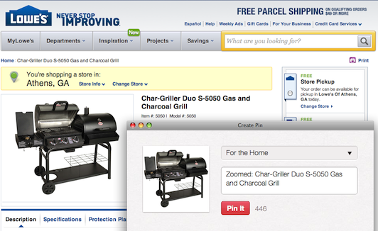
Users populate their Pin Boards with Pins. A Pin consists of a photo, along with a caption that can be edited by the Pinner. A user who views a Pin they like anywhere within Pinterest can, with two clicks, pin it to any of their existing Pin Boards, or to a new one that they create on the fly. More importantly, Pinners who have added the Pinit button to their browser can pin any image on any web site to one of their Pin Boards, with a link back to the original source. This utter simplicity of universal content curation is catapulting Pinterest to the forefront of social commerce.
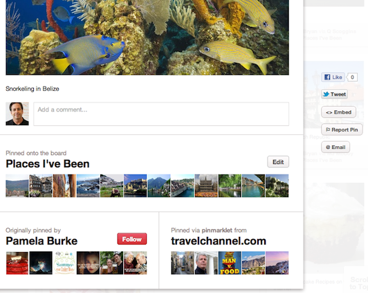
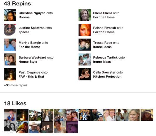
Clicking a Pin brings up a larger image in a modal overlay, along with the Pin’s metadata: the original Pinner, the original content source, user comments, and photos of people who have pinned it, liked it, or commented on it. In this modal you can:
- Repin to one of your own boards
- Like it via Pinterest
- Follow the original pinner
- Open the original content piece (by clicking the image)
- Like it via Facebook
- Tweet it
- Embed it
- Email it
- Report it as inappropriate
These options illustrate how fluid the user experience on Pinterest is. Once you have identified something you like, you can share it in many directions with just a click. Courtney explained the dissociated state of the Pin this way: “Think of a Pin as floating in space. Each picture has its own community. It gets tagged with whoever has pinned it and whoever has commented on it.”
Clicking the larger Pin image takes you to source URL with the original content. This link back to the original content source is what makes Pinterest different from some sort of online scrapbook. It is a visually rich directory of what users have highlighted for beauty, desirability, entertainment value, or usefulness. That’s pretty much all there is to the Pinterest user experience hierarchy: Pinners, Pin Boards, and Pins. Pins are the atomic units of content shared among Pinners, and they are organized into Pin Boards.
It’s Social
The social network of Pinterest centers on Pins, of course. When two people pin the same image to their Pin Boards, they become associated with one another in the metadata of that Pin. People who Like the Pin (Pinterest Like; not Facebook Like) also appear together in the community of that Pin.
There are several ways to find Pins that you would like to add to your Pin Boards. You can click the Everything link at the top of the page, and then select one of the predefined categories (Architecture, Art, etc.). This brings up a wall of Pins that have been tagged by users as belonging to that category. You can also use the search feature to locate Pins with a word or phrase in its description. Or you can search on a person’s name, and if they have an account, you can view their Pin Boards and drill in to see their Pins.
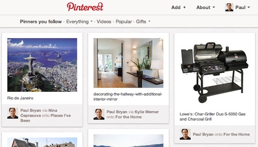
When you find someone whose Pins resonate with your own tastes, along some dimension of interest (beauty, humor, hobby, etc.), you can subscribe to their Pins—either one of their individual Pin Boards or all of their Pin Boards. It works like an RSS feed. Whenever they post a Pin to the Pin Boards you are following, it appears in your account under your followers. When you click the Pinners You Follow link, you see all the Pins of people you follow, in reverse chronological order.
This is where the social aspect of Pinterest diverges dramatically from Facebook and other social networks. First of all, the connection is based on similar tastes, aesthetic sensibilities, hobbies, senses of humor, product interests, etc. How many of your Facebook friends have tastes similar enough to yours that you would want to see everything they think is Pin-worthy in a particular category? When people are brought together on Pinterest, it is a bond over like-minded passions, which may or may not be true of the everyday relationships you have formed.
Secondly, the social connections you make on Pinterest center primarily on objects portrayed in images in which you have a shared interest. Pinterest spreads excitement about products in a context that engenders shared enthusiasm. This is not true of most other social networks (there are some exceptions, most notably among electronics and cars).
Of course, Pinterest can be social in more standard ways as well. You can integrate your Pinterest account with Facebook and Twitter, so that those networks broadcast your Pin activity. But if you look at the counts of these activities compared to Repins and Pinterest Likes, they are decidedly in the minority.
It’s Personal
When I joined Pinterest, I was practically forced to follow some strangers’ Pins—one of the few things I didn’t like about the experience. When their Pins appeared in my account, I thought, “I don’t like those images. They don’t represent me at all!” So I deleted them all and began searching for Pinners who had core sensibilities that resonated with my tastes. This experience revealed that I automatically associated what appeared in my Pinterest account with my identity, my personality, what I like. I have never felt that way about my Facebook account. On LinkedIn, I have taken a lot of time to make my account reflect my professional focus and experience, but that’s a layer of abstraction away from what interests me on a personal level.
Pinterest touches the soul in a way that other social networks don’t. Courtney explains it like this: “It’s very dear to your heart—very personal. Facebook is just a profile. You don’t want to put yourself out there on Facebook. If there was another way to share pictures, I wouldn’t even use Facebook.”
It’s Beautiful
Put simply, the centrality of images as the primary form of connecting on Pinterest has led to a focus on beautiful things. This is vastly different from Facebook, where images are typically linked to personal activity. Scanning a Pinterest page reveals intense energy devoted to uncovering things that are first and foremost delightful visually.
The landing page of Pinterest is full of beautiful images, whether it’s your own Pin Boards, the page of Pinners you follow, or on the Everything section.
Initially, the images I saw on Pinterest reminded me of the images I saw on the cubicle walls of Sapient (a digital consulting agency) when I started working there in the late 1990s. Most of the designers had pinned postcard-sized images of striking visual scenes or designs to their walls—proclaiming their creative sensibilities, and to inspiring themselves to create equally striking images in their work for clients. I won’t be surprised if Pinterest becomes a major design research resource and repository one day, as designers and artists from around the world express their aesthetic values to the world with a few simple clicks.
It’s Functional
As Courtney explained why she was so excited about Pinterest, it became clear that she uses it as a tool in her daily life. She accesses songs that someone has Pinned as good listening when going for a run. She looks at fashion Pins to get ideas when shopping for clothes. She accesses recipes on Pinterest when she goes to the grocery store. “I use Pinterest all the time when I’m grocery shopping,” Courtney said. “I pull up recipes I pinned to know what to buy. I eat a lot healthier since I started using Pinterest, because great recipes are so easy to find.”
It’s Mobile
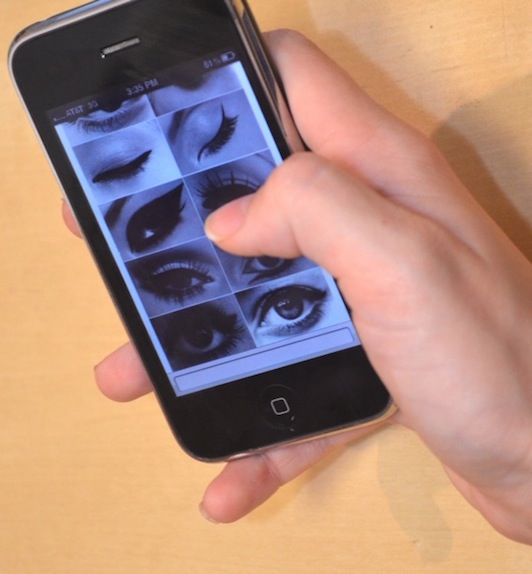
At one point in our conversation, Courtney pulled out her iPhone and said, “I use Pinterest everywhere: in class, at home, in my car. The cool thing about having it on your phone is that it goes to your online account too. They’re not separate.”
I asked her to give me some examples where she uses Pinterest on her phone instead of on her laptop. “When I go to the gym, I pull up exercises that I pinned,” she responded, showing me a Pin that focuses on slimming your arms, and then the original content behind it. She continued, “I don’t bring the computer into the bathroom when I’m getting ready, but I do bring my phone. I use Pins like this one with 12 different types of eyeliner.”
It Can Improve
The Pinterest user experience is a quantum leap forward for social commerce, but it can still get much better. For example, Pinterest could expand into the real world. Customers who see a product in a store could scan the tag or QR code and send it directly to their Pinterest account to access later.
There are also many Pinterest pages that scroll on and on forever. Some, like the Videos page, also seem like a random hodge podge of content. It would be nice to be able to filter such pages using key attributes, which could be discovered in a user research exercise. It would also be helpful to be able to search within a Pin Board or Everything topic, rather than the whole Pinterest site, to make the search results more relevant.
Furthermore, there are some quirks that people have complained about when they first get started. For example, new users are practically forced to follow prolific Pinners that they have never heard of, without much of an idea of the kind of images that will be pouring into their account. I understand why Pinterest would want to toss users in the deep end like that, but it could cause frustration or even abandonment in some cases. With the help of UX experts, Pinterest will probably find a much more elegant approach to demonstrating the ins and outs of Pin Boards and Pins to new users.
While the Pinterest user experience makes it easy to subscribe to Pins from people you have decided to follow, there is no social rating mechanism to filter through the noise. The likes and comments are shown, but they don’t cause some Pins to become more prominent in your Pin Boards. They appear to be strictly sequential, moving right to left and then up to down, in the same visual path that Westerners follow when reading text on a page.
Conclusion
The unique focus of Pinterest on beautiful images of things you like makes its Pin collection a refreshing respite from other activities. “I’d much rather pin stuff than watch TV,” Courtney told me “I can look through it for hours. It makes me feel really good.”
It is precisely that emphasis on “stuff” and “good” that sets the Pinterest user experience apart. It is also what will make it a unique and formidable social commerce powerhouse in the years to come.
Thumbtack image provided by Shutterstock


