The Exploratorium is a museum of science, art, and human perception located in San Francisco. As an exhibit developer here, my task is to create experiences for museum visitors that are educational and entertaining. Like many other user experiences, museum exhibits must offer quick entry and intuitive interaction—often allowing the visitor to move beyond initial engagement to a deep exploration of a given topic or phenomenon.
The museum floor is a complex space for which to design a user experience: there are many exhibits competing for a visitor’s attention, the space is often crowded with other visitors, and it contains a wide variety of content. As such, visitor experiences must be crafted with the help of the visitors themselves, in an iterative process that brings prototypes on and off the museum floor rapidly, responding to visitor feedback at every step.
Iteration is critical to the design of any successful user experience, but immediate access to end-users at the Exploratorium brings them directly into the process.
The Birth of an Exhibit
Exhibit developers at the Exploratorium generally decide which science topics and phenomena are most “exhibitable,” and start with an experience in mind rather than a particular content goal. A developer builds an initial prototype to showcase a particular phenomenon or concept, gathers input from the development team, and as quickly as possible pushes the prototype out onto the museum floor.

This focus on engaging end users as a core part of the development cycle is key to the richness and robustness of the exhibits. Testing with real users, and in actual use scenarios, allows the exhibit development team to craft the nuanced experiences required by the museum environment.
The Evaluator: Exhibit Life Coach
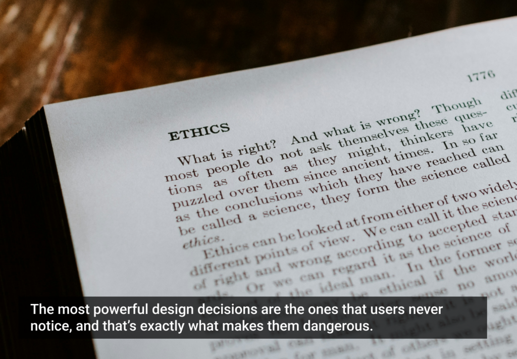
Most Exploratorium exhibits spend the majority of their lives in adolescence: trying to understand who they are, how people perceive them, how to become self-sustaining, and how to make themselves understood. The Exploratorium has a team of professionals devoted to escorting exhibits through this stage: the Visitor Research and Evaluation department (VRE).
Other UX professions have similar groups, often called something like “quality assurance” or “usability testing”. VRE staff use many of the same techniques as their usability testing cousins: they collect and analyze data, perform carefully controlled studies, and communicate their findings to the rest of the development team.
However, VRE staff generally execute these tasks in very close communication with others on the team, specifically with the exhibit developer. Instead of being called in toward the end of the development process, the evaluator works closely with the developer on every iterative cycle.
The Early Years: Nurturing
When the developer feels a prototype is ready for a first floor test, the evaluator and developer discuss the primary questions they need visitors to answer. In early cycles, these questions tend to focus on usability and content understanding.
As with designers in other interaction design fields, exhibit developers have an intuitive understanding of usability and affordances. However, young prototypes invariably have some behavioral issues that could use some serious counseling. The point of entry for the exhibit may be unclear or the core experience may be obscured by more peripheral design elements; the science content may not read clearly through the interaction; and sometimes, the interaction itself even ends up distracting from the content.
Evaluators on the VRE staff are there to help these young exhibits learn who they want to be when they grow up. To develop the final character of an exhibit, evaluation generally moves along a spectrum of mediation. Earlier tests require a lot of questioning and explaining, with evaluators and developers walking visitors around the unfinished elements of an interface and highlighting segments of content not yet surfaced in the prototype.
Adolescence: Letting Go
As development proceeds into later iterations, evaluators mediate less and instead fall back into the shadows, relying on observation rather than conversation. Targets for improvement become narrower, and later development cycles gain more specific focus, working out the kinks in a user interface element or nuances in the communication of a particular concept.
Once the usability of an exhibit solidifies, development moves on to visitor understanding and engagement. Questions move from “Do they understand how to use it?” to “How long do they use it?” and “What questions are they asking and answering about the content?”
Throughout development cycles, evaluators help developers clarify goals for the exhibit. It’s not uncommon for a developer to have a general sense of their intended visitor experience, but to let the visitors themselves determine the details of the experience. By observing which interactions are smoothest, which assumptions are most common, and what elements provide the deepest engagement, evaluators channel visitors into the exhibit development process.
Problem Children
Occasionally, visitors refuse to use an exhibit as the developer intended. In some of these cases, the development team can devise a way to guide the prototype back onto the intended track. In others, despite carefully contrived affordances and painfully explicit labels, visitors still stubbornly push exhibits in a different direction than the developer ever imagined.
Following are examples of each of these two scenarios. Both of these exhibits were developed for the Exploratorium traveling exhibition Geometry Playground.
Exhibit A: Dividing Space
“Dividing Space” demonstrates Voronoi diagrams, a particular geometric concept used in spatial planning. The original idea came from The Price Is Right game “Plinko,” in which contestants drop a puck into a field of pegs and watch it make its way down to the bottom. The intent was to have visitors to set up a field of stationary red pegs, drop a blue puck into the field, and watch the projected Voronoi pattern change as the puck sifted down to the bottom. Unfortunately, many a visitor’s intent (especially boys around 6-12 years old) was to play air hockey.

We also had a problem with the labels mounted along the sides of the table being completely overlooked by visitors. Faced with these two seemingly unrelated challenges, one wise team member came up with a single solution to both. By mounting the label at eye level, visitors would be more likely to notice and read the label while interacting with the exhibit. By placing that label at one end of the exhibit table, that end was blocked off from two-player air hockey action.
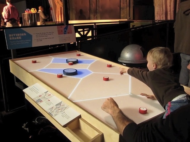
Careful observation combined with clever design offered a clear road to steer the piece from frustrating prototype to successful exhibit.
Exhibit B: Build A Room (née: Spin A Shape)
Exploring spatial reasoning was one of the essential goals of Geometry Playground. The initial prototypes of “Spin A Shape” were about rotational geometry, created in the space around a visitor. A camera tracked rings, bars, and triangles held by the visitor; as the visitor spun around in a circle, a live video feed showed the shapes created by spinning around with these shapes. For example, spinning a bar created a cylinder around the visitor; spinning a ring created a torus.
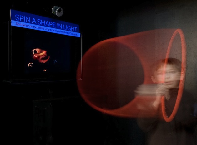
However, floor testing quickly showed that instead of spinning around, visitors would much rather wave the shapes in the air to create ‘light paintings’. Elaborate labels and use graphics were not enough, and a spinning chair design proved too complex and difficult to implement safely.
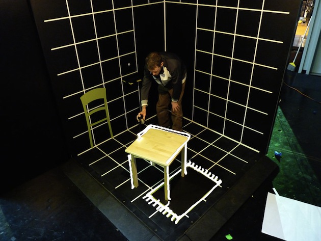
So, we let the visitors tell us what the exhibit should be: we allowed them free reign to create light paintings, but included affordances to encourage them to do so in a very spatial, three-dimensional way. The backdrop behind the visitor became a cubical room with gridded walls, and props, labels, and a slideshow suggested painting along planes in the space. The new title, “Build A Room,” nudged visitors to make their paintings three-dimensional.
Without evaluation and testing on the museum floor, the exhibit would have only encouraged spatial reasoning in a very small percentage of users. For “Build A Room,”” the visitors themselves showed us the path in which the exhibit needed to grow.
Iteration as a Way of Life
The Exploratorium is a museum, but it is also a production house for exhibits. Having the capacity to build exhibits and test them immediately creates an atmosphere in which iterative design flourishes. In fact, many elements of a visit here require the design process to be tightly coupled to the visitor experience.
The museum floor is a highly active space, with young and old visitors easily distracted by exhibits, events, and even other visitors. A fulfilling exhibit experience requires a visitor to be able to understand both how and why to use it within a matter of seconds. With these challenges, it is critical to iterate quickly and frequently, and to test each iteration with the end users.
The exhibit shop is directly adjacent to the floor, and visitors can lean over the wall and watch the museum actively taking shape. This arrangement makes evident the concept of visitors as integral to the exhibit development process, and reminds the public that they are as much a part of creating the exhibits as the Exploratorium is.
While other user experience design scenarios may not provide the same opportunities to integrate end users into development, the core concept remains true throughout all design professions: the bigger a part of the design process the users are, the richer the end result will be.