Save

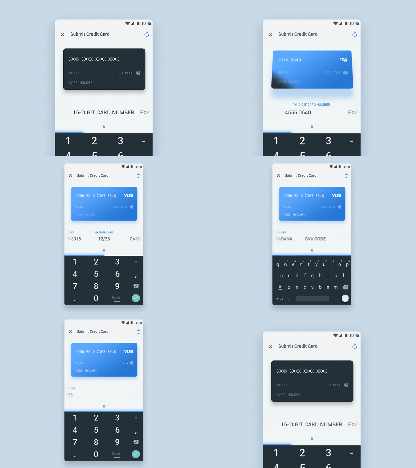
Working in the design business taught me to pay attention to the organization, the system, the country — the “Big”. At the same time to have an ear for the individual, the person — the “Small”. To work successfully, I have to harmonize what the “Big” wants and what the “Small” wants. I believe, that bringing together the Small helps facilitate and create the Big. And that’s what microinteractions are all about.
Design can solve small, universal and overlooked problems and these really little things have a huge amount of impact. Microinteractions are the small moments in UX that can be boring and easy to forget, or exciting and engaging. They are everywhere: in the gadgets we carry, the appliances in our house, in the apps on our phones and desktops.
What is Microinteraction?
Facebook’s “Like” is an example of the successful microinteraction. If Facebook came out with a product that didn’t have a “Like” button, you would think, “Why did they get rid of the ‘Like’ button?” Microinteractions are what happens when people use small pieces of functionality that exist in a place of larger features.
Microinteractions can be part of a product — or even the product itself. For example, a toaster does nothing but one thing: it toasts. It only has one function: you put sliced bread into the toaster and press the button. That’s easy. A toaster is a device which produces a single microinteraction. In a similar way, small apps can be made up of one microinteraction alone.
Microinteractions are all about interaction and details of a product. And details aren’t just the details; they are the design. The difference between a product with friendly UX and a weird product is often in the microinteractions.
Microinteractions are based on user-centered design approach, where the user is in focus. A lack of attention to a tiny detail can quickly set off a domino effect of discontent among your customers.
А. Definition and Types
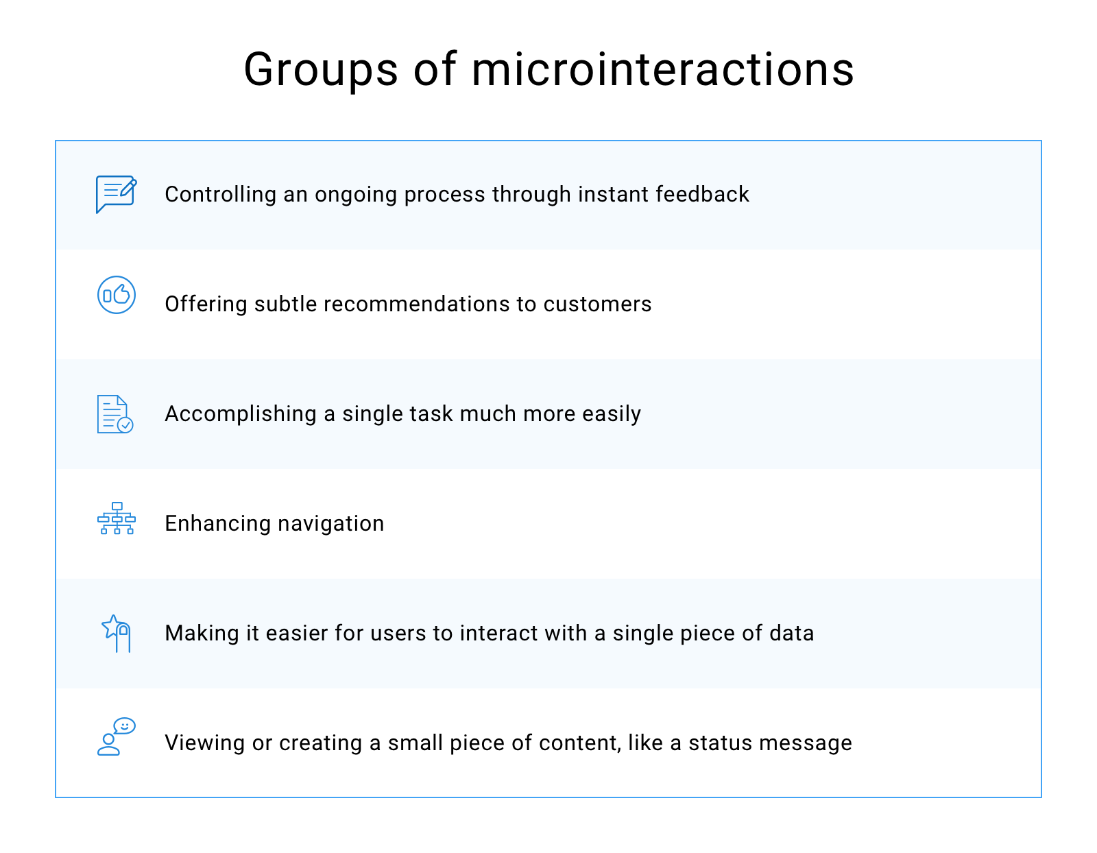
Microinteractions should be simple, short, and easy as pie. For instance, a music player is a feature; adjusting the volume is a microinteraction inside that feature. Every microinteraction within the interface performs its own function.
B. Effective Microinteraction: Do’s And Don’ts
A legendary designer and educator Victor Papanek once said, “Nothing big works.” I also believe that in the design process you need to pay attention to the details.
For example, too much animation will “blur” your hierarchy, and your message will be lost. Sophie Paxton explained this in her article “Your UI isn’t a Disney Movie”:
“You wouldn’t make every sentence of a document into a heading. The same principle applies to animation. Consider every animated element in your UI to be the equivalent of a heading in a written document. It should be used to signal the importance of an element.”
When you create a visual design containing microinteractions, follow these principles:
- Make UX microinteractions invisible and functional. Make sure micro animations don’t feel awkward or annoying. Common and minor actions demand modest response. Occasional and major actions need a solid response.
- Keep long-term use in mind . What seems fun the first time might become stressful after repeated use.
- Follow the KISS principle (keep it simple, stupid!). Over-designing a microinteraction can be a problem, causing a long loading process.
- Don’t start from zero. You always know something about your target audience and the context. Use this knowledge to make your microinteractions more effective and powerful.
- Create visual harmony with other UI elements. Pay attention to the details to create a delightful microinteraction.
- Absorb Complexity. Figure out where the core complexity lies, then decide which parts of that the user would like to have, and when.
- Coordination. Don’t forget about physical principles. Human eyes have special mechanisms for seeing lines. According to Fitts’s law, we may be better at seeing horizontal and vertical lines than oblique lines or circles.
- Evolution. Your micro-animation should not behave the same way each time it is used. If you want your design to shine, you need to keep things interesting.
C. The Structure Of Microinteractions
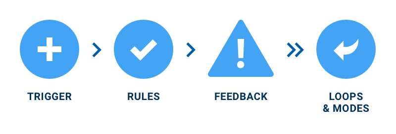
Size and structure of microinteractions make them effective. Dan Saffer describes 4 parts of microinteraction in his book “Microinteractions: Designing with Details”. Those are triggers, rules, feedback, and loops and modes.
Trigger
The trigger is that moment when microinteractions begin. It may be initiated by users, when a user clicks a button or an icon or fills out a form. It is known as manual trigger.
Another kind of trigger is the system trigger. The system triggers set up once a particular condition or set of conditions is met. The most effective system triggers predict what the user wants, based on the users’ activity data.
Every time you get an email and Google thinks the message may be a phishing email, it shows a fishing hook rather than a profile image.
Rules
The second part of microinteractions is rules. The rules of the microinteraction ‘game’ are outlined by a designer.
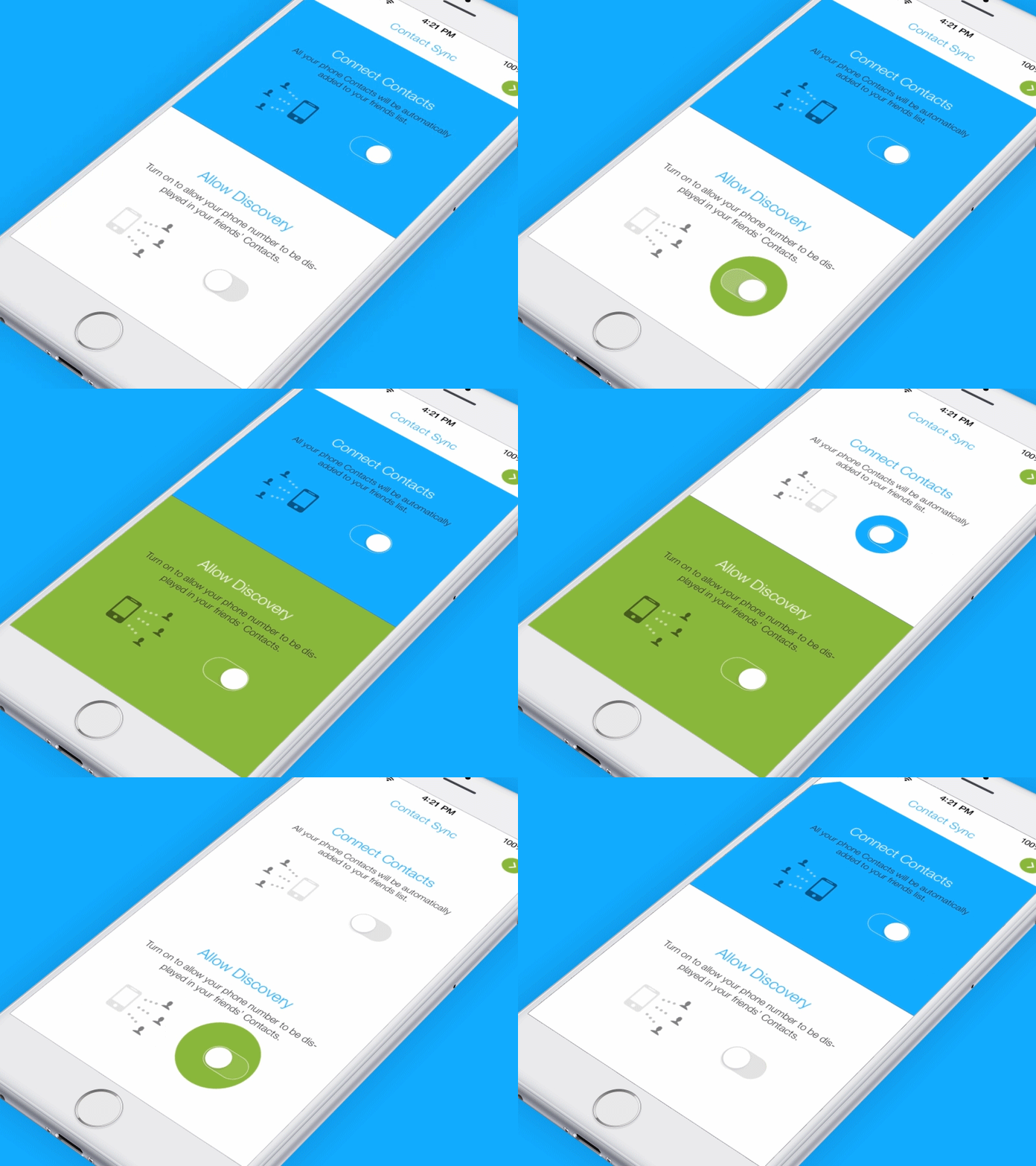
Turning on a light is the simplest microinteraction. Once you use the trigger (a light switch), the light turns on. There’s one rule: the light stays on till the switch is turned off.
Rules determine which action happens, and in which order — when the user pushes that button or when a message arrives. The rules shouldn’t feel like rules. They are invisible and direct users through the ‘interaction’ part of the microinteraction. Users want a feeling of natural flow from the trigger to rules to feedback.
Feedback
Feedback is knowing how understand the rules. There are three major types of feedback: visual, audio, and haptic. The visual is the most dominant because we have a tendency to look at what we’re interacting with.
With a little bit of humor or edge, feedback will add personality to your microinteractions. Less is more — the least amount of feedback you can provide, the better. An extra trick with feedback is to use the neglected elements. Designers already have a lot of UI chrome to play with, so why add one more element on screen? Use the ignored — the cursor, the scrollbar, a button state — to convey more of what’s happening.
Loops and Modes
Loops and modes are the last elements of microinteractions. Loops determine how long the microinteraction lasts. Take into account what happens when the user returns again and again. Long loops help extend your microinteraction so it changes and adapts over time.
So, triggers initiate the microinteraction, rules determine how it functions, and generate feedback, and the loops and modes specify what happens over time with the microinteraction.
Why Do Microinteractions Work?
Microinteractions typically get very little attention. They are designed to be invisible. Microinteractions are the ‘product hygiene’: users simply expect them to be there. After all, nobody comes to your app to enjoy the functionality of password change.
Jakob Nielsen developed ten general ideas for interaction design, which are called “heuristics”. Visibility of system status is the first User Interface principle. The device should always keep users informed about what is going on.
Microinteractions are used to provide the right feedback within a reasonable time. Often they take the form of micro-animations within the larger interface hierarchy. Really helpful are micro-animations in a slow mobile interface.
With the assistance of micro-animations, the user will see the elements of the interface. They create a focus of attention and save time, without distracting the user.
UX microinteractions work because of the user’s natural desire for acknowledgement. The users instantly know their action was accepted and get a visible reward. Similarly, microinteractions will guide users on how the device works.
If you care about UX, you should care about microinteractions. Take what is boring and rework it into something users will enjoy. There are three ways of working with microinteractions:
· look for them and focus on each apart;
· reduce a complicated feature to a basic microinteraction;
· treat every feature as a set of linked microinteractions.
Blending Microinteractions into Your UX
To sum everything up, if you put together a trigger, rules, feedback, maybe a loop or mode, you can create a microinteraction. It will turn something boring into a polished UX that helps users enjoy your product.
In the edge of AI and self-driving cars, we need the microinteractions that can make large systems more humane. In the next part of the article, I will discuss practical UX cases with their implementation. It will show how microinteraction offers a relief while solving some small and discrete problems.
This article was originally posted on the Product Tribe blog.
A multi-project designer with a natural feel of UX. Loves animation, mountain hiking and sharing his experience with the design community in his articles.


