Flag

We stand with Ukraine and our team members from Ukraine. Here are ways you can help

Get exclusive access to thought-provoking articles, bonus podcast content, and cutting-edge whitepapers. Become a member of the UX Magazine community today!

Home ›› Behavioral Science ›› How spatial logic can make your product design more intuitive and high-craft

How spatial logic can make your product design more intuitive and high-craft

by Vida Zhang
3 min read
Share this post on
Tweet
Share
Post
Share
Email
Print

Save

How-spatial-logic-can-make-your-product-design-more-intuitive-and-high-craft-lead-banner.png

Navigation in digital influences design. 4 reasons why having clear spatial logic between components in design is necessary.

Just as in the real world, when navigating in digital products, people need to know where they are, how they got there, and how to get out. That’s why having clear spatial logic between components is necessary.

1. Good spatial logic often maps to physical world metaphors

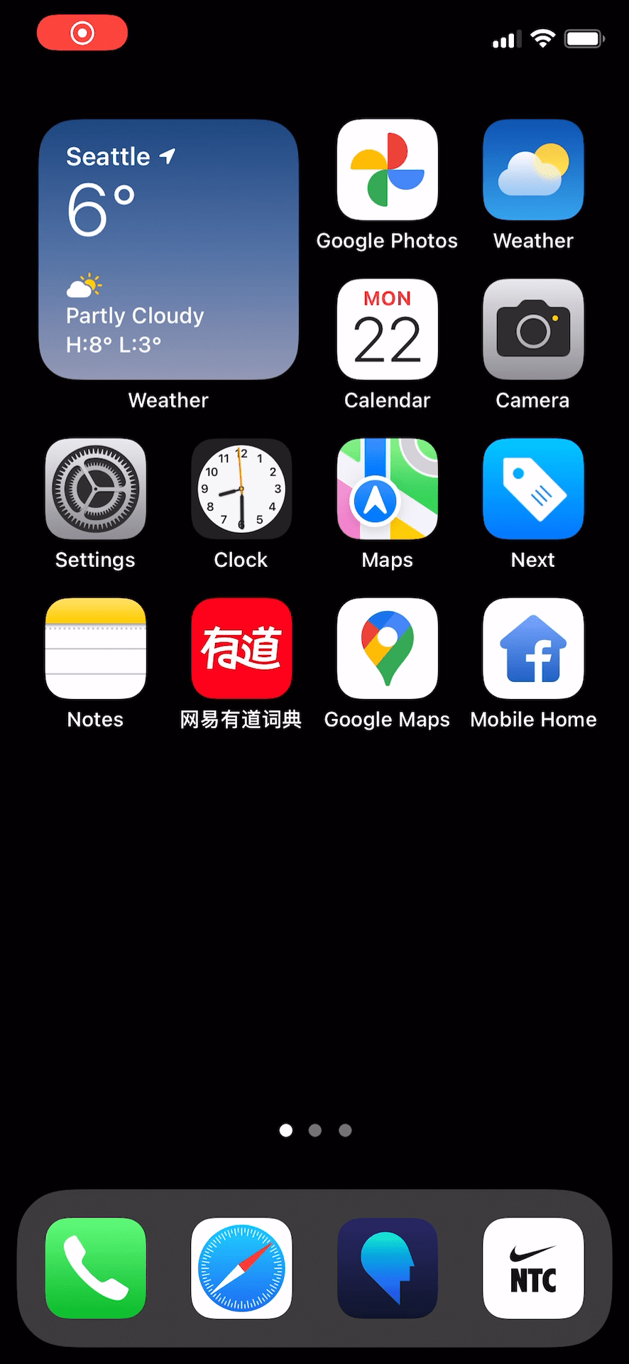
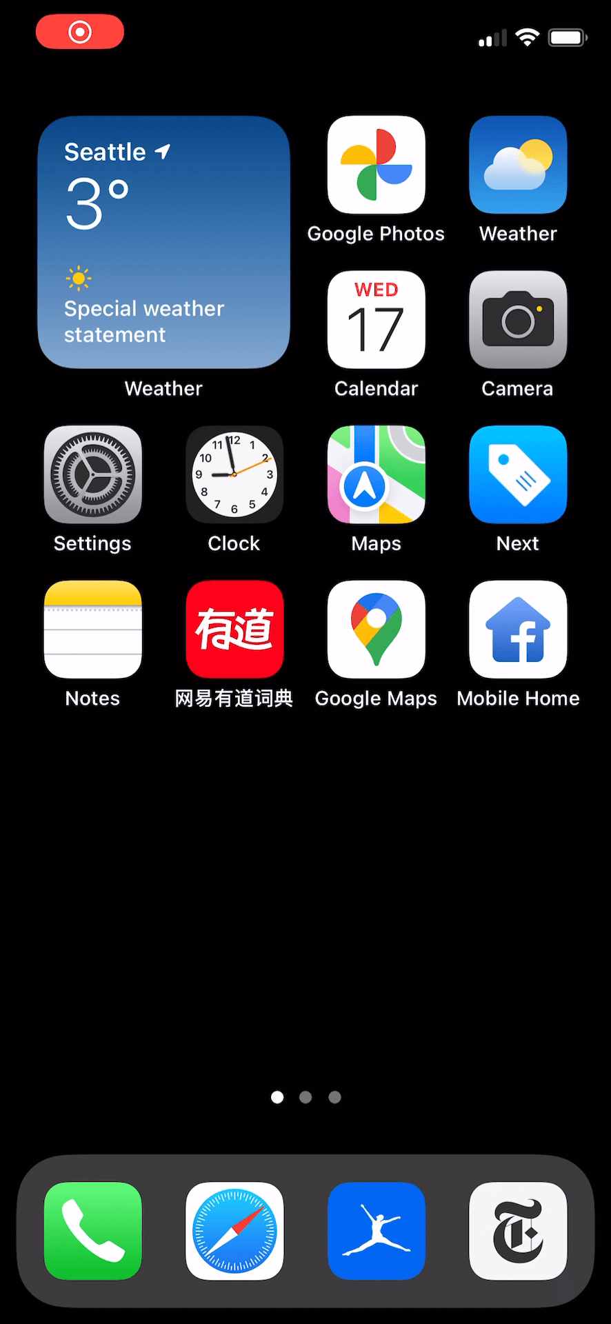
Opening a folder on iOS is like opening a folder or a box in real life. The expanding animation keeps the continuity of the “folder” — it’s as if we brought a physical folder closer to our eyes to see what’s inside.

Opening a folder on iOS
Opening an app on iOS

2. People have also gotten used to digital-native patterns that don’t exist in the physical world

For example, iOS users are quite used to opening a list cell that pushes the next screen in, or tapping on bottom tab bars to see a different screens. These patterns don’t remind us of any physical world interactions, but people get used to them after thousands of repetitions. As designers, we should leverage these familiar patterns as much as we can.

Opening a list cell
Opening a list cell
Tapping on a tap bar

3. Clear spatial logic your design more intuitive

Compare swiping down to access notification center on iOS and control center on Android. On iOS, the spatial relationship between the notification screen (screen A) and the launch screen (screen B) is straightforward. A sits on top of B — edge swiping pulls it off, the gesture and screen movement synchronized. It’s straightforward because we can easily find a physical world metaphor.

Swiping down for notif screen on iOS

In comparison, the spatial logic of the same interaction on Android is much less clear. By pulling down anywhere on the screen, the launch screen morphs into a white layer — no mapping physical world metaphor here.

It’s also hard to tell visually the spatial logic between the control layer with the black background and the white layer. Are they on the same level or the black layer is one level lower? Whereas on iOS the blur effect on the notification screen gives a clear clue.

Users can definitely get used to this interaction with repetition, but the lack of spatial logic will always cause cognitive dissonance. Subtleties like this make the product feel less fluid and thus of lesser quality as well.

Swiping down control center on Android

4. Seamless animation also plays a huge role in establishing spatial logic and elevating product quality

Let’s look at opening and closing an app on iOS. When opening an app, the app icon expands and fades out, with the app screen fading in and growing in size with the fading icon. The animation establishes the spatial logic and tells the user where the app lives in this digital space — it’s embedded within its icon. Closing app animation mirrors this behavior, which is expected, as the app goes back to where it came from.

Opening and closing an app on iOS
Opening and closing an app on iOS slowed down (manually)
Opening and closing an app on iOS slowed down

In comparison, the opening vs closing app interaction on Android is somewhat fragmented. But I’ll leave it to you to observe and find out in the video below.

Opening and closing an app on Android

To summarize, when you think about elevating the intuitiveness and craft of your product, look into the spatial logic implied by the design.

  1. Does it map to real-world metaphors?
  2. Does it follow an interaction pattern that most people are familiar with?
  3. Does the spatial logic simply make sense?
  4. Are you using animation to demonstrate the spatial logic?

In design, subtleties like these always matter.

post authorVida Zhang

Vida Zhang
Vida Zhang is a product designer at Meta, working on Messenger. She’s passionate about designing great products and writes about no-frill design tips.

Tweet
Share
Post
Share
Email
Print
Ideas In Brief
  • It is important to use spacial logic in digital products as it helps people understand where they are, how they got here and how they can get out – like in the real life.
  • 4 reasons why having clear spatial logic between components in design is necessary:
    • Good spatial logic often maps to physical world metaphors
    • People have also gotten used to digital-native patterns that don’t exist in the physical world
    • Clear spatial logic your design more intuitive
    • Seamless animation also plays a huge role in establishing spatial logic and elevating product quality
  • Vida Zhang, a Product Designer at Meta, suggests looking into the spatial logic implied by the design when you think about elevating the intuitiveness and craft of your product.

Related Articles

AI is reshaping the role of designers, shifting them from creators to curators. This article explores how AI tools are changing design workflows, allowing designers to focus more on strategy and user experience. Discover how this shift is revolutionizing the design process and the future of creative work.

Article by Andy Budd
The Future of Design: How AI Is Shifting Designers from Makers to Curators
  • This article examines how AI is transforming the role of designers, shifting them from creators to curators.
  • It explores how AI tools are enhancing design processes by automating routine tasks, allowing designers to focus on strategic decision-making and curating user experiences.
  • The piece highlights the growing importance of creativity in managing AI-driven systems and fostering collaboration across teams, ultimately reshaping the future of design work.
Share:The Future of Design: How AI Is Shifting Designers from Makers to Curators
5 min read

Are you overthinking your research process? This article explores how to determine when research is essential and when it might be holding you back. Learn a practical framework to prioritize studies, align with stakeholders, and maximize impact without wasting time or resources. Unlock strategies to focus your efforts on what truly matters.

Article by Carol Rossi
Are You Doing Too Much Research?
  • The article questions the common practice of conducting extensive research, suggesting that not all projects require it. Instead, it highlights the importance of discerning when research is truly necessary.
  • It introduces a framework to prioritize research efforts based on clarity, risk, and cost, ensuring impactful results without unnecessary delays.
  • The author emphasizes the role of stakeholder involvement in the research process, fostering better collaboration and alignment with organizational goals.
  • Practical strategies are provided for tracking and communicating the post-research impact, making the value of research more transparent and measurable.
Share:Are You Doing Too Much Research?
7 min read

Learn how to design and facilitate impactful co-creation sessions that inspire collaboration, spark creativity, and align diverse perspectives for meaningful outcomes.

Article by Aalap Doshi
Designing and Facilitating a Co-Creation Session
  • This article delves into the process of designing and facilitating effective co-creation sessions to foster collaborative innovation.
  • It outlines key steps, including planning, creating a structured agenda, and using tools to engage participants meaningfully.
  • The piece highlights how co-creation sessions can drive creativity, align diverse stakeholders, and generate actionable outcomes for complex challenges.
Share:Designing and Facilitating a Co-Creation Session
3 min read

Join the UX Magazine community!

Stay informed with exclusive content on the intersection of UX, AI agents, and agentic automation—essential reading for future-focused professionals.

Hello!

You're officially a member of the UX Magazine Community.
We're excited to have you with us!

Thank you!

To begin viewing member content, please verify your email.

Tell us about you. Enroll in the course.

    This website uses cookies to ensure you get the best experience on our website. Check our privacy policy and