As a ride-hailing app, learning from unexpected sources, such as Netflix, helped us implement a new profile selection feature that has improved user experience and doubled business orders conversion rate. Our new “Smart Switcher” has delivered outstanding results, making the ride-hailing experience smoother, more reliable, and user-friendly.
Who we are
Gett is one of the leading taxi booking platforms operating in Israel and the United Kingdom. Founded in 2010, the company specializes in the regulated taxi space offering a variety of flexible ground transportation solutions, including delivery services, to B2B and B2C customers.
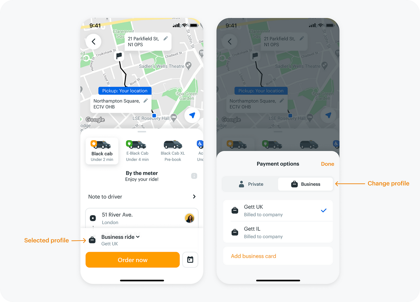
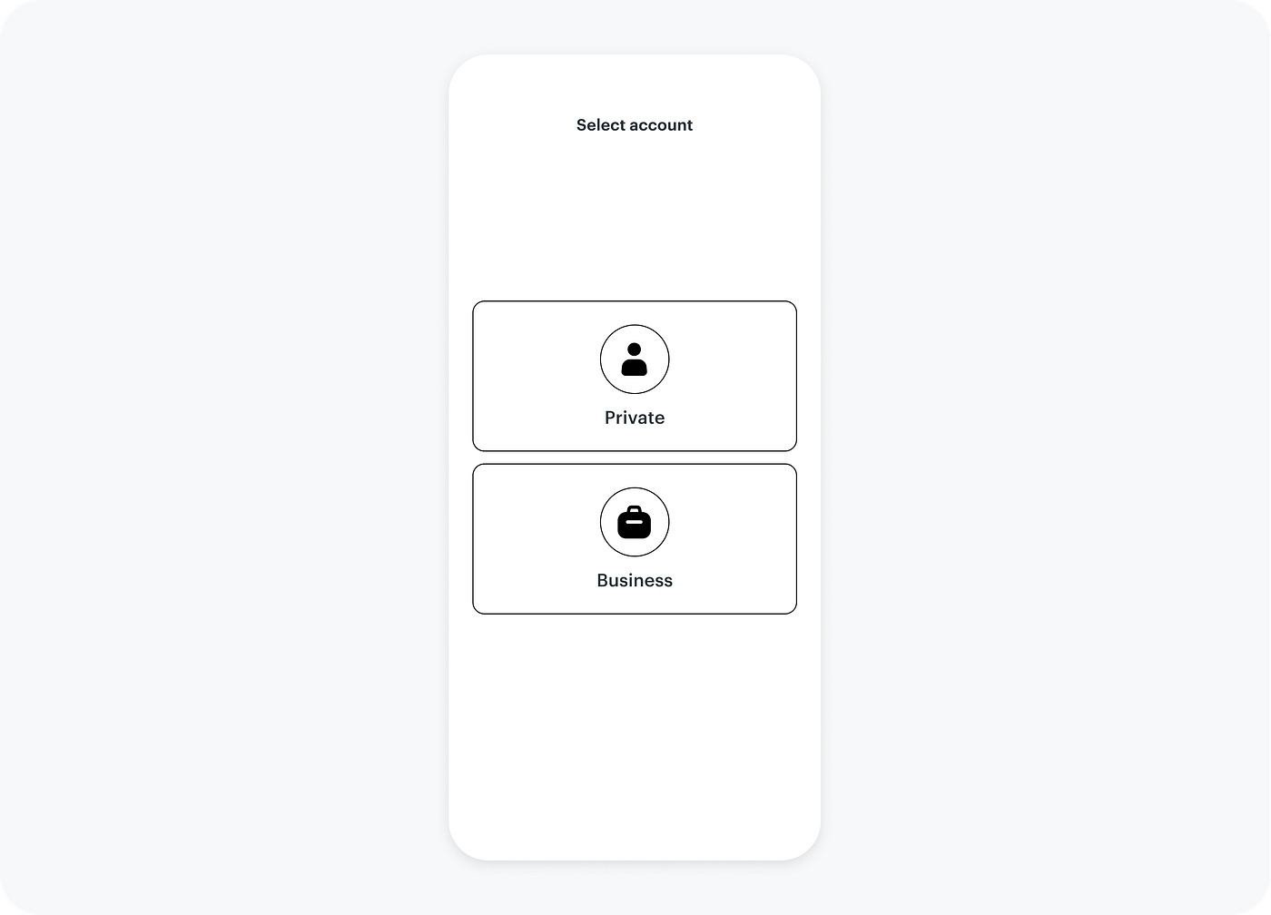
We prioritize ease of use and a superior user experience. Whether you’re rushing to catch a flight or trying to get to an important meeting, a smooth and quick experience is a must. While similar to other products, we offer both private and business riding profiles (Our B2B capabilities are a differentiator vs other ride-hailing apps) which results in some challenges when it comes to profile switching.
Problem
We faced two main problems with profile switching:
- Users have the option to switch between profiles in the ‘Order Review’ screen. However, in the rush of daily life, many overlook this crucial step, often realizing it too late in the flow. As a result, orders are placed on the wrong profile, leading to cancellations and a bad experience.
- Because of the way the profile switching works, we struggle with business FTO (First Time Orders). After users register their business, they continue ordering on their private profile and don’t order their first business ride.
Analysis
Data
We found that about 6% of canceled orders immediately order again with a different profile, indicating that users are ordering on the wrong profile. We also saw that only about 20% of new business users order their first business ride, and some of them over time stop ordering business rides altogether.
User Feedback
We found that quite a few businesses complained about individual expense requests from employees due to users who ordered by mistake on their private profiles, even though expense reports are one of our main product values. We also found that some users were ordering private rides on their business profile, which may be even more frustrating since it involves your workplace’s money.
When we interviewed new business users and asked them why they didn’t order any business rides after registration, we were surprised to hear that some said, ‘Oops, I didn’t even remember I registered,’ and others said, ‘What?! I was sure I ordered only business rides.’ This showed us that profile switching is not obvious enough, and users don’t notice it during the ordering flow.
Goals
Main project metrics
- Increase FTO (First Time Order) rate of new business users
- Increase business rides share of existing users
- Decrease cancellations rate due to wrong profile selection
Research
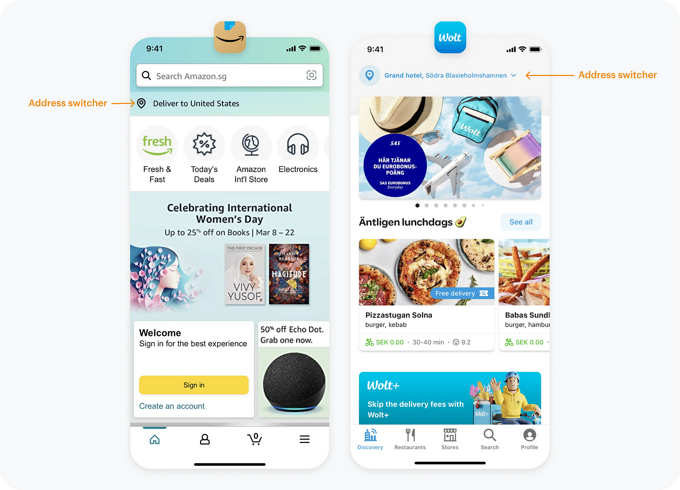
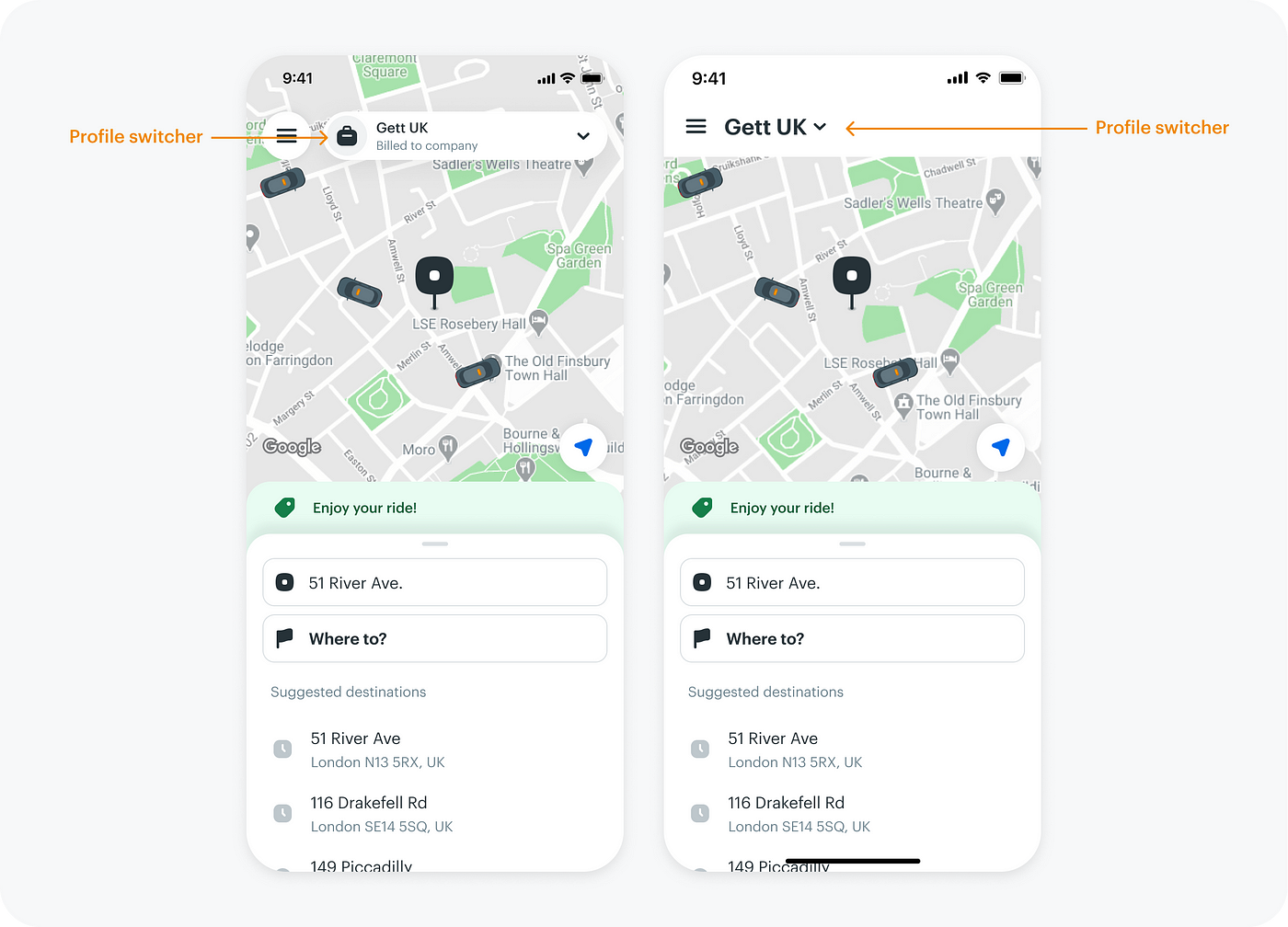
To tackle this problem, I examined competitors and their approaches to profile switching. I looked into products like Amazon and Wolt, both employing a similar hierarchy under one account. Amazon, for instance, differentiates prices and products based on addresses, while Wolt allows different stores and delivery prices for addresses under the same logged-in account. These examples, along with others, positioned the switcher prominently at an earlier stage in the flow, often on the main screen.
Here are two examples
I quickly came up with some concepts for having the profile switcher on our main screen and tested them with some users internally and externally. The results showed an improvement, but the team believed we could do better.
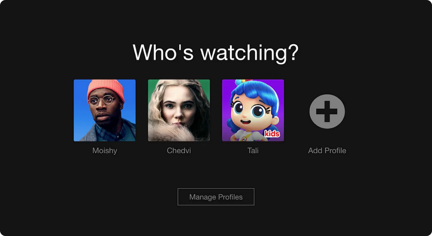
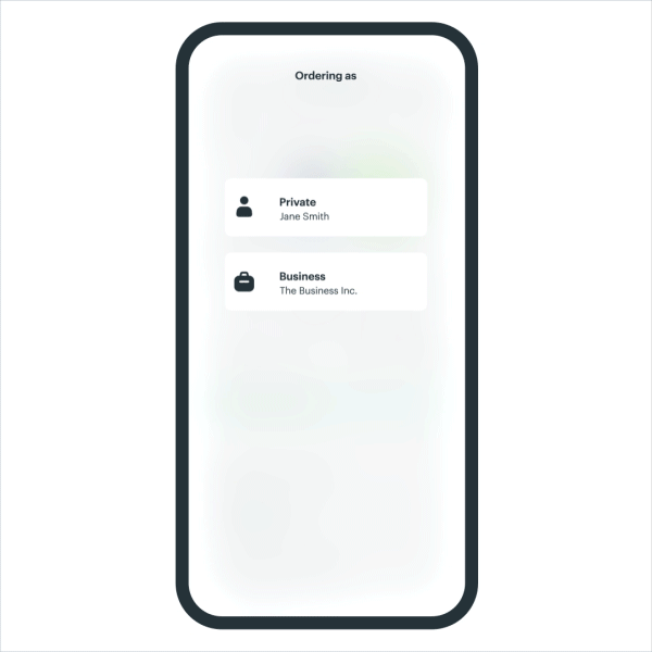
Then we decided to rethink our approach completely and came across a promising solution in an unexpected place: Netflix. The streaming giant, which personalizes user experiences through profile selection by asking users to choose their profile each time they launch the app.
This got us thinking — what if we applied a similar concept to our ride-hailing app? What if, each time a user launched the app, we asked them to select their profile, effectively preventing the mix-up between private and business?
How Netflix’s approach could suit our needs
- No room for mistakes
- It’s just a quick single click
- The possibility to personalize content even further
I quickly crafted some concepts and conducted quick user testing and found, like in Netflix, most users don’t mind the brief profile selection process. In our case — where account mix-up meant not just the wrong movie recommendation but actual monetary loss — users welcomed the change.
Challenges
Of course, there were some unique challenges to address. In our scenario, certain users frequently switch between both business and private profiles, while others predominantly use one type of profile around 99% of the time — such as those exclusively using the business profile. In this case, we believed that adding an additional screen and click might not be the optimal solution.
Solution
The “Smart Switcher”:
Following interviews and qualitative analysis of our current business users, we introduced the ‘Smart Switcher’ solution that solves our unique scenario and challenge. If a user placed their last two orders using the same account, we assume that they primarily use that account and as a result, we won’t prompt them to select an account again for their third ride, until they select a different account again. However, users who frequently switch between accounts will be asked to confirm an account with each new order.”
Results
This out-of-the-box approach yielded impressive results. Not only did we see better conversion rates for new business users, but the overall usage of business profiles increased. The rate of cancellations due to profile mistakes also saw a reduction.
Cancellations due to wrong profile
3.2% drop
FTO (First Time Order) of new business users
Doubled the rate
Business rides of existing users
13% increase
The overall share of business rides
15% increase
My key takeaway is to not solely seek inspiration from the obvious sources but instead think outside the box, even within your everyday products that may not be directly related to your product’s natural field of activity.