If you’ve seen an Instagram story involving a question and people tilting their heads, you probably were looking at the “Who Is More” Instagram filter. In this article, I will share the creative process and decision making behind this filter.
Note: this is not a technical guide on how to create the filter
Coming up with the idea
In anticipation of Valentine’s day, I wanted to create a filter to be played by couples. I had only created single-player filters so far and it would be a fun challenge to build something for multiple players.
The initial idea was to show a question (e.g. “Who has higher IQ?”) and have the filter randomly select one person as the answer.
But then I thought, “Wouldn’t it be more interesting if the players themselves can choose the answer?” Not only that, it would provide a much more interactive experience for users too.
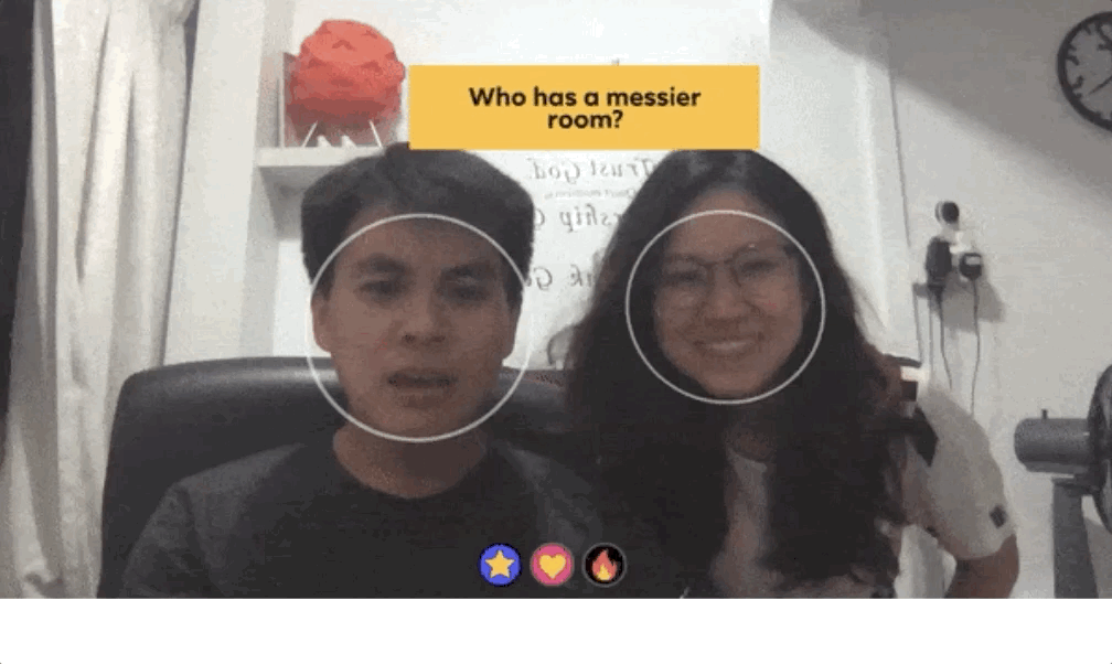
This led to the idea that is similar to the Shoe game commonly played at wedding ceremonies. In the Shoe game, the couple raises a heel to represent the bride, or a shoe to represent the groom.
If we want to build this game as an Instagram filter, how do we translate that experience onto a mobile screen?
Designing the user experience
Once we have an idea for the game, we move on to a huge part of the user experience — the game controls. Fortunately, Spark AR (the tool to create Instagram filters) provides a variety of user interactions for us to play around with.

Head turn
Since players can be expected to be beside each other (one on the left, one on the right), it made sense to use a directional interaction — either head turn or head tilt. When trying out both actions, it was clear to me that head tilt was the better option.

Head tilt
Turning your head makes it difficult to maintain eye contact with the screen, which would negatively affect gameplay. Also, continuously turning your head physically strenuous and disorientating.
(Try turning your head right-left-right vs tilting your head right-left-right and you’ll get the idea)
Another component of the game experience is the user interface. Due to the nature of the Instagram stories platform, users are limited to a small screen size and have a little time to take in new information. This means that interactive filters should be intuitive and frictionless.
For the “Who Is More” filter, I applied these concepts:
- Colour as feedback
IMO colour is the fastest method to give feedback to users, better than icons or text. Changing a background colour to green/red also saves screen space, as compared to displaying a “Correct” or “Wrong” text.

Neutral, wrong & correct states
- Minimalistic visual design
Every visual element in the filter (text, boxes, icons or circles) exists only to convey useful information to the users. I made the design choice to minimise unnecessary elements so that users do not have to waste time figuring out what to do during the game. For example, the purpose of the countdown timer is to tell users when to tilt their heads. It appears only when it is needed, and disappears once it has served its purpose.
- Delightful animation
Animation is an excellent way of adding delight to a filter. Additionally, it’s a useful method to smoothly transition between different states of a filter. However, animation should always be used with caution as we don’t want to ‘over-animate’ and distract users. For the “Who is more” filter, I used a simple rotation animation to indicate the start and end of the game.

Maximising replay value
Personally, I find that the best filters are those that can be used over and over again. It’s a lot more fun when the users can keep replaying the filter with a different experience each time.
Having a high replay value also helps to boost the virality of the filter. More times played per user means more stories posted and higher chances of their followers discovering the filter
Now, you can probably guess that the #1 method to increase the replay value is to have a large variety of questions. But what other ways can we encourage the user to replay the game? This is where we discuss the format of the game.
We already know what we have is a question-and-answer type of game. If you watch a lot of game shows (I was a huge fan of the Korean variety show Running Man), you may know a couple ways to structure a game like this.
At first, I structured the game as such: Players can continuously answer new questions but the game ends when a question is answered wrongly. I thought this could boost replay-ability by encouraging users to beat their ‘high-score’ (similar to Flappy Bird). But I realised this is not a strong reason especially when considering the platform and the users.
Instagram users are less likely to be motivated by achieving high scores. Majority of them just want something fun to play or something funny to post.
This format can cause the game to end too early and be discouraging for players who continuously get their first question wrong. Also, users who get a lot of questions correct will quickly learn all the questions and get bored.
I then switched to another format that uses a fixed number of questions. Players receive a fixed number of questions per session and try to answer as many as they can correctly. This effectively shifts the motivation for replay from getting a new high score to finding out more questions.
This option provides some advantages too:
- Users get to enjoy the game even if they get all questions wrong
- Consistent game duration — not too short that they cannot enjoy the game, or too long that it gets draggy or strains the players’ necks
- Players receive a rating at the end which subconsciously encourages them to replay the game until they get full marks (similar to the 3-star rating system in Candy Crush and Overcook)
Result
After much testing, tweaking and updating, the result of this process is the “Who Is More” filter that you see on your Instagram stories feed. It has 3 different modes: Friends, Couples and Burning Bridges editions and a total of 173 questions.
The filter was launched on 13 Feb and has over 1 billion impressions so far.

It was amazing to see the filter go viral and spread from Singapore to all over the world. Influencers, YouTubers and even Hollywood celebrities have played it!

Left to right: @mongabong, Shane Dawson, Sarah Hyland (from Modern Family), Victoria Justice, @laurdiy
The filter was also featured in a few articles:
Hope you enjoyed this article as much as I enjoyed writing it.
For those who want to try out the filter, here’s the link!
If you’re interested in creating filters, it’s actually really simple thanks to the free Spark AR program provided by Facebook. (Click here to get started). It’s up to your creativity to create all sorts of cool, interesting and beautiful filters.
Let me know down below if you have any questions. In the meantime, I will continue to create and publish new filters. Free feel to check out my other filters on my Instagram profile @vamonke 😉

Huge thanks to my sis for helping when I needed another person to play test!