
Light Pattern vs. Dark Pattern
While I was having a discussion with a friend a few months ago about a (bad) digital strategy I mentioned the problem stated above. ‘What is a dark pattern?’. I could see the curiosity in his eyes twinkle. A new word.
A dark pattern is a deceptive design pattern created to trick users into doing something. For example, buying an overpriced subscription with extras they don’t need.
The term was first coined by User Experience Designer and consultant Harry Brignull in 2010. Opposite to dark patterns we have light patterns, created to guide users in the best way possible. When I was in university we were taught that as a designer you have the responsibility to always be an advocate for the user. Don’t be seduced to the dark side.
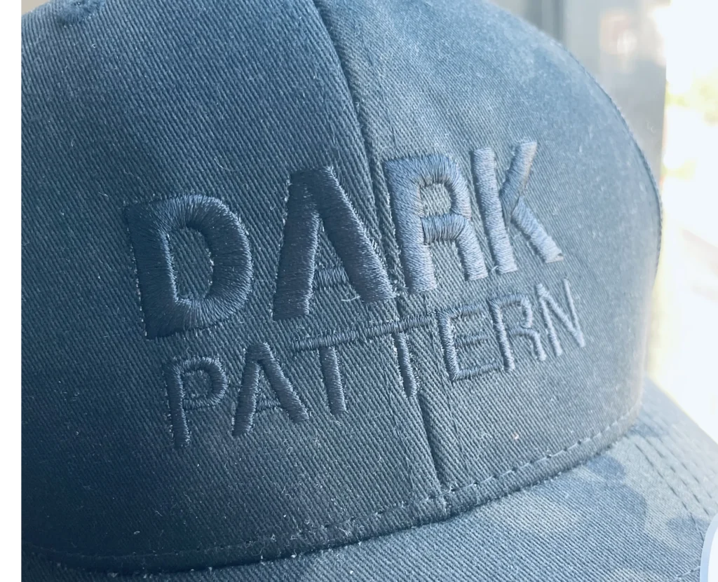
‘Oh, that is very good. I like this word.’ To my amusement a few weeks later I got this cap in my mailbox. Ever since I am being called the designer that only creates dark patterns. Which is a joke, just to be clear.
‘I’ll be honest I click-baited you’
I didn’t have the intention to write about this observation but ever since I have been paying extra attention to it, it started to appear everywhere. Like when you are interested in a certain car and suddenly it pops up at every corner of the street.
Earlier this week I was watching a video on YouTube about a guy reviewing a certain collection of products from a celebrity. The title stated something like ‘INSANE’ and then a ridiculous amount of money.
As the video progressed I started to realise that the insane amount of money was never true. The real amount was about four times as low. At the end of the video, the presenter admitted that he was going to clickbait us.
At least he is being honest about it, but it’s a repeating dark pattern that has become more or less the standard of YouTube today. Some of the comments underneath the video even applauded him for doing this.
Regulations are always playing catch-up
Regulations always come too late, but it’s important they are put into place correctly. Luckily in the US and EU, there are more and more regulations in place to stop designers from implementing dark patterns. Famously Epic Games got a 245 million dollar fine for using dark patterns in Fortnite earlier this year.
It seems like a lot but according to the US Justice Department Epic Games collected information about children and tricked them into buying digital assets. With that, they violated the Children’s Online Privacy Protection Act (COPPA).
This example illustrates how a YouTube title is relatively innocent although a bit annoying once you realise how often this happens. But there are also very serious cases from renowned companies, showcasing that it is a deeply rooted problem.
The grey area of influencing behaviour
Now coming back to the digital strategy part, I always try to at least attend 2 or 3 conferences a year. Not only to bounce off ideas of my own but also to listen and learn from other companies and creators. What are they doing? What are the challenges they face?
To my surprise, it happens more than once per conference that digital strategies look a lot like dark patterns. But then covered under the umbrella of ‘influencing’ behaviour. Yes, commercial companies often use digital strategies to influence behaviour but there should be customer value at the horizon for them. Tricking somebody in a loyalty program and spamming them with emails does not really seem like it.
But if the data shows high engagement we all get off our seats and applaud it. It is considered a success.
Make sure you collect the right data
So it’s easy to say that as a User Experience Designer, you have a responsibility to avoid these things from happening. But being an advocate for the user is not always an easy task. When you have to deal with different opinions of people, departments and stakeholders it is not always possible to just stand your ground with an opinion. You need data to show it.
Recently I have had the fortunate opportunity to start collaborating with a Danish company called iMotions, they have some amazing biosensor products. Allowing us to collect behavioural data from digital experiences.
At this moment we are using facial expression analysis and a Galvanic Skin Response (GSR) device. In the future, we want to also use Electroencephalography or EEG. That will allow us to measure brain activity and discover the cognitive processes that underline how we think, react, and behave. For example, when users need to read a complicated text and make a decision afterwards, we can see how much that task asks from them and if the design is good enough to support that cognitive load and gives room to think and make a decision.
In my opinion, this is usability testing 2.0.
For a long time, these devices were mostly used in academic research but I think it’s time for creators and companies who can afford these technologies to start using them. It allows UX researchers and designers to get a deeper understanding and data to convince stakeholders of the importance of good design.
No more dark patterns.