Save

While it didn’t shy away from adopting new tech, it was never a truly customer-friendly environment. The niche jargon and the complex mechanics of finance rarely provided for a satisfying experience.
The advent of Fintech changed a lot. The digitization of banking forced this industry to play by modern tech and design rules. And it’s fair to say that it benefited greatly from it.
Fintech’s adoption of modern design and UX standards has by no means halted. In this article, we’ll explore the most recent trends in Fintech design that elevate the banking experience.
The playing field
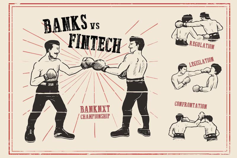
Virtually all contemporary UX and tech trends within the finance industry are best conceptualized through a bank-fintech dichotomy. Heavily bound by regulations, banks are almost pathologically risk-averse. As such, whatever new trends might emerge, it takes banks a long while to adopt them.
On the other hand, fintechs have more room to experiment and innovate, which renders them trendsetters in the finance market. Therefore, nearly all trends we talk about in this article are driven by fintech products.
1. Gamification
Let’s be honest, finance isn’t exactly the epitome of “fun.” It’s worrisome and intellectually demanding. Fintech gamification can make personal finance less stressful and stimulate healthy financial behavior.
As Warren Buffet once brilliantly put it: “The stock market is a device for transferring money from the impatient to the patient.” It’s fair to assume that one of the goals of Fintech products is to help their users make less impulsive decisions.
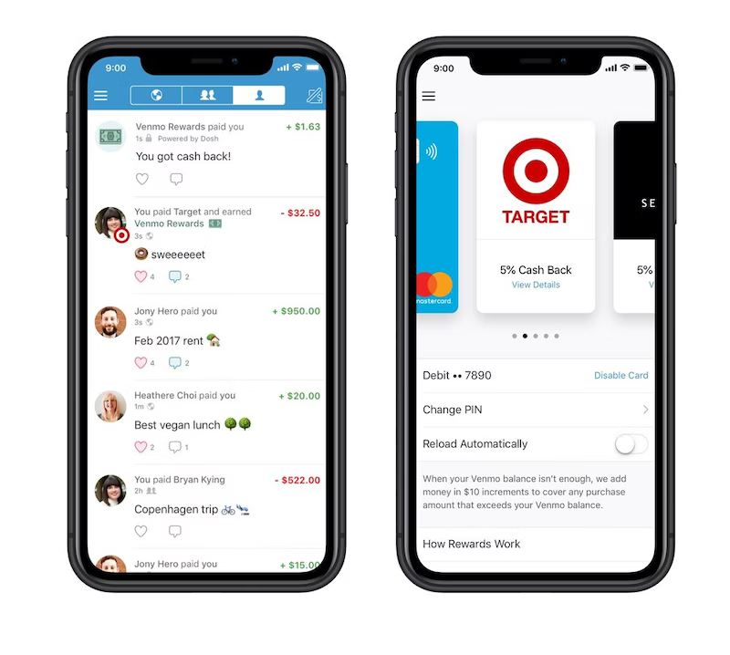
By receiving rewards for meaningful choices, users become more passionate and engaged. Managing money is no longer a boring and irritating job. It’s framed as a series of accomplishments and achievements.
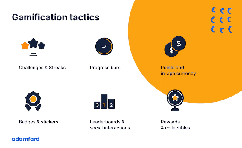
Here are a few examples of popular gamification elements you can incorporate into your Fintech product.
2. Product Identity
Aside from bland color palettes and a penchant for impenetrable slang, banking apps used to be, well… boring. Fintech products have gone a long way from a purely functional tool to a whole brand experience.
Product identity will help a person embrace the importance of managing finance in a quick and painless manner. This is especially relevant when users resonate with the product’s spokesperson and their personality.
Let’s compare two fundamentally different examples of Fintech design.
On one hand, we have Zeller’s old design. By modern standards, it’s pretty much sterile. The color palette is cold and uninviting. More importantly, nothing stands out from a personality standpoint. It’s just what it is — a banking product.
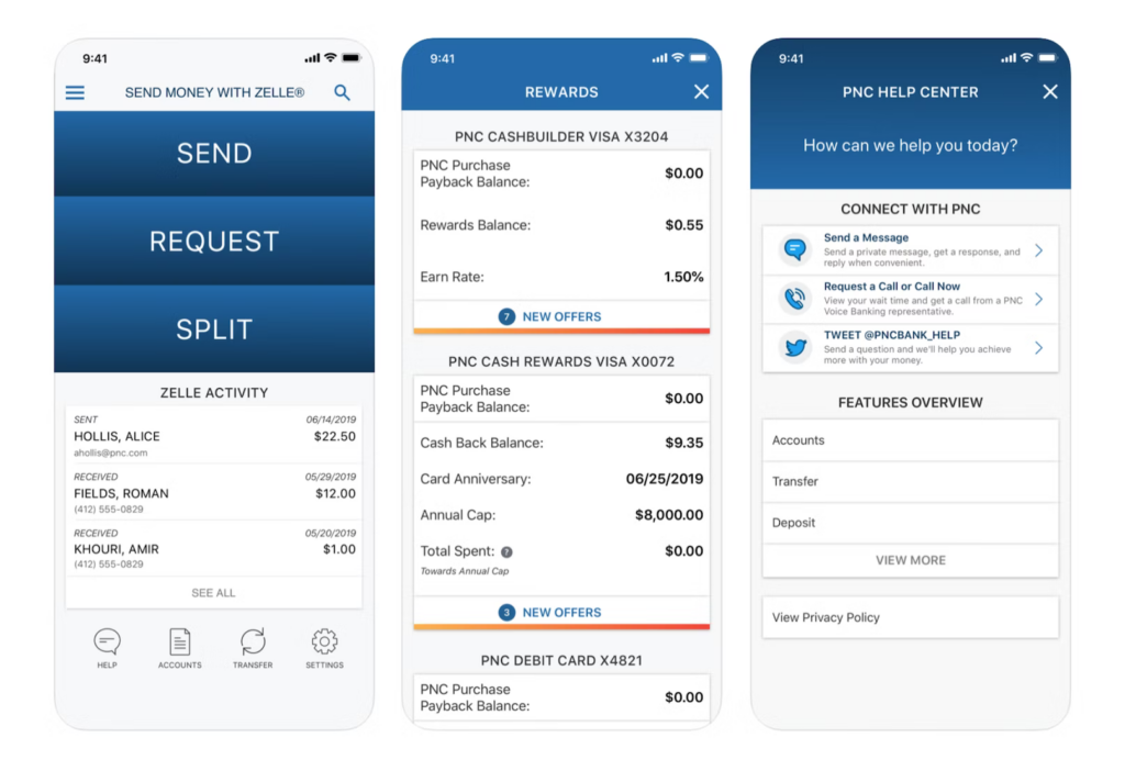
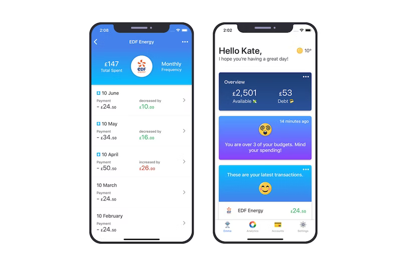
On the other hand, there’s Emma — a money management tool. We can immediately sense how it’s much more welcoming, and less crammed, which, as a result, causes less unwanted friction.

Their use of whitespace and emojis makes the design more human and less foreign 😉. Respectively, it allows the product to significantly improve the experience of managing money.
Aside from reducing friction, Fintech design should aim to create a truly enjoyable experience.

To do that, we need to tap into emotional design and make use of colorful animations and illustrations. This makes the product more fun and enjoyable, which will skyrocket user engagement, along with the value that it provides.
Lastly, if you’re dealing with Millenials or even the younger generations, then vibrant branding is a must. Unlike their predecessors, Millenials & Gen Z value memorable experiences over things like information security, for instance.
3. Centralization
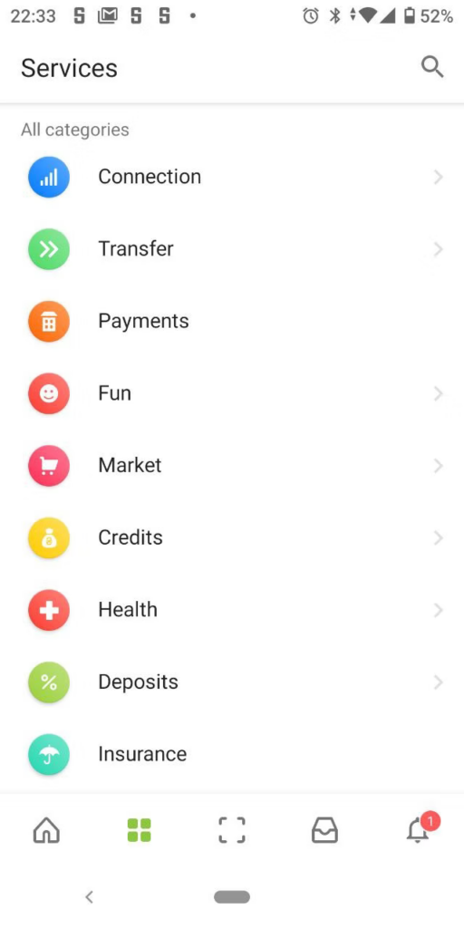
Third-party integrations with other services allow Fintech apps to do more than regular banking products. FinTech apps, mobile ones especially so, are not just a tool to transfer money from one place to the other. Nowadays, fintech encompasses a huge range of financial operations for both an average joe and a finance executive.
This enables users to follow their expenses throughout a variety of channels and get a “bigger picture” view of their finances. At the end of the day, isn’t this what we really want from a financial product?
Here’s Ukrainian retail PrivatBank’s approach to centralizing a broad spectrum of channels in one app.
4. Fully mobile banking
The detachment from brick-and-mortar institutions is a part of the Fintech disruption. In a continuously accelerating world, we rarely have time to go to our local branch to approve transactions and sign paperwork.
Newer financial products like Revolut and N26 make this possible by ensuring superior security.
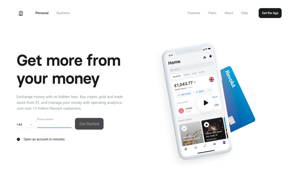
This, as a result, allows for a better user experience that doesn’t have to do with the product’s interface. Instead, it’s about simplifying a customer’s access to their finance and removing the bureaucratic burden from it.
5. “Social” banking
Social media have reshaped the way we think about the world. Moreover, we can assume that “a feed” is a format we’re used to and comfortable with.
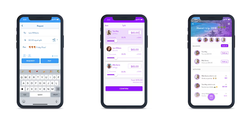
Products like Honeydue allow couples to manage their finances together. With this app, you can track expenses and review transactions made by you and your partner.
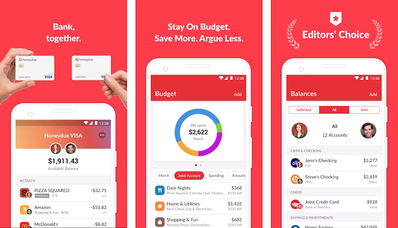
Finch, another popular Fintech product, allows you to even split bills with your friends and receive suggestions from them. The UI is pretty similar to a Facebook or an Instagram feed. This familiarity helps integrate a banking experience into their social space.
6. Data Visualization
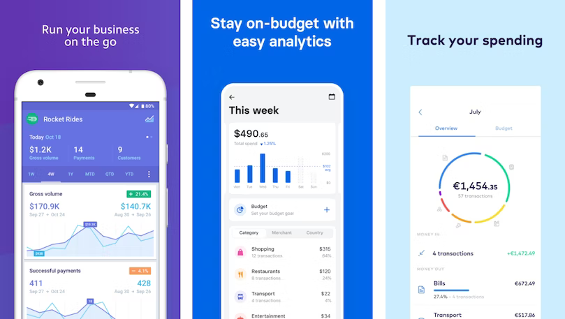
Allowing users to view their finances in a graphically meaningful way is one of the most useful things Fintech products offer. It allows us to have a better understanding of our earnings, expenses, and the relationship between them.
Data visualization has permeated this field so much that it’s almost an inherent expectation.
More progressive products on the market take this step even further. By using Machine Learning algorithms, users can access predictive visualizations that gauge the impact of their choices over time.
Below is a compilation of a few personal finance apps that display the ratio between expenses and earnings. This simple yet impactful approach helps users quickly learn about how much money they’ve spent as a part of their monthly income.
7. Human language
Very often, it’s the impenetrable financial lingo that’s stopping us from using Fintech products. When an app is oversaturated with niche slang, it’s hard not to be intimidated by it, which causes us to drop our attempts at tracking expenses.
Clear copy can help people make better financial decisions, without having to learn the terminology. That, however, doesn’t mean that we need to entirely remove financial terms.
You’ll find that a variety of words like overdraft, prolongation, or LTV Calculator don’t have simpler forms. A great way to help your users navigate this terminology is to have a dedicated glossary that will host the definitions for them.
Conclusion
While trends tend to fluctuate, it’s essential that we focus on optimizing our users’ experiences through design. Most of the products we’ve highlighted in this piece are by no means perfect, yet they strive to make personal finance a more bearable and human task.
Adam Fard
Adam is a senior lead UX/UI designer with more than 8 years of experience. Adam's passion for design steadily grew into his own agency, that he's currently leading.
- Many banks are implementing innovative solutions to make the user experience not only effective but also fun.
- The article covers the following fintech-driven trends:
- gamification;
- product identity;
- centralization;
- fully mobile banking;
- social banking;
- data visualization;
- human language.


