Save

Do your users remember your product or service? What do they think of when they do? How long are those memories of your product or service going to last? Are these people likely to remain as loyal customers?
These questions of user memory matter as much as questions of user experience. The goal is to build long-term relationships with people who love your product, yet product designers spend a disproportionate amount of time focusing on fleeting moments of present experience without considering which ones will have the greatest impact that stands the test of time.
When you consider that most of your users will remember just a few moments from their initial experience with a product, you can see the scale of the opportunity for focusing on the craft of designing and engineering for memorable moments. These memories determine how users think about the products they’ve used, what they’ll tell other people about those products, and how they’ll recall the products in the future when thinking about using the products again. Let’s take a closer look at how people remember.
Right Brain is Right Now
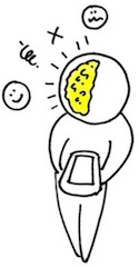
A whole host of tools such as eye tracking, heuristic evaluation, and direct observation let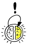
The right brain is a crucial part in creating memorable moments. The peak experiences of the right brain will travel over to left brain through a right-to-left handoff. The left brain will organize these peak experiences into a potential memory.
Left Brain Takes the Leftovers
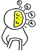
The tool chest of UX design mostly focuses on analytical means of helping the left side of the brain do what it wants (information architecture, design patterns, analytics, etc.). But we tend to neglect the left brain’s craving for memorable moments.
The remembering left brain holds onto memorable transitions and peak moments. It’s heavily influenced by the way things end. Behavioral economist Daniel Kahnmann argues that endings are one very important element we don’t attend to nearly enough. They can ruin an entire experience or save a bad experience by adding a positive spin to the end.
Turn Experience Into Memory
Kahnmann’s work, and research in the field and behavioral economics generally, show that there are three kinds of experience capable of turning the immediate, present experience (experience-in-the-moment) into a potent memory. These three types of experience provide a framework for the design and engineering of more memorable products.
1. Transitions
Giving users one sensation and then transitioning to another causes them to experience change. Providing a visceral effect that signals one thing ending and another beginning you help natural left- and right-brain triggers to fire and a memory to form.
Face Time on iPhone: That initial call transition to the high quality video of the person on the other side is extremely memorable. This is something you’ll be mentioning to your coworkers the next day.
Google Maps: Remember the first time you entered your address into Google Maps and clicked “Street View”? That transition from a 2D map to a 3D video like image of your house is forever ingrained in your mind now.
Photoshop: Think back to the very first time you Photoshoped yourself into a funny picture. Remember the transition from the original to the photoshoped image? People remember this moment so well that “photoshop” is now used as a verb in ordinary day to day conversations.
TurboTax: Remember how you put some numbers into a form and saw your tax return from the government jump up and go from red to green? That transition is how you remember this product.
Each of these interactions was memorable and reinforced the core value of each product. When was the last time you considered how specific changes and transitions in your product impact what people remember about it?
2. ‘Wow’ Moments
Thinking about ‘wow’ moments forces you to acknowledge that very little of what you create for a user will ever be remembered. They will, however, remember the peak experiences they have and refer back to them to sum up their feelings about your product. At the end of the day, when you strip away all the detail, what are the ‘wow’ moments you’ve left your users with?
Zappos: Ever order shoes at 6pm on Zappos.com thinking it’ll take at least three days to get them and then actually get them the next day? Wow! Imaging how many people you’d tell about that experience.
Wii Controller: Remember the first time you played baseball on Nintendo Wii? How hard did you swing the controller? How many people did you tell about it? This is what you think about when try to remember the Wii.
TiVO: Remember fast forwarding through commercials for the first time on TiVO? Remember recording TV shows when you were away? How many times did you tell others about that?
Apple: Ever shake your iPod nano and notice that is changed to the next song in queue? Wow! You just unlocked a new feature. This makes you wonder what else this thing does which you don’t know about. Each of these gives a user a story-worthy moment they are likely to pass along to friends and family and readily remember when deciding whether to return.
3. Endings
It’s so easy to close a browser tab or window that we rarely think of the very last impression we leave users with once they’re done with our site. But endings can be remarkable or disastrous. They can put a positive spin on an otherwise negative experience or take a good experience and ruin the whole thing.
- Good ending: You setup a nice visual goal in Mint.com and end your session knowing that it’s there and you can measure your progress against it. Later on when you meet your goal you get a nice “You have met your goal!” email with a great visual. You will surely remember these moments.
- Bad ending: You setup a nice visual goal in Mint.com and never see any confirmations. It’s hard to check your progress. You never get any confirmation that you have fulfilled your goal.
- Good ending: You buy your airline ticket on Delta’s website and get the itinerary right on your smartphone.
- Bad ending: You are ready to buy your airline ticket on Delta’s website. You fill out all the details and in the middle of the transaction you get a “Forbidden 404” error. You now don’t know whether you were charged or not. You’re lost.
- Good ending: You ask a question on Yahoo! Answers, get quick answers and select the best answer as winner. At the end you are happy to get the information you needed.
- Bad ending: After one week of asking your question on Yahoo! Answers you get very open-ended responses that don’t answer your question. You probably won’t be coming back to the site again.
Dmitry Dragilev
Dmitry is the Marketing Lead at ZURB.
He snuck over to Zurb from Crossloop (a start-up down the street). He's a classic example of a software engineer turned to the dark side. Originally from Moscow, Russia, he immigrated to New Hampshire when he was 11. At 16 he got his first software development gig and for the next eight years he worked as software engineer for a number of companies.
He received his bachelors in Computer Science from the University of New Hampshire in 2004. After that he was a developer by day and a marketer for a small start-up by night, when he found that he loved the "night work" better than his "day work."
Leaving behind his comfortable day job, family and friends he decided to move across the country to Silicon Valley to work as a marketer for a start-up in the valley. Over the next two years, Dmitry helped Crossloop with their marketing while also getting his MBA from the Fisher Graduate School of International Business. He feels like he's on top of the world to be starting at ZURB.
In his spare time he plays classical guitar but has been getting heavy into the blues lately. He ran the Big Sur Marathon last April and hasn't turned down a good run since then. He hikes, bikes, and has some crazy moves on the dance floor.
You can follow Dmitry on Twitter @dragilev.
Jeremy Britton
Jeremy Britton is Partner at ZURB, a 12-year old design consultancy with 100 start-ups under its belt. He acts as Design Lead and Strategist with the team. Setting up problems that people care about and then solving them in ways that work for businesses and delight customers are his focus at ZURB. He still loves to draw pictures, which comes in very handy at these tasks.
A San Francisco Bay Area native, he graduated from the hilltop forest known as UC Santa Cruz (Banana Slugs!) with a degree in Fine Art and an emphasis on digital media and electronics. His background in theatrical set design led him to create some pretty far out art installations during this period and his stint as a graduate teaching assistant gave him his jump into the web industry. "Getting a bunch of students to take their crazy ideas and actually turn them into something with Flash or on the web was extremely cool," he said.
Before joining ZURB, Jeremy worked as an independent design consultant, then animator and interactive designer for Walmart.com, and later co-founded his own digital media company NING Empire, though not the Ning that closed $44 million in financing last year.
You can follow Jeremy on Twitter @jebritton.


