When it comes to best practices for landing pages, it’s easy to find many articles that provide a checklist with the dos and the don’ts. We are familiar with the recommendations: clear call to action, add a relevant image, reduce the load time, remove distractions. And yes, all these changes matter, but behind a powerful landing page, there’s a powerful emotional message.
Every decision we make in life has an emotional reason to it, whether it’s to feel better about ourselves, to feel part of a community, or to feel loved or just safe. If there’s anything that the advertising campaigns from big brands have taught us, it’s that an emotional message is paramount. Coca-Cola, Disney, and Nike, among others, delight us with beautiful commercials that we remember. Yet, not many brands convey emotions in digital ads, let alone their landing pages. More often than not, their landing pages look merely informative.
New landing pages should not be a replica of existing pages with a few changes in elements and copy; they require deliberate thought. After all, many of them are for paid advertising campaigns, there’s money spent, and thus we want to ensure they work.
Firstly, they should be designed for mobile and then adapted to desktop, not the other way around. We need to understand that mobile behaviour is different, and it’s challenging. Mobile conversions can sometimes be twice as low as those of desktop, and there are two main reasons for that:
- Marketing best practices suggest designing mobile-first, but this seldom happens. It’s easier first to create the desktop version and then poorly adapt it to mobile. If at least 30% of your website traffic comes from mobile devices, it’s worth it to start designing the mobile version first. Also, most of the acquisition channels are mobile-focused; hence, the mobile version must undoubtedly be the first option.
- On mobile, everyone is highly distracted. We check our phones in between meetings or breaks, while commuting, waiting for a doctor’s appointment, watching TV, speaking to someone over the phone, even while crossing the street. It’s outrageous. So wanting to find an explanation of why your users drop is pointless.
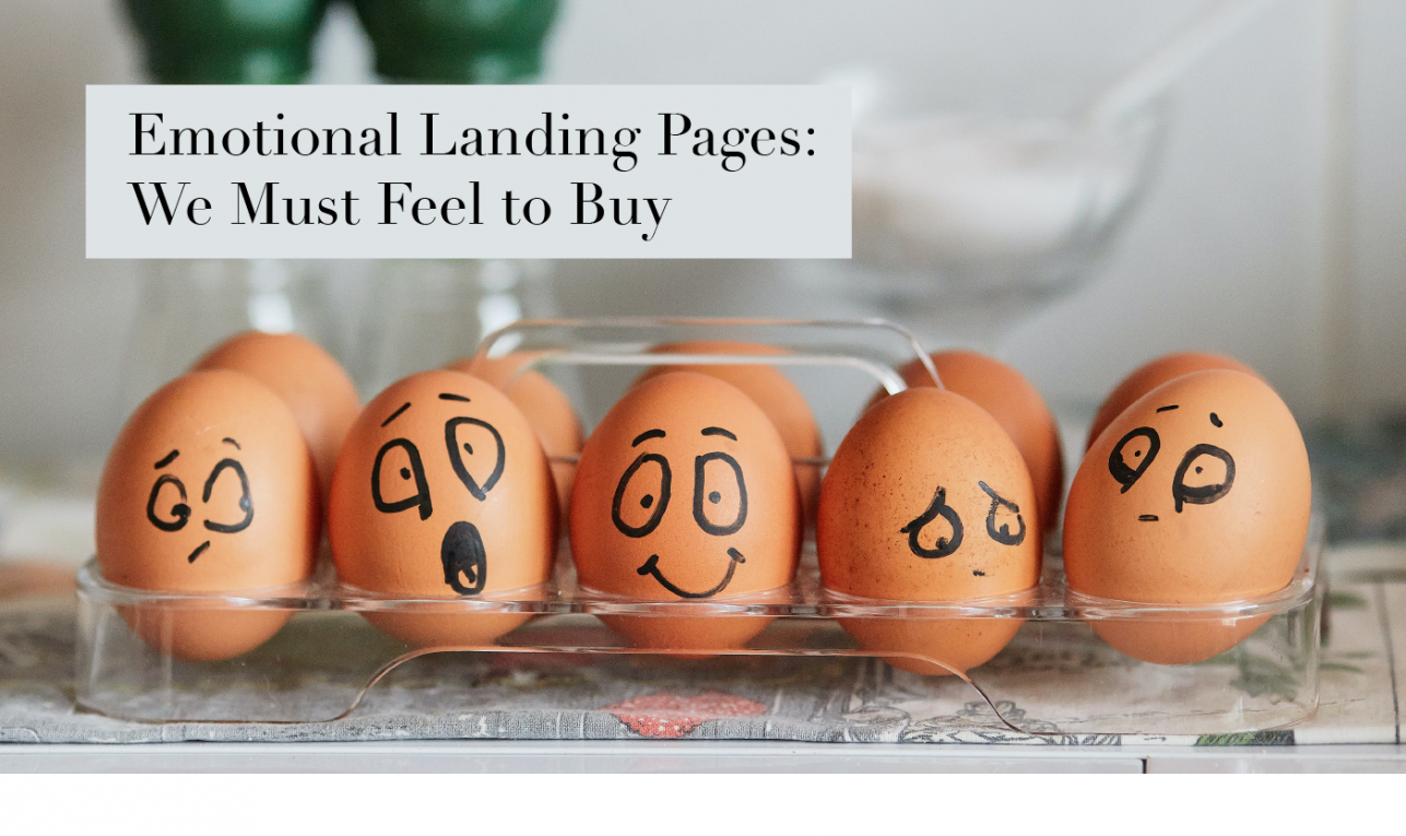
We should just focus on what we can control: the message. It must be sharp, brief, and persuasive. To achieve this, I’ve found an exciting approach proposed by Talia Wolf to add this emotional component to landing pages, especially on mobile devices. I previously posted this article about how emotions affect our decisions, but, with a few lines of text, this is how powerful an image can be:

Source: Reddit
So here is the three-step process that Talia Wolf proposes to assess the emotional message on a landing page:
1. Emotional Competitor’s Analysis
Every company always keeps an eye on what competitors do, but they rarely evaluate the message from an emotional point of view. So this analysis is to understand what emotional message the market is receiving by examining the top 10 to 15 of your direct and indirect competitors. Look at these four elements on their landing pages:
Message: What do they say on their landing page?
Colours: Particularly relevant on mobile as screen real estate is tiny; hence, you can use colours wisely to convey meaning. Here’s the link to a colour cheat sheet.
Image: What visual element accompanies the message?
Emotional trigger: How are they making their customers feel?
As an example of a brief competitor analysis, I’ve selected The Waking Up meditation app along with three main competitors and looked at their homepages:
Waking Up

Source: Waking Up
Message: Discovery and theory of the mind
Colours: Blue (serenity)
Image: Abstract
Emotional trigger: Self-awareness and balance
Headspace

Source: Headspace
Message: It’s all about mindfulness
Colours: Orange (warmth) and blue (serenity)
Image: Design illustrations
Emotional trigger: Balance and happiness
Calm

Source: Calm
Message: Peace of mind
Colours: Blue (serenity)
Image: Serene landscape
Emotional trigger: Balance. Although some wording is ambiguous such as ‘sleep more’ instead of ‘sleep better.’
Buddhify

Source: Buddify
Message: A different way to meditate
Colours: A wide range of vibrant colours. It conveys inclusion.
Image: People
Emotional trigger: Flexibility and balance
2. The Emotional SWOT
SWOT stands for strengths, weaknesses, opportunities, and threats. This insightful method enables businesses to analyse the environment and the company’s standing in it. The first two are internal, and the last two are the external factors out of the company’s control.
Therefore, the emotional SWOT analysis is to evaluate how our prospects may feel about our brand and the overall industry. When creating an emotional SWOT, it should be as objective as possible as it should reflect how most people might perceive us rather than our own opinions of how we’d like to be viewed.
In the meditation app competitors above, the most prevalent colour is blue, which is associated with serenity and peace, and they all use balance as the primary emotional trigger. They all also communicate that this balance is achieved through better sleep and stress reduction. This is a clear indicator that one of the core reasons people explore meditation is because they may struggle with these too and want to find an alternative solution in meditation.
Continuing with the Waking Up app, this is a brief example of what an emotional SWOT could look like:
Strength: Authority/trust — Sam Harris is a well-known neuroscientist, moral philosopher, the author of five New York Times bestsellers, and he’s been a meditator for the last 30 years. He has built a strong reputation for many years before creating the meditation app.
Weakness: The homepage mentions there’s theory present, which might give the impression that this meditation app is complicated, with hard going content, or probably dull. At a glance, it doesn’t communicate how deep the theory is, so it may look like a lecture, and hence, less attractive to a broader audience.
Opportunity: The practice of meditation as a new way to find more purpose, to pursue balance in life. A more insightful approach to learning or finding more meaning in life.
Threats: People might hesitate if meditation is what they need, or they might need a faster solution. They might consider they don’t have the time to learn, or that it’s hard work to build this new habit.
3. The Emotional Content Strategy
The emotional competitors’ analysis gives us a better understanding of the messaging to find patterns: What we have in common and what we want to differentiate from them.
The SWOT, particularly the weaknesses and threats, can help us identify the most significant barriers or reasons that may hold people back from trying our product. In the case of the Waking Up app, there’s an opportunity to convey that:
- The theory is easy to understand; they are bite-sized concepts taught during the practice.
- The practice will help you not only solve your emotional struggle but also discover how your mind works around it, tackling the issue from the root cause.
- The app guides you through building a habit. You don’t need to worry about it.
- The only way to find if something works for you is to give it a try.
Therefore, for the emotional content strategy, the next step is to place the emotional triggers across the following framework. It enables us to brainstorm test hypotheses and find opportunities to sound different or identify where to reinforce our message:

This framework supports copywriters and designers to work towards the same goal. I’ve added many emotions and words to give room to the creation of different hypotheses that would result in the production of at least two different landing pages. It’s essential to use a combination of emotional triggers; it’s never about one.
After you’ve conducted a thorough competitor analysis, emotional SWOT, and developed a content strategy, there’s one thing left to do: testing and iterating.