Flag

We stand with Ukraine and our team members from Ukraine. Here are ways you can help

Get exclusive access to thought-provoking articles, bonus podcast content, and cutting-edge whitepapers. Become a member of the UX Magazine community today!

Home ›› Automotive ›› Does the Red Light Mean the AC Is On or Off? #wtfUX

Does the Red Light Mean the AC Is On or Off? #wtfUX

by Josh Tyson
1 min read
Share this post on
Tweet
Share
Post
Share
Email
Print

Save

Turning the air conditioning on and off in a rental car finds one user confused by the meaning of a little red light.

Automotive UX does not have the best reputation. Sure, there have been some wins, and carmakers like Tesla have put interface design front-and-center, but curious problems persist. We’ve got another bout of quizzical automotive interfacing for you courtesy of Deborah Sommers.

“After giving up being a car owner for the convenience of rentals and city cars, one of the challenges has been finding the buttons for all the little things like tuner, volume, and—in particular—air conditioning,” Sommers says. “However, this most recent rental topped them all for poor design. We easily found the AC button on this Renault Captur, but had trouble understanding how to turn it on and off.”

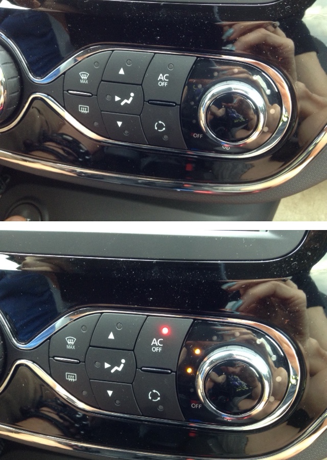
“The console features a tiny red light to indicate OFF and no light to indicate on!” she says. “It took a while for this to sink in and I found the need to keep testing to be sure this was actually true. For me it was a real WTF design moment.”

Keep these coming. Send them to us via Twitter or Facebook using the hastag #wtfUX or email them to: [email protected] with “#wtfUX” in the subject line. Include as much context as you can, so we get a full understanding of what the f%*k went wrong.

post authorJosh Tyson

Josh Tyson
Josh Tyson is the co-author of the first bestselling book about conversational AI, Age of Invisible Machines. He is also the Director of Creative Content at OneReach.ai and co-host of both the Invisible Machines and N9K podcasts. His writing has appeared in numerous publications over the years, including Chicago Reader, Fast Company, FLAUNT, The New York Times, Observer, SLAP, Stop Smiling, Thrasher, and Westword. 

Tweet
Share
Post
Share
Email
Print

Related Articles

Data visualization isn’t just about charts — it’s about telling a clear and compelling story. This article unpacks a wide spectrum of essential principles for making data easy to understand, honest, and engaging. Ready to transform complex numbers into meaningful insights?

Article by Jim Gulsen
The Ultimate Data Visualization Handbook for Designers
  • The article serves as a comprehensive guide for elevating visualization work, combining technical expertise with design principles to help designers transform raw data into meaningful insights.
  • It provides a point of reference for strategies, methods, and best practices to create more effective and impactful data visualizations.
  • The piece recommends tools and resources that design professionals can immediately implement to enhance the clarity and persuasiveness of their data storytelling.
Share:The Ultimate Data Visualization Handbook for Designers
23 min read

Discover how breaking down silos and embracing cross-functional collaboration can lead to smarter, more user-centered design — and better products for everyone.

Article by Rodolpho Henrique
Beyond the Design Silo: How Collaboration Elevates UX
  • The article explores how siloed UX design practices can hinder product success and argues for cross-functional collaboration as essential to creating meaningful user experiences.
  • It outlines the benefits of working closely with product managers, engineers, and stakeholders to align user needs with technical feasibility and business goals.
  • The piece provides real-world collaboration examples across research, prototyping, design systems, and accessibility to show how teamwork leads to more innovative and effective UX outcomes.
Share:Beyond the Design Silo: How Collaboration Elevates UX
4 min read

Designing for AI? Know what your agent can actually do. This guide breaks down the four core capabilities every UX designer must understand to build smarter, safer, and more user-centered AI experiences.

Article by Greg Nudelman
Secrets of Agentic UX: Emerging Design Patterns for Human Interaction with AI Agents
  • The article examines how UX designers can effectively work with AI agents by understanding the four key capability types that shape agent behavior and user interaction.
  • It emphasizes the importance of evaluating an AI agent’s perception, reasoning, action, and learning abilities early in the design process to create experiences that are realistic, ethical, and user-centered.
  • The piece provides practical frameworks and examples — from smart home devices to healthcare bots — to help designers ask the right questions, collaborate cross-functionally, and scope AI use responsibly.
Share:Secrets of Agentic UX: Emerging Design Patterns for Human Interaction with AI Agents
10 min read

Join the UX Magazine community!

Stay informed with exclusive content on the intersection of UX, AI agents, and agentic automation—essential reading for future-focused professionals.

Hello!

You're officially a member of the UX Magazine Community.
We're excited to have you with us!

Thank you!

To begin viewing member content, please verify your email.

Tell us about you. Enroll in the course.

    This website uses cookies to ensure you get the best experience on our website. Check our privacy policy and