As a user interface designer, one of the most exciting changes I’ve seen in last few years has been the growth of rich Internet applications. Although I designed many good standard Web applications, interactions and components have long been limited. It was like trying to build a Lego sculpture with only three shapes. To me, having a full range of Legos is necessary to meet the complex challenges of designing interfaces for RIAs.
I have to think much harder when I design rich interfaces than when I work on standard Web applicaitons. With the increased flexibility and more components comes a higher risk of making silly mistakes. If I use a component inappropriately, users can’t figure out what to do, even though the components may look cool.
The purpose of this article is to help designers avoid mistakes and to help them choose (or design) components based on sound, fundamental principles of usability.
Before I get into that, let me explain what I mean by a component. A component is the most granular piece of an interface. For instance, a component might be something for a user to make a selection from a list, choose ranges, or to enter, edit, and view data. This would include drop-down lists, text entry boxes, sliders, editable text, and others. Sometimes components are called controls.
Selecting and using good components is a very important part of the design process. It would be easy to write a spec that says “drop-down list goes here,” “editable data field goes here,” but we need to do more than that. All drop-down lists are not created equal. Some are inherently usable, and others are terrible. Designers need to be mindful about how every component works—from how it displays on screen, what triggers it, what feedback it provides, and what happens when the user finishes an action. Designers shouldn’t leave component selection to developers, and developers shouldn’t assume their favorite component library is actually usable.
But back to usability. There are some fundamental principles of how human cognition works that can help us choose components and feel confident they’ll be usable. Let’s look at them.
Vision and Seeing
Vision is our dominant sense (for those of us with reasonable eyesight) and we, as designers, rely heavily on users to visually notice, interpret, and understand our designs.
There are many interesting facts about vision that impact usability. Here are some important issues that will lead to better usability:
- We have sharp vision in the center of our focus that is good at paying attention and identifying detail.
- We have poor peripheral vision that can identify movement and contrast, but not identify detail.
- Shadows help us perceive information in three dimensions—light from above and shadow below makes things pop out of the page.
- Sudden movement, changes in contrast and the appearance of images can attract visual attention.
Why do I mention these facts when talking about interface design? Because they have everything to do with users seeing components on pages and noticing change. If people can’t see something or see it change, they aren’t going to be able to use it.
So when choosing components, here’s a handy checklist:
- Is there enough contrast and spacing for a user to really see the component?
- Do changes happen right where the user is looking?
- If changes happen outside the field of vision, is there something that will attract visual attention (movement or color) so they see the change? And does the change persist long enough to be spotted?
Examples
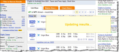
Kayak.com uses contrast and change to attract visual attention to the “updating results” message.
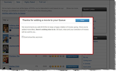
Quickflix uses deep shadow to make this notification message pop-out.
Knowing What to do (Affordance)
Assuming users spot a component, the next important part of usability is to indicate tothe user in to what the component does. There are two concepts that help users figure out what to do with something: affordance and intuitiveness.
Affordance
Affordance is the attribute of an item that communicates what can be done with it. When effective, users should be able to figure out what to do with an item just by looking at it. For example, in the physical world, round door knobs are for turning, buttons are for pushing, and chairs are for sitting on. Online, shadows and highlights can make buttons pop (which helps users know they can be pushed), sliders look like they can be slid, and dials look like they can be turned.
Intuitiveness
Everyone says they want interfaces to be intuitive. The funny thing about intuitiveness is that an interface can’t be intuitive—only people can be intuitive. Intuitiveness is also different to innateness (possessed at birth). Intuitiveness is about learned behavior and can be considered synonymous with the phrase “easy to learn.”
Things that are easy to learn build on existing knowledge. As designers, we need to know something about our users’ existing knowledge before we can design or choose a component that will be help them act intuitively. This knowledge may vary with the topic, perhaps on the user’s experience with computers, or the user’s overall exposure to the product.
Usable components
Following the two key principles of affordance and intuitiveness, a usable component will be one that:
- People can figure out how to operate just by looking its visual representation
- Builds on existing knowledge by using existing conventions
- Provides an easy way to learn it

When you open the geolocator on etsy.com, the globe is spinning slowly—a visual indicator that it can be spun.
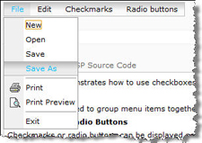
This menu looks, feels, and works in a similar way to a Microsoft Windows menu, suggesting familiarity.
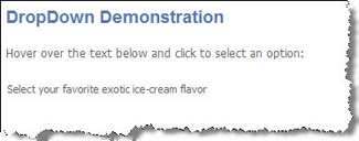
This drop-down looks like plain text, not like a drop-down menu. People won’t understand what to do with it.
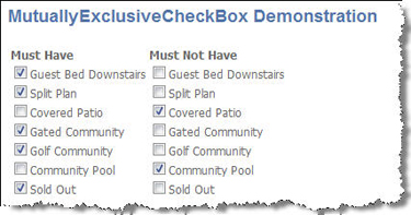
This component breaks convention. Checkboxes are for multiple selections, not for toggling pairs of items.
Feedback
Another important part of usability is feedback. As users work with an interface or with components, they need to receive clear, helpful feedback about their actions. All feedback must be plainly visible, and must happen where the user is looking.
Feedback can take many forms, including (but not limited to):
- Buttons that appear to depress on click
- Waiting indicators for processes that take time
- Search results that appear as they are found (rather than after a delay)
- Confirmation messages that appear after actions
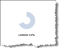
Progress indicators help people know something is happening.
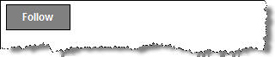
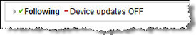
Twitter provides immediate feedback after clicking the “follow” button.
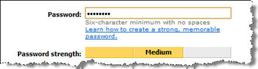
The MSN password strength component provides immediate feedback as you set your password.
Errors
Error management has always been an important part of interface design, and it is even more important when designing interfaces for rich Internet applications.
There are three aspects to error management:
- Avoid: Users need to be able to avoid errors.
- Identify: If an error does occur, users need to be able to quickly see that something happened, and understand what to do about it.
- Correct: Users need to be able to quickly correct an error and be able move forward right away.
The overarching goal is to help people avoid errors in the first place. Much of this can be accomplished with good task flow, layout, and labeling. But choosing the right components is a very big factor in error management. For example:
- A combo box (combination of single-select list and text entry box) reduces error to a much greater extent than just a text entry field. Giving the user an initial set of options, simple data entry and formatting errors can be avoided.
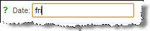
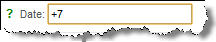
- Date pickers reduce the margin of error compared to date text entry fields.
- Auto-complete helps people select from long lists.
- Components with forgiving formats allow users to enter data in a way that makes sense to them, rather than the way the system wants it.
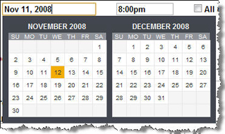
Date pickers help users avoid errors in format and date entry.
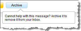
This button has help text so users can readily understand the consequence of an action.
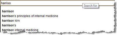
Amazon‘s auto-complete functionality helps users avoid spelling errors.
Todoist‘s forgiving format allows users to enter the date how they want, not how the system demands.
Summary
When designing or selecting components, use this checklist to make sure every component in the interface will be usable. If you do, your work will make users happy, and that is your goal as a designer.
- Is it easy to see on the screen?
- When changes happen, are they easy to see?
- Can people figure out what to do with a component just by looking at it, or with minimal thinking?
- Does the component use conventions that people already understand?
- Does the component help people avoid errors?
- If people make an error, do they know it happened and can they easily recover from it?
This article was originally published on the User Interface Resource Center (UIRC). For more info, please see https://uxmag.com/uirc