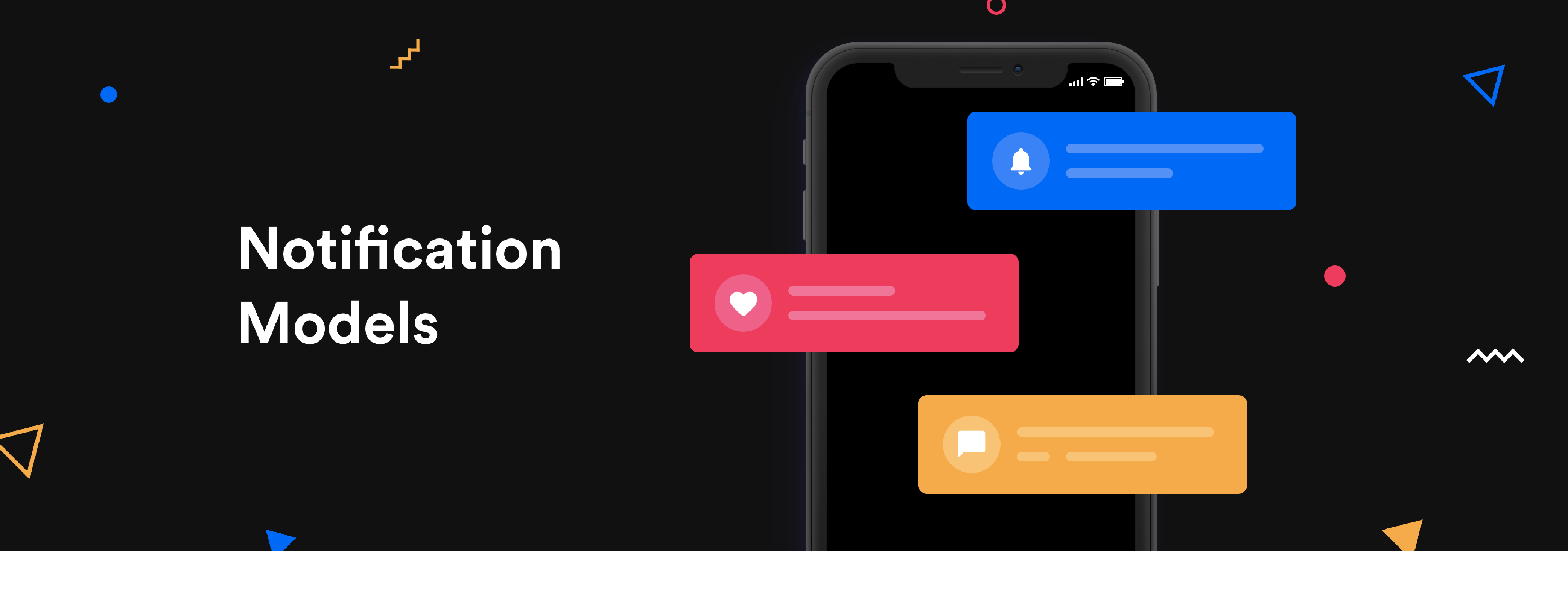
Notifications can be a complex feature to deal with. This article does not cover all the details around it, but I hope it will be enough to provide you with some clarity and a direction towards picking the right notification model for your application.
Before we begin discussing notification models, let’s do a quick rundown of what notifications are and what they consist of. Notifications are pieces of information originating from an app targeted at the user. Here are some important components of a notification.

Notification Models — Schema
Source: This is the part of the app from which the notification originates. The architecture of an application can have several buckets in which information is categorized, and these buckets would be the sources of notifications.
Information: This is the message that needs to be conveyed to the user by the means of a notification. Some examples are “Daenerys Targaryen sent you a friend request” or “Lord Varys started following you”.
Type: Notifications can be mainly of two types: informational and actionable. Both these types could have further subtypes depending on the context of the app.
Notification Badge: These are visual indicators that direct the user to the notification. Notification indicators can be as plain as a dot, or they can also have a count on it which would show the number of unread notifications.
Anchor: Anchor is the visual component of the app where the notifications surface on the interface. To put it simply, this is the component on which the user will see the notification indicator/badge. Note that anchors are not necessarily sources of notifications, but only the component where the notification surfaces. An anchor could house notifications from multiple sources or just one. Think of it like this, sources are more on the architectural/informational level, but anchors are the visual component where you see the notification badges.
Notifications are one of the mediums via which an application communicates with the user and possibly brings them back to the application. Hence, they’re a really important part of the app. Let me introduce you to some of the most popular notification models that exist and also when it makes sense to use one over the other.
1. Notification Center
In this model, there’s a defined place where all your notifications land. The notification center could be a dedicated screen or a flyout depending on the real estate available. In this model, all the notifications are anchored to the notification center regardless of their source. From the notification center, you can then navigate to the source of the notification. Medium uses this model for notifications. A badge shows up on the bell icon which is the entry point to all your notifications. It is also important that the read and unread notifications differ visually to allow the user to differentiate between them.

Medium — Notification Center
The biggest advantage of this model is its flexibility. It’s one place that can accommodate every notification, be it from an existing source or something new.
Guidelines
- All the different types of notifications must be thought through and should follow the same design schema. When designing the schema, it’s important to think of scalability as our primary goal.
- If you have too many sources of notifications, there’s a possibility that this model can start looking a little cluttered when there are too many notifications. If there are similar types of notifications, you could group them together which would help to reduce repetition. For example, “Sansa Stark and 3 others sent you a friend request”.
- Ensure that the notification center is easily discoverable and accessible.
Use the notification center when
- Your product has a need for notifications that cannot be anchored to any of the existing navigation options. It could be because the notification isn’t consistent with the existing objects on the product, or the notification does not originate from any of the defined sources in the information architecture.
- There are more possible sources for notification than the app can accommodate on the landing screen.
- When you’re short on time. There could be cases when you need to ship a feature before you have the time to think through all the possible scenarios for notifications and find the anchors for each. In such a case notification center could be your easy way out as it’s very flexible in nature.
2. Source Anchored Notifications
In this model, every notification is anchored to a navigation option which is most likely the source of the notification as well. There is no single hub/center for all your notifications. Have a look at WhatApp to get a better idea. On both platforms (android and iOS), the notifications from chats or calls are anchored to the respective navigation menus. The advantages of this model are that it leads to more content discoverability. The user can now directly reach the information being conveyed by the notification, without the trouble of an added middle layer. But this model isn’t as flexible or scalable as the notification center.

WhatsApp — Source Anchored Notifications
This model heavily depends on the information architecture of the app. The navigation must be able to accommodate all the different types of notifications. Like the previous model, here also it’s important that the read and unread notifications differ visually.
Guidelines
- Ensure that every notification can be anchored to one of the navigation options on the landing screen. As the complexity of your application increases, the sources of notifications may also grow in number. In this case, you could either go for a notification center or you could consider a mixed model (i.e. a combination of the anchored model and the notification center). We will get to the mixed model in the next section.
- Every anchor should have a design schema for the content it will house. Ensure that your notification fits the schema of the anchor. To understand this, let us take the example of WhatsApp. The anchor “chat” here has a design schema that defines how a chat object should look like. This means that any notification anchored to chat must follow this schema. Same goes for “calls”.
- Ensure that the anchors are easily discoverable and accessible. Avoid using nested anchors.
Use source anchored notifications when
- When all the possible sources of notification can be accommodated on the landing screen.
- You have thought through all the scenarios of notifications and all notification can be accommodated with the existing design schemas. It’s important that these notifications follow the schema of the source they’re anchored to.
3. Mixed Model
This model is a combination of both the models. It is the most commonly used models. Facebook, LinkedIn, Twitter and Instagram are some of the popular apps that use it. Here, the notification center becomes one of the options in the navigation menu which can be used as an anchor for sources that do not qualify to be on the landing screen. For example, Facebook anchors new friend requests to the “friends” tab, but an invite to like a page is anchored to the notification center.

Facebook — Mixed Model
This model has the merits of both the models and can easily accommodate most of the cases. Though now you have the ability to anchor notifications to the notification center, it is still essential to think through all the scenarios and prioritize which can be accommodated with source anchored notifications.
Just like the source anchored model, this model is also heavily dependent on the navigation menu, which also has the notification center as an option now.
Guidelines
- Identify and rank the most important buckets of information in the architecture of the product. Ranking them would allow you to prioritize which notifications should be anchored to the sources, and which should go in the notification center. As this model depends on the navigation, the configuration for notification can change according to the available real estate.
- Ensure that the primary anchors and notification center are easily discoverable as a part of the navigation on the landing screen.
Use the mixed model when
- You have thought through the notification scenarios. You have some notifications that can be anchored to their respective sources but some other notifications cannot be anchored to any of the existing sources in the architecture.
- You have nested sources in your navigation. For example, the hamburger menu icon on the Facebook app is an anchor for notifications coming from the sources under it, such as Groups, Watch, Memories, Saved, Marketplace etc.
Conclusion
All the models mentioned above are useful in the right context. The decision of which model to pick for your app depends on the information architecture and the types of notifications you want to cater to.