Save

More than four billion people around the world still don’t have access to the internet. This means over half of the world doesn’t have access to the kinds of services, tools, and influences that the rest of us take for granted. As a new wave of users comes online, they’ll do it on smartphones without ever having used a desktop computer. In places where the internet infrastructure lags behind access to affordable devices, users enter a world of information through unfamiliar technology and spotty networks. In this rapidly emerging space, the role of design needs to fundamentally shift.
Every designer has their own lens; their own bias for design. As I immersed myself into the world of emerging markets as an interaction designer at IDEO.org, I had to learn how to let go of assumptions of what good design looks like and find new ways to get there. I am still very much on this journey today, but here are a few of the patterns I’ve observed over the past two years.

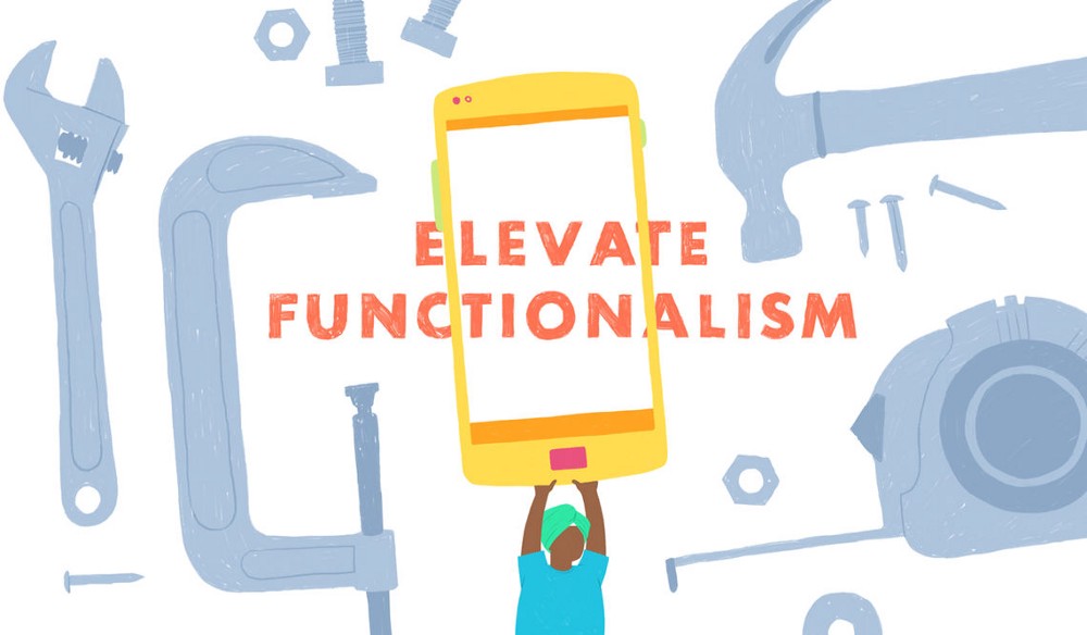
Elevate functionalism.
People with low-literacy are used to problem solving. They create workarounds so that technology can better meet their needs — and they’re really good at it. This resilience comes from overcoming painfully steep learning curves, put in the way by technology that just hasn’t considered users in the emerging space. As designers, we can create a more inclusive experience.
Last year my team went to Bangladesh for the research and design of a personal finance app and immediately learned that over 27% of adults in our user base were not literate in Bengali. This was complicated by the fact that many existing tools, especially financial ones, had only ever been available in English — so users had developed varying levels of familiarity between English and Bengali — often with no overlap. For our project, this meant we couldn’t rely on written language to communicate key concepts.
First, we looked at how symbols and iconography could guide users through the experience. When testing UI and icons, users in emerging markets tended to gravitate towards the most literal visual expression. Modern iconography has evolved to the point that it’s no longer intuitive out of context. Familiarity with minimal icons like a paper plane (for send) or a box with an upward arrow (for upload) requires reinforcement and context that users new to tech don’t often have. When doing user research in Dhaka, I remember testing a spread of icons to represent ‘Send Money’, and without fail each user pointed to the most representational version of the icon — an envelope with a taka bill flying out of it. When we probed further, the answer was simple: “I recognize this.” When dealing with money, our users — many of whom living under the poverty line — had little or no appetite for abstraction, with good reason. We sacrificed a “clean” interface for one people could trust.
Beyond iconography, we looked for other ways to guide users through the different financial service flows. We assigned a different color to each function in the app, so they acted as a simple but pervasive guidepost. The color scheme and iconography let users know they were in the right place, doing the right thing — all without words. The design decision was a departure from existing digital experiences, where dominant colors and visual style are defined by the brand. As a designer in the emerging space, I’ve pushed myself to design experiences that prioritize clarity and inclusivity over minimalism.

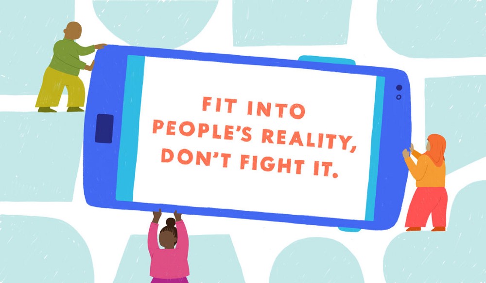
Fit into people’s reality, don’t fight it.
Designing digital products and services in places like Cambodia, Uganda, and Zimbabwe has shown me that there is no universal mental model for the way people use their phones. In many places, large families share ownership of a single device. In other contexts, people use feature phones for calling and texting, and their smartphones are kept at home only for Facebook and Youtube. A man I interviewed in Chittagong, Bangladesh switched his SIM card between three different feature phones to avoid losing important text messages. Suffice it to say that phone usage around the world is not one-size-fits-all.
Assuming that the relationship between user and phone is always one-to-one reinforces experiences that just aren’t designed for today’s reality in most emerging markets. As both designers and outsiders, we have to acknowledge how each environment uniquely shapes the way that people use their phones before we can design the right experiences for them.
Back in Bangladesh, we saw how the misalignment of technology and cultural values had systematically marginalized women. Through our research, we learned that Bangladeshi women rarely registered their own phone numbers, because female numbers were commonly subject to lewd, predatory phone calls. It was their father, brother, or husband whose name would appear on their paperwork; a compromise that made a woman’s ability to engage in connected services (e.g., PIN reset or transaction reversal, which both require identity verification) completely dependent on that man. As a response to this learning, we tailored the onboarding experience of the personal finance app to give users full control over their information, allowing users to customize their name, their photo, and to selectively share them with users of different levels. Emphasizing these options at the beginning of the experience (versus hiding them in settings as an afterthought) was an effort to empower all users, especially women, to confidently use the tool.
When it came to the app home screen, we began with the hypothesis that a dynamic UI — mirroring the user’s behavior by elevating features with the most heat — would make for a more intuitive experience. But we heard story after story of people whose child, mobile agent, or even neighbor acted as their shadow user. Whether it was because they were illiterate or uncomfortable with technology, there was simply no substitute for this extended network of users. In fact, agents helped 70% of Bangladesh’s mobile money users with over the counter (OTC) transactions in 2016.2 If each customer had a completely unique UI, it would be impossible for agents to keep up with their dozens, sometimes hundreds of daily OTC transactions. We ultimately pivoted towards a simpler interface that relied on clear information hierarchy over unnecessary customization. Letting go of our original assumptions made room for critical user-driven insights — an essential practice if we’re to help users transition to new behaviors and improve their digital fluency.

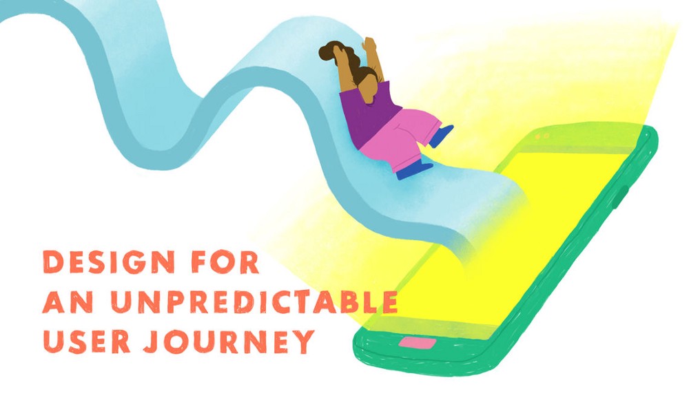
Design for an unpredictable user journey.
Living in the US, I don’t step out of the zone of constant network coverage very often. In the developing world, connectivity is much less predictable. Users have to deal with the uncertainty that their texts, calls, and mobile money might not make it through. Local network infrastructure is still catching up with demand. When designing digital products in such an unpredictable environment, we must understand — and design for — the emotional consequences when technology fails. If a user isn’t sure whether or not their text went through, they might associate fear and anxiety with their phone. If they might not know if their remittance was sent, it could mean that their family won’t have money for food or clean water.
Over the course of several trips to rural Uganda, my team created an Android tablet app aimed at helping a local coffee cooperative more efficiently pay farmers in mobile money. During our early research, we observed the dated system co-op staff used to manage and pay farmers. One of the managers walked us through the process; he turned on the generator, flipped on the router, and pulled a laptop out from under an old stack of papers. After turning the device on, he painstakingly attempted to login for seven minutes without success. Because the existing system didn’t have a password reset flow, he told us it would take three days to reset his information. Until then, the entire station wouldn’t be able to view farmer profiles or pay in mobile money. Creating safeguards for these dead-end moments sounds like low-hanging fruit, but being creative and thoughtful in how we design for them about them can elevate the entire experience.
We also focused on creating intuitive safeguards for other critical pain points, like when the network connectivity went down. We learned from farmers who had accepted their payment in mobile money that it could take anywhere between 10 minutes and eight hours to appear on their phones. On the old system, there was no way for staff to tell what was going on, or otherwise put farmers at ease. This lack of transparency created a deep distrust in the system, and very few farmers were willing to accept it a second time. With our focus group of stakeholders, we tested UX flows that gave staff different opportunities to course correct if the network was weak. Staff members told us they wanted to test the network before they pushed payments out to avoid their famers being in a state of limbo, so we created a payment queue; if the network was poor, payments would be stored and the system would notify staff when they could try again. We weren’t going to erect new network towers overnight, but we were able to create a safeguard system that worked for the way that farmers and staff communicated today.
So, what does this all mean?
When we design new digital tools and services for people in emerging markets, we’re inviting them to take a risk; it might be doing away with paper receipts and moving towards digital, or trusting that their money won’t disappear if they put it on their phones. These first encounters are extremely fragile — getting it wrong could mean turning vulnerable people away from all the benefits that technology can give them. Getting to the digital future we want means that as designers, we have to actively acknowledge our biases and let the voice of our users define what good looks like. We need to see the communities we are serving less as clients and more as collaborators we partner with for the long haul. We need to be prescriptive about how our learnings are implemented so that the things we create have the integrity and durability our users need. It isn’t going to be easy, but solving these kinds of complex design challenges will ensure that the next wave of digital tools and services will be inclusive for every user.
Angie Fu
Angie is a multidisciplinary designer focused on design for social impact and the unique needs of emerging markets audiences. She's currently on the Connectivity team at Facebook designing solutions to help improve the access and affordability of the internet, and was previously designing financial health and youth mental health solutions at IDEO.org.
- When designing experiences, it is essential to aim for inclusivity and accessibility since users around the world don’t have the same opportunities.
- One way to create an inclusive experience is to embrace functionalism and opt for clear visual elements. This might include easily recognizable icons and colour schemes.
- Because of issues like poor network coverage, digital products should be also adapted to the unpredictable environment that characterizes some of the developing countries.
Read the full article for some ideas on how to consider accessibility in digital products around the world.


