To create applications and systems that are easy to use, it is crucial to understand the user and the context in which the app will be used. Understanding the context helps design systems that anticipate use cases at a relevant time of use. The more unobtrusive and transparent the experience is at the time of use, the better the design. This means the user does not have to think about the device he is using, changes in the environment, or changes in context, and can rely on great functionality and ease of use independent of his situation.
In traditional systems, the context of use did not change much. Whether the use was in the office or at a personal computer at home, the surroundings were similar and there was no need to adapt to different environments. In today’s world, smartphones, tablets, laptops, and smart TVs provide different services in different contexts. These services are consumed by a variety of users and require different interaction models, use cases, and planning. For this reason, UX professionals should first design for the context of use in order to provide better experiences and ultimately enhance the intended purpose of the product.
The Multiscreen App Ecosystem
Designing for context is especially important when designing for a multiscreen ecosystem, where multiple devices are all a part of one product.
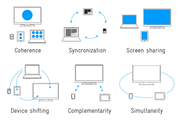
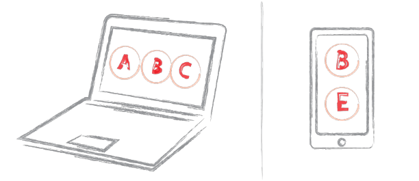
Michal Levin, a UX designer at Google, describes multiscreen ecosystems in terms of three main categories. The first is consistent experience, where the application and the experience are similar across all screens. For example, the Google Search application provides the same search experience across all devices. The second category is the complementary experience, where devices work together and communicate with each other in order to create a unique experience. An example of this is Padracer, a racing game where the user’s iPhone serves as the steering wheel and the iPad screen as the racetrack.
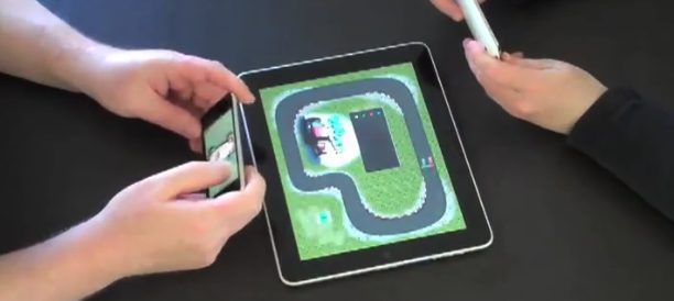
Padracer – a complementary multi-screen experience
Another example of a complementary multiscreen experience is SlingPlayer for mobile devices. A Slingbox is a device that allows you users to stream live television from their living room to mobile devices. Using the SlingPlayer application, users can watch or record their favorite programs from a remote location. Each device complements the other and the experience could not exist with just a single device.
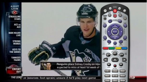
SlingPlayer for tablet
The Continuous Multiscreen Experience
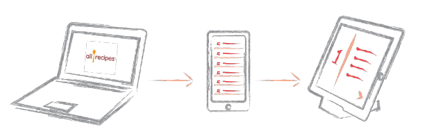
The third category of app ecosystems the continuous multiscreen experience, which is possibly the most important category for a contextual multiscreen design. For a continuous experience across several devices, UX professionals must evaluate when and where a product will be used in order to assess the optimal experience for the user at the time of use. AllRecipes is an example of a continuous ecosystem where one can search for recipes online using a desktop computer and add ingredients to create a shopping list. While shopping, this list is accessible using a smartphone, the device most likely to be carried while shopping. The app also allows one to scan products using the camera and receive additional recipe ideas with greater ease. When it’s time to cook, an iPad can be brought into the kitchen for a cook-friendly interface with large fonts and big buttons so the user can touch the tablet with a knuckle in case of wet or messy fingers. The tablet’s larger screen is a perfect size for the kitchen, much like a traditional cookbook resting on the counter.
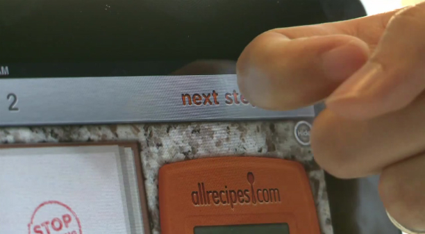
Cook-friendly interface with large buttons for messy hands.
Eventbrite is another great example of a continuous multiscreen ecosystem. Users can register for an event through the Eventbrite website and receive an email ticket that they can print. Alternatively, users can download the mobile app for easy access to tickets and event information. The mobile app is ideal in this case because users will most likely take their smartphones to events to use a unique QR code as a ticket, which the app displays in high brightness and contrast for easy scanning in dark environments.
But the Eventbrite experience should not end there. The makers of Bizzabo, a new app designed to improve the social experience of conferences, believe in the importance of eye contact, handshakes, and face-to-face meetings. Their mobile app allows event organizers to import Eventbrite event information and engage directly with their attendees, while enabling professionals to network efficiently at conferences and meetups. This continuous experience is a natural evolution to the Eventbrite platform.
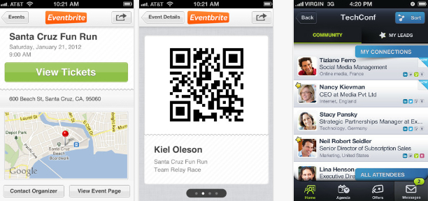
Eventbrite and Bizzabo, a continuous experience.
Additional Categories of Multiscreen Ecosystems
Precious, a studio based in Hamburg, Germany published a collection of additional multiscreen categories and scenarios to help understand and define strategies for the multiscreen world. It’s a handy reference for discussing solutions for digital products and services.
Understanding The Story
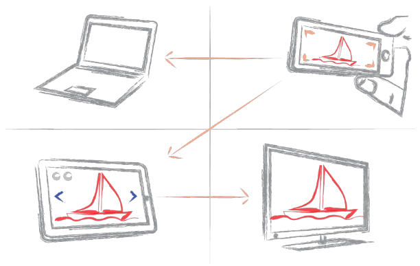
Sarah Doody writes, “A product is more than an idea, it’s more than a website, and it’s more than a transaction or list of functionalities. A product should provide an experience or service that adds value to someone’s life through fulfilling a need or satisfying a desire.” Understanding how people use a product and telling their stories helps designs create better critical paths and experiences for each platform when designing for a continuous multiscreen ecosystem. For example, a social network might decide that image sharing plays a significant role in developing the value of the product by enhancing user engagement. Although the website is the perfect platform for sharing and keeping in touch with friends, the critical path in the smartphone application can be directed towards the camera. Smartphones are carried everywhere, so a camera is always at arm’s reach. The images can then be synched with a tablet, which is an ideal platform for image sharing and manipulation because of its larger screen. Those images can be streamed directly from the tablet to a smart TV when friends come to visit, rounding out a great value for people who use the entire ecosystem.
Contextual Paths
When we understand how context affects usage for each device, we can create contextual paths to help guide the design for a multiscreen ecosystem. For example, a responsive website for a large city tells visitors what to do when in town, shows maps of public transportation, and provides directories of municipal services. To adapt to the context of a mobile platform, this same website should provide different paths according to the context to accommodate users on the go, typically by focusing on location-specific information such as bus routes. To determine these paths, designers can utilize web analytics to evaluate what users look for when using different platforms.
Device for Context
After doing some research I have accumulated some experience in understanding the basic context assumption for the various device types:
Smartphones
The idea that smartphone users are generally on-the-go outside the home, using the device as a substitute or a replacement for the personal computer is a misconception. Rather, smartphones are becoming a platform of their own and not a substitute for the computer, both at home and on-the-go.
However, it is safe to assume that the smartphone is always within reach throughout the day. With the rise of other convenient devices for media consumption (e.g., tablets), users mainly use smartphones for micro-tasks: looking for quick information, killing time, and social sharing.
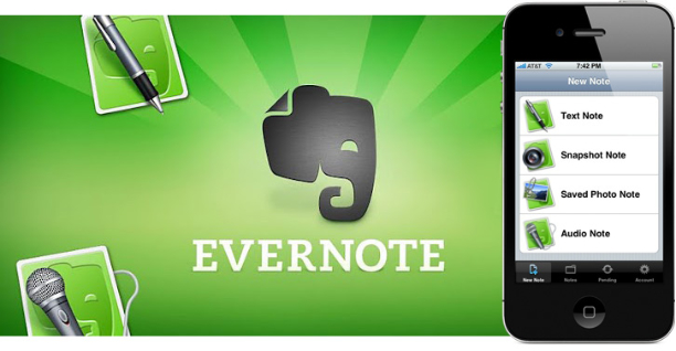
Because the smartphone is always within reach, the context of use could be understood in terms of the application’s intended purpose. An example of this is Evernote, a multiscreen ecosystem that allows you to take notes, create to-do lists, clip articles, and save URLs. Evernote makes these notes completely searchable whether you are at home, at work, or on the go. In its mobile app, Evernote understands the mobile context and provides quick access for text notes, photo capture, and voice dictation. By utilizing the device capabilities and providing a quick way to save ideas, Eventbrite turns smartphones into a great note-taking platform.
Our Mobile Planet is a great resource for understanding the mobile consumer. The insights within this website are a result of an extensive technology research project commissioned by Google for understanding the smartphone adoption and usage around the world.
Tablets
Tablets are mostly used for media consumption, reading books, browsing news, and checking emails. People may use smartphones to look for a quick article to kill the three minutes waiting for a train; once on the train, they may take out the iPad for the hour it takes them to ride home (Usability of iPad Apps and Websites). Tablets are used in environments not conducive to a keyboard and mouse such as lying in bed, watching television, or standing. Because of its lighter weight in comparison to a laptop, the tablet is easily carried; however, its main usage is within the home. Most tablet owners use the device daily for an average of 90 minutes a day, mostly on weekdays.
Because the screen of a tablet is larger than that of a smartphone, the tablet is ideal for reading and viewing media such as images and movies, and the larger virtual keyboard is more convenient for writing emails and note-taking. However, the tablet is not currently considered a work tool for most people, nor is a replacement to the desktop computer; it is merely a more convenient way to consume media and surf the Web away from the office desk or the typical computer environment.
As technology advances, future tablets will have the power to replace the laptop PC. With the upcoming release of Windows 8, an operating system geared to touch devices and personal computers, there will most likely be a shift in the market, and perhaps one day the tablet (with an auxiliary keyboard) may replace the laptop altogether.
Tablets are a perfect platform for reading. Pocket (formally known as Read it Later) is a great example of an app that uses the tablet to enhance a consistent multiscreen experience. When the user finds something on the Web while using a desktop PC or laptop that he wants to view or read later, he simply puts it in Pocket. Pocket captures those reading items and displays them in a clean, easy-to-read layout on a tablet (or a smartphone), creating a personalized magazine for the individual user.
Personal computers (desktop or laptop)
People use personal computers for two completely different functions: for work and for leisure. Because personal computers are found in almost every home and office, it is essential to consider them when designing for a multi-screen ecosystem. Oftentimes, users will look for an application or find something they’re interested in while surfing the Web on a personal computer, and then continue the interaction onto other devices. Personal computers are also used to backup files and images, and users often revert back to the computer for the most important tasks in their daily routines.
Mouse and keyboard ergonomics and the advanced processing powers of personal computers provide an efficient working environment. When designing multiscreen ecosystems, UX professionals can utilize additional devices to serve as auxiliary screens. For example, with Adobe Nav and a network connection between an iPad and a computer, users can move the Photoshop toolbar onto the tablet and customize it to more easily access the toolbar without crowding the main interface, creating an even more efficient environment.
Smart TVs
Smart TV is a general term for a new generation television viewing experiences where the TV (or a specialized device connected to it, such as an Apple TV) has Internet connectivity and can run applications (e.g., Netflix) and video processing utilities.
Designing for television screens is also known as “designing for the 10-foot experience” because, from the distance of the living room couch, the apparent size of elements on the screen is noticeably smaller compared to a computer screen, where the user’s eyes are typically less than two feet (60 cm) from the display. When designing for the context of smart TVs, one can assume that users are in a very comfortable setting in their living rooms, often wanting to relax, to be entertained, and to interact with people who are in the room with them. The interaction with this device could last a few hours or longer.
The preferred television input device is a remote control. For the most part, people don’t want to use a mouse and keyboard when they’re watching television. This means the UI has to be simple and obvious, and users must be able to navigate with their thumbs without looking at the input device.
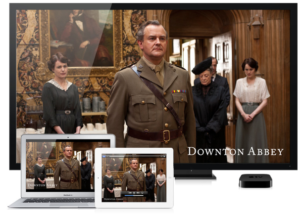
With devices like Google TV or Apple TV using AirPlay, smart TVs can integrate with other devices such as smartphones and tablets. For example, a tablet can be used as a program guide and as a way to read more about the program currently being watched. Or for a multiscreen experience, a user can begin watching a show on her laptop and then switch to her television for a more comfortable environment. The move between each device is synced and seamless to the user.
Following up his 2011 article Re-Thinking User Interface Design for the TV Platform, Jim Mischel noted in an interview: “A good way to satisfy the television user is by presenting a simple user interface on a tablet or phone. The tablet/phone presents the interface, and the user’s input on that device controls the television. Note that this is only important when dealing with short-format content. If the user is going to watch an hour-long television show or a two-hour movie, then Web interfaces like Hulu, or cumbersome cable TV-like interfaces are okay. The user is willing to put up with a little aggravation if the reward is an hour or two of uninterrupted entertainment. But if the user is watching YouTube videos or consuming other short format content, the user interface has to be simple. Really simple. The user can’t be bothered with having to go through a ton of menus every three minutes.”
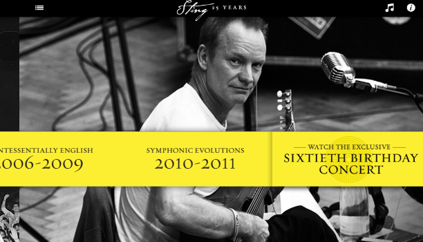
The television could also serve as an extension to other devices, using the large display for streaming media or images from the tablet or using a high-quality sound system for better audio experiences. A good example of this is Sting 25, an app celebrating the life and work of the musician Sting. It allows a dual-screen AirPlay viewing of exclusive concert footage wirelessly on a smart TV while exploring additional content on an iPad.
A natural user interface (NUI) is an emerging concept in human–computer interaction, and refers to an interface that allows a user to control a tool or digital content using relatively natural means of communication. The goal of NUI is to make computing and technology simple to use, everywhere around us, accessible to people with minimal technical expertise, reliable and more intuitive. With a motion-sensing input device technology like Microsoft’s Kinect, the living room environment becomes a setting for an even greater TV experience. For example, face recognition software could detect a person and flip through his favorite channels as he taps two fingers together or waves his hand, and a voice command could initiate more complex actions.
Here is a demonstration of gesture controls by PrimeSense, an Israeli Company specializing in NUIs:
Conclusion
Designing for context is about aligning the purpose of a product with the user’s requirements at any given time or in any given situation. By evaluating each platform against the story of the users and how (or where) they use the product, designers can create better flows across and within the ecosystem. Creating these product ecosystems turns smart devices into smart displays. These smart displays follow users throughout their day and help drive the experience, allowing users to engage with the product more than ever before.