Companies are increasingly embracing design, not just as a feature, but as a core competency. As design is a collaborative process, many executives are finding the best ways to communicate with their design counterparts. Recently, our clients too have been asking us for help to steer their design teams to achieve a concerted success.
Requests like these aren’t alien to us. However, what was intriguing was the fact that they believe we are well-suited or more capable to do it than them because “designers listen to designers”. This got us questioning if it’s true, or if it’s a matter of effective criticism.
Let’s face it. Passive-aggressive competition during a design review isn’t a new thing. Both executives and designers have their fair share of experiences and live to tell their #FML tales. This situation begs the question: why are designers so fragile and why do comments from executives seem so harsh?
It’s because nobody enjoys critique. Period.

It’s tough for executives to give constructive feedback as they have no idea how to start, or where to start. Likewise, it is also difficult for designers to figure out how to improve a design in response to executives’ critiques.
For clarification’s sake, we are not covering how to effectively run a design critique, as there are many relevant articles out there. Instead, we are sharing ahem… a common method (no pun intended) we have been using internally as the ingredients for design critique. It comprises 3 key questions that aim to achieve alignment between clients and fellow designers, thus making design critique more effective and enjoyable.
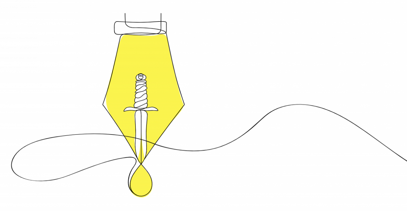
№ 1: Question the design purpose
Many of us might think this is akin to questioning the design objective. However, there is a difference. A design objective is a goal set forth by the team, but a design purpose is the ‘why’ behind a design. The design intention needs to be clear and aligned with everyone first before we can kickstart an effective design critique.

It would be subjective to say that one logo is better than the other one, as we are not sure of the purpose behind the designs. But if we all know that the design purpose is to predominantly showcase critic attributes, followed by food, it would be easy to identify the left logo as a better option, and even suggest design changes to the right one (i.e. reduce the prominence of the egg, make the shape of the pen more iconic). When we make a design purpose clear, anyone (regardless of profession) can make better design choices and provide constructive criticism.
№ 2: Question the use of design principles
When we instinctively see design as being good, it’s likely because one or more Gestalt principles of perception are at play. Using Gestalt principles for design critique is helpful because it allows us to identify the best way a design purpose can be expressed.

It’s pretty obvious which poster design stands out from the other. The poster on the left uses the Gestalt Law of Figure/Ground that allows us to cognitively process the design as a whole. The poster on the right uses the Gestalt Law of Symmetry, which may not be the best as it requires us to comprehend different elements (i.e. the message, the difference between two images), before being able to fully absorb the design purpose. Using Gestalt principles for design critique will give us greater control over our designs, create more balanced and effective designs.
So next time before we say “it’s too bland”, or “it’s too complex”, we should question how we can use various Gestalt principles #FTW.
№ 3: Question the design placement
Design in itself is a solution. Having a great design purpose and principle is just part of the equation. What’s equally important is the design placement (or, design/visual hierarchy). Mainly because it leads the viewing experience, helping our brain process the information (in its intended way), regardless of its medium. There are a total of 12 characteristics in Visual Hierarchy, with some overlapping with Gestalt principles. To not to confuse ourselves, we use 4 key ones: scale, contrast, direction and reading patterns.

Let’s take a look at how visual hierarchy can bring out the best design even on a small mobile screen.

Looking at the above example, the design on the right is created with the right mix of visual hierarchy, making the classification of apps clear and easier for users to choose. The design on the left places equal weightage to the design elements (i.e. header size, app icon size), and takes a bit more effort to make sense of the classification of apps. Visual hierarchy, when used in a situation with complex information, can make designs a lot easier to comprehend.
Effective design criticism is not an entitlement to designers only.
Over the years, these 3 key questions (purpose, principles and placement) have been crucial in helping us turn design killer feedback into killer design outcomes. It can be applied to any designs critiques, from logos to apps.
Getting great design outcomes is no longer just the job of a designer. Executives play an equally important role to shape the design outcome.
As the global COVID-19 situation requires us to collaborate remotely, we believe even more executives and designers need to master the art of design critiques, so they can achieve the synergy between vision, strategy, craft and execution to elevate the value design can provide for their companies.