Save

There’s a type of cognitive dissonance that haunts designers: the genuine desire to be truly innovative and original whilst simultaneously trawling the web for inspiration and design ideas.
I doubt many designers sit down with the intention of copying Airbnb, Apple, or Stripe. But they’re such beautifully-designed experiences that it’s hard not to be inspired to some degree — even subconsciously.
Whilst the limitless optionality of a blank Figma board can be overwhelming, the answer is rarely to copy someone else. The plagiarism issue aside, it’s tough to replicate the magic of another user experience and not lose the magic that makes it work.
Do you actually understand why it’s worked? Have you lost the secret sauce somewhere in the replication? Can you then innovate your own ideas onto them?
Firstly, let me give you an example of an industry where it’s been commonplace to copy what works from younger and more agile start-ups: banking.
Today I published some of the findings from a 900-day study of 12 banks in the UK called The UX of Banking. As a lifelong reader of Smashing Mag, I wanted to give you all a modified excerpt from that article and then some advice on how to effectively take inspiration from others.
Monzo Bank Was Heavily Copied In 2020
Back in 2020 (when I started this study), I was critical of how most of the incumbent banks handled basic card management features. They lacked context, the designs themselves were really poor, and there were basic usability issues.
New features, like freezing your card or showing your PIN inside the app, were simply added as new rows — similar to a settings page. This was the predictable risk of adding new functionality for decades without rebalancing the core user experience.
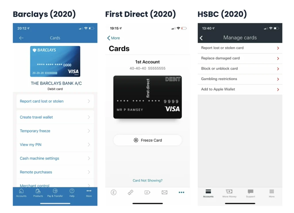
But, unburdened by how things used to be, Monzo, Starling, and Revolut seized the opportunity to design something that felt intuitive for this new paradigm. This example is from the UK, but it’s true of many global brands, like Robinhood, Venmo, N26, and CashApp.
Since 2020, there’s been a noticeable effort to replicate what works inside the UK banking scene, and the experiences are looking very similar.
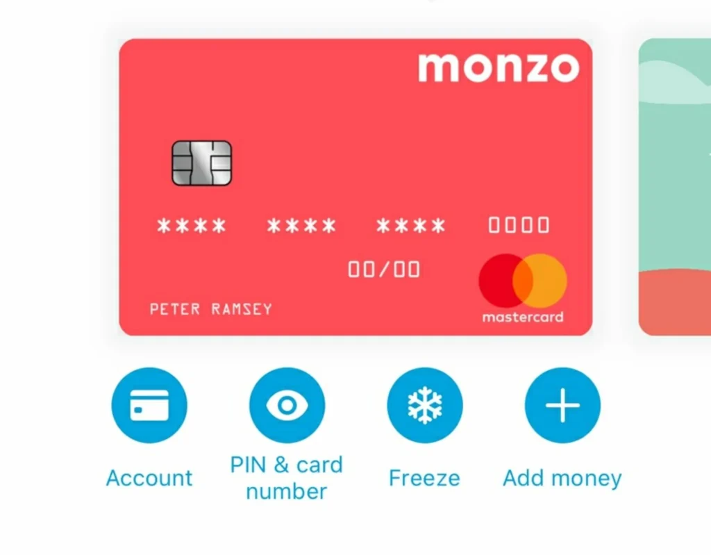
In particular, the order and positioning of the most common card management features — as shown above on Monzo in 2020. This is what’s clearly been a massive ‘inspiration’ to other banks.
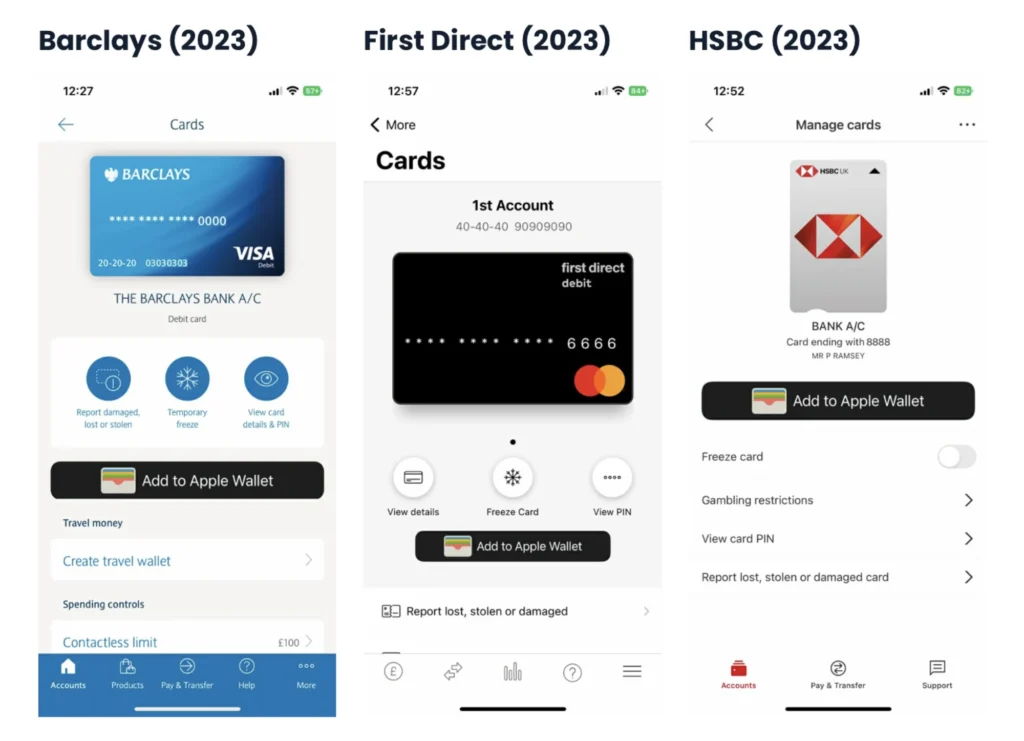
This is true both of the visual aspects of design (i.e., how it looks) and the functional architecture of managing your card (i.e., how it works).
Barclays might have more than 80,000 employees, but it looks like they have the same grey Figma habits as the rest of us.
The Risk Of Copying
Now let me show you an example where copying can get you in trouble: chasing ‘click-parity’, copying a simple flow that you don’t understand, and not considering that often the best experiences are the longest.
Here are the number of clicks it takes to order a new card with each of the 12 banks I’ve been following:
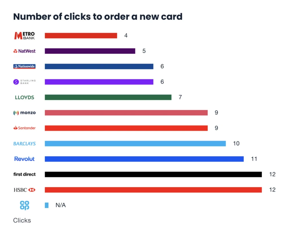
As an analyst (and at first glance), it might look like Metro has the best user journey. But in this instance, the number of clicks is the wrong metric to care about.
There appears to be very little positive correlation between what I believe are the better experiences (e.g., Revolut, Monzo, and Starling) and the number of clicks.
Rather, having too few clicks is more likely to be an indication that there’s not enough context (or that it’s crammed into one screen).
It’s almost like the obvious cheat codes of design: use more padding, space things out, and give yourself more room to add context.
Let’s consider a few nuances to this specific user journey (i.e., losing your bank card):
- 📅 Infrequent usage
Most people aren’t ordering new cards every month. So, this isn’t a ‘power feature’, and they’re not hoping to optimize for efficiency. - 😰 Negative connotations
Most of the time, you’re ordering a new card due to a negative event (e.g., stolen, lost, or damaged). You’re probably already anxious, stressed, and frustrated. - ⌛️ Time sensitive
People need a new card quickly. The context behind delivery speed is important, rather than the speed of ordering the card.
To summarize: People who’ve lost their card will likely be looking for reassurance and comfort rather than efficiency. That’s the tone of the user journey, and as a designer, you need to be acutely aware of it.
Metro has so few clicks because it’s essentially one screen with two buttons. You have no option to keep the same PIN (say, if you’ve damaged your card at home), which means that you have to wait for both a card and a PIN to arrive.
The two clicks saved by not asking about this preference forced me to wait an additional two days before I could use my card.
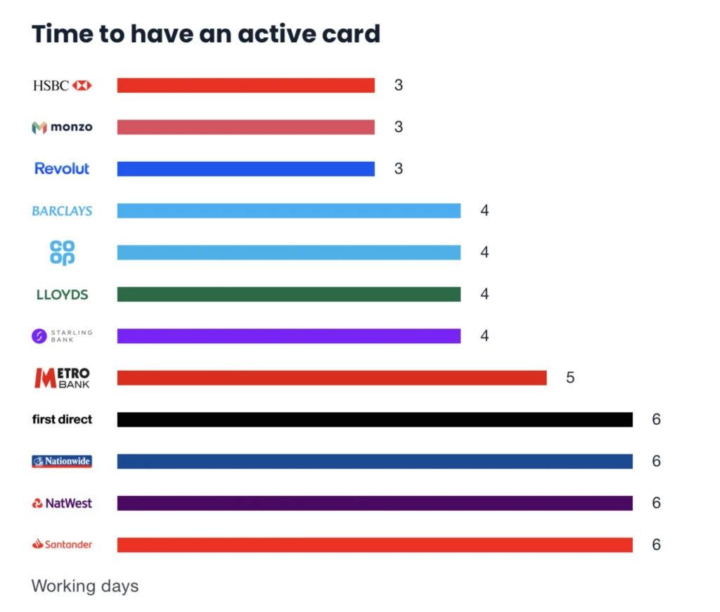
And they’re the two metrics I’d measure success by for this user journey:
- How good was the experience (qualitative)?
- How quickly can they use their card (quantitative)?
If you were to copy Revolut’s flow but remove the features your product doesn’t have, that 11-click process might not feel the same.
Or, you could take inspiration from Monzo’s ‘card-selection screen’, but if you’ve combined it with another step they don’t have, you may lose the magic of why it works.
Even banks, who largely have the same feature set, are replicating the same ideas with a really broad quality of execution.
Note: It’s an industry that should be relatively easy to replicate ideas, but demonstrates how subtly hard it can be.
The Do’s And Don’ts Of Implementing Inspiration
To be absolutely clear, I’m an advocate for leaning into the Familiarity Bias — a tendency for people to prefer (i.e., choose) products, services, and options that feel familiar to them.
So, here are a few handy do’s and don’ts of building familiar-feeling products, without losing that magic spark:
✅ Things to do:
- Try to identify the psychological biases that are in play.
Is the user frustrated? Sad? Are they trying to avoid making losses, or is their decision-making skewed by something else? Ultimately, do they resemble the same biases affecting your product? - Can you lean into a well-known mechanism and save some onboarding effort?
For example, TikTok popularized the ‘swipe to watch’ mechanism. There’s no shame in using that same navigation style; your users will instantly feel more familiar with your product. Remember: familiarity is a shortcut to learning. - Be inspired by the inventiveness of the execution, not the visual stuff.
It’s not productive to fall in love with Shopify’s checkout process and convince yourself that you need to copy it. Instead, try to identify how they’ve cleverly innovated about subtle and specific problems (i.e., managing global delivery addresses in one page without reloading).
❌ Things to avoid:
- Don’t outright copy someone else’s design.
You are probably only seeing 5% of the complexity, and the other 95% may include unexpected nuances that led to visible decisions. - Don’t assume that you should have feature parity.
In other words, just because a company you admire has features X, Y, and Z in the main nav doesn’t mean you should. What do your users actually want to do? - Don’t forget that your start-up isn’t Airbnb, and you need to educate people on what you actually do.
In other words, when a product becomes a household name, they often don’t need to spend time (i.e., clicks) teaching the user what they actually do — everyone already knows. But you probably do.
I don’t have the silver bullet of successfully replicating the magic of Apple (and if I did, honestly, I’d probably keep it to myself and make a fortune).
But, hopefully, this serves as an important reminder not to follow the competition blindly.
To read the full (and free) study on the UX of Banking, visit Built for Mars.
Obsessed with UX. One of the most well-known UX experts with more than 250.000 people reading his blog “Built for Mars”.
- The author speculates on the right balance between drawing inspiration from existing designs and creating original work and provides some do’s and don’ts of implementing inspiration.
- Copying another’s design may result in losing the key elements that make it work, making it difficult to replicate the original experience.
- Designers can use inspiration as a starting point rather than a destination to fuel creativity.


