Save
In part one of this two-part series we introduced and reviewed the basic concepts of conversion rate optimization and how Google’s Web Optimizer – a free tool from Google – can help improve your conversion rate, delivering fewer browsersmaking tire kickers drive off the lot and more buyers to the checkout. We also examined some of the tests that GWO performs to deliver useful conversion rate analytics. But there are additional benefits to using this performance assessment tool. Let’s have a look:
1) Test Problems Identified During Usability Testing
In part one, we urged you to undertake usability testing – sitting actual humans in front of a monitor to move through your site identifying anything confusing. From usability tests, you should have a list of problems and issues identified by your testers (or your observations of them). Then move on to use GWO to analyze anything identified as other potential problems.
For example, if several people thought the checkout was confusing, test it after site launch to see if the checkout page is where many visitors bounced (opt- out of the sale). If so, you need to make the checkout simpler more simpleand/or clearer, don’t make visitors think. Remember, usability tests identify why visitors aren’t buying and that’s one thing you want to know now!
2) Test Your USP
Your USP – your unique selling position – is what sets you apart from the competition. It could be your low, low prices or the assurance that high cost means high quality. In any case, describe your USP in a few words. Then, look at the competition to see what they use as their USPs and conduct some A/B splits to see if, maybe, your current USP could be changed, clarified or refined.
3) What Do Visitors Take Away From Your Site?
Make a list of priorities – the five messages or sell points you want each visitor to remember when s/he leaves the site. Then, run GWO tests to determine if these five points are clear. You’ll be able to tell with the graphics reporting GWO delivers during testing to seeprovides which messages stick and which are lost on visitors.
4) Define Characterize Your Ideal Buyer
Male, over 30, income over $50K annually – make a list of the characteristics of the ideal buyer. This is who you’re trying to reach. Your copy, site design, graphics and images should be directed straight at your target demographic – the market segment you most want to reach.
5) Test Headlines
Headlines are critical to site success. If they don’t motivate buyers to action you don’t won’t make sales. So try different headlines in A/B splits to see which headers pull best. Headlines should describe the benefits of products or services (not product features), they should emphasize ease of use and finally, they can’t be overblown bombast, i.e., headlines must be believable. In fact, all site text must be believable.
6) Test Your Tagline
The tag line is the phrase that follows your site or company name, e.g., Dow: Better Living Through Chemistry. The tag should express the essence of your site and, in a few words, the site’s USP.
7) Test Pricing
Cheapest isn’t always best. Many consumers take comfort in knowing that they’re getting better quality at a higher price. This “velvet rope” approach to marketing is what makes haute couture so expensive. Test pricing to find the comfort level of your target demographic.
Also, drop prices a penny. $24.99 sounds so much less than $25.00. It’s a strategy that’s worked for decades and all of us fall for it because we tend to round down not up.
8) Promotions and Give-Aways
Buy one get one free. A one-month free subscription. Enter our Island Hide-Away Sweepstakes. Test these one at a time to see which promos have the greatest impact on your site’s bottom line.
9) Make the Call to Action Link Really Obvious
A colorful button labeled “Order Now” tells the visitor what’s expected and how to complete the most desired action. Don’t let them guess. Tell them what to do next.
Other ways to make points stand out? Bold type face, italics, high-lights, arrows – anything to grab the readers’ attention – quickly.
10) Test Site Layouts
A single-column layout gives you greater control over the order in which information is presented to visitors. Make sure the most important information comes first.
Also, studies show that people read from upper-left to lower right, stopping at the headlines. That makes the upper-left corner of each page prime site real estate.
11) Critical Information Goes Above the Fold
Some visitors don’t scroll so if they don’t see it above the fold they don’t see it at all.
12) Test Images
A picture is worth a thousand words – sometimes. Test various images and color usage to see what pulls best: a tabletop product image, product in use by happy customers, etc. A/B splits will tell you what you need to know, here.
13) Site Text Typography
Critical to site success. Don’t overwhelm visitors with pages of text. Use enough to make the pitch then get off stage. Know when to stop selling.
Use simple language to describe product benefits not product features. Make sure visitors have all the information needed to make a buying decision and address common buyer objections, e.g., too expensive, etc.
Test font sizes and colors for readability and use bulleted lists for quick delivery of key points. Refine after each test.
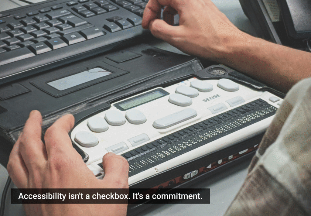
14) Test Site Accessibility
Accessibility is a refinement ofclosely married to usability. Start by testing your site in different browsers and at different screen resolutions to get a “customer’s eye view” of your on-line business. What looks good in FireFox may not look so good in IE.
Keep download times as short as possible. 90% of visitors will sit through a 10-second download. Only 10% will sit through a 30-second download so keep site pages light on graphics, Flash animations and other bells and whistles.
Activate Google’s site search feature using Google Mini and Google’s Free Web Search tools. These make your site more accessible to search engine users.
Create “clickable” features. Users click on anything – links, pictures, graphics – anything that captures the attention of the visitor should be clickable.
Test on-site adverts such as Google Adwords. Adwords allows you to split links into various channels for A/B split testing. Test for: ad size, shape, positioning on each page and color formats to make ads pop out or blend in with the rest of your site design.
Finally, establish and record baseline measurements for comparison purposes. Compare test results to your baseline findings to determine what’s working and what needs more work.
Google’s Web Optimizer is a terrific tool for improving your site’s conversion rate and improving your bottom line. However, be patient. It may take several refinements before your site is fully optimized to convert visitors to buyers.
Also, remember that conversion optimization is not a goal. It’s a process – one that continues even as your site sees improved traffic and sales. Optimization should take place regularly and every change you make should be tested for results. Does the change improve conversion? If not, go back to what you had and try again.
Conversion optimization is a little bit of a science, a bit of an art and a whole lot of trial and error so keep at it. With Google’s Web Optimizer, you have the tool to test how your site is doing.
Use it to grow your site to profitability faster. Use it to achieve site success. Use it to make your site the best it can be. After all, that’s what we’re each trying to do in the world of e-commerce – and Google wants to partner in your success.
Frederick Townes
As a <a href="https://.w3-edge.com/">web design company</a>, W3 is most excited about building <a href="https://.w3-edge.com/weblog/web-2-0">Web 2.0</a> web properties (community-driven web sites) and furthering the use of web standards and accessibility.
Frederick also maintains the corporate blog, where he shares the insights and discoveries of the staff on a range of topics from <acronym title="Cascading Style Sheets">CSS</acronym>, markup and web standards, search marketing, usability and conversion rate optimization.


