Flag

We stand with Ukraine and our team members from Ukraine. Here are ways you can help

Get exclusive access to thought-provoking articles, bonus podcast content, and cutting-edge whitepapers. Become a member of the UX Magazine community today!

Home ›› Consumer products ›› Confusing, Confounding Content #wtfUX

Confusing, Confounding Content #wtfUX

by Josh Tyson
2 min read
Share this post on
Tweet
Share
Post
Share
Email
Print

Save

By identifying and sharing examples of bad UX, we can rid the world of poorly designed experiences.

The world is full of poorly designed experiences. By identifying and sharing them, maybe we can shrink their numbers. Here we’ve got some examples of content that confuses, confounds, or does both of these undesireable things.


When preparing your taxes, you want everything just right. Little inconsistencies like this can elicit momentary panic.


The content in this survey is confusing in it’s breakdown of professional strata and confounding in the way it relegates certain professions to non-professional status.


To Netflix’s credit, it’s hard to think of anyone who reads through terms of use documents, but reminding customers of the length and density of the terms governing their use of your product seems to reenforce the reason they are so often ignored in the first place.


So 11:15pm isn’t part of the day? But I want some ceviche.


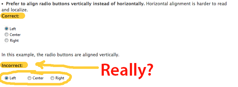
This came in an email from Daniel Brown: “Microsoft’s UI standards give an example wherein giving “Left”, “Center”, and “Right” should be stacked vertically rather than horizontally. If there is one case in which this is NOT true, this would be it.”


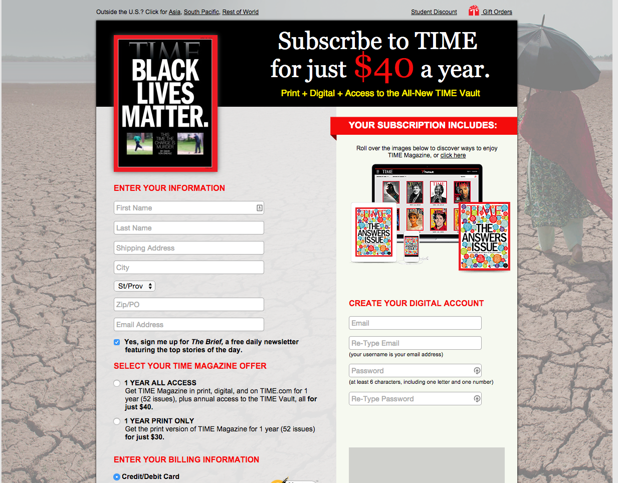
I found this one as I was trying to read an article on the Time magazine website. A popover that I can’t seem to click around or close, unless I subscribe. Shrewd.


UPDATE: We heard from Erik Frick, a user experience designer at Time Inc., who said that this subscribe page should never be served as a popover. “If it was, it was likely by accident,” Frick says. “My best guess (assuming the page was served correctly) is that the while loading the page, the browser detected a stray click that just so happened to land on a subscribe link—there’s one near the top left of every page that directs you to a new page in the same tab.”


Keep these coming. Send them to us via Twitter or Facebook using the hastag #wtfUX or email them to: [email protected] with “#wtfUX” in the subject line. Include as much context as you can, so we get a full understanding of what the f%*k went wrong.


post authorJosh Tyson

Josh Tyson
Josh Tyson is the co-author of the first bestselling book about conversational AI, Age of Invisible Machines. He is also the Director of Creative Content at OneReach.ai and co-host of both the Invisible Machines and N9K podcasts. His writing has appeared in numerous publications over the years, including Chicago Reader, Fast Company, FLAUNT, The New York Times, Observer, SLAP, Stop Smiling, Thrasher, and Westword. 

Tweet
Share
Post
Share
Email
Print

Related Articles

Learn why your badges and streaks won’t wow kids raised on Minecraft.

Article by Montgomery Singman
Gamification 2.0. Beyond Points and Badges: Designing for Players, Not Metrics. Chapter 4: Special Considerations
  • The piece explains that young users, trained by thousands of hours of expert game design, can smell fake gamification at a hundred paces.
Share:Gamification 2.0. Beyond Points and Badges: Designing for Players, Not Metrics. Chapter 4: Special Considerations
4 min read

Learn about the most difficult challenge for designers in Agile.

Article by Paivi Salminen
The Part of Agile Designers Fear the Most: Imperfect Work
  • The article argues that designers aren’t afraid of shipping imperfect work; they’re afraid of imperfect work remaining imperfect because teams tend not to come back to improve what they’ve already shipped.
Share:The Part of Agile Designers Fear the Most: Imperfect Work
4 min read

Find out why slapping gamification on your product without first selecting a genre is the silent killer of your engagement strategy.

Article by Montgomery Singman
Gamification 2.0. Beyond Points and Badges: Designing for Players, Not Metrics. Chapter 3: The Framework
  • The article argues that “adding gamification” without selecting a genre is akin to “adding music” without referencing jazz or heavy metal: a category error that most product teams never realize they’re making.
  • It contends that different game genres are not just aesthetic choices; they are fundamentally different motivational architectures, and mapping your product to the wrong one is why most gamification fails.
Share:Gamification 2.0. Beyond Points and Badges: Designing for Players, Not Metrics. Chapter 3: The Framework
19 min read

Join the UX Magazine community!

Stay informed with exclusive content on the intersection of UX, AI agents, and agentic automation—essential reading for future-focused professionals.

Hello!

You're officially a member of the UX Magazine Community.
We're excited to have you with us!

Thank you!

To begin viewing member content, please verify your email.

Get Paid to Test AI Products

Earn an average of $100 per test by reviewing AI-first product experiences and sharing your feedback.

    Tell us about you. Enroll in the course.

      This website uses cookies to ensure you get the best experience on our website. Check our privacy policy and