Designing for Trustworthiness
I joined a team of three UX designers brought together to help design the user experience of Solipay data monetization app. Over a two week sprint our team collaborated with Solipay Tech to conduct research and design solutions for the Solipay app to create a frictionless user experience that users can trust and enjoy.

From the Solipay website;
“Solipay is changing the ecosystem around consumer data by providing payment for high-frequency, high-quality, passively generated data delivered via Google Cloud Platform.”
The goal of Solipay is to allow users to collect, control and sell their data to data-buyers.
We researched eight competitors in the data-sharing market. Competitive research allowed us to see the opportunity space that makes Solipay unique in the Passive & Private data-sharing market and it also helped us to discover the types of features and designs that users of data-sharing apps expect to see. We used the research to create a Competitive Matrix and Feature Analysis.


Competitive Matrix and Feature Analysis.

We created an online screener survey to find current users of the Solipay app, created a discussion guide and conducted interviews. The purpose of these interviews was to find out people’s experiences with using the Solipay app and any pain points or friction they might have experienced.
From our interviews we found that current Solipay users:
- are looking for more passive income.
- expect good customer service.
- want a clear and friendly design.
- think public social features aren’t necessary but will share with friends.
- generally see apps as tools to make life more convenient.
When it comes to data, Solipay users:
- want to learn more information about data collection / sharing.
- want control of their data and how it’s being used.
- don’t mind sharing data because it’s already being shared on other platforms.
- want to know specifically what data Solipay is collecting.

People are aware their data is being collected by the apps they use, but don’t know how they can benefit from it directly.
Digital natives are always looking for opportunities to raise their income passively, especially if it involves something they already do. However, they won’t participate in something that feels ‘suspect’.
How might we demonstrate the monetary benefit of sharing data while ensuring they can trust the platform with sensitive information?

Solipay User Archetype
We designed a user Archetype based on interviews, user demographics provided by Solipay and our own user research. The Archetype of the typical Solipay user was designed to help us better understand user needs from the perspective of the user and to focus our design studios on those needs.

DESIGN STUDIO We identified the key expected functions of the app with a MoSCoW map. The expected features identified through competitive analysis and user interviews are organized by importance; Must have, Should have, Could have and Won’t have. With the features in mind, we quickly sketched and iterated new designs for the main Data Permissions and Offers pages of the Solipay mobile app.

MoSCoW (Must, Should, Could & Won’t have).

A sketch illustrating app navigation design.
MID-FIDELITY WIREFRAMES
After a quick test of the low-fidelity sketches we began creating mid-fidelity wireframes to prototype and test. We focused on bringing trustworthiness to the Solipay app by designing a tutorial onboarding process. When apps deal with sensitive user data, it is especially important that the function of the app is transparent and easy to understand from the very beginning.

Mid-Fi Onboarding Wireframes
We also added clarifying text to two main landing pages of the app; the Permissions and the Offers pages. We felt it was important to provide information about the type of data the user is sharing in the same location that they toggle sharing on and off. We replaced the hamburger menu with a nav bar to provide the user with easy access to all the pages available in the app.

Original Solipay design (Left) and the redesigned wireframes (Right).
USABILITY TESTING MID-FI
We performed one round of usability testing with five users for the mid-fidelity design. Users appreciated the simplicity of the onboarding process but needed more clarity about the control they have over their data. Users expressed concerns that the word “banking” made them think that sensitive bank account data is being kept by the Solipay app, rather than what is actually kept, the transaction history data. Our new design will need to be more specific about the type of data being collected in order for users to feel comfortable sharing that data-type.
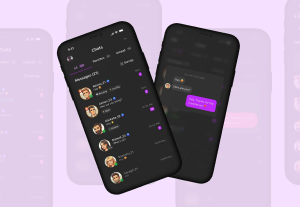
HI-FIDELITY DESIGN
Using insights we gained in mid-fidelity testing, we created a high-fidelity design. For the high-fidelity we gave the on-boarding screens more concise descriptions of the data being collected. We changed the name from “Banking” to “Purchasing” to more accurately convey that type of information being collected and build on the trustworthiness of the app. We also linked the Permissions page to the Data page so that users could quickly access the data being collected when toggling the data sharing permissions.

Hi-Fi Onboarding Wireframes.

Hi-Fi Data Permissions and Offers pages.
USABILITY TESTING HI-FI
The first task: create an account and go through the Onboarding process.
The second task: get some new offers by turning on data sharing Permissions.
All users successfully completed the tasks. 4 of 5 turned on Permissions first; one user wanted to click around before feeling comfortable turning on Permissions. All users accepted Offers; some clicked to find out more about what they were accepting.
We found that the users would like to have some additional information on why companies are buying their data & why they received the offer.
TAKEAWAY
The goals of providing an onboarding tutorial and making the function of the app transparent and easy to understand helped to increase the trustworthiness of the app for the users.
NEXT STEPS
Adaptations from Hi-Fi Testing:
- Revisiting Offer copy — What do users need to know?
- Adding a transaction history to the Balance page — When was your last payout, how much, etc.
Possible Feature Integrations:
- A dedicated Home Page
- A social feed — Think Venmo’s feed
- Alternative methods & forms of payment
- CashApp
- Cryptocurrency