Flag

We stand with Ukraine and our team members from Ukraine. Here are ways you can help

Get exclusive access to thought-provoking articles, bonus podcast content, and cutting-edge whitepapers. Become a member of the UX Magazine community today!

Home ›› Customer Experience ›› Case study: Category hierarchy

Case study: Category hierarchy

by Tornike Kurdadze
3 min read
Share this post on
Tweet
Share
Post
Share
Email
Print

Save

Walk through the process of designing for hierarchy and learn its main challenges.

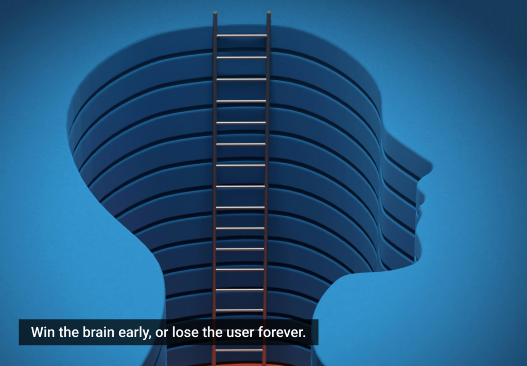
Everybody has chosen categories while filtering the content out. This action might have been overwhelming or boring for some of us while facing the ‘family tree’ of categories, their child categories, grandchild categories, etc. This endless hierarchy can make us feel lost at some point.

Case study - category hierarchy, categories

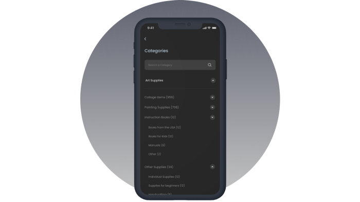
This problem is easily solvable if we have two levels of categories. To my mind, Reddit has found the best way to provide categories and subcategories in a visually appealing way.

After testing several potential users of our application, it turned out that the tree structure didn’t sound amusing for them either. Looking at the competitors of our eCommerce platform, it turned out that an optimal solution had yet to be found.

For example, on eBay, after choosing a category, you get redirected to the list of its subcategories, choosing which guides you to another list showing all the parent categories that are not highlighted enough to be easily differentiated.

I had to find a better solution for the eCommerce app with multi-levels (about 5) of categories.

The main challenges were the following:

  • Users should be able to see the path of his/her current selection.
  • Users should be able to return to the parent or any descendant category easily
  • Child categories should be different from the parent one
  • Users should not have to scroll a lot
  • Users should be able to search with keywords
  • The overall interface should be smooth and intuitive

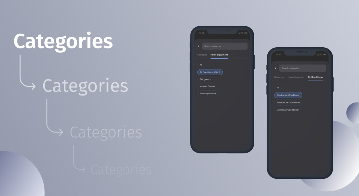
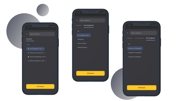
Instead of a mere list of categories, I decided to present them in the form of chips — chips are easy to use and look cool and modern too. You will ask, how it is possible to show hierarchy via chips? After thinking it out, the following turned out to be the solution:

I provided categories as a default in the form of chips. Each chip that has subcategories — has an arrow, showing that users will be redirected to the second level when they tap on it. There are several subcategories shown right on the chips too so that users have a full expectation of what kind of interface they’ll have to deal with when they follow the flow.

In addition to the section with a bunch of chips, I placed the navigation bar at the top of the screen, right below the Categories’ search input. As a default, there is a single tab called categories, but as soon as the user chooses a category, the second tab with the name of the chosen category appears right next to the ‘Categories’. If the user goes deeper into the subcategory, the third tab appears with the corresponding name. In the end, the user has it all in hand — All the tabs to navigate or go back to any level, and easily scannable chips for the subcategories.

Category hierarchy - subcategories

Later on, after building the product, I tested the flow, and turned out that 87% of the users (132 participants) were satisfied while interacting with the interface.

Future improvement ideas:

  • When only two levels are left the Reddit model can be integrated into the process.
post authorTornike Kurdadze

Tornike Kurdadze
Mobile Engineer and UX Enthusiast with several years of experience in developing applications.

Tweet
Share
Post
Share
Email
Print
Ideas In Brief
  • Since choosing categories while filtering the content out can be complex and monotonous, it’s crucial to provide categories and subcategories in a visually appealing way.
  • Tornike Kurdadze, Flutter Engineer at Netguru, found a solution for the eCommerce app with multi-levels (about 5 of categories)
  • During testing and research, the author found that when creating hierarchical categories, there are several things to keep in mind:
    • Users should be able to see the path of his/her current selection
    • Users should be able to return to the parent or any descendant category easily
    • Child categories should be different from the parent one
    • Users should not have to scroll a lot
    • Users should be able to search with keywords
    • The overall interface should be smooth and intuitive

Related Articles

Discover how AI-first design principles let you build beautiful, functional UIs in minutes — without ever opening Figma or writing any code.

Article by Adam Judelson, Ryan Brotman
Making Designs Without a Designer
  • AI-first design turns simple text prompts into fully functional, production-ready UIs — no coding or Figma required.
  • Learn how to develop structured AI prototyping workflows to eliminate bottlenecks, and ensure fast, scalable, and consistent UX across projects.
  • This isn’t just faster design — it’s the future of product design, making high-quality UI creation accessible to everyone.
Share:Making Designs Without a Designer
10 min read

AI is shifting designers from creators to curators. How can we refine AI-driven designs while keeping creativity and user needs at the core?

Article by Krunal Rasik Patel
The Future of Product Design: From Creators to Curators in an AI-First World
  • The article explores how AI shifts product designers from creators to curators.
  • It highlights AI Agents and Copilots transforming design workflows.
  • The piece stresses guiding AI outputs to ensure human-centered design.
  • It advocates mastering AI tools and curating user-centric experiences.
  • The article underscores the need for human expertise in refining AI-driven designs.
Share:The Future of Product Design: From Creators to Curators in an AI-First World
4 min read

Consistency in UI/UX builds trust and efficiency — without it, users feel lost. Learn how top brands maintain it and how AI can help.

Article by Rodolpho Henrique
Consistency in UI/UX Design: The Key to User Satisfaction
  • The article examines the role of consistency in UI/UX design for user trust and efficiency.
  • It showcases visual, functional, and interaction consistency in creating seamless experiences.
  • The piece warns about the negative effects of inconsistency, including confusion and frustration.
  • It promotes the use of AI and design systems to ensure consistency across digital platforms.
Share:Consistency in UI/UX Design: The Key to User Satisfaction
4 min read

Join the UX Magazine community!

Stay informed with exclusive content on the intersection of UX, AI agents, and agentic automation—essential reading for future-focused professionals.

Hello!

You're officially a member of the UX Magazine Community.
We're excited to have you with us!

Thank you!

To begin viewing member content, please verify your email.

Tell us about you. Enroll in the course.

    This website uses cookies to ensure you get the best experience on our website. Check our privacy policy and