- Customer Experience, Design, Design Tools and Software, Mobile Applications, Mobile Technology, Usability, UX Magazine
Walk through the process of designing for hierarchy and learn its main challenges.
Article by Tornike Kurdadze
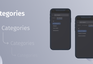
Case study: Category hierarchy
- Since choosing categories while filtering the content out can be complex and monotonous, it’s crucial to provide categories and subcategories in a visually appealing way.
- Tornike Kurdadze, Flutter Engineer at Netguru, found a solution for the eCommerce app with multi-levels (about 5 of categories)
- During testing and research, the author found that when creating hierarchical categories, there are several things to keep in mind:
-
- Users should be able to see the path of his/her current selection
- Users should be able to return to the parent or any descendant category easily
- Child categories should be different from the parent one
- Users should not have to scroll a lot
- Users should be able to search with keywords
- The overall interface should be smooth and intuitive
Share:Case study: Category hierarchy
Share this link
- February 9, 2022
3 min read


