Save

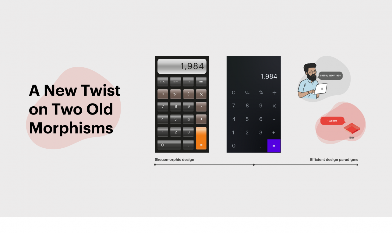
Remember getting into heated discussions about skeuomorphic design back in the day? I mean, did it die when Apple removed gradients and shading from the calculator buttons in iOS 7? Or does the fact that, even in its flattened form, the calculator app is a virtual representation of a physical object classify it as skeuomorphic no matter how dull it looks? Does the word anthropomorphic give you flashbacks of Microsoft’s Clippy offering to help you write a letter?
Well, it’s a good time to dust these morphisms off and put them back into your design vocabulary because they have special relevance in the rapidly emerging realm of conversational design. Often misunderstood and occasionally maligned, these morphisms are actually crucial to designing conversational experiences that connect with users, sometimes even working together in complementary ways.
As Apple’s calculator lineage demonstrates, in visual design skeuomorphism is the concept of making digital things look like their real-world counterparts. When users encountered the calculator in early versions of Mac OS, the shaded buttons made it look similar to the calculator in their desk drawer. As user adoption widened, the need for those visual cues dissipated, leading Apple to give the calculator a flat design.
With conversational design, we’re currently in the non-visual skeuomorphic phase of evolution. This means that we’re following the same track as visual design in terms of users understanding the technology. To a conversational designer, this might mean adding some extra interactions to make sure users understand the nature of the experience they’re engaged in.
A design that leans heavily on non-visual skeuomorphic design might look something like this:
Conversational app: Thank you for calling Bank of Antarctica. If you’re calling to check your account balance or make a payment, say “account balance” or “make payment” and I can help you. If you’re calling with a question for our loan department say “loan department” and I can direct your call.
User: I’d like to check my balance
Conversational app: I think I heard you say “check balance.” Do you want to check your account balance?
User: Yes.
Conversational app: Ok. Please say or enter your 10 digit account number …
Here, the conversational application is going out of the way to make it clear that the user is calling a bank and that this conversation is dedicated to banking related tasks. The example above is likely more skeuomorphic than necessary for certain industries, and as conversational AI becomes more commonplace, layers of skeuomorphism can be peeled away (i.e. prompting a user to say “account balance” right after you’ve listed it as an option will become overkill).
In conversational design, anthropomorphism can give applications human qualities—a powerful tool for making interactions feel like a genuine interaction with another sentient being. The net effect of anthropomorphism in conversational design creates the feeling or perception of a human-to-human relationship between conversational app and the user.
If used successfully, this lever can foster a sense of human connection, trust, and loyalty. This is actually a very powerful tool in the realm of conversational AI, and it should always be applied with clear intent. The extreme end of the spectrum would amount to fooling a user’s senses into believing they are interacting with a person they have a valuable relationship with
Conversational app: Your account balance is currently $1.56.
User (panicked): What? That’s all the money I have in my account?
Conversational app (sensing distress): Yes your current account balance is $1.56. I see that you have a mortgage payment in the amount of $1,500.00 us due in three days. Would you like to talk with one of Bank of Antarctica’s refinancing specialists about applying for a higher interest loan?
User: I don’t know.
Conversational app: I know it sounds scary, but it can really help people make it through tough times …
This example presents some impressive high-level contextual awareness, but would be going too far, irrespective of how well-intentioned.
Anthropomorphism can build trust, putting users at ease, which can be helpful as they work with conversational AI to complete tasks. When people have conversations with bots, they aren’t comparing those experiences to other conversations with bots, they are comparing them to interactions with other humans.
If a user comes to trust a conversational app the way they might trust a friend or colleague, that can be a huge design win. Compromising that trust—by roping them into a sales pitch, for example—can have long-lasting consequences. The focus should be on making the interaction feel more authentic.
In digital design and conversational design alike, skeuomorphic and anthropomorphic tactics take more effort. The former has to accommodate for a lack of familiarity on the part of the end-users. Designing the buttons to look like a real-world calculator takes more time, but creates a shorter onramp for users. Once the technology is widespread to the point where users don’t need as many visual cues, the design load gets lighter.
Anthropomorphic design requires a great deal of nuance and timing. It’s important to have a good grasp on context when humanizing bots, and getting it right requires a high level of sophistication.
In terms of using these techniques in a complementary fashion, it helps to think of skeuomorphism as a way to orient users to a space or to things (I’m having a conversation about an unexpected withdraw from my checking account) while anthropomorphism has to do with the degree to which a human perceives their interactions to be with a human.
You could even say users might perceive their interactions to be part of a relationship they have with a human (I’m feeling nervous about my missing funds, but I’m feeling reassured because I know I can trust the IDW to look out for me and get this taken care of).
User: I don’t understand why there was a $450 withdrawal from my checking account yesterday.
Conversational app: The Bank of Antartica appreciates your patience. I’m looking over your account details now to see what I can find out.
User: I didn’t spend $450 and I need that money back in my account.
Conversational app: I understand that unexpected withdrawals can be stressful and confusing, I’m doing my best to get the issue resolved quickly.
Whether you’re using them separately or together, skeuomorphism and anthropomorphism are tools that connect with users on a visceral level. As conversational AI continues to grow and impact all aspects of business, it’s valuable to refresh your thinking on these morphisms and how they can apply to a new design paradigm. What hasn’t changed is that you should never put eyes on a paperclip.
A lot of the thinking shared with you today is part of what’s discussed in a substantial white paper OneReach.ai is about to release. It explores the components of a robust ecosystem for hyper-automating, along with what a strategy looks like for creating evolving these ecosystems. In it we share a lot of perspective and new ideas and best practices that we’ve discovered through over 10,000 conversational applications created on the OneReach.ai platform.
AI researcher, technologist, designer, and innovator. Lance Christmann is the head of experience design at OneReach.ai, where his strong background in interface design and design management, extends the user-centered design approach across all departments. Lance has created many products and enterprise applications and conversational AI experiences over his career for brands such as FedEx, Boeing, and the design of the highly acclaimed eBay Desktop application which won an Abode MAX award. Prior to joining OneReach.ai, Lance served as chief experience strategist at EffectiveUI, a full-service user experience agency acquired by WPP/Ogilvy.


